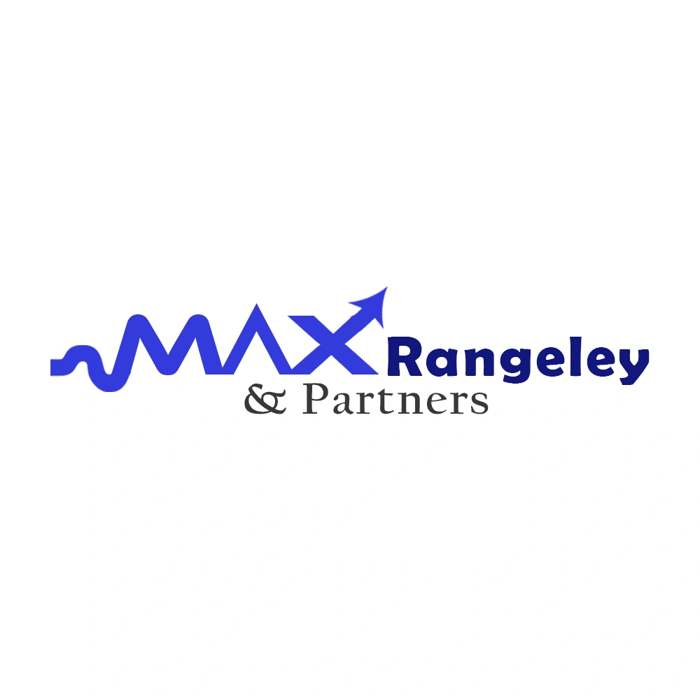
The logo for Max Rangeley & Partners
Pokala Shedrak
The logo for Max Rangeley & Partners is designed to reflect the professionalism, reliability, and forward-thinking nature of the company. The bold, modern font conveys strength and trustworthiness, essential for a brand offering business services.
The "MAX" element features a stylized wave line, symbolizing flexibility and adaptability, along with a subtle upward arrow on the "X," indicating growth, progress, and upward trajectory—qualities that align with market analysis and business development.
logo design
The color scheme primarily uses a deep blue, known for evoking trust, stability, and professionalism, making it ideal for a consulting firm. The "& Partners" text in a classic serif font adds a traditional touch, highlighting reliability and a strong foundation.
logo design
Overall, the logo combines modern and traditional elements, capturing the essence of a business that is both established and dynamic, ready to adapt and support clients across various services.
Like this project
Posted Nov 6, 2024
Designed a modern, trustworthy logo with growth symbolism for Max Rangeley & Partners, highlighting professionalism.