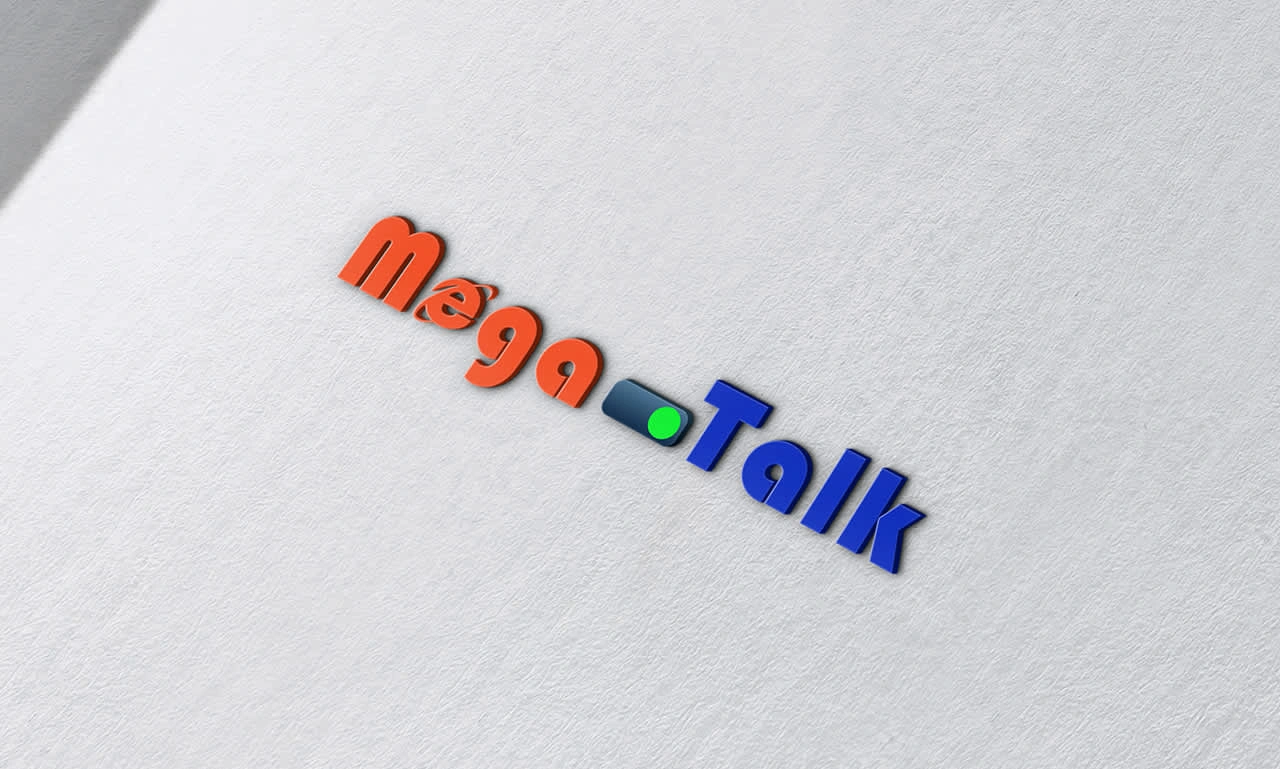
The MEGATALK logo DESIGN
Pokala Shedrak
the MEGATALK logo has a strong start and captures some of the youthful energy you described. Here are a few points on what works well and where it might be enhanced to better align with your vision:
Positive Elements
LOGO DESIGN
Color Choice: The combination of orange and blue is effective in representing vibrancy and innovation, fitting for a youth-oriented social platform.
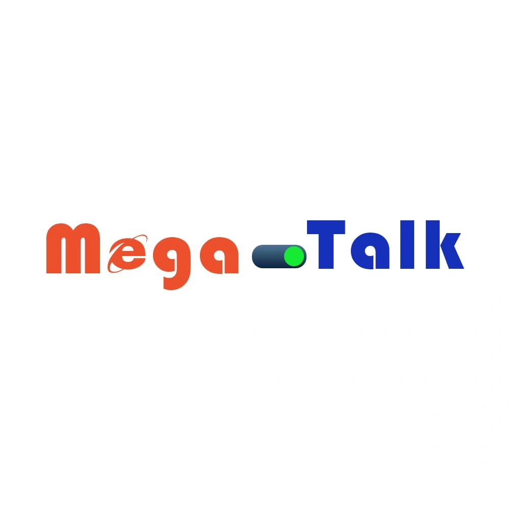
Font Style: The rounded, bold font gives a friendly and approachable vibe, which can appeal to younger users.
Symbolic Elements: The use of a toggle/switch element between "Mega" and "Talk" is interesting. It adds a modern touch, suggesting action or interactivity, which aligns with the social network’s aim for dynamic communication.
Like this project
Posted Nov 5, 2024
Also, providing formats like PNG, JPEG, SVG, and the source file (e.g., AI or PSD) will be helpful for consistent use across digital and print platforms.