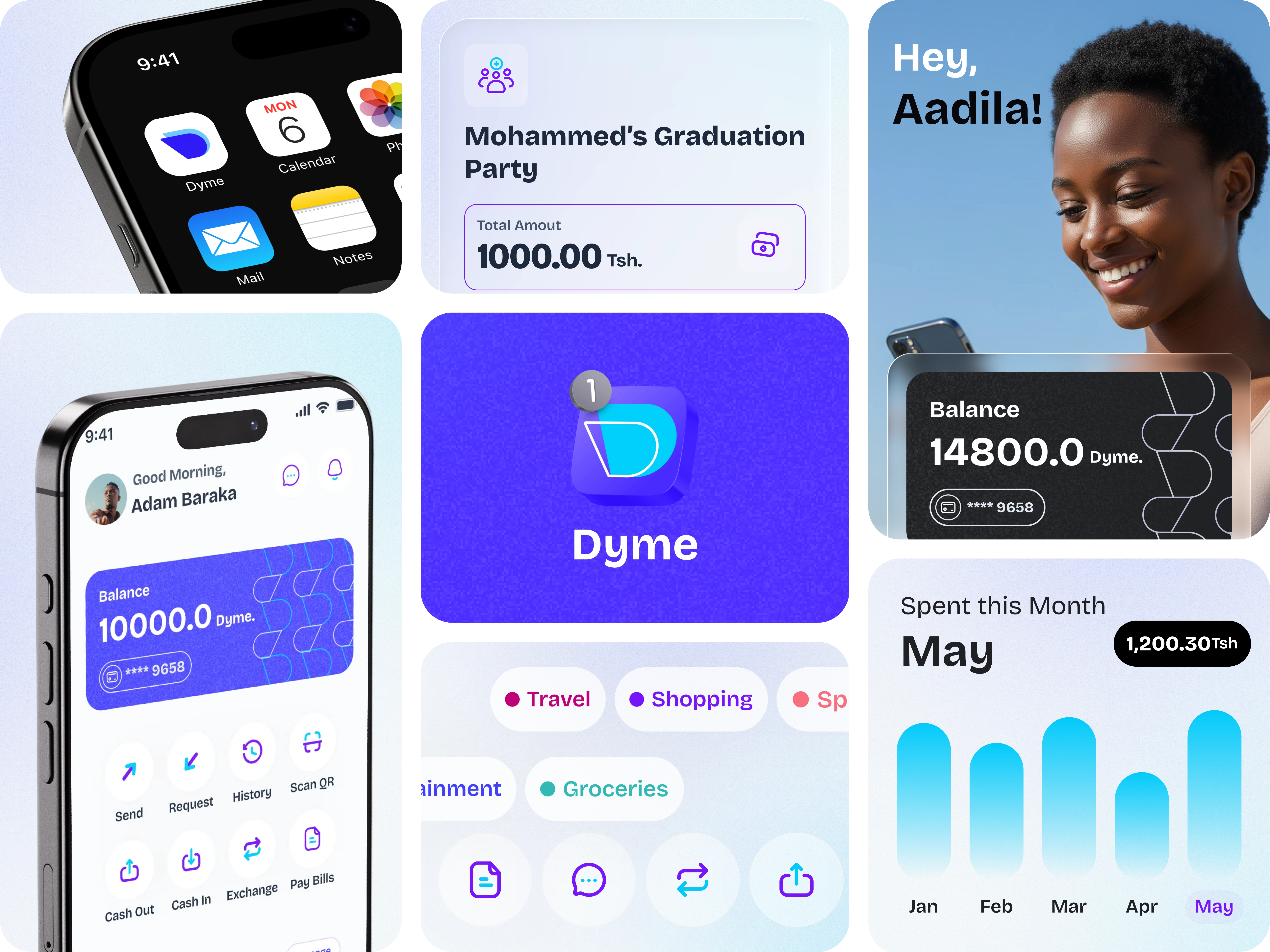
Dyme Mobile App Design
Mohammed Alyazji
Overview
Dyme is a mobile application that enables users to pay, get paid, shop, split, and share with peers in a friendly and intuitive experience — all powered by stablecoin technology, making transactions faster, cheaper, and more accessible.
🕐 Timeline: 12 weeks. || 💳 Industry: Fintech. ||📍 Location: Tanzania.
💻 Tools: Figma, FigJam, Adobe Illustrator, Notion, Jitter,
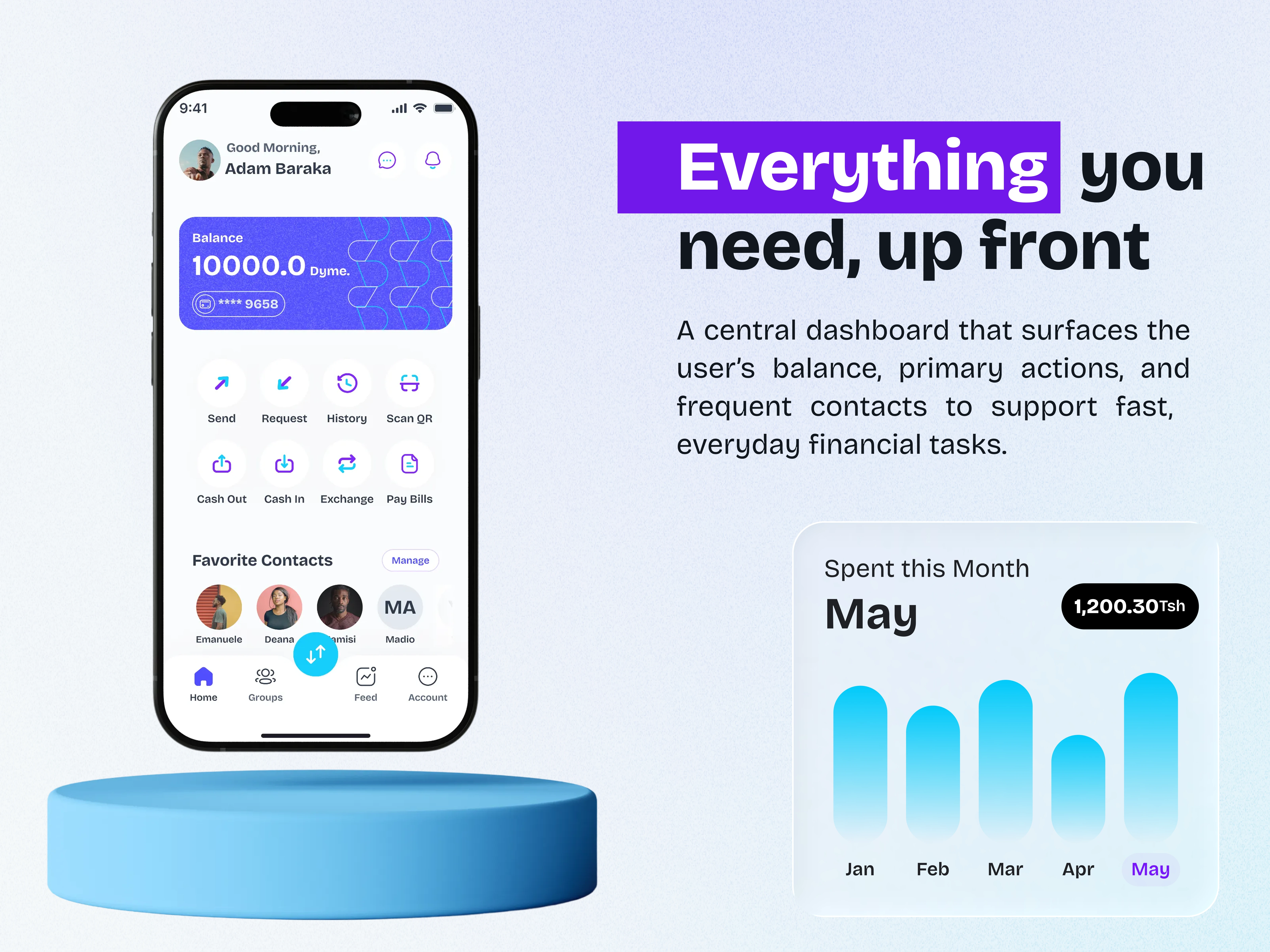
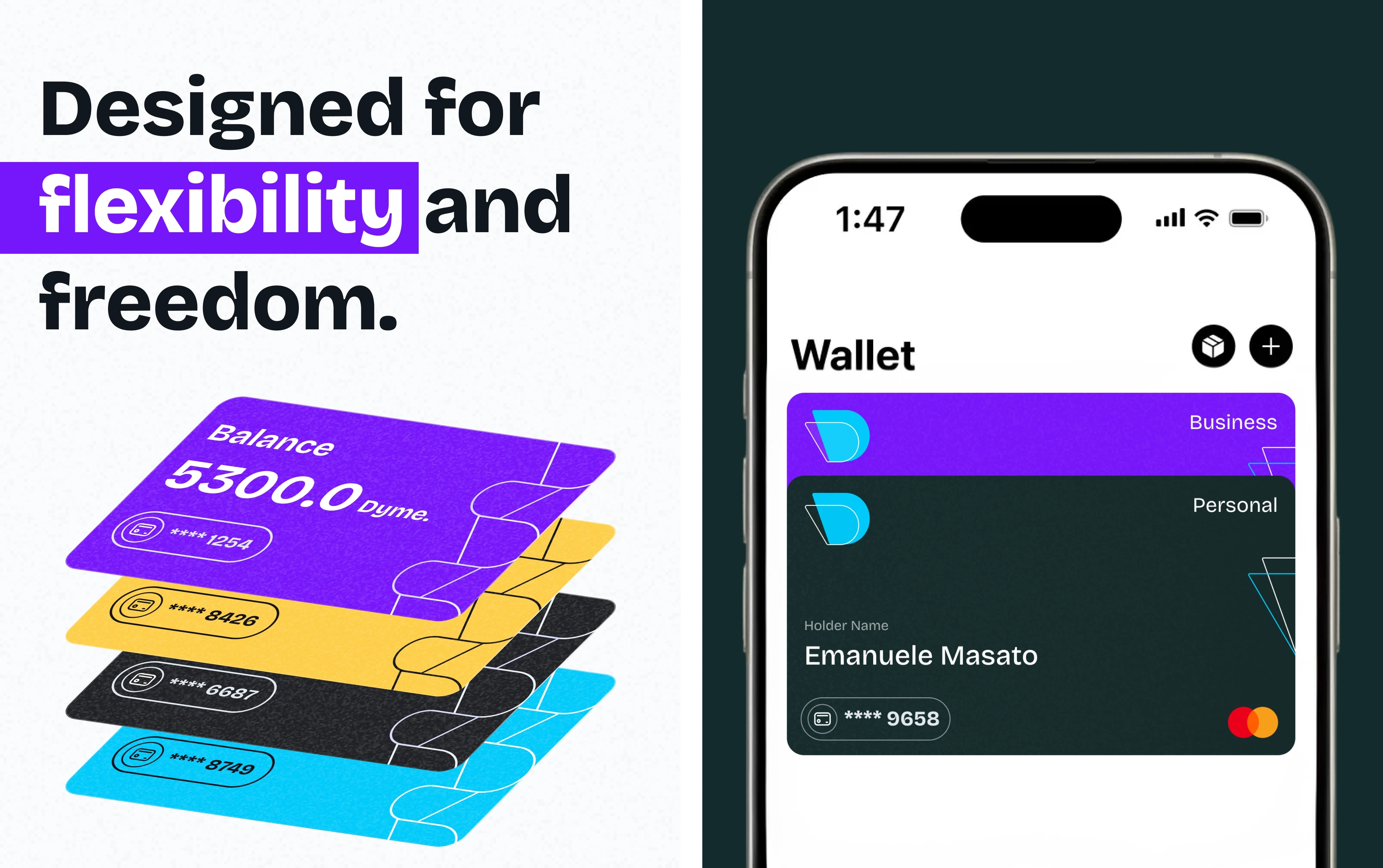
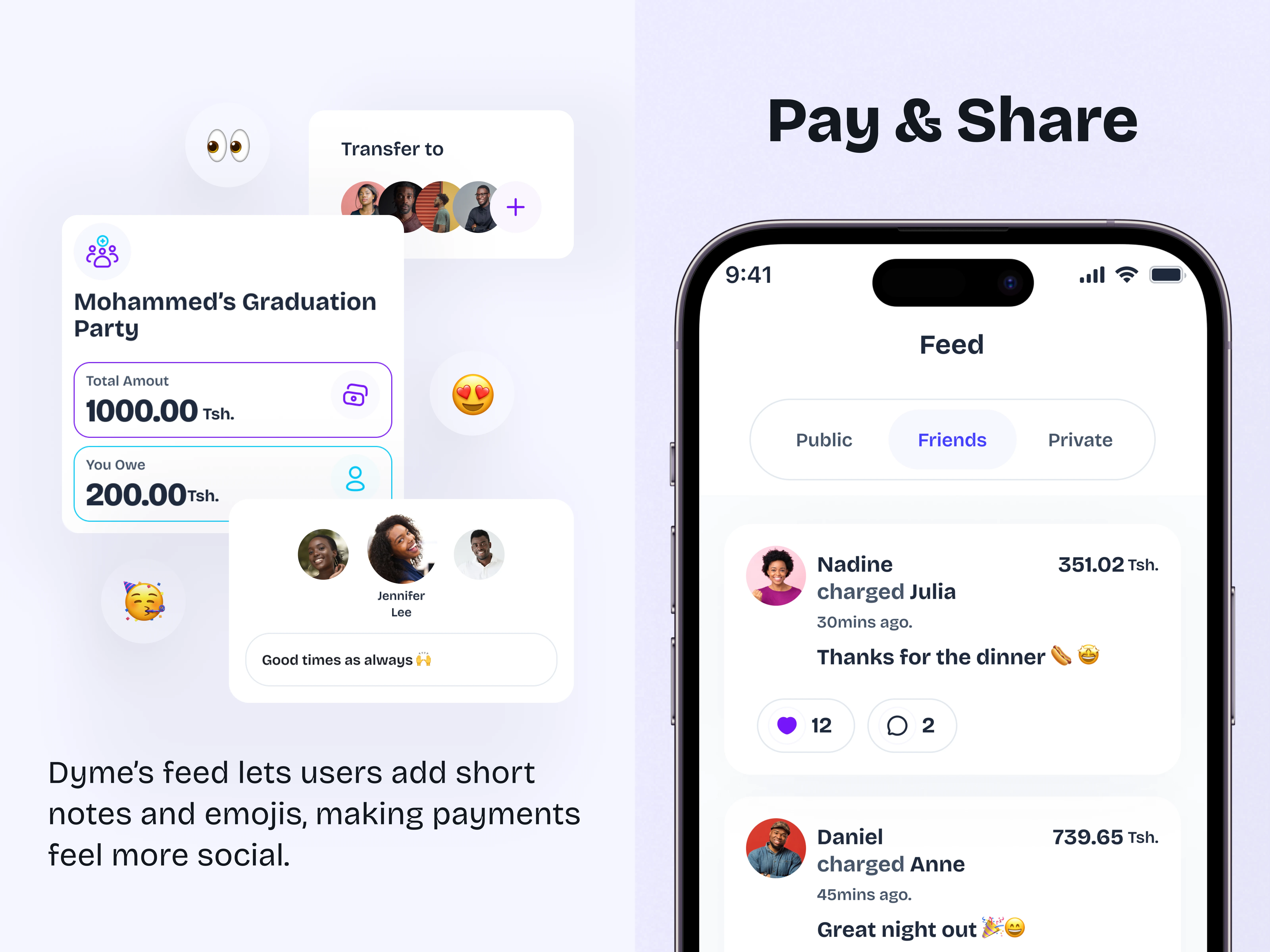
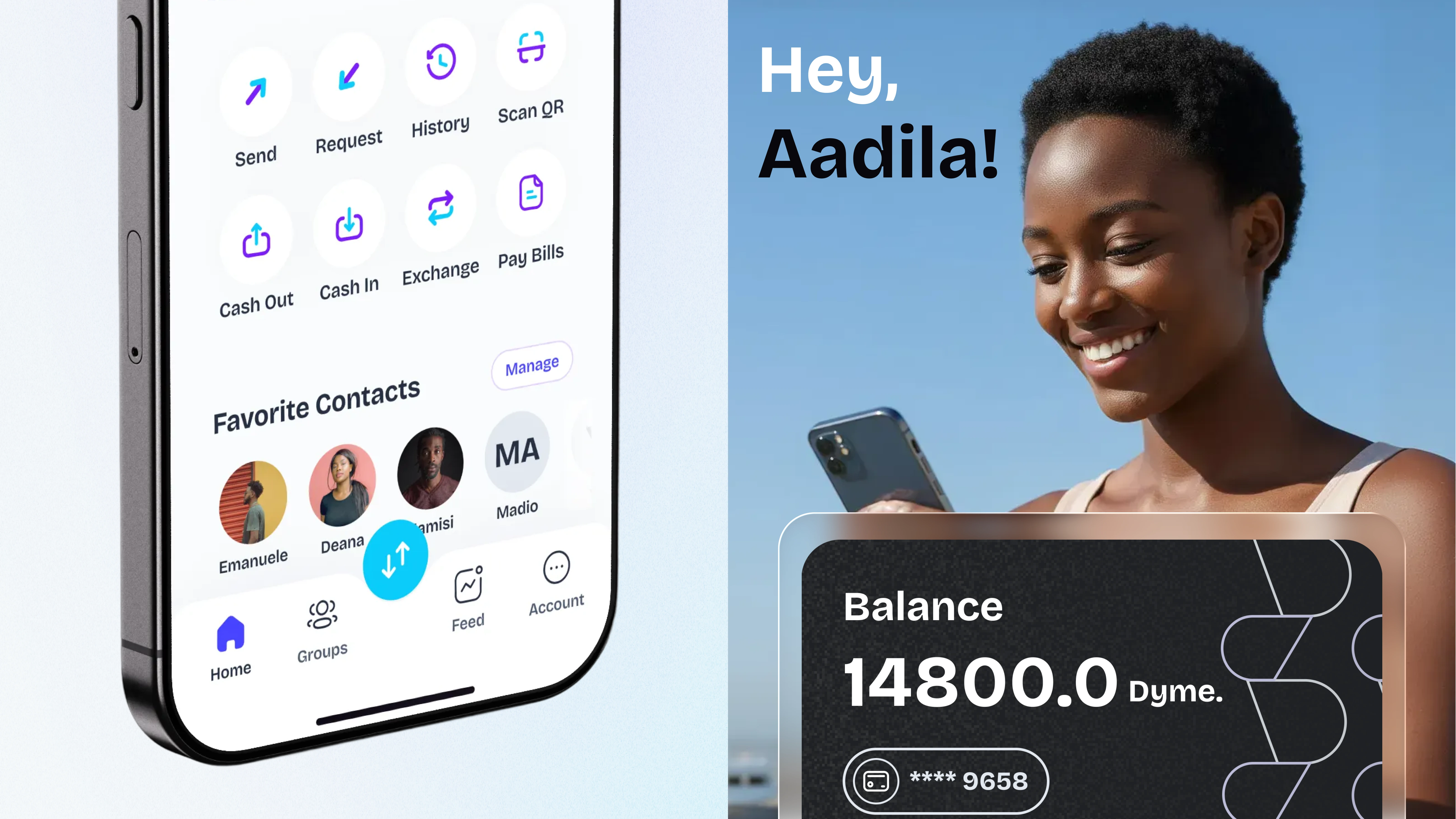
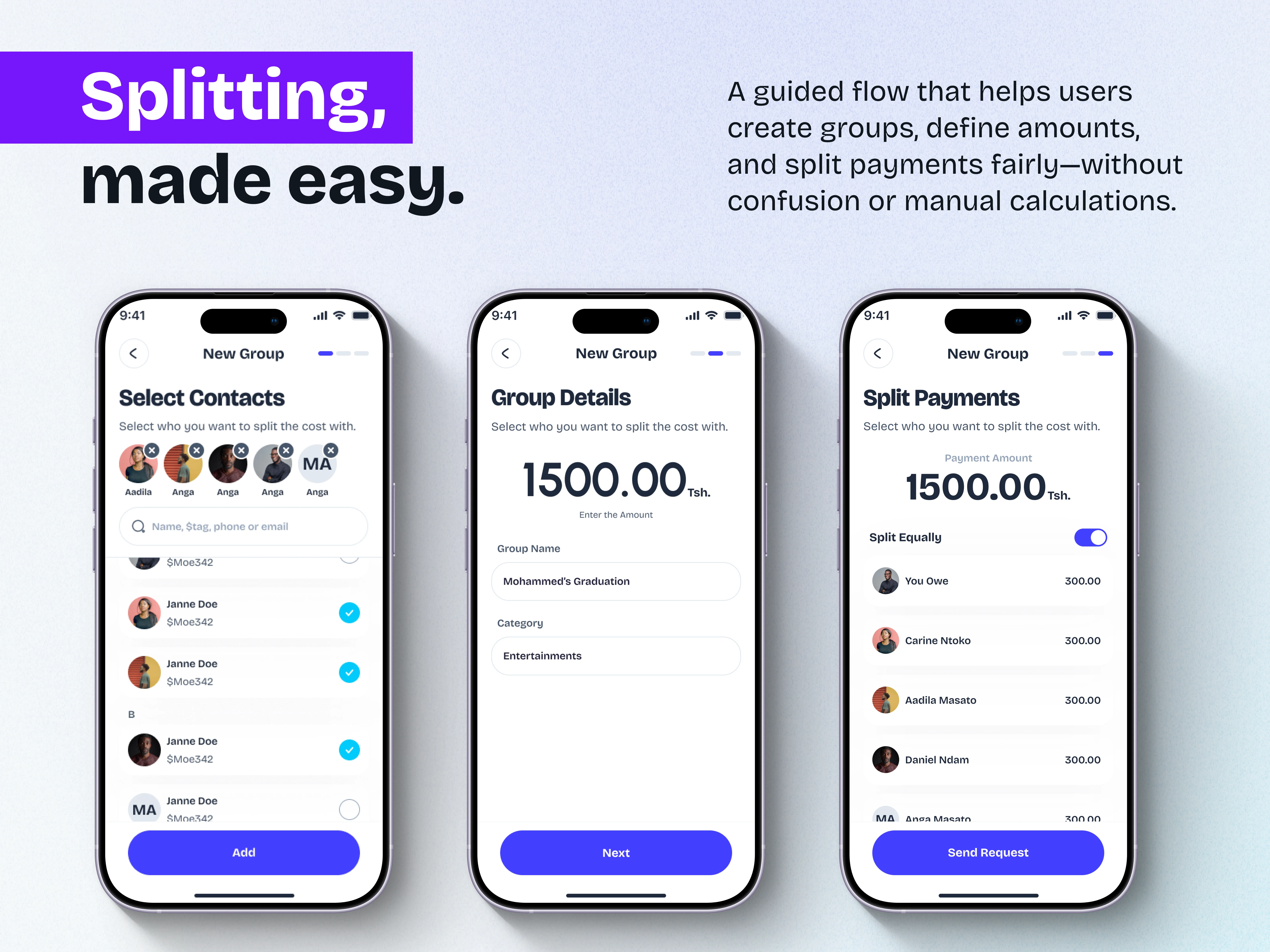
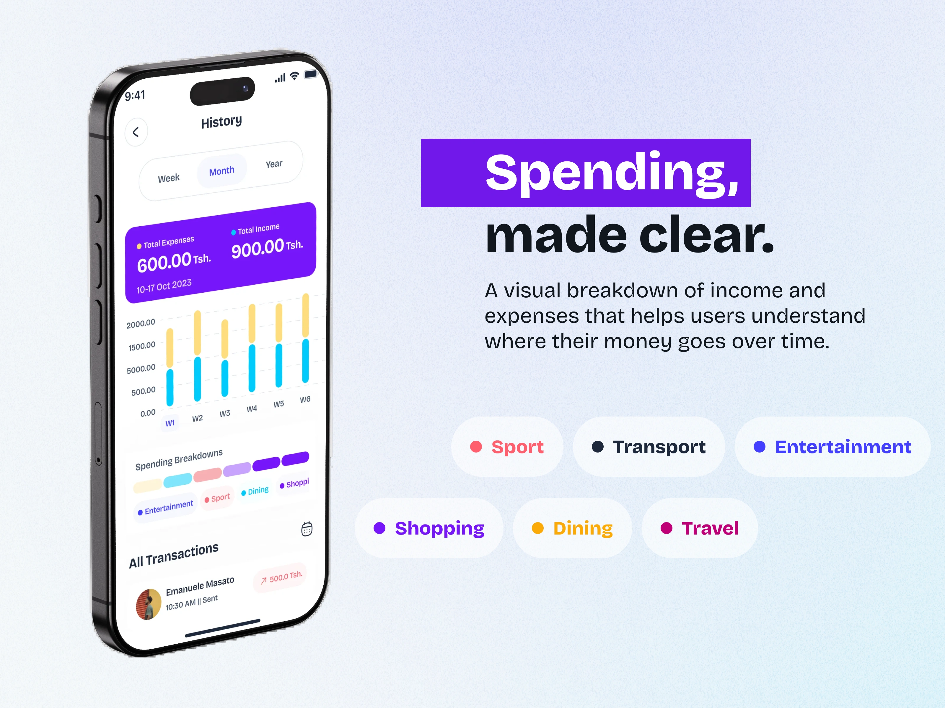
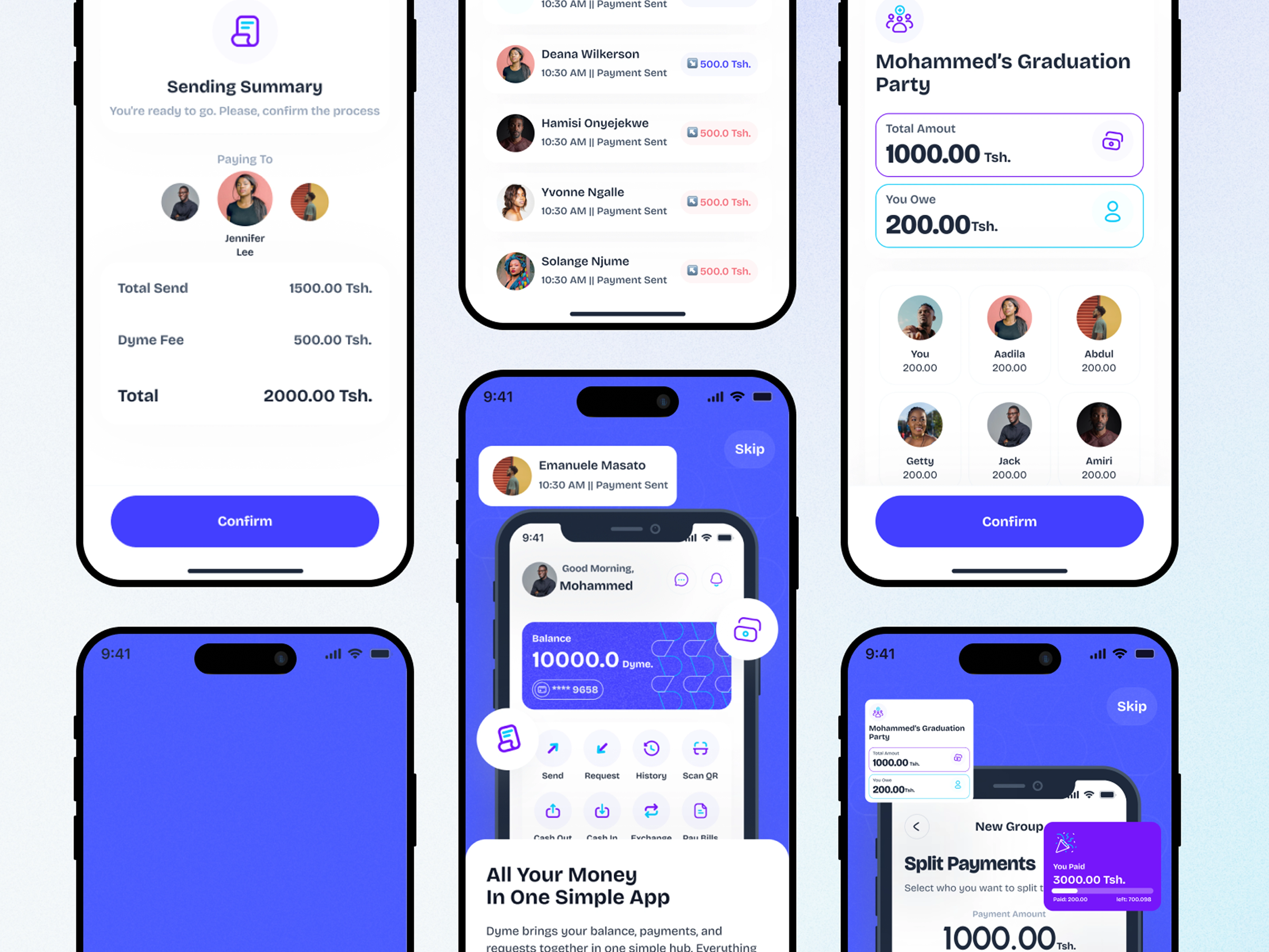
Dyme Mobile App UI Snapshot.
Role & Responsibilities
Led the end-to-end design process for Dyme, from research and strategy through UI design to developer handoff, creating an accessible, scalable digital payment experience.
UX Research & Strategy: Analyzed client materials, validated assumptions, and conducted user interviews surveys to define project direction.
UX Design: Built UCD canvas, affinity diagrams, user story maps, flows, and task analyses to align business goals with user needs.
UI Design: Created wireframes, high-fidelity screens, style guides, and a modular Figma component library for consistency and scalability.
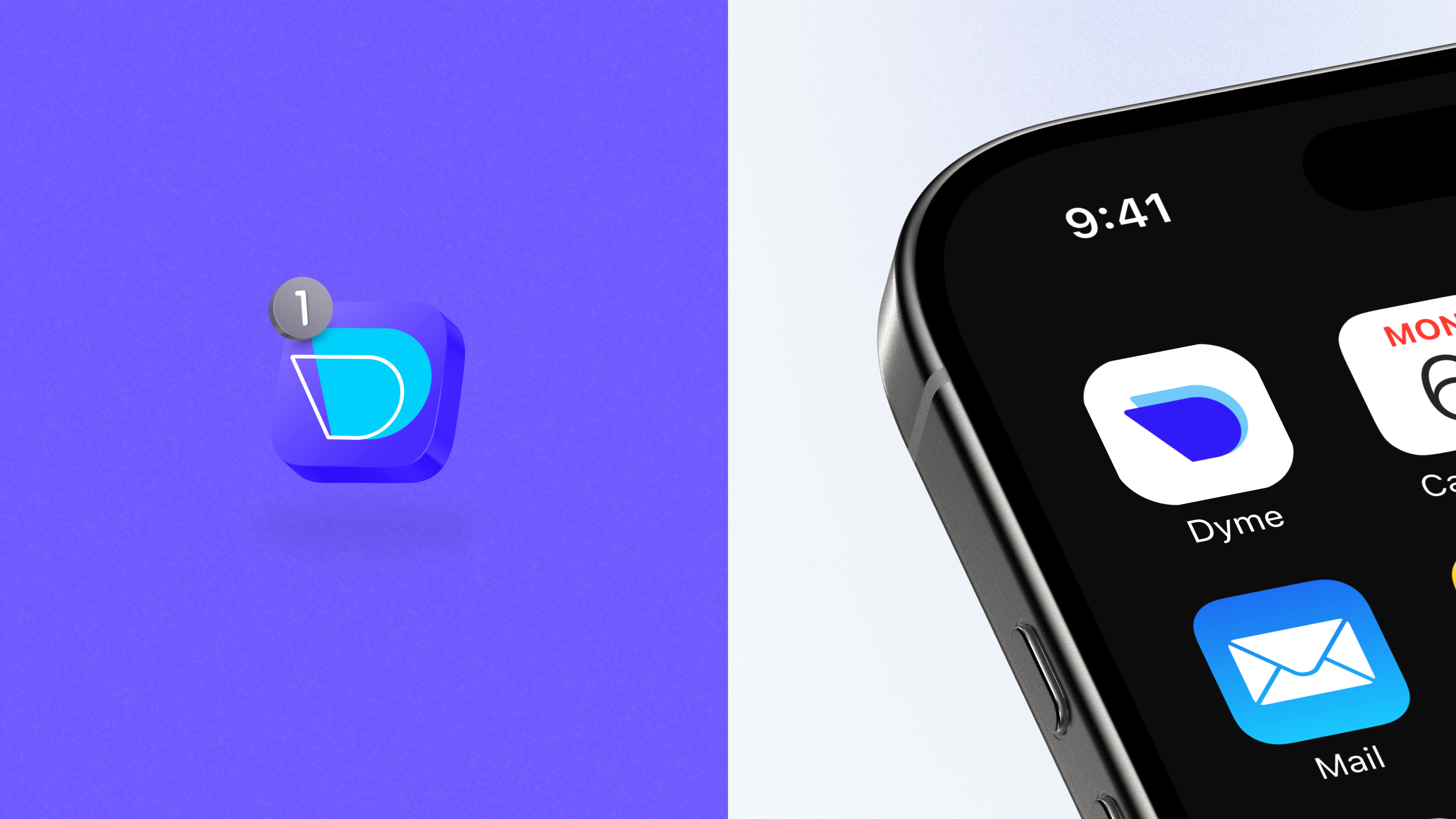
Brand Design: Designed Dyme’s logo and visual identity
The Challenge
Despite the widespread adoption of mobile money, users continue to face structural and usability barriers that limit trust and accessibility.
Key pain points included:
High transaction fees
Network reliability limitations
Fraud and trust concerns
Complex wallet interactions
Low financial literacy
Fragmented provider ecosystems
These constraints often push users back toward cash-based behaviors.
The Goal
Design a simple, low-cost, and trustworthy payment experience that removes these frictions while keeping the process familiar and intuitive for everyday Tanzanian users.
Design Process
A user-centered design process guided the product from research through delivery — translating behavioral insights into intuitive financial interactions supported by a scalable design system.
Design Process and Activities
1. Discovery
Understanding the product vision, market landscape, and financial behaviors shaping mobile payments — supported by stakeholder alignment and early assumption mapping around trust, costs, and accessibility.
A snapshot of Discovery Stage Activities
2. Define
Synthesizing research into clear problem framing and product direction grounded in user needs, payment behaviors, and trust barriers.
Key Insights:
High transaction fees reduce usage
Splitting and requesting payments is still frictional
Cross-border transfers are complex
Users value speed, clarity, and trust
A snapshot of Define Stage Activites
User Persona
The Problem Statement
Users rely heavily on mobile money for daily transactions, yet high fees, unstable systems, limited transaction visibility, and missing features such as payment requests and expense splitting constrain the experience.
They need a more transparent, reliable, and modern way to manage their financial interactions.
3. Ideate
Exploring solution pathways through story mapping and experience flows—structuring financial interactions into simplified, user-centered journeys, supported by early wireframe foundations.
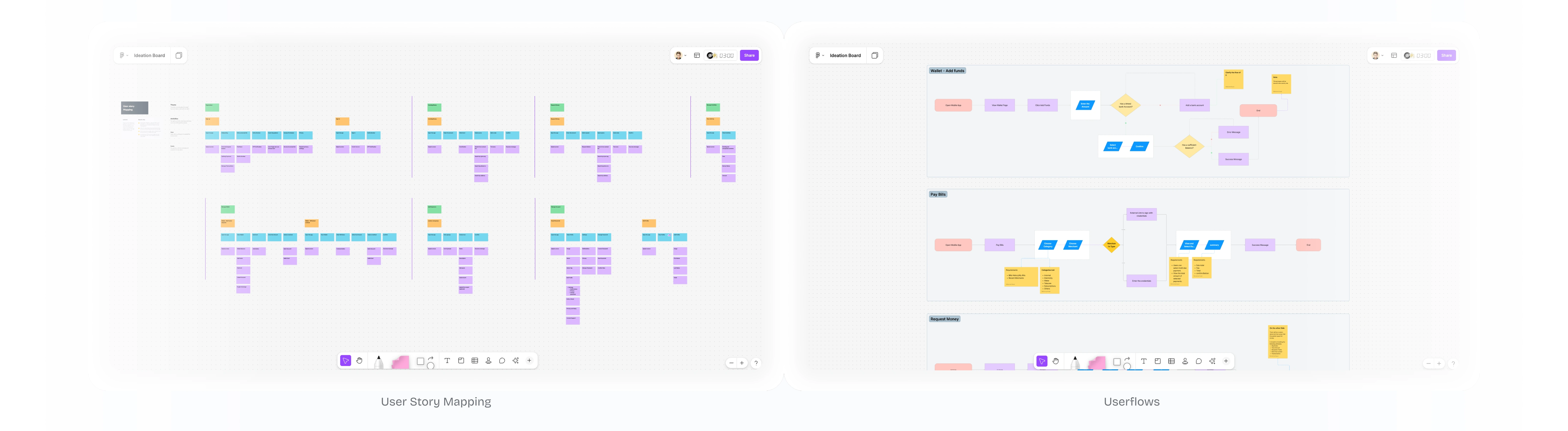
A snapshot of Ideation Stage Activities
A Snapshot of Wireframes
The Outcome
A cohesive fintech product experience designed to simplify payments, strengthen trust, and make everyday financial interactions faster, clearer, and more accessible.
Conclusion
Designing Dyme was an end-to-end journey—from shaping the brand identity to building a complete, user-centered mobile experience. Through research, strategy, and thoughtful design, the goal was to create a product that makes digital payments simple, social, and trustworthy.
This project reflects how a clear visual system, seamless interactions, and human-centered thinking can come together to turn complex fintech experiences into something approachable and engaging.
Like this project
Posted Feb 12, 2026
A mobile application that enables users to pay, get paid, shop, split, and share with peers in a friendly and intuitive experience, powered by stablecoin.