San Diego Pickle Logo Design
Ivan Ehouman
📋 STUDY CASE: SAN DIEGO PICKLE LOGO DESIGN (VERSION PROJET PERSONNEL)
🎾 San Diego Pickle - Logo Design Concept
Project Type: Personal Portfolio Project
Industry: Pickleball Coaching & Sports
Role: Designer
Timeline: 3 days
Deliverables: 4 logo concept variations
🎯 PROJECT OBJECTIVE
I created this logo design as a personal project to demonstrate my ability to craft brand identities for sports and lifestyle businesses. Inspired by the growing pickleball community in San Diego, I designed a logo system for a hypothetical coaching company offering tournaments, lessons, and clinics.
Design Goals:
Create an instantly recognizable pickleball brand
Balance athletic energy with professional credibility
Develop a versatile logo system that works across all applications
Showcase modern sports branding techniques
Demonstrate typography integration and icon design skills
💡 DESIGN APPROACH
I explored four distinct concepts, each balancing pickleball authenticity with modern simplicity:
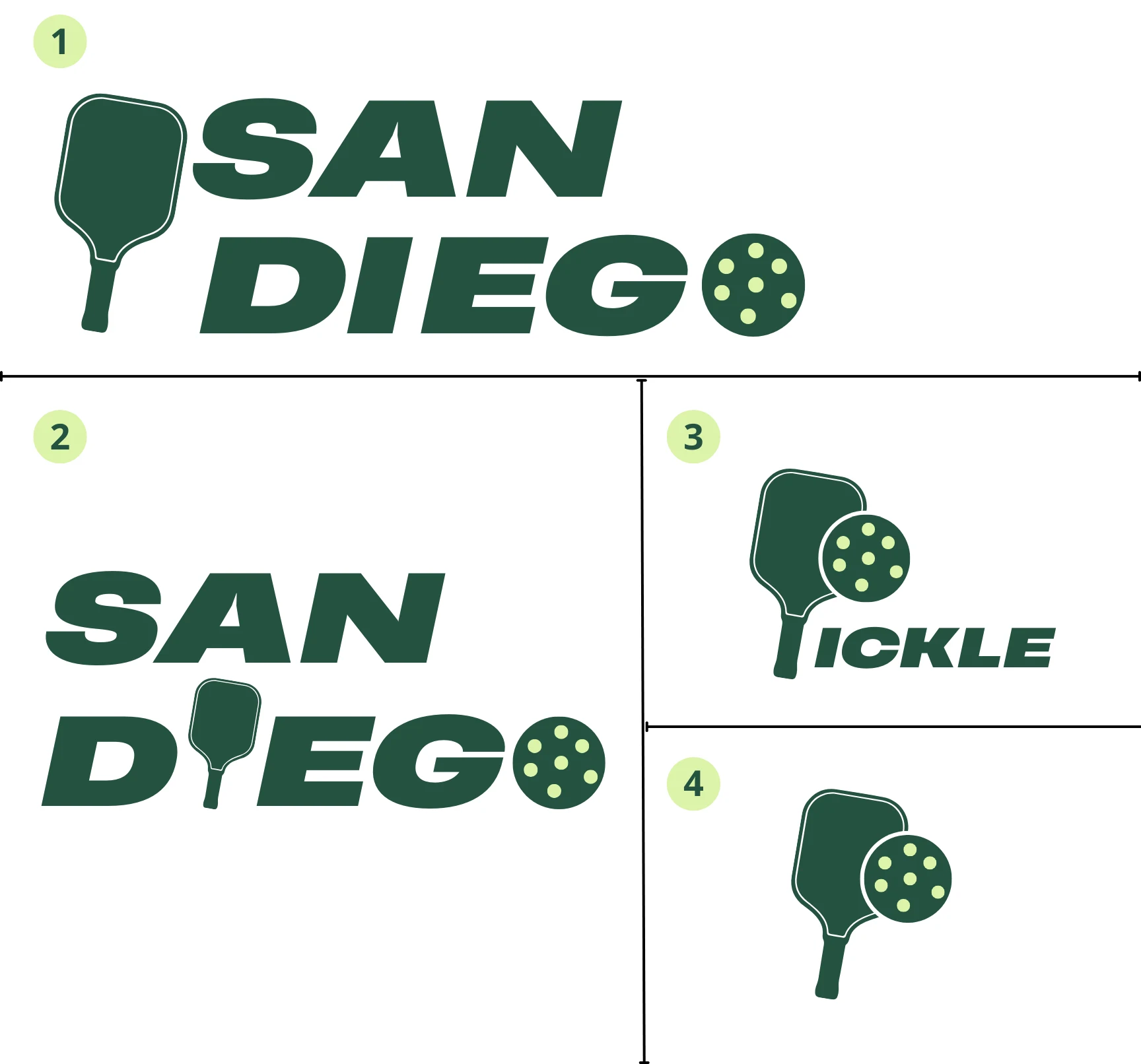
Concept 1: Paddle-First Wordmark
Integrated a pickleball paddle silhouette directly into the "SAN" text
Replaced the "O" in "DIEGO" with a pickleball showing signature holes
Bold, athletic typography with italic slant suggesting motion and energy
Color: Deep forest green (
#2F5233) - professional, sporty, timelessConcept 2: Paddle as Letter Replacement
Similar approach with paddle integrated into "DIEGO"
The "I" becomes a paddle handle for seamless integration
Pickleball positioned as the "O"
Maintains strong readability while adding playful visual interest
Concept 3: Icon + "ICKLE" Wordmark
Created a standalone icon: overlapping paddle and pickleball
Paired with "ICKLE" text (assuming "San Diego" appears elsewhere as a lockup)
Italic, dynamic typography suggesting movement
Most modular - icon works independently for social media, app icons
Concept 4: Minimal Icon-Only
Simplified paddle + ball combination
Clean, modern silhouette design
Perfect for favicon, app icon, or social media profile
Works as secondary mark alongside full wordmark
🎨 DESIGN DECISIONS
Color Choice: Deep forest green (
#2F5233) was selected for:Distinction - Stands out from typical bright sports branding (blues, reds, yellows)
Maturity - Professional enough for competitive tournaments
Versatility - Works beautifully on light and dark backgrounds
Timelessness - Won't look dated or trendy in 5-10 years
Typography:
Bold, geometric sans-serif with italic slant
Conveys energy, movement, and forward momentum
Highly legible at all sizes (tested from 16px to print)
Modern without being overly trendy
Icon Integration:
Paddle and ball are immediately recognizable pickleball symbols
Simplified shapes ensure perfect scalability
Authentic pickleball hole pattern (not generic circles)
Works as standalone mark or integrated into wordmark
✅ DESIGN FEATURES
Versatility:
Works in full color, black, white, and grayscale
Scales perfectly from 16px favicon to billboard size
Icon separates from wordmark for flexible applications
Multiple lockup options (horizontal, stacked, icon-only)
Authenticity:
Pickleball holes accurately depicted (proper pattern)
Paddle shape true to actual sport equipment
Avoids generic sports clichés and clip-art aesthetics
Memorability:
Unique integration of paddle into typography
Distinctive enough to stand out from competitors
Easy to describe and recall ("the one with the paddle as a letter")
📊 WHAT THIS PROJECT DEMONSTRATES
Logo Design Expertise:
Creating multiple strong concepts from single brief
Balancing creativity with functional requirements
Typography manipulation and custom letterforms
Icon simplification and refinement
Sports Branding Understanding:
Capturing energy and movement in static design
Appealing to active lifestyle demographics
Maintaining professionalism for competitive/tournament contexts
Technical Proficiency:
Vector design for infinite scalability
Multi-application thinking (web, print, apparel, signage)
Color theory and psychology
Visual hierarchy and composition
Strategic Thinking:
Understanding target audience (players, coaches, tournament organizers)
Creating modular brand system with flexibility
Considering real-world application scenarios
Balancing uniqueness with clarity
🛠️ DESIGN PROCESS
1. Research & Discovery
Analyzed existing pickleball brands and sports logos
Studied San Diego's visual identity and coastal aesthetic
Identified gaps in current pickleball branding (mostly generic, clip-art style)
2. Ideation & Sketching
Explored 15+ rough concepts on paper
Tested different paddle/ball integration approaches
Experimented with wordmark vs. icon-based solutions
3. Digital Refinement
Developed 4 strongest directions in Adobe Illustrator
Tested scalability at multiple sizes (16px to 2000px)
Refined proportions, spacing, and color application
4. Presentation & Documentation
Created visual presentation showing all concepts
Tested on mockups (business cards, website, apparel)
Prepared usage guidelines and technical specifications
💼 SKILLS SHOWCASED
✅ Logo design and brand identity development
✅ Typography and custom letterform creation
✅ Icon design and geometric simplification
✅ Sports and lifestyle branding
✅ Scalable vector design (Adobe Illustrator)
✅ Color theory and application
✅ Multi-format deliverable preparation
✅ Brand system thinking (primary, secondary, icon-only marks)
🎯 WHY THIS DESIGN WORKS
Each concept balances authenticity (real pickleball elements) with simplicity (clean, modern execution). The paddle-integrated wordmark creates a unique, ownable brand asset that's both functional and memorable.
The deep green color differentiates from typical sports branding (which skews bright blue/red/yellow) while maintaining energy and approachability. The italic typography adds dynamism without sacrificing readability.
The modular nature (icon can separate from text) provides flexibility for real-world applications: website favicons, social media profiles, apparel embroidery, tournament signage, and promotional materials.
📂 DELIVERABLES CREATED
Visual Assets:
4 distinct logo concepts (full exploration)
Full-color primary versions
Black and white variations
Icon-only marks
Horizontal and stacked lockups
Technical Files:
Vector source files (AI format)
Scalable SVG exports
PNG files (transparent, multiple sizes: 512px, 1024px, 2000px)
JPG files (white background)
Documentation:
Color specifications (HEX:
#2F5233)Typography guidelines
Minimum size recommendations
Clear space requirements
Usage examples and mockups
🌟 PROJECT TAKEAWAYS
This personal project allowed me to:
Explore creative freedom without client constraints
Refine my process for rapid logo concepting and iteration
Build portfolio depth in sports and lifestyle branding
Demonstrate versatility across different logo styles and applications
Practice presentation skills for explaining design rationale
The result is a comprehensive logo system that could be immediately implemented by a real pickleball business—showcasing my ability to deliver client-ready work even in portfolio projects.
Tools: Canva
Category: Logo Design, Brand Identity, Sports Branding
Year: 2025
Type: Personal Portfolio Project
Like this project
Posted Nov 4, 2025
Designed 4 logo concepts for a pickleball coaching brand as a personal project.
Likes
1
Views
4
Timeline
Oct 14, 2025 - Oct 17, 2025