Reimagining the Solidaris Careers Portal

Bert Selleslagh


Reimagining the Solidaris Careers Portal
In the battle for top talent, your jobs page isn't just a listing – it's your company's first impression on tomorrow's innovators.
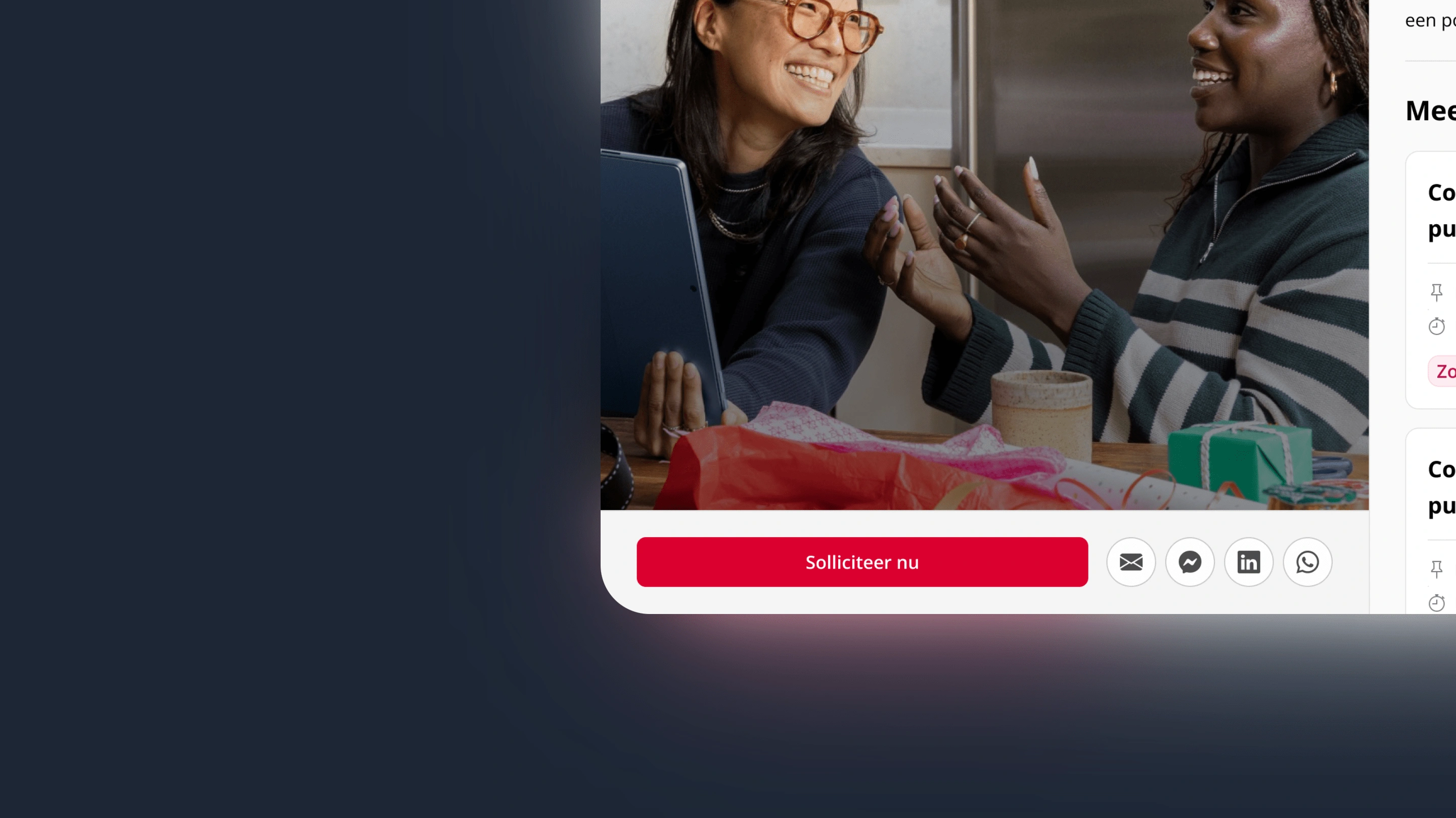
When Solidaris tasked me with reimagining their careers portal, the diagnosis was clear: functional but forgettable. After diving into desk research of successful job platforms, I was particularly struck by Spotify's approach – how they transformed mundane job listings into compelling invitations to join their mission. This insight became the north star for our redesign: we emphasized warm photography and inviting copy. The image masks are Plectrums, a staple in the Solidaris brandbook.
The image masks are Plectrums, a staple in the Solidaris brandbook.
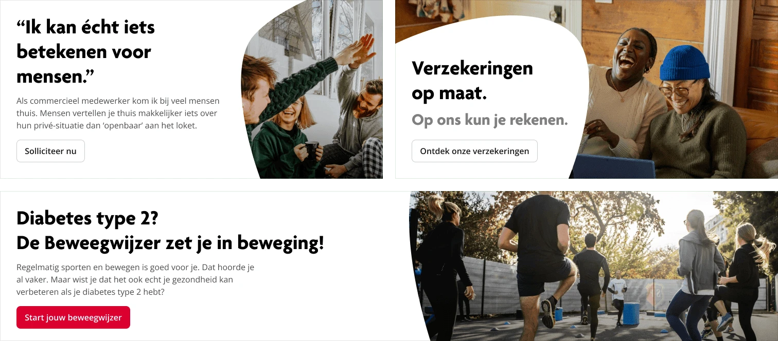
With this direction, I moved from wireframes to full UI designs for both mobile and desktop experiences. The transformation focused on three key elements: warmth, diversity, and accessibility. We replaced the modest listings with an engaging way to show content that showcased real Solidaris employees and their stories. The redesigned interface organized positions into intuitive categories with clear pathways to application, reducing friction in the user journey. Color psychology and typography choices were deliberately selected to evoke the caring yet professional nature of healthcare work while establishing Solidaris as a forward-thinking employer.
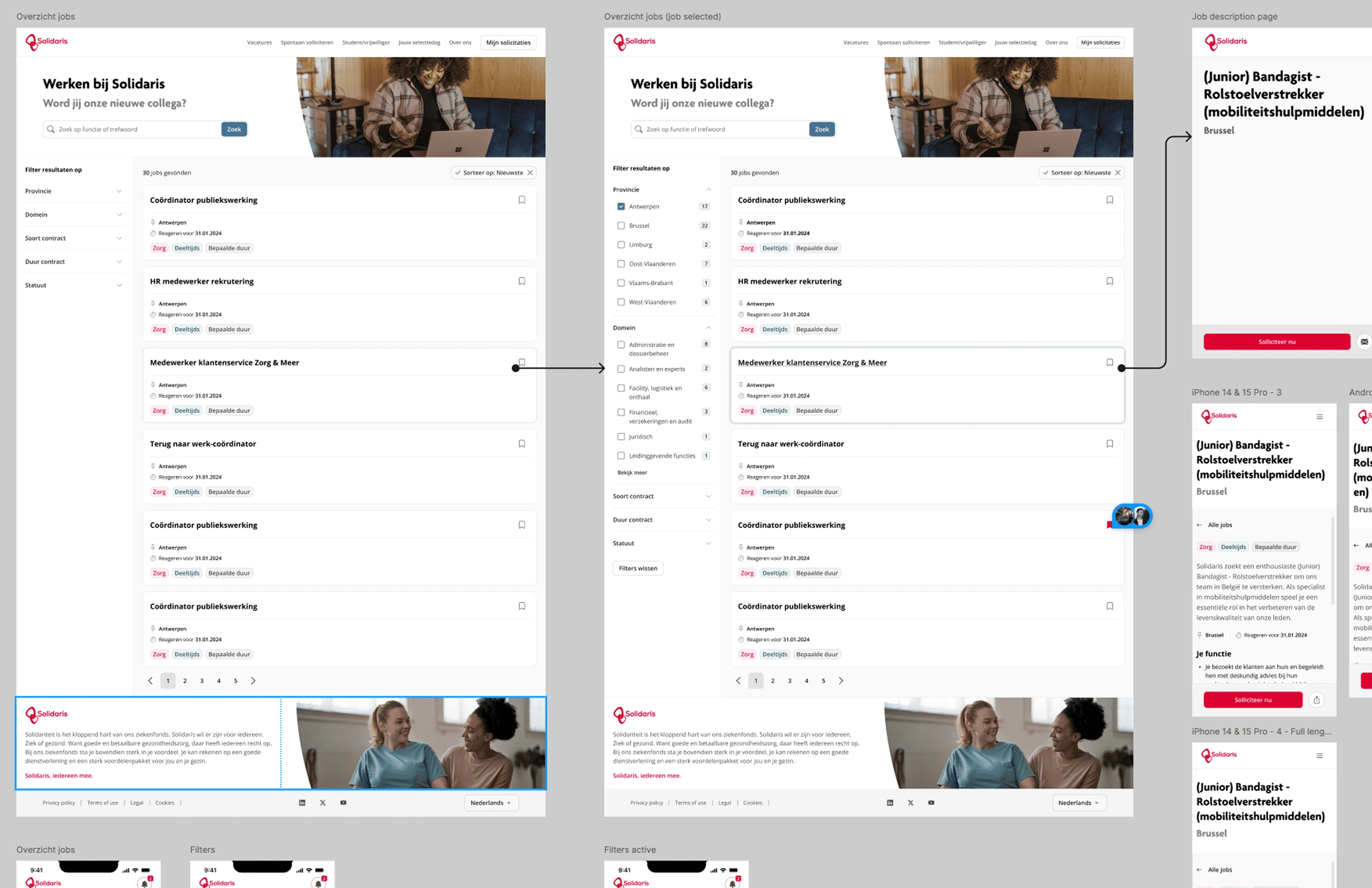
Setting up the UI designs in Figma required us to explore different screen sizes, and do lots of desk research.
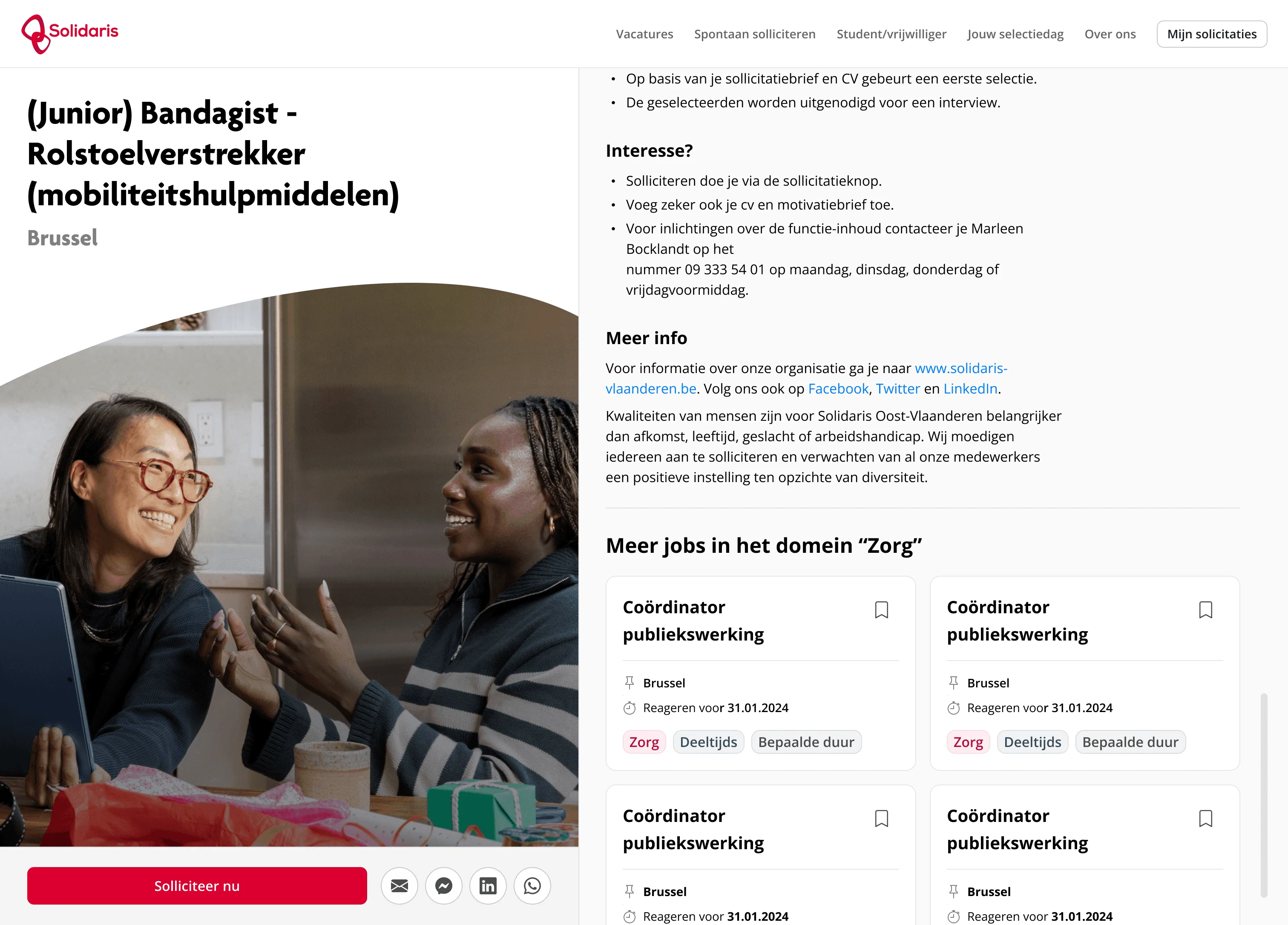
The job detail screen is warm, inclusive and Solidaris-branded.
The before-and-after contrast speaks volumes – what was once a modest, functional listing has become an engaging portal. By prioritizing the human element in both content and design, we've created an experience that doesn't just list jobs but invites meaningful careers. The redesign positions Solidaris not just as a place to work, but as a diverse community where careers can flourish.
Like this project
Posted Mar 11, 2025
In the battle for top talent, your jobs page isn't just a listing – it's your company's first impression on tomorrow's innovators.
Likes
0
Views
0
Timeline
Aug 11, 2024 - Sep 11, 2025
Clients
Solidaris


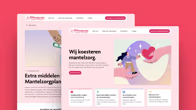
Caring by Design: How We Transformed Coponcho's Digital Presence
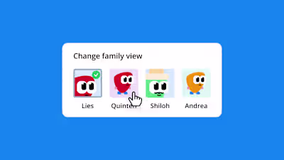
Meet Pim The Plectrum: Bringing Personality to Healthcare Tech