Creation of a holistic patient-centric healthcare platform
Aurélie Radom
Create a patient-centric healthcare system that radically improves life for every one of us.
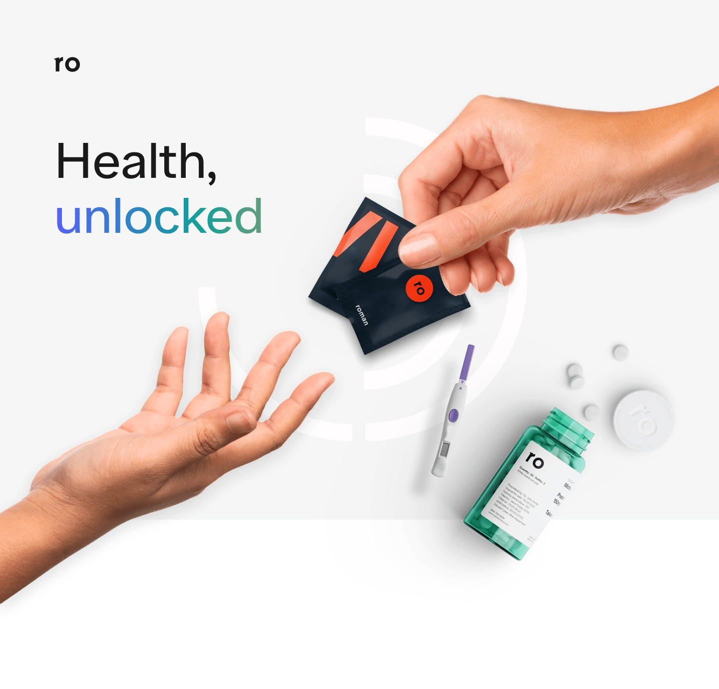
The United States spends nearly $4 trillion on healthcare, making it the most expensive system in the world. Still, it remains inefficient, with a highly frustrating patient experience, a lack of interoperability between multiple technology platforms, and a significant challenge in developing seamless experiences accelerated during the COVID-19 pandemic, according to the West Health-Gallup 2021 Healthcare in America Report. Furthermore, patients want to control their health but face various obstacles. Either they can’t easily access it, or they don’t want to be seen going to a specialist in sexual health, skincare or smoking addictions — and even talking to a doctor about their needs — can be anxiety-inducing. To deliver an affordable patient-first experience, Ro, a direct-to-patient healthcare company behind Roman, Rory, and Modern Fertility, wanted to reimagine a new unified responsive web platform under ro.co, the world’s first vertically integrated primary care health hub—providing high-quality healthcare without the need for insurance. It is the only company to seamlessly connect telehealth and in-home care, diagnostics, labs, and pharmacy services nationwide.
Our mission is to help patients feel cared for and earn their trust by anticipating their needs, proactively addressing their concerns, demonstrating expertise, and conveying the true patient-centric of Ro – differentiating it from a typical U.S. healthcare-org or transactional D2C provider.
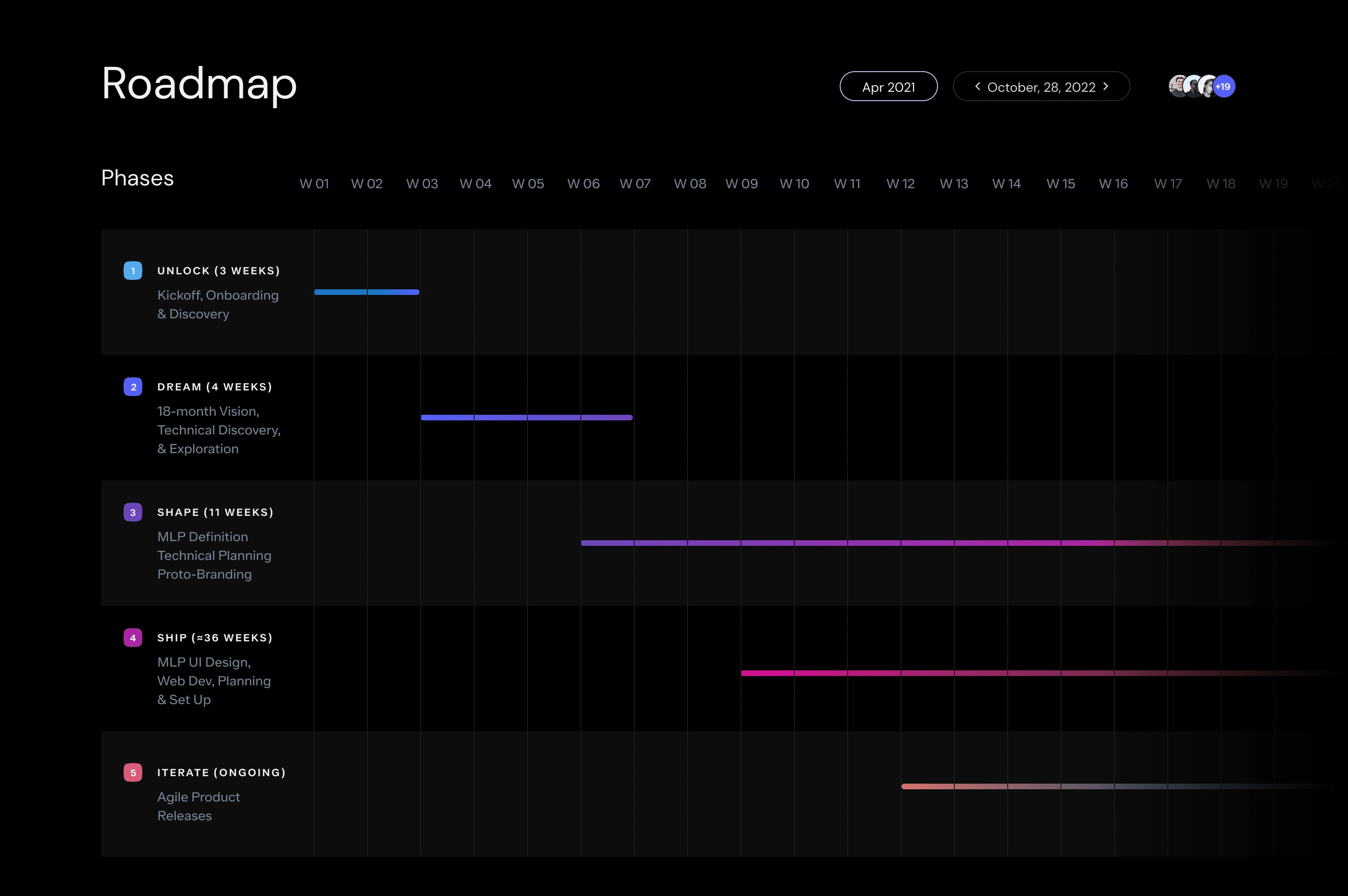
18-months project roadmap
Target Audience
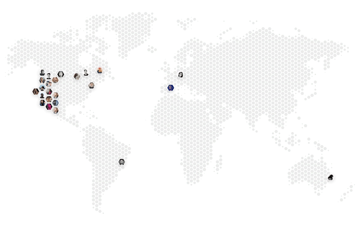
The Ro audience is large and varied, and while it trends older and more white, it includes every type of person that you could encounter in the US — young and old, high-income and low-income, urban and rural.
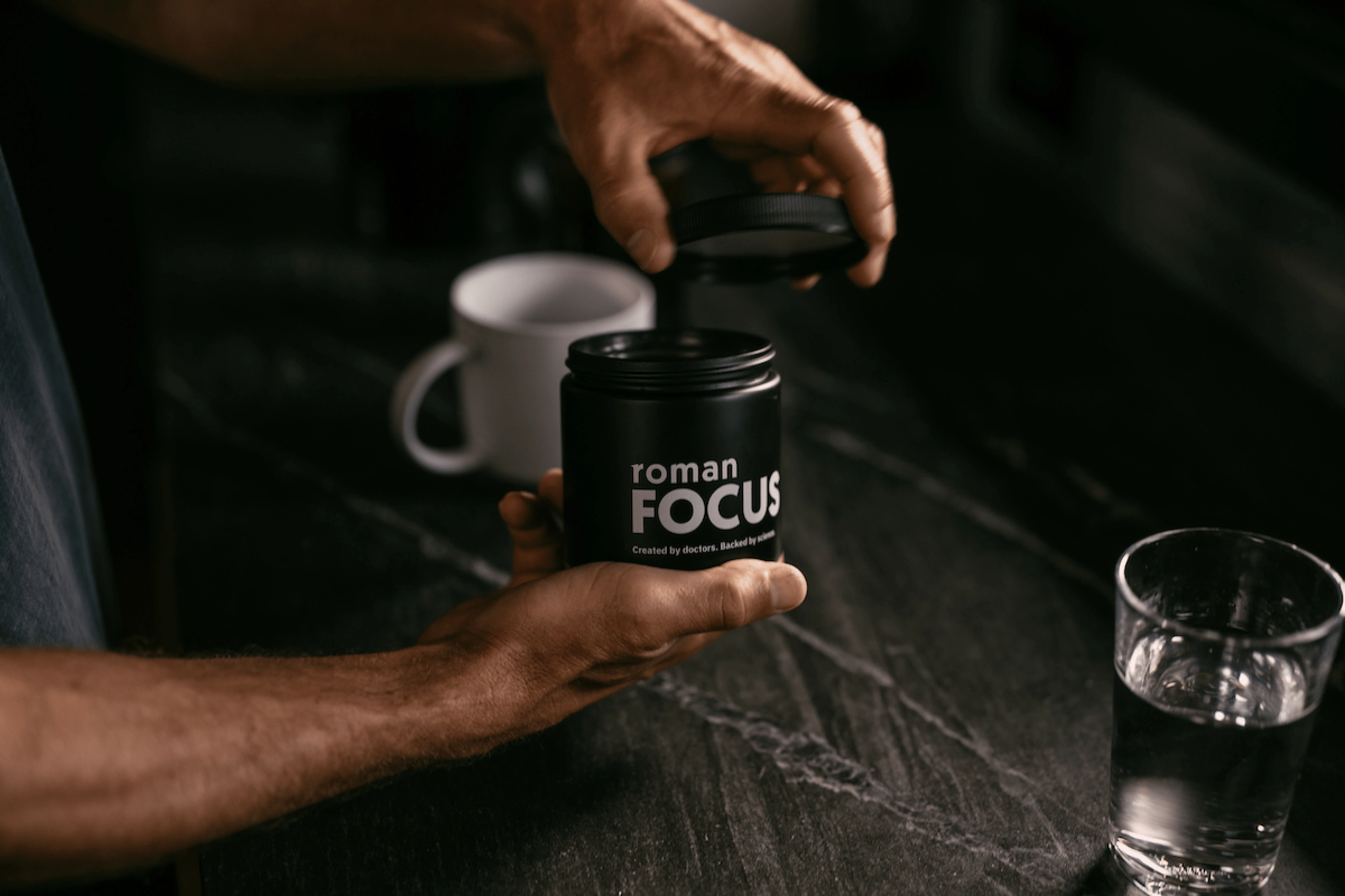
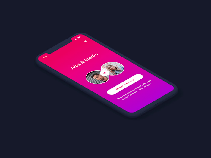
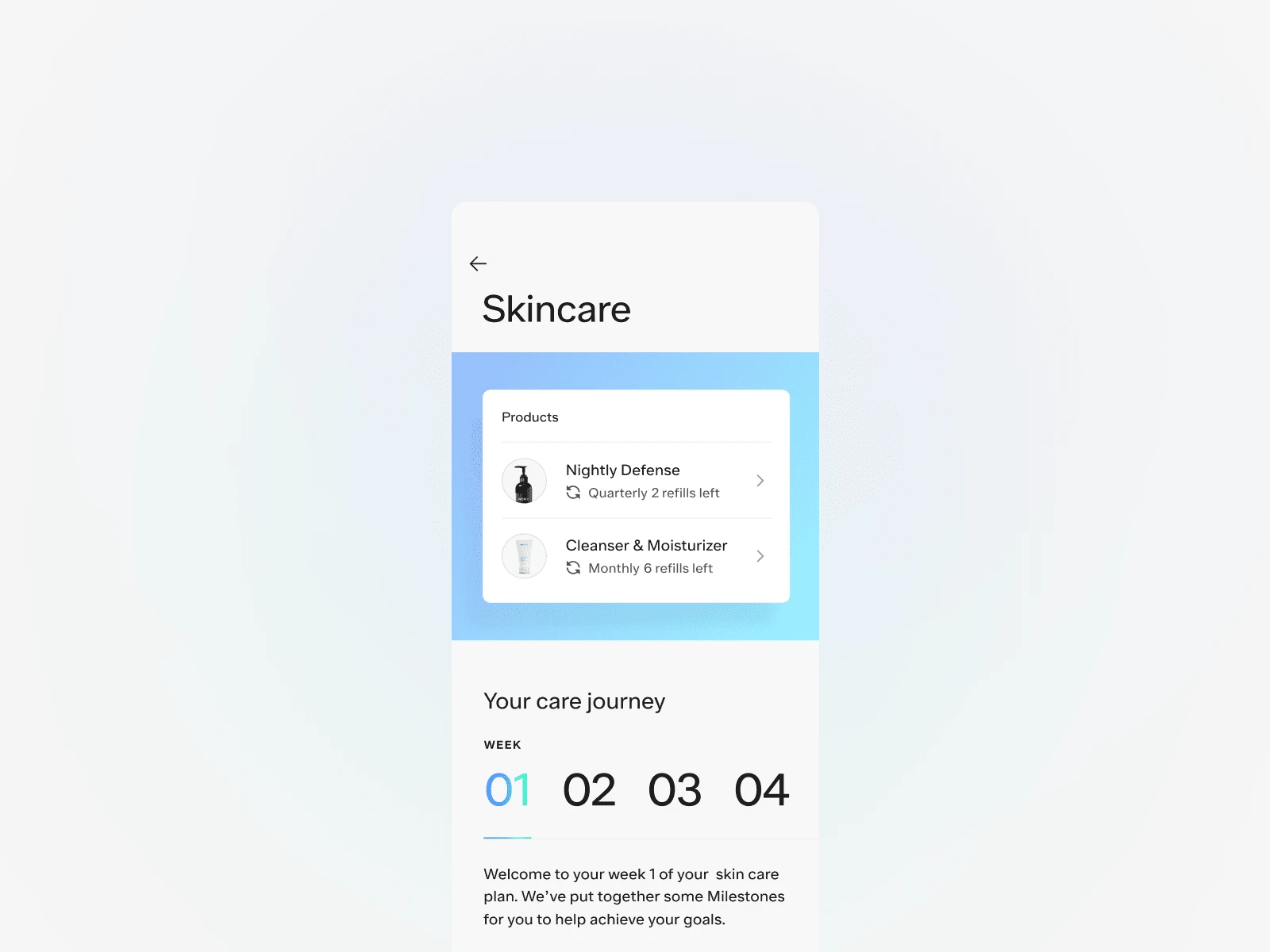
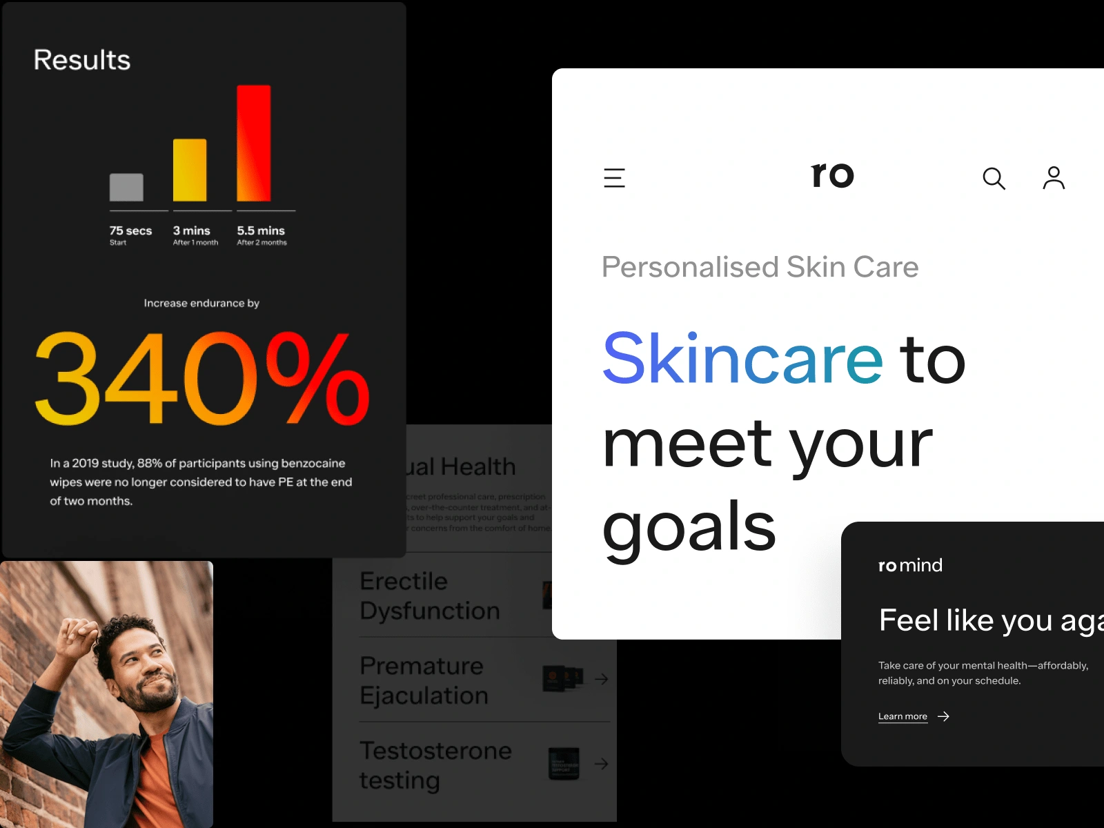
Roman Focus pills © - Ro CX product
The majority of our patients do not look and live like most of our members are over 30, and 70% are over 40. They do not over-index on the coasts, but are evenly spread throughout the country.
When it comes to their health, they can be thought of in terms of whether or not they've encountered a triggering event, such as a health scare, chronic condition, death of a family member or friend, or having kids, and how that has affected their mindset.
User Archetype
Our patients fall into 2 user archetypes. Health to Gain and Health to Regain are interested in the same thing: improving their health. We find both user archetypes in every condition we treat because they are based on mindset—where they are starting from, how they feel about it, and what motivates them to seek treatment.Numerological Analogy
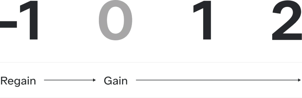
Health to Regain started from a negative place and trying to get back to a level hey can feel confident in — essentially going from -1 to 0.
Health to Gain is already at a level they feel good with and are striving to get even better — essentially going from 0 to 1 or 1 to 2.
A jobs-to-be-done approach
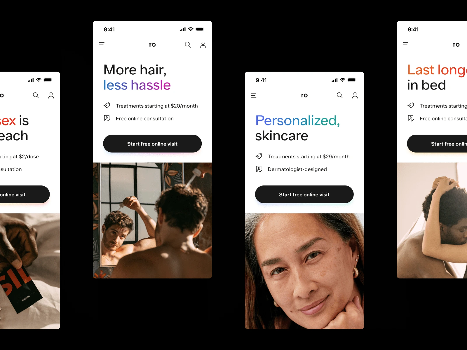
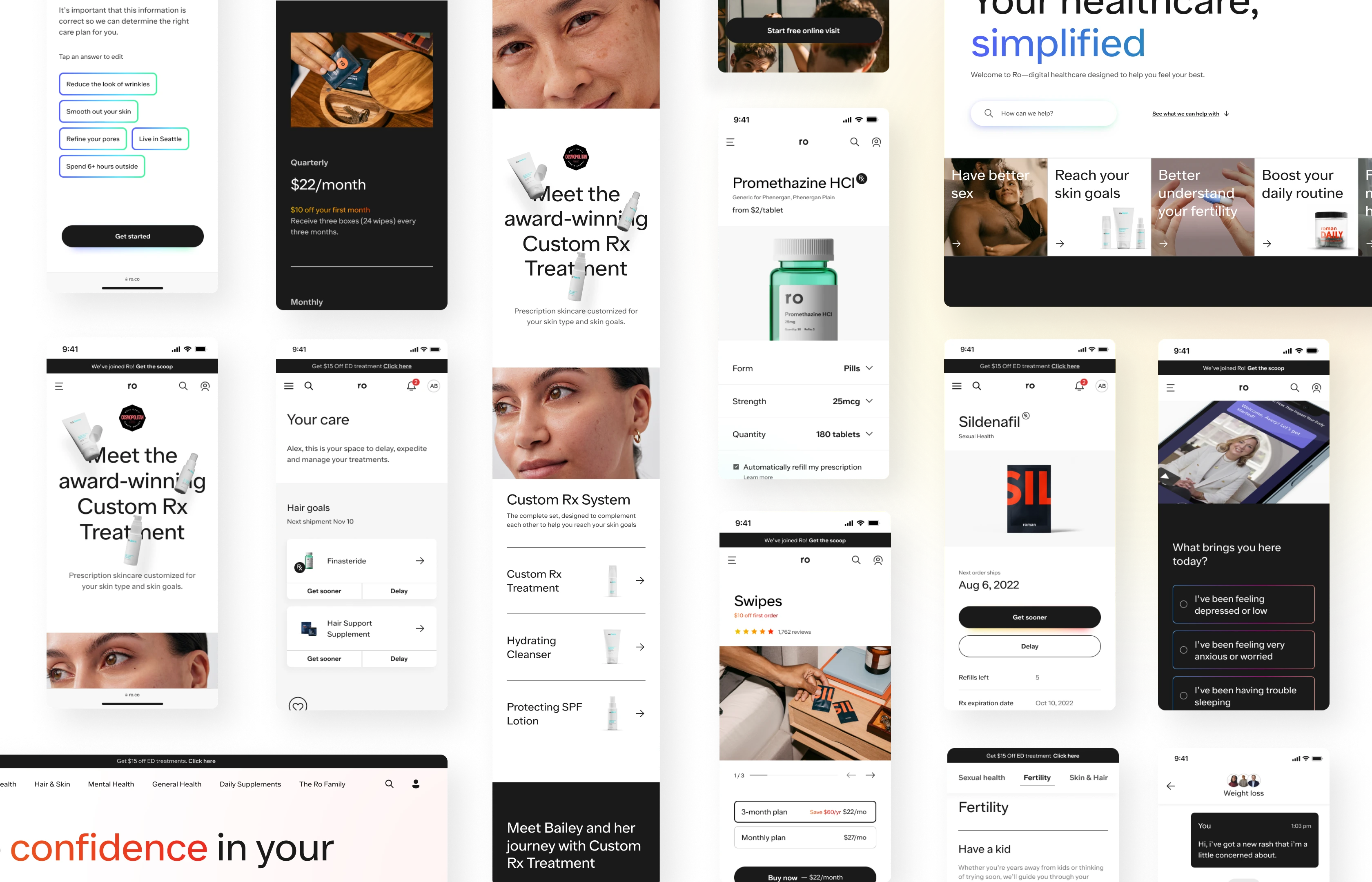
Many VIMPROs and telemedicine companies focus on their services (what the consumer needs), but Ro learned quickly that patients aren't always sure what they need but know what they want. That's why we defined a jobs-to-be-done approach focused on what the user wants. Rather than advertising its telehealth services, Ro promotes the product and the 'want.' Once users are in the door, Ro delivers the patient's needed service. Example: 'I know I want to have clear skin. I don't know if I need a telemedicine service or a dermatologist.' The patient can choose a product he ideally wants. If the selected product is OTC (over-the-counter), he can buy it immediately. However, suppose the product requires an RX. In that case, the patient must go through an online visit and complete a medical questionnaire to identify his needs and the ideal treatment for his condition. Tools such as guided search and conversational quizzes mimic real-life provider interactions— helping patients discover new ways Ro can help them achieve their goals.
Information Architecture
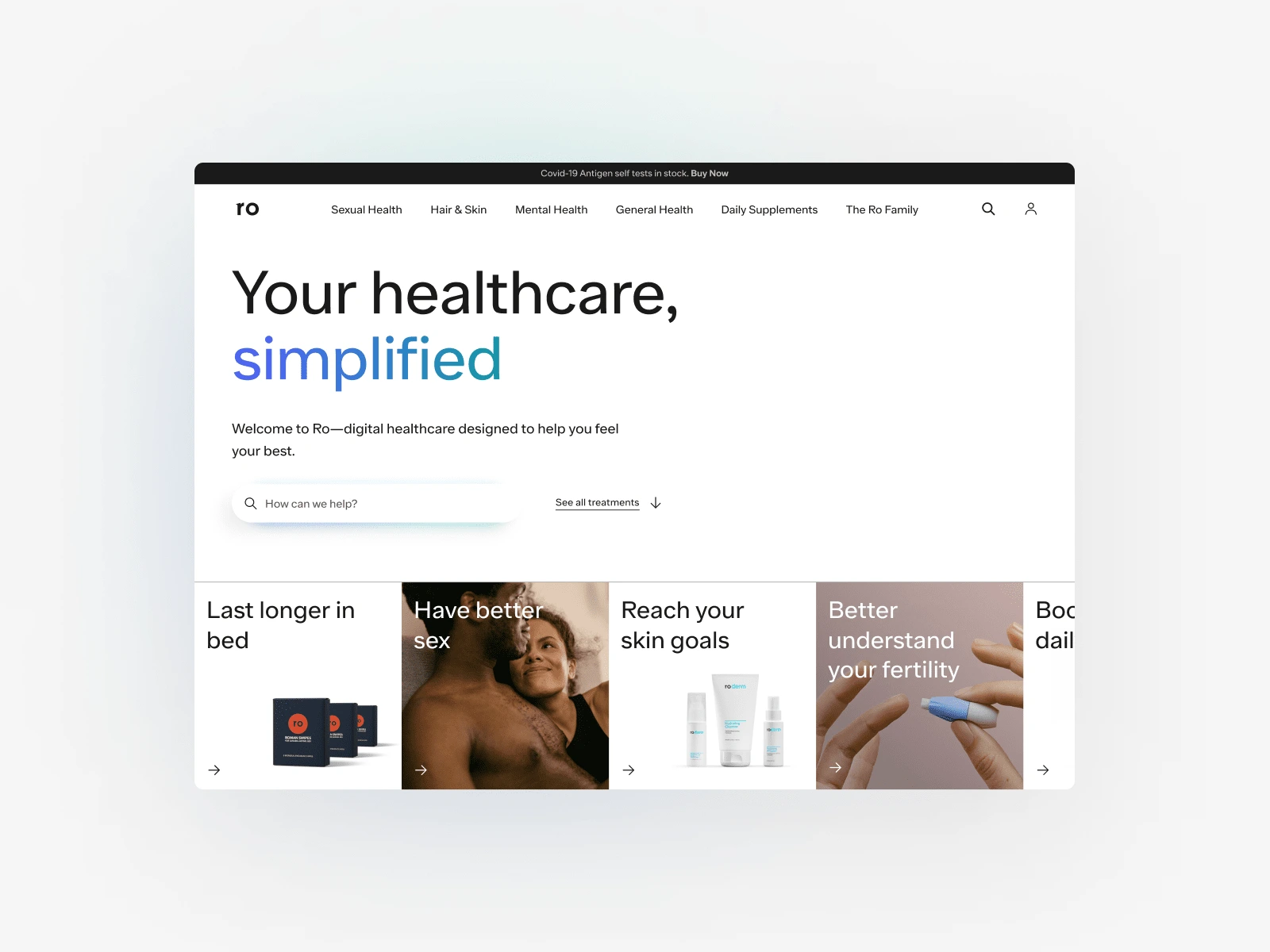
The previous experience only delivered solutions on table stakes, not what patients want and need. Our objective was to learn if all conditions under a global IA would increase awareness (total page views) of Ro’s offerings beyond one brand segmented by Men + Women conditions, products and treatments. So we unified Ro’s offering under a single front door – ro.co to increase x-poll and awareness of how Ro can holistically serve patients’ needs, reduce friction to discoverability, and elevate its positioning as a patient’s true partner in their healthcare journey.
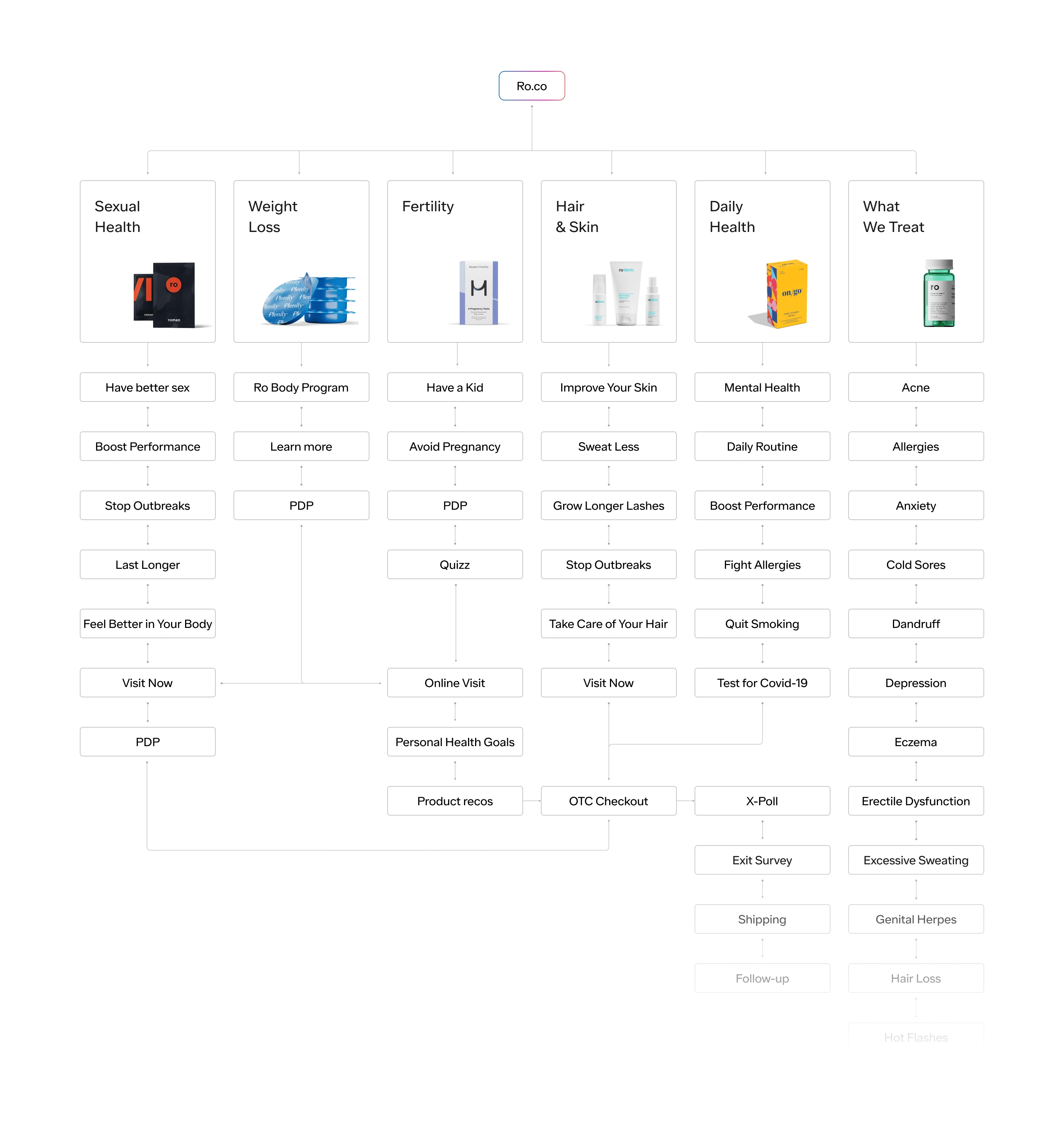
Ro.co information architecture - MetaLab x Ro ©
Design for essential. Then, determine what needs energy.
Radically improving health starts by helping patients with what they want so we can be there for what they need. People want to make informed choices to make progress, so we combined simple, usable design with vibrance and energy to create the brand expression. It comprises monochromatic elements, with gradients used as a guide and a structured layout with moments of surprise and movement. We use colour and layout to create a kinetic, exciting visual brand and guide patients through their user journey. The 90/10 rule guides our designs. 90% of the design should be within the Slate and White palette, emphasizing the essential and functional. The remaining 10% of the design should be imbued with energy. We apply colour and energy with restraint to bring patients along their journey with joy.
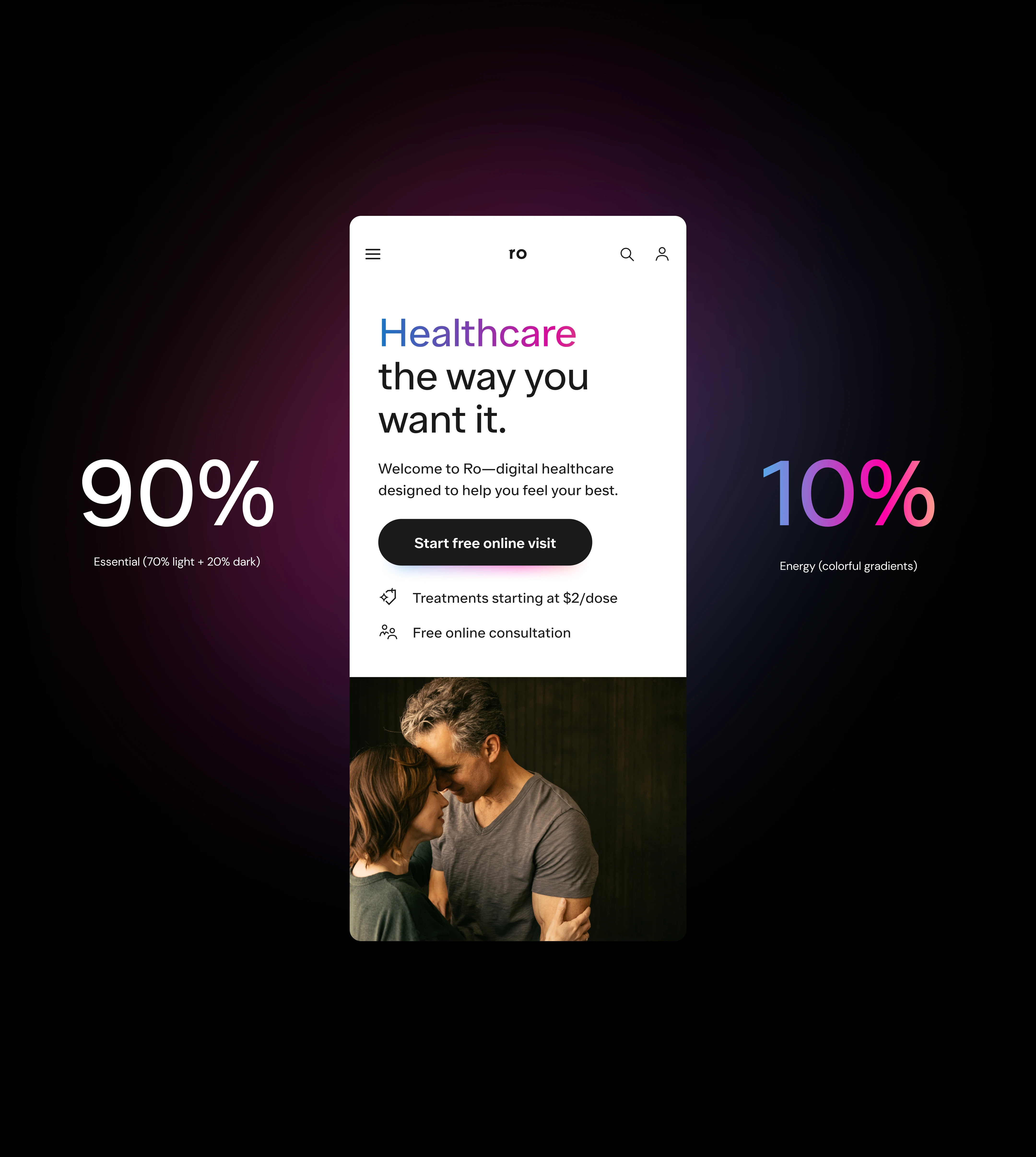
Ro's branding concept - MetaLab x Ro ©
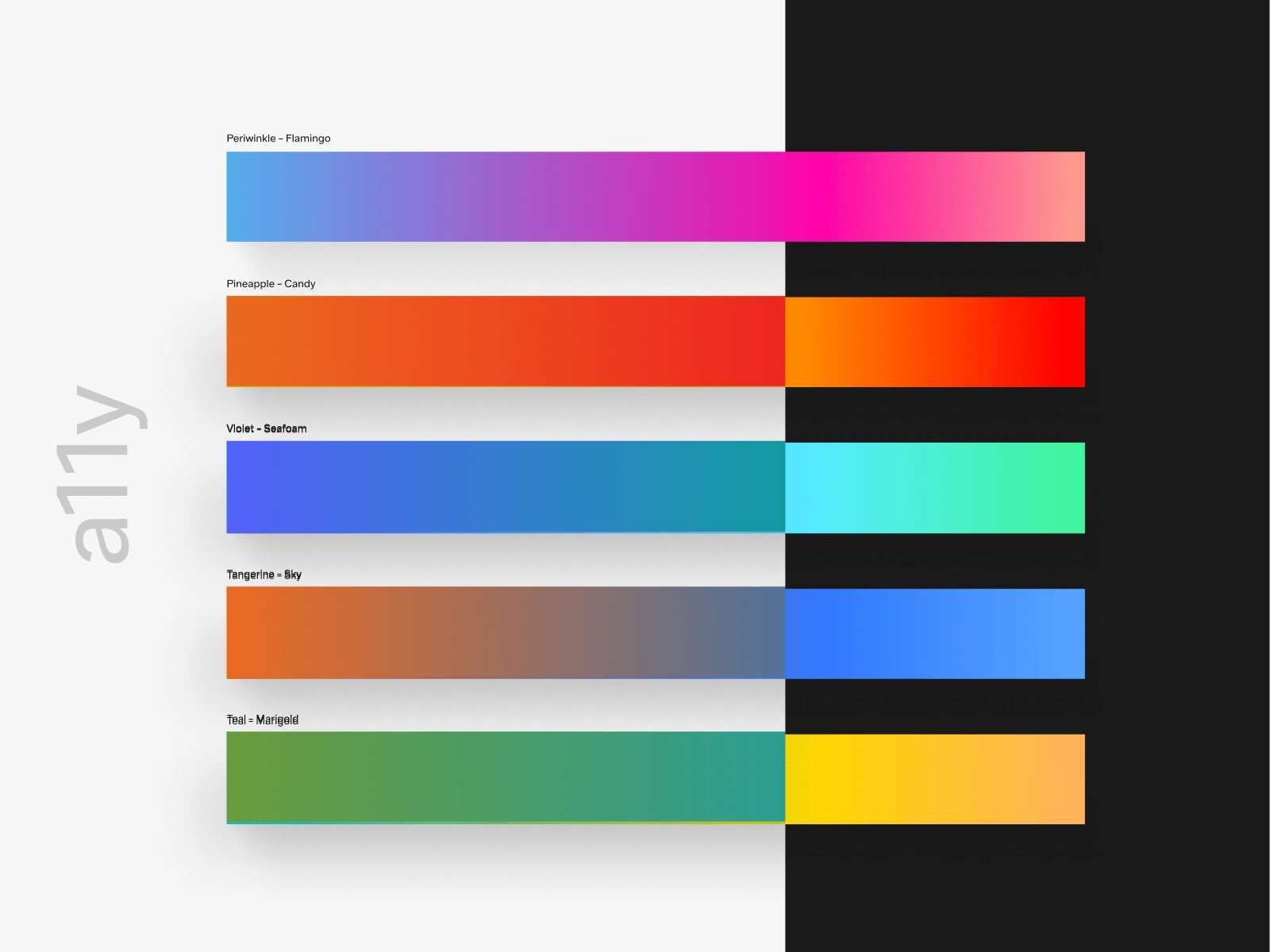
We use colour gradients to communicate energy and vitality. Paired with the 90/10 rule, it refers to unlocking health and life. One of the best and most versatile uses of gradient text is on slate, white and plaster backgrounds. The Ro gradient set is designed with a11y accessibility rules to work on slate in any text application over 24px, considered ‘Large text.’ H1, H2, H3, and H4 gradient texts are all AAA compliant.
Finding the most effective ways to use text over gradients while maintaining legibility is crucial to creating energy throughout a composition and breaking up white space when we don’t want to rely on a dark module. When using white cards over gradients, variable stops in a freedom gradient are acceptable.
Bringing all together
We created a design system to support future growth for Ro design and product teams. It allows designers to create screens quickly while being accessible to all levels of Ro’s design and product departments with different levels of Figma competency.
We focused on best practices in combination with a tailored video knowledge base to guide how to use, scale and maintain the design system moving forward.

One Ro. A global team and great outcomes.
For 18 months, we worked remotely between nine time zones, six countries and eight disciplines, including accounting, marketing, product management, research, UX design, branding, visual and motion design.
10k Unique Impressions
We successfully launched the new Ro's website in September 2022 with 10k unique impressions per day.
38% Successful Cross-Polls
38% of successful cross-polls (85.3/day) from the homepage originate in the’Other Offerings’ section in the first week.
34.3 Successful Checkouts
We noticed an average of 43.7 OTC x-poll checkouts originating from all treatments per day and 31.5 TR x-poll checkouts originating from all treatments per day. This makes up 34.3% of total x-poll checkouts across the web and mobile.
Like this project
Posted Sep 26, 2023
Reimagine a unified responsive platform under ro.co, the 1st vertically integrated primary care health hub, seamlessly connecting telehealth and in-home care.