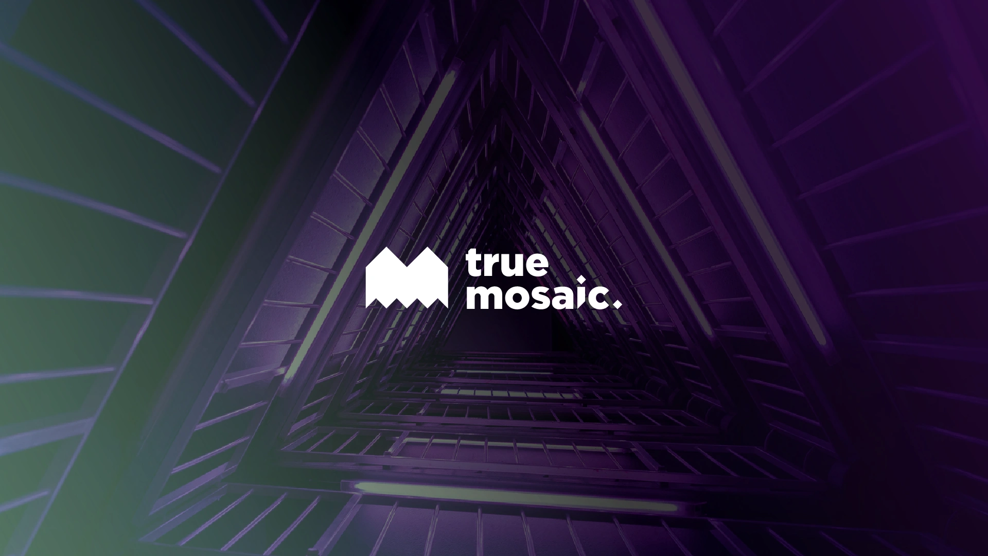
(Brand / Art Direction) True Mosaic
Pedro Freixo
(PT / BR) OVERVIEW DA MARCA
"True Mosaic é uma empresa de consultoria de marca especializada no propósito e na visão da marca. Acreditamos que grandes marcas são um mosaico de muitos elementos que se unem para trabalhar em harmonia.
Nosso trabalho é descobrir a verdade das marcas e criar um mosaico de boas ideias. Uma grande visão da marca informa não apenas o marketing, mas também a cultura e o orgulho da empresa. É um mosaico."
(EN / US) BRAND OVERVIEW
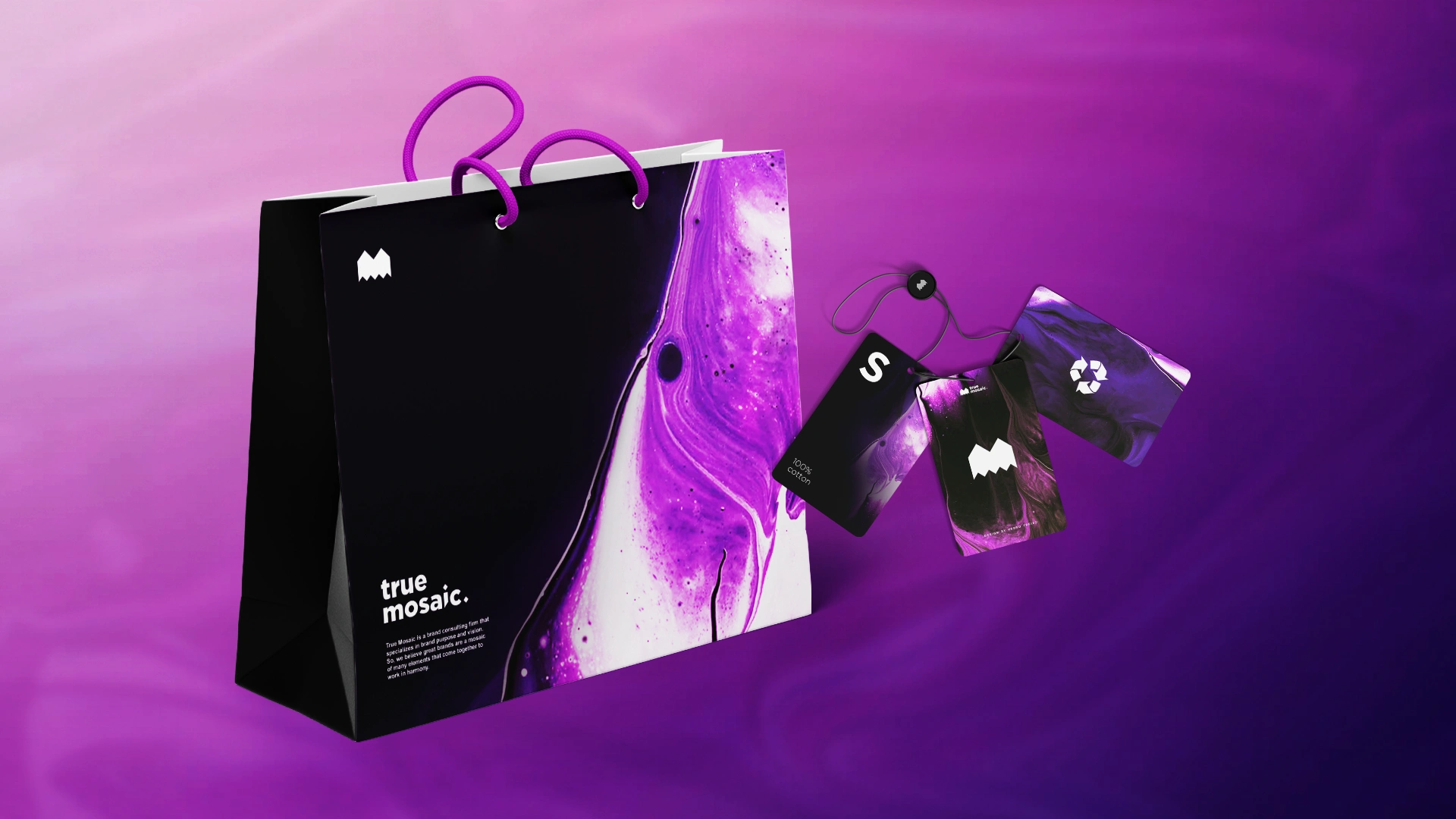
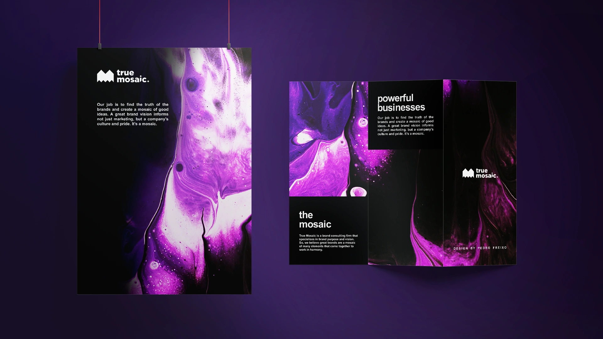
"True Mosaic is a brand consulting firm that specializes in brand purpose and vision. So, we believe great brands are a mosaic of many elements that come together to work in harmony.
Our job is to find the truth of the brands and create a mosaic of good ideas. A great brand vision informs not just marketing, but a company's culture and pride. It's a mosaic."
(PT / BR) CONCEITO DA LOGO
O logo da True Mosaic reflete exatamente o conceito e o que a marca é com muita redundância que nos direciona a uma imagem geométrica e simétrica com todos os elementos em harmonia.
Além disso, a tipografia foi desenvolvida e estilizada em uma malha de losangos em 45º exclusivamente para comunicar com o símbolo da marca, que além de ter a forma de um "M", ele remete especialmente a ideia de um mosaico.
(EN / US) LOGO CONCEPT
True Mosaic's logo reflects exactly what the brand is and the exact concept of the brand with a lot of redundancy that leads us to a geometric and symmetrical image in which all the features are in harmony.
In addition, the typography was developed and styled in a 45º lozenge mesh exclusively to communicate with the brand's symbol, which, in addition to having the shape of an "M", especially refers to the idea of a mosaic.

(PT / BR) TIPOGRAFIA - GOTHAM
A font escolhida para este projeto foi a Gotham, pois ela é uma família de fontes geométricas que funciona muito bem nos diferentes contextos; impressos e digitais. Além disso, é claro, é uma tipografia relativamente moderna, muito versátil e está em concordância com o conceito e com o posicionamento da marca True Mosaic.
(EN / US) TYPOGRAPHY - GOTHAM
The font chosen for this project was Gotham as it is a geometric font family that works very well in different contexts; print and digital. In addition, it is a relatively modern typography, very versatile and is keeping with the concept and positioning of the True Mosaic brand.

BRANDING / BRAND POSITIONING: Kristi Faulkner
ART DIRECTION: Pedro Freixo
BRAND / VISUAL IDENTITY: Pedro Freixo
CONCEPT: Pedro Freixo and Kristi Faulkner
Like this project
Posted May 11, 2026