GSM, Logistics Company
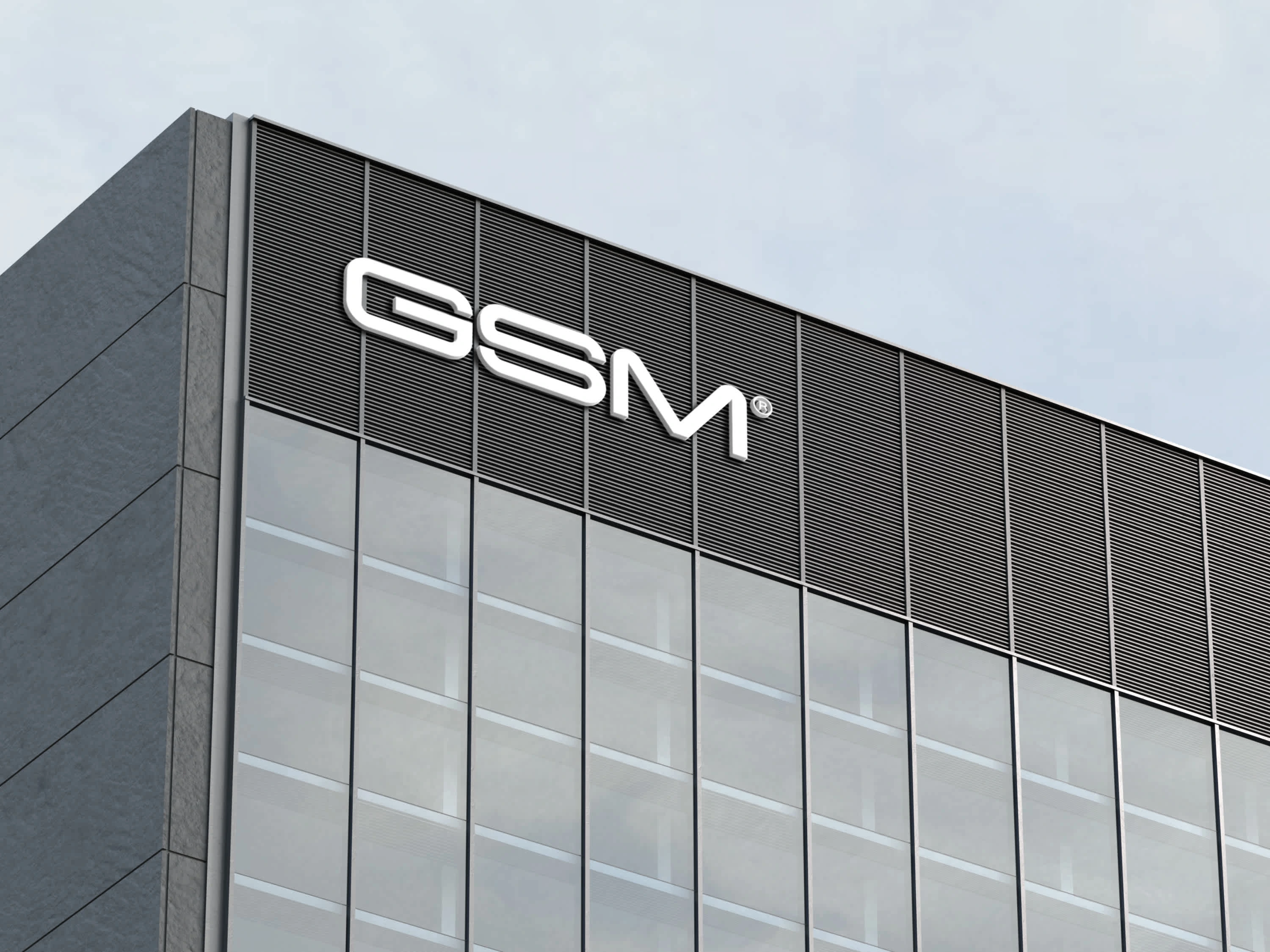
The progress of today's society is intrinsically linked to global transportation. At GSM, they focus on moving goods by land, sea, and air, ensuring reliable, professional, and hassle-free service to and from any point in the world.

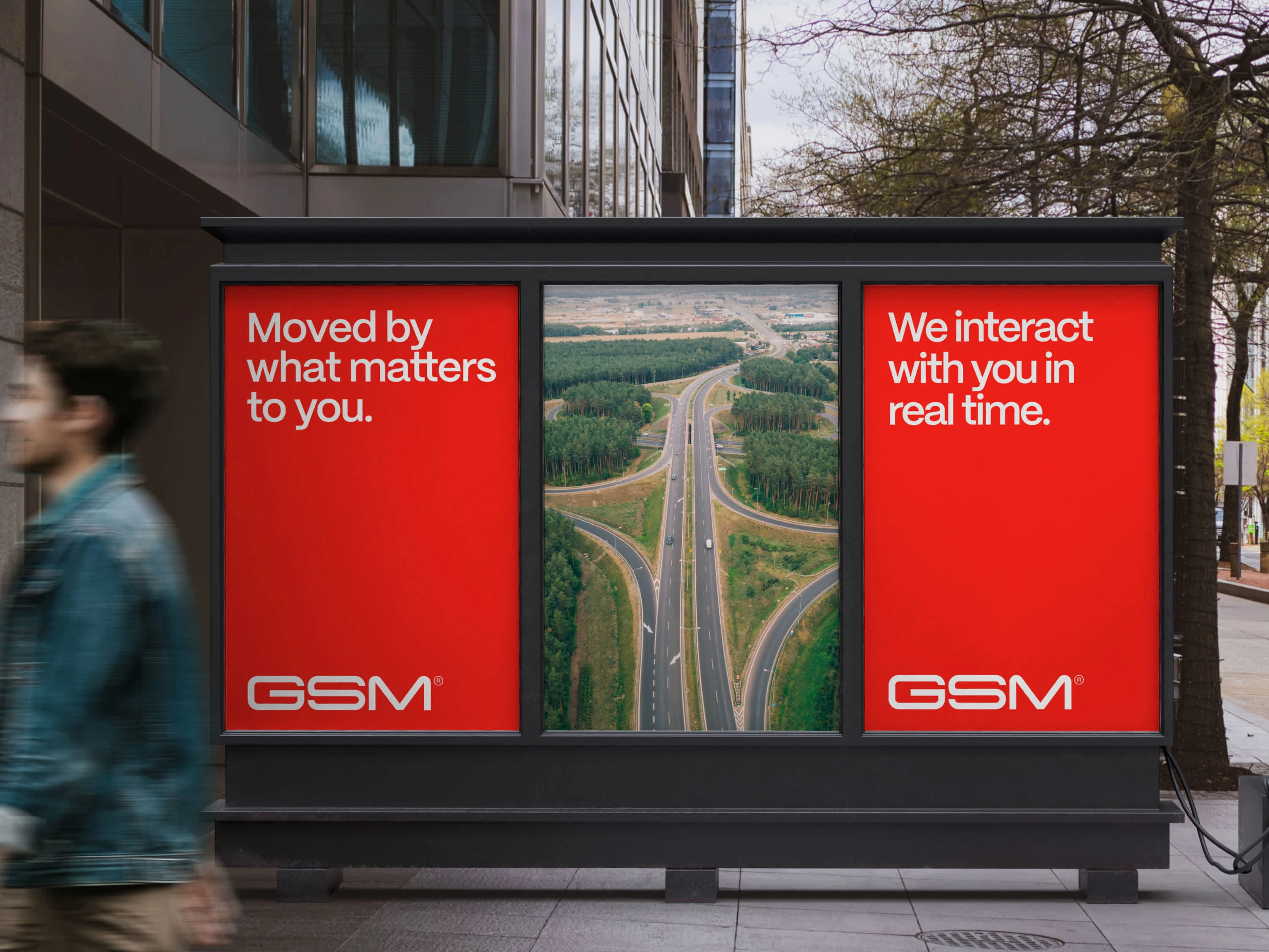
GSM Billboard
The Briefing
They required a complete brand redesign from the ground up, involving the creation of a new strategy and identity that aligns with their evolving needs and ambitious expansion vision. The goal was to help GSM stand out among competitors while continuing to convey the trust and professionalism that are the hallmarks of their service.
The Rebranding
The rebranding process began with a deep dive into their strategy. Once we clearly defined the new values, tone of voice, and target audience, we moved on to refining the visual identity, focusing on the logotype, wordmark, and color palette first, and then move to art direction, applications and web design.
Live website: http://gsmcanarias.es
WORDMARK & LOGOTYPE
The client wanted to maintain the essence of their existing brand, preserving its traditional look and meaning rather than opting for a complete overhaul. With this in mind, we modernized the wordmark by making subtle adjustments to the typography, ensuring it felt fresh yet familiar. Next, we simplified their logotype, streamlining the helix design into a two-color, line-based version. This approach retained the brand’s iconic elements while making the logo more distinctive and recognizable in today’s market.
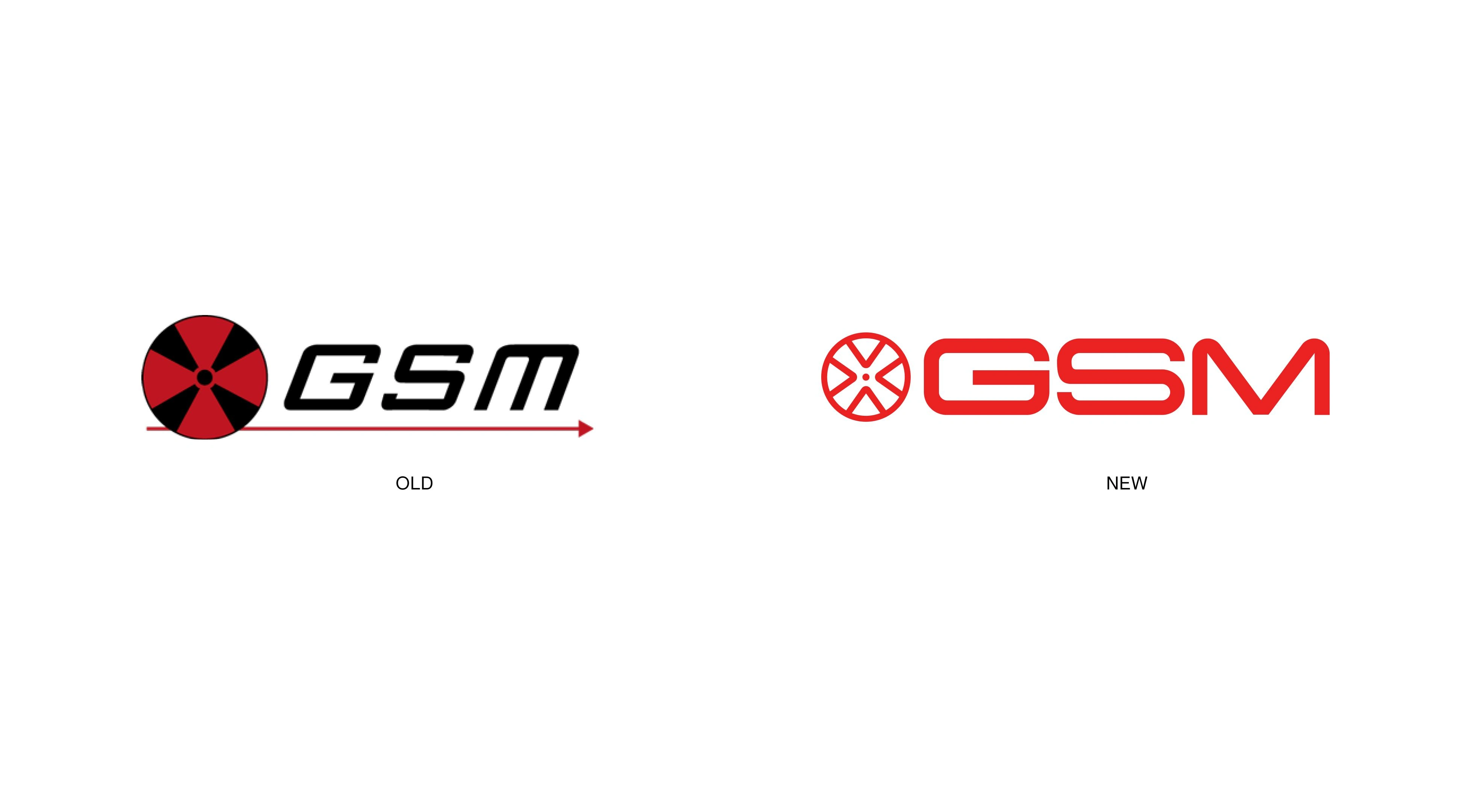
LOGOTYPE & WORDMARK
Wordmark Animation
Logotyope Animation
COLOR PALETTE
The rebranding also involved refining the color palette, just as we did with the logotype and wordmark. We retained the corporate red but made it more saturated and vibrant, giving the brand a fresh and energetic feel. The previous palette included two very muted reds, which we decided to eliminate in favor of a simplified three-color scheme. With the bold, bright red as the primary color, the new palette is more cohesive and impactful, ensuring that the brand is instantly recognizable.

Old color palette

New color palette
TYPOGRAPHY
PP Mori is the primary font for the brand. This sans serif typeface brings a lot of personality to the table, capturing the voice and expression of GSM. Its modern and distinctive character adds a renewed spirit to the brand, reflecting the expert yet approachable nature of GSM.
The secondary font, Archivo, complements PP Mori in body text and longer content. Its clean, readable design provides a supportive contrast, enhancing the overall typography while maintaining a cohesive and professional look across all materials.
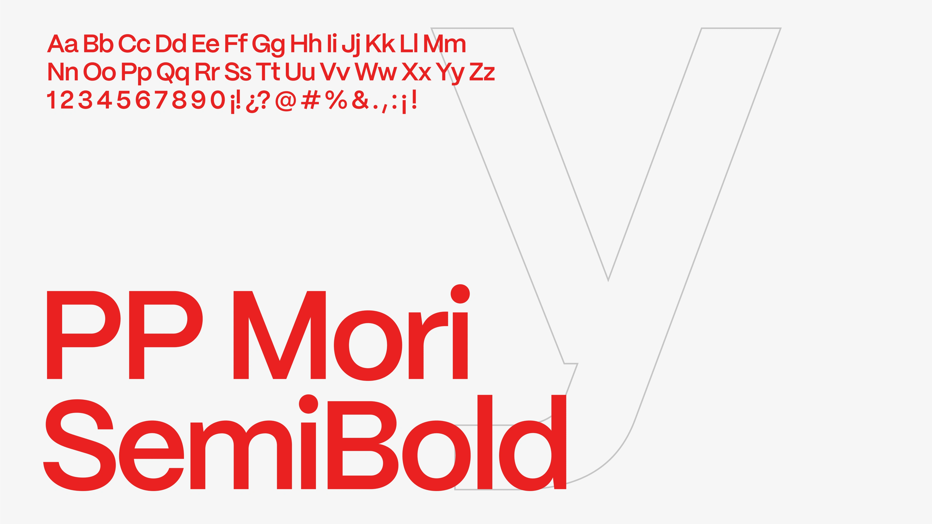
PP Mori
CLAIM
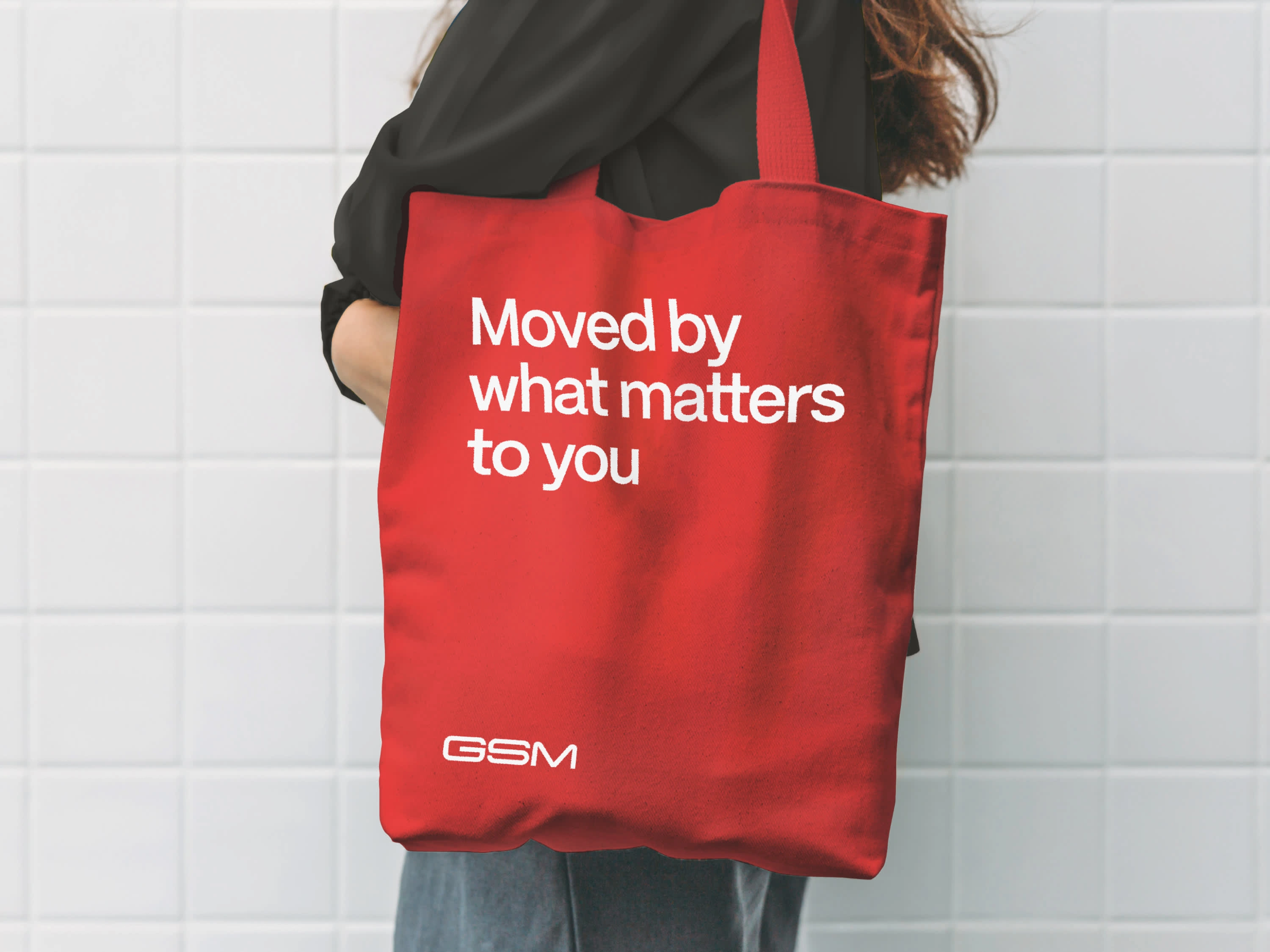
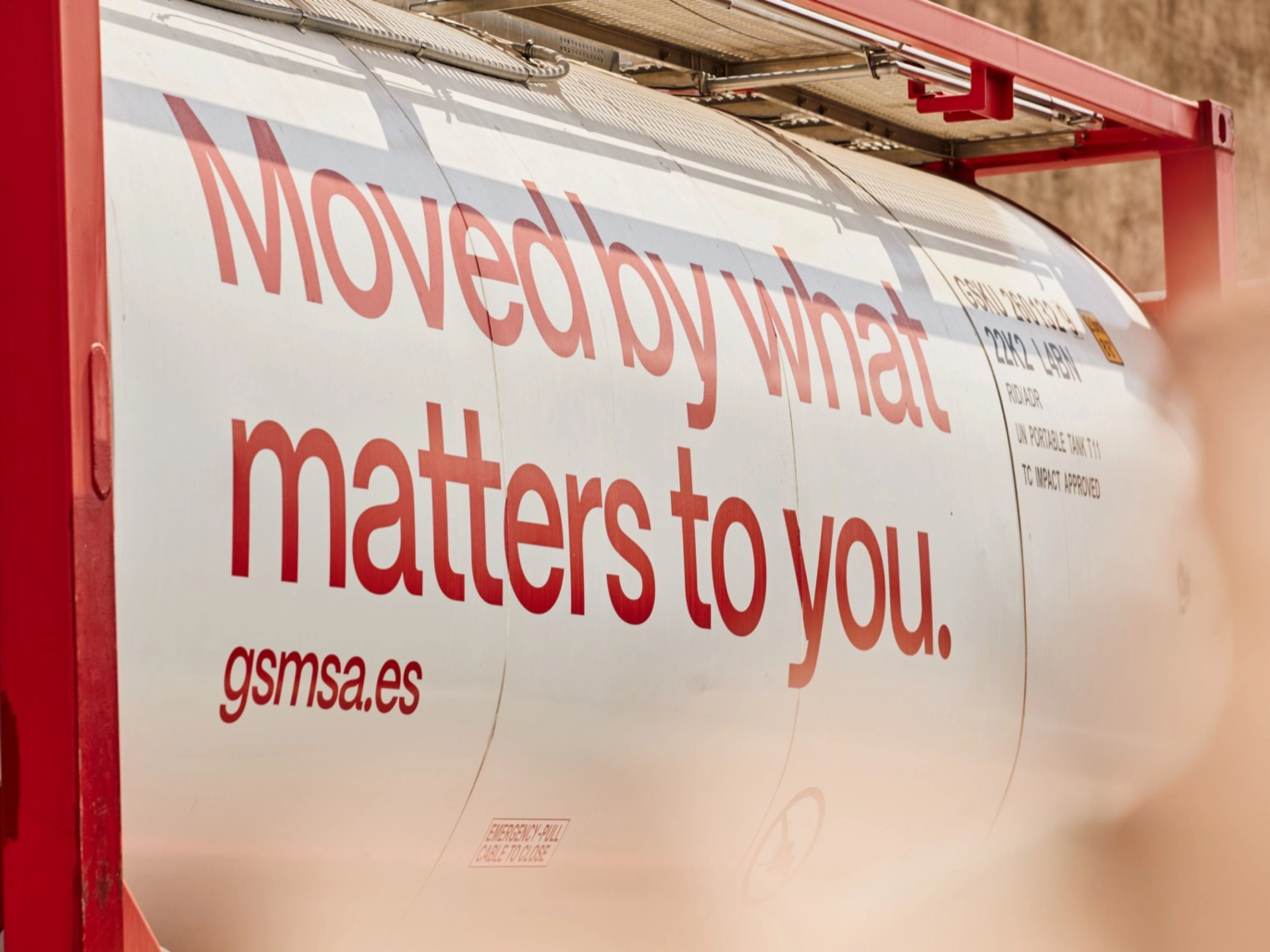
The brand claim, also known as a tagline or slogan, is a concise and memorable statement that encapsulates the essence of the brand and its promise to customers. For GSM, considering the focus on reliability, professionalism, and global transportation, the brand claim is:
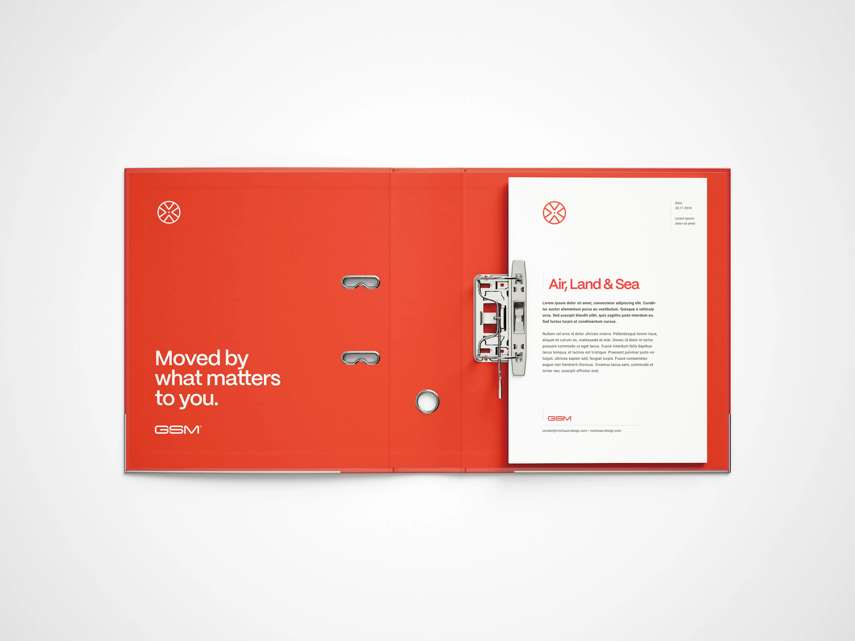
Moved by what matters to you
This claim highlights GSM's ability to move goods across the world with ease, emphasizing their commitment to a smooth and professional service.
Claim Animation
WEB DESIGN
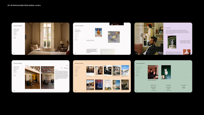
For the web redesign, we started by conducting interviews with current customers to understand their needs and identify areas where the site was lacking. These insights were invaluable in shaping the direction of the redesign. Based on the feedback, we created a new sitemap to pinpoint the necessary changes that would enhance the user experience.
With a clear structure in place, we then developed wireframes that integrated the new approach, values, information, and art direction. These wireframes served as the blueprint for the redesign, ensuring that the website not only met the functional needs of users but also reflected the refreshed brand identity in a cohesive and engaging way.
APPLICATIONS
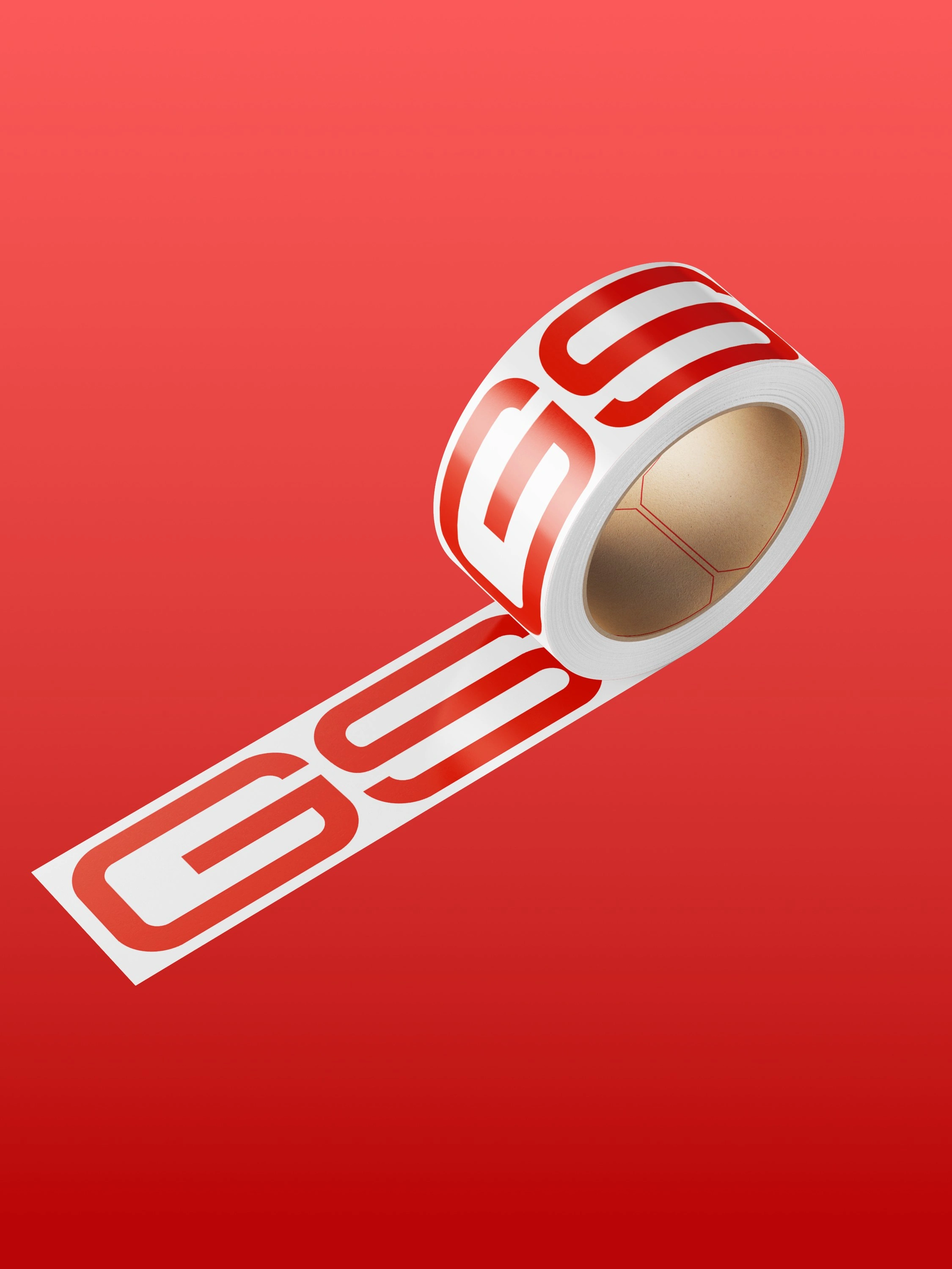
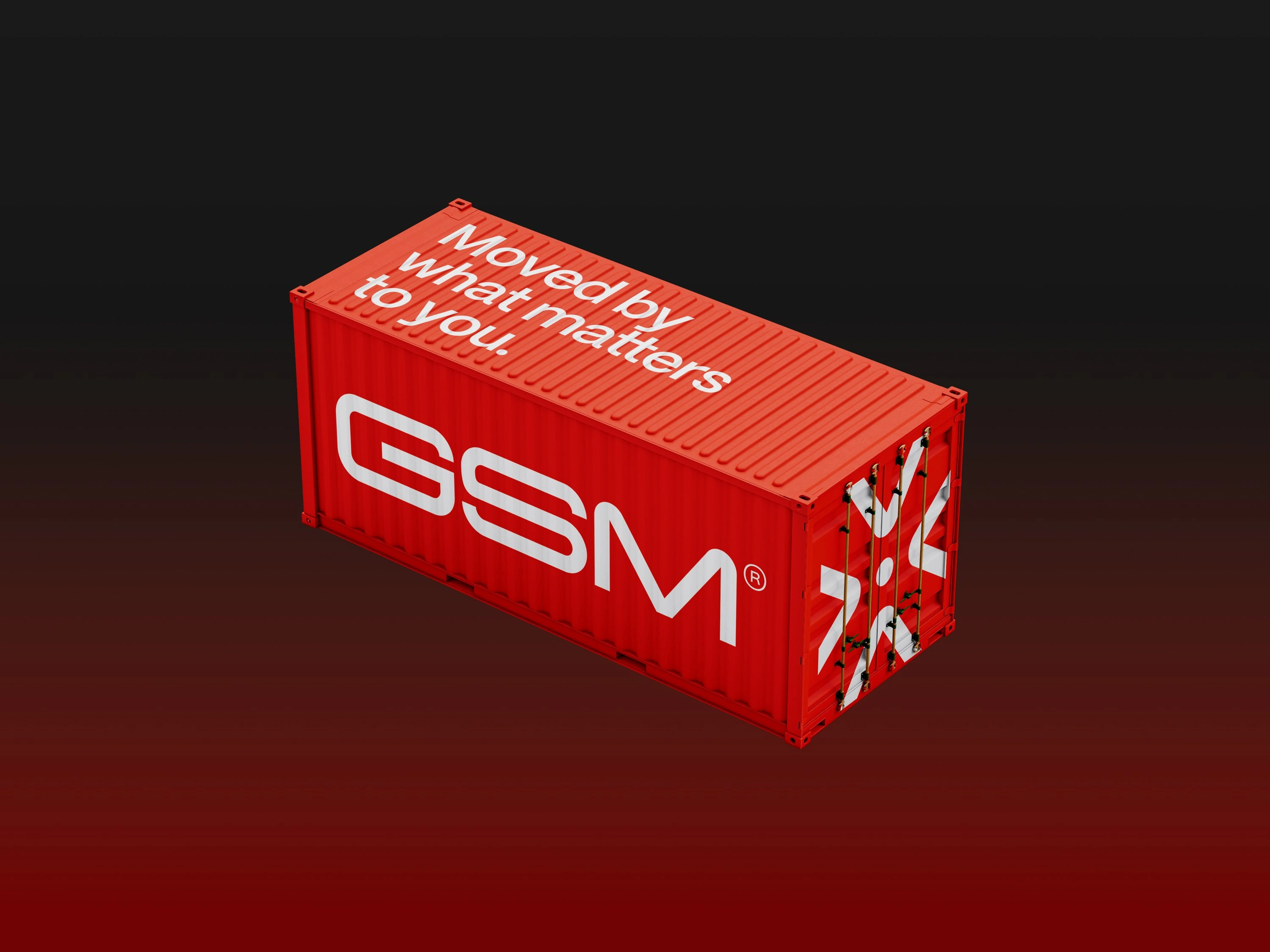
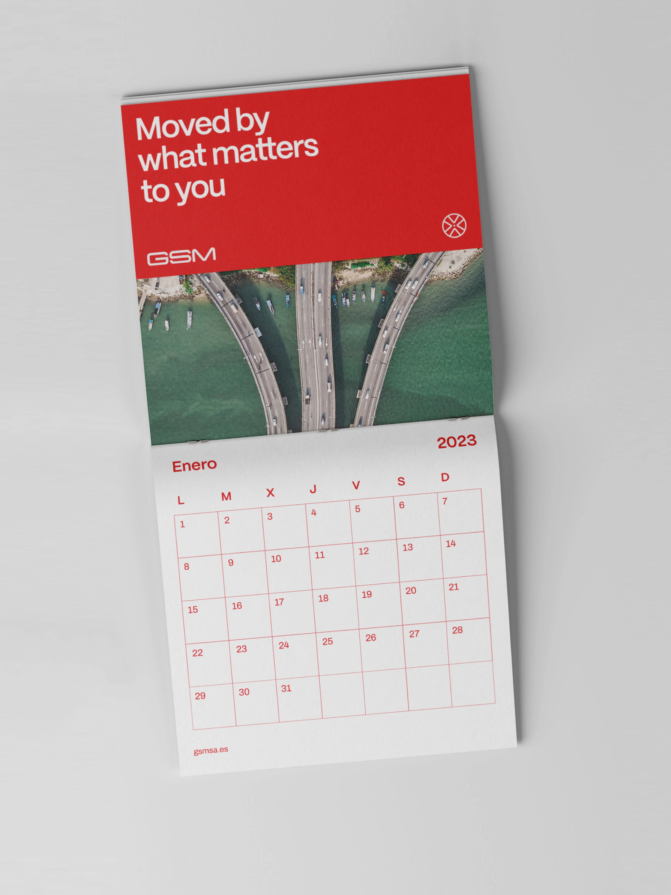
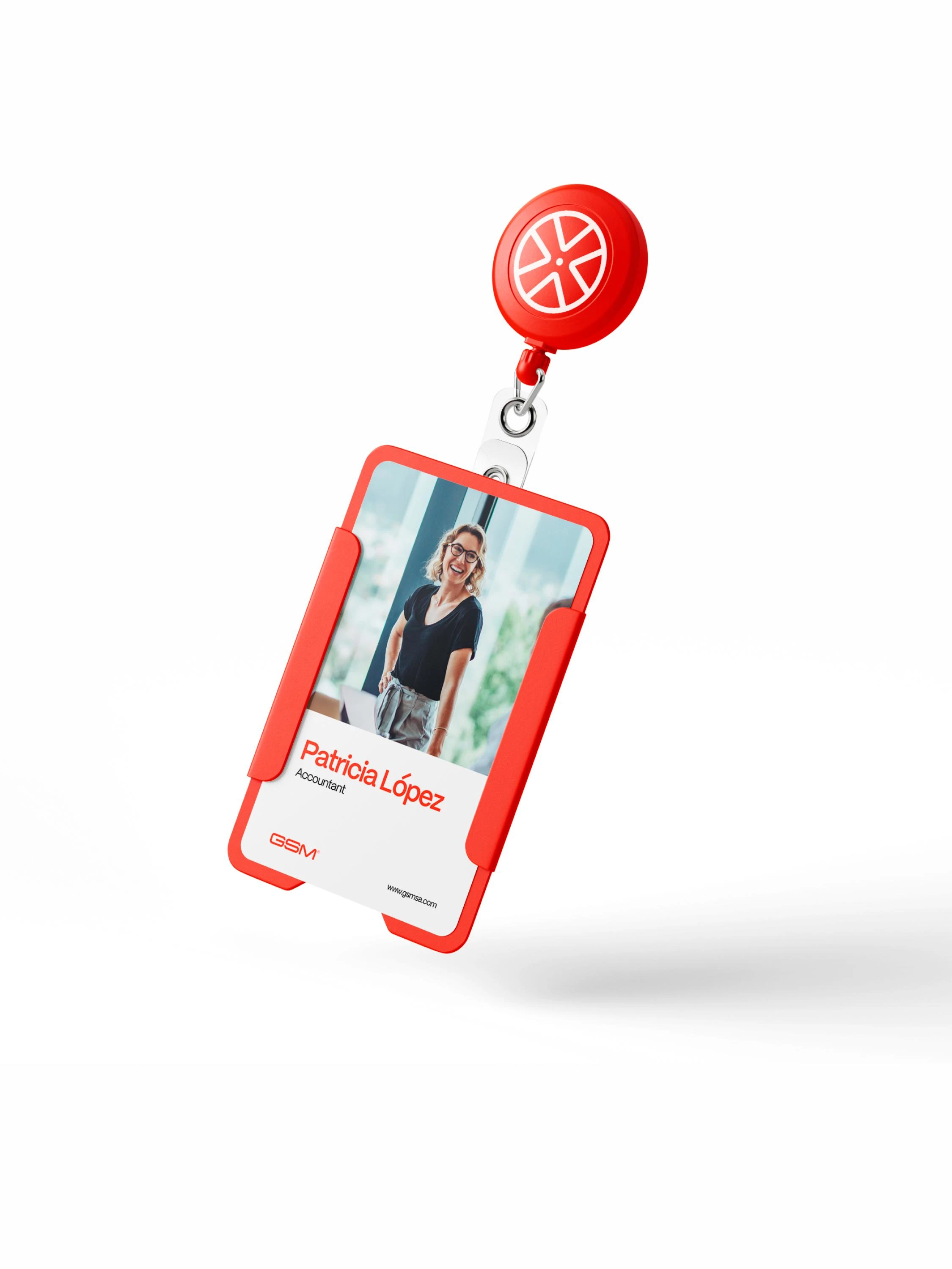
The applications of the redesign effectively address all aspects of the brand overhaul, serving as a prime example of how a cohesive redesign can rejuvenate and update a brand to stay relevant. Here’s how:
ART DIRECTION
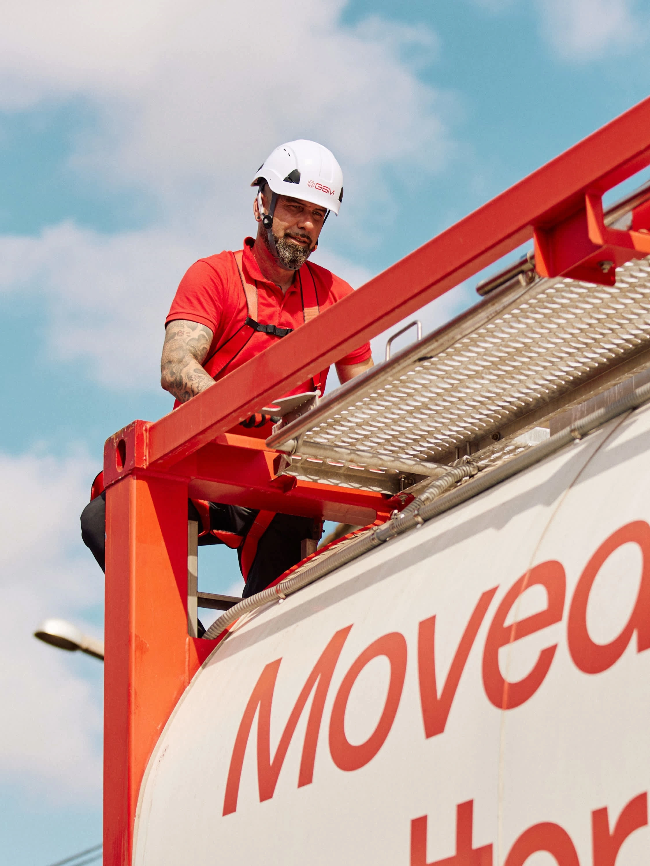
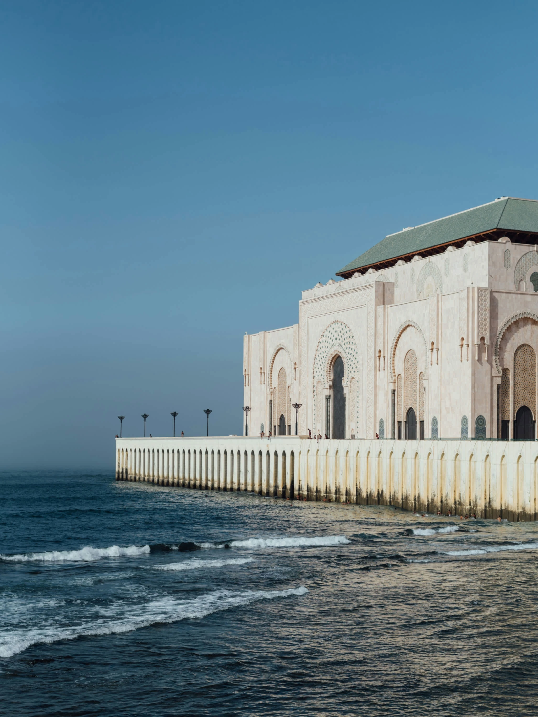
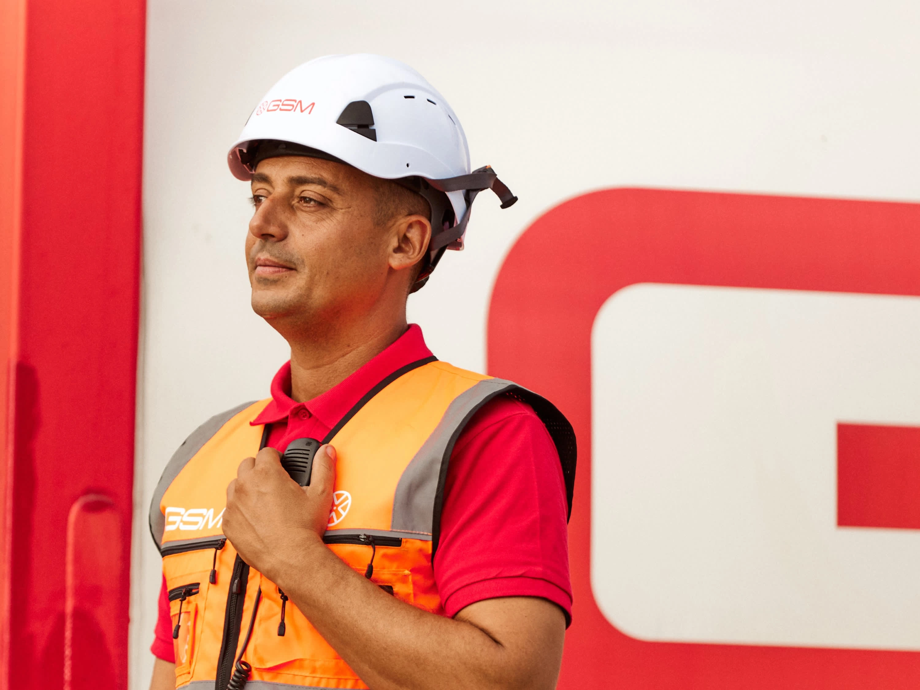
The art direction focused on authentically capturing the essence of GSM's environment, emphasizing their methodology, close relationships with clients, and genuine care for their work. Through carefully crafted photos and videos, we aimed to showcase the hands-on approach and dedication that define GSM. The visuals were designed to reflect the trust and professionalism they bring to every project, highlighting not just the logistics but the people and values behind the brand. The goal was to create a visual narrative that resonates with their audience, reinforcing the reliability and personal touch that GSM offers.








Like this project
Posted Aug 19, 2024
GSM required a complete brand redesign from the ground up, involving the creation of a new strategy and identity aligned with their evolving needs.
Likes
0
Views
13
Clients
GSM

