Orbyto AI Website Design Full Case Study

Abdul Qadeer


The Challenge
AI SaaS companies have a communication problem. Their technology is complex, their value proposition is abstract, and their target audience ranges from technical developers to non-technical decision-makers. Most AI websites either lean too hard into futuristic aesthetics (all glow effects and no substance) or go full enterprise boring (walls of text with stock photos of people pointing at screens).
Orbyto needed a website that threads the needle: visually striking enough to signal innovation, clear enough to explain what the product actually does, and structured to convert both technical evaluators and business buyers.
Design Approach
The design process started in Figma, where every section was crafted to balance visual impact with clarity.
Key design decisions:
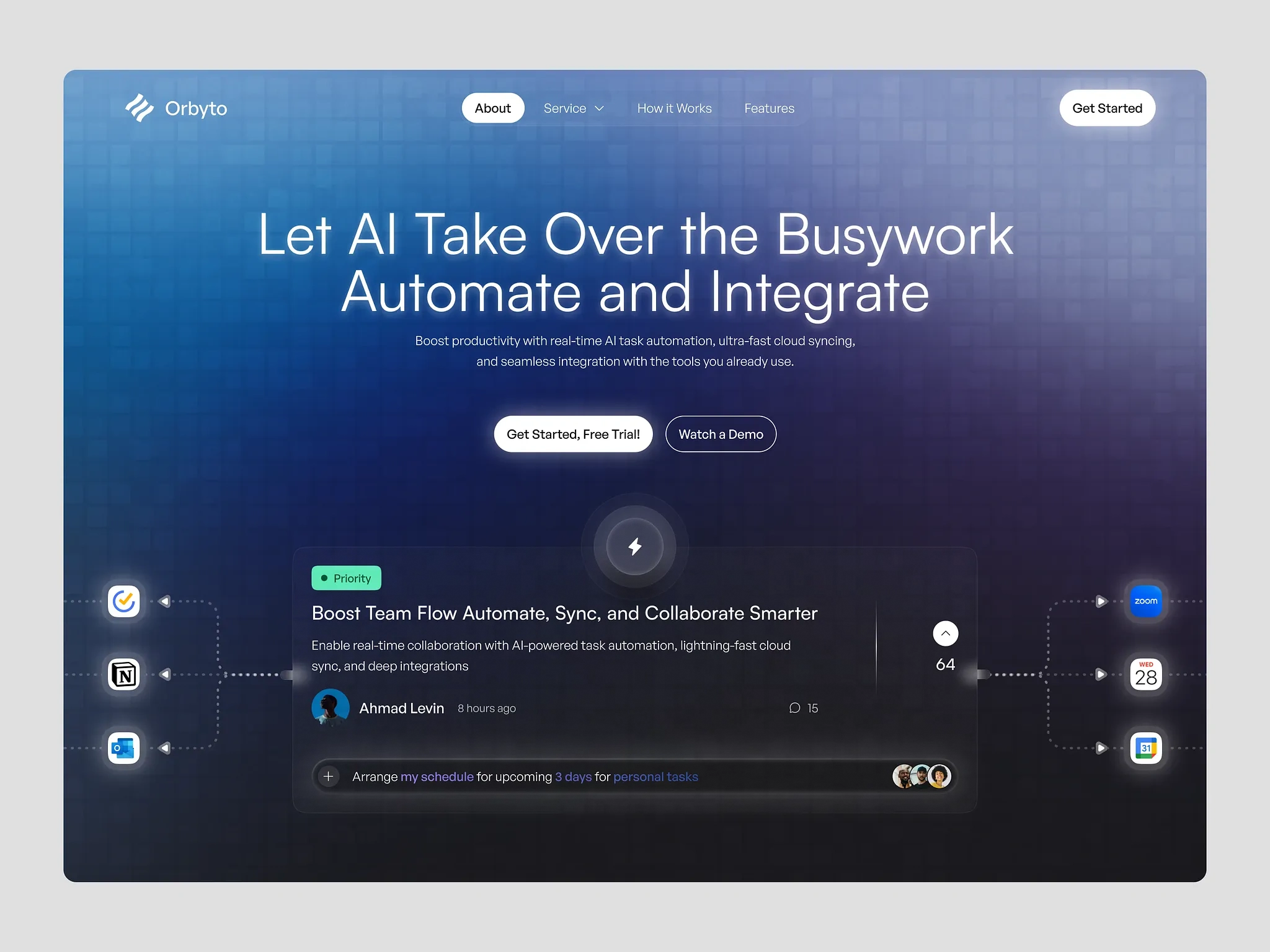
Futuristic but grounded visual language. The design uses a dark theme with vibrant gradient accents and subtle geometric patterns to create a sense of intelligence and forward-thinking technology. The aesthetic signals innovation without tipping into sci-fi territory.
Product-first hero section. The hero leads with a clear value proposition and a visual preview of the product interface. Visitors understand what Orbyto does within 3 seconds of landing on the page. No abstract metaphors, no vague promises.
Feature sections with visual proof. Each feature is explained with a concise headline, a short description, and a UI screenshot or animation showing the feature in action. Showing beats telling, especially for AI products where the value is in the interaction.
Progressive complexity. The page starts simple for business buyers (what it does, who it's for, what results to expect) and gradually reveals technical depth for developers and engineers (API documentation, integration options, architecture overview).
Social proof and metrics. Customer logos, usage statistics, and testimonials are positioned at key decision points in the scroll. They appear right when a visitor might hesitate.
Clear pricing structure. Transparent pricing tiers with feature comparisons eliminate the "contact sales" friction. Self-serve signup for smaller teams, enterprise contact for larger organizations.
Developer-friendly signals. A prominent documentation link, code snippets in feature sections, and API-first messaging tell technical users this is a serious product built for integration.
Visual System
The design system was built for consistency and scalability:
Dark backgrounds with gradient accent cards create depth
A consistent type scale guides the eye through content hierarchy
Icon system uses line-weight consistency across all feature illustrations
Component library ensures every page maintains visual coherence
The Result
A fully designed AI SaaS website built in Figma, combining futuristic visual identity with clear product communication. The design serves AI startups, machine learning platforms, and SaaS companies looking for a digital presence that communicates technical sophistication while converting both technical and business audiences through strategic layout and progressive disclosure.
Like this project
Posted Jul 14, 2026
End-to-end UI/UX design and development of an AI-powered SaaS website with a futuristic visual identity, built to communicate complex AI capabilities through clean, intuitive design.
Likes
0
Views
14