Shoes E-Commerce Landing Page Full Case Study

Abdul Qadeer


The Challenge
Footwear e-commerce is brutally competitive. Brands fight for attention against Nike, Adidas, and hundreds of DTC startups, all selling through nearly identical product grids. The landing page is where most of that competition plays out. A generic product listing won't cut it. The page needs to stop the scroll, communicate brand identity instantly, and make buying feel inevitable.
This project focused on designing a bold, high-impact landing page for a modern footwear brand. The goal was to create a page that feels more like a brand experience than a product catalog.
Design Approach
The design process started in Figma, where every element was crafted to balance brand storytelling with conversion mechanics.
Key design decisions:
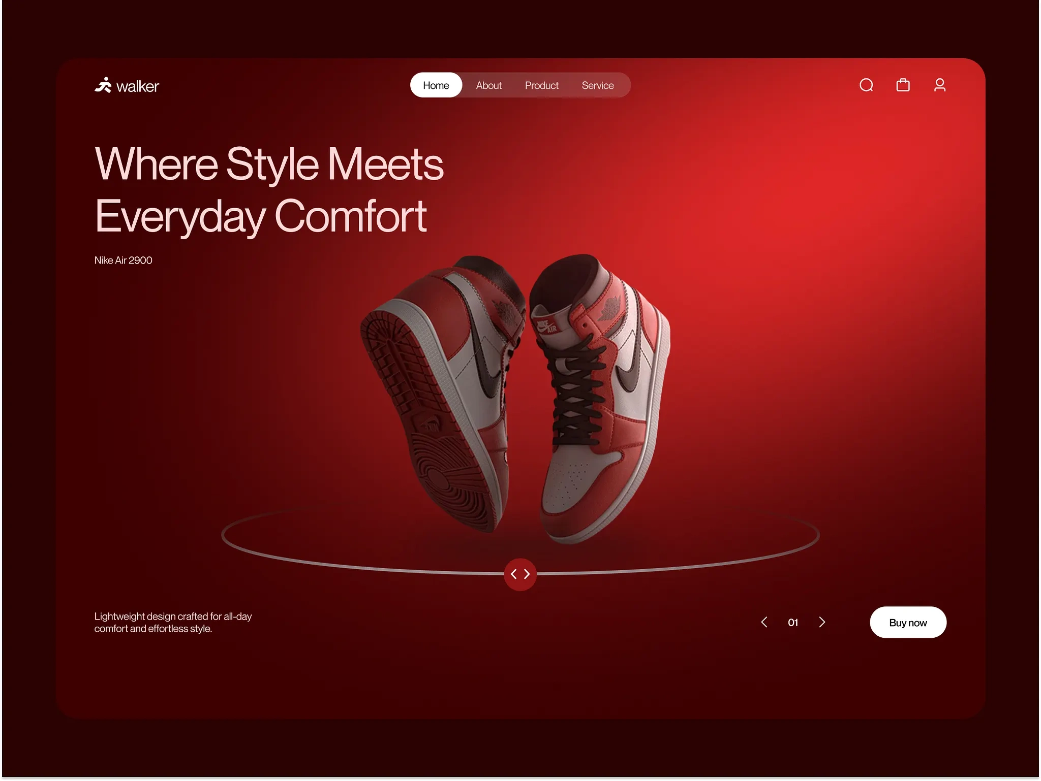
Bold, high-contrast visual identity. Dark backgrounds with vibrant product photography create immediate visual impact. The shoes pop off the screen. Every color choice is intentional: the background recedes, the product advances.
Hero section with attitude. The hero leads with a lifestyle statement, not a discount code. Large typography, dynamic product imagery, and a clear CTA set the brand tone in the first second. Visitors know exactly what this brand is about before they scroll.
Product showcase with depth. Products are presented with large, detailed imagery showing multiple angles, material textures, and color options. Each product card feels like a mini-experience, not just a thumbnail with a price tag.
Social proof integration. Customer reviews, ratings, and user-generated content are woven into the page flow. Real people wearing real shoes builds more trust than any marketing copy.
Streamlined purchase flow. Size selection, color options, and add-to-cart are accessible without navigating away from the landing page. Fewer clicks between interest and purchase means higher conversion.
Brand storytelling sections. Sections highlighting craftsmanship, materials, and brand values break up the product grid and build emotional connection. People buy shoes for how they make them feel, not just how they look.
Mobile-optimized layout. Thumb-friendly navigation, swipeable product galleries, and a sticky add-to-cart button ensure the mobile experience converts as well as desktop.
Visual Strategy
The design uses contrast as its primary tool:
Dark backgrounds make product colors vibrant
Large typography creates hierarchy and urgency
Whitespace between sections gives each product room to breathe
Accent colors guide the eye toward CTAs
The result is a page that feels premium without being pretentious, bold without being cluttered.
The Result
A fully designed e-commerce landing page built in Figma, focused on brand impact and conversion optimization. The design serves footwear brands, sneaker companies, and fashion e-commerce businesses looking for a landing page that communicates brand identity while driving product sales through strategic visual design and streamlined purchase flows.
Like this project
Posted Jul 14, 2026
End-to-end UI/UX design of a bold, conversion-focused e-commerce landing page for a modern footwear brand, built to showcase products and drive sales.
Likes
0
Views
15