Cycuity Icon System Library Design

Scott DS Young


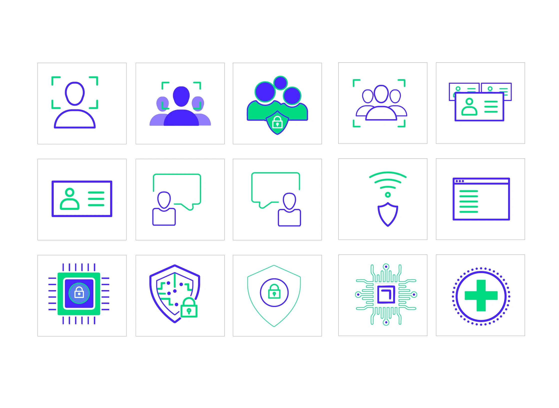
Icon System Library
For Cycuity’s internal communications, I was brought in to design to create their icon system library. The icons follow a clean, line-based style and were built using the grid structure of Cycuity’s logo. I focused on keeping the compositions dynamic, integrating the brand’s color palette to maintain visual energy and cohesion. Variations in scale were developed to ensure the icons would work across digital and print environments.
The work was also designed in Figma.
https://www.figma.com/deck/pKhjLBsk0b0oNotcV5SyLI/Micro-Chip-Security-Template?node-id=15-617&t=davmltMYfCwFOeAW-1


Like this project
Posted Apr 17, 2025
For Cycuity’s icon system library.
Likes
1
Views
16
Timeline
Jan 4, 2024 - Apr 13, 2024


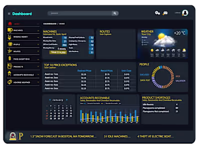
Analytics Dashboard

Mockup of Dashboard
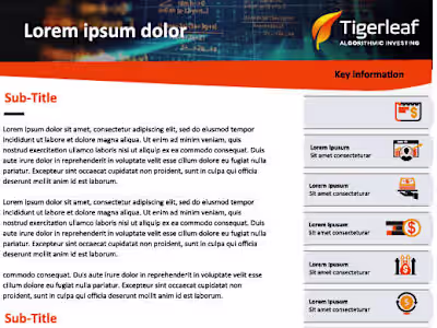
Investment Fund Marketing 2-Pager

ICONOGRAPHY: Flat Icon Concepts