Brand Identity Design for Dia’capella Delights

Oguntade Olufemi


Context
Dia’capella Delights is a culinary brand specializing in vibrant, packaged comfort, from hearty soups to fresh, bottled smoothies and juices. The goal was to create an identity that felt indulgent yet approachable, capturing the "delight" of a high-quality, ready-to-consume meal or drink.
Exploration
In my initial sketches, I played with literal food imagery, bowls, straws, and steaming pots. While they clearly communicated "food," they felt generic. They didn't capture the soul or the rhythmic nature of the name "Dia’capella." I needed something that felt more like a "performance" of flavor rather than just a kitchen utensil.
The Pivot
I moved away from the tools of the trade and focused on the experience of the consumer. I pivoted toward a bold, typographic-heavy mark. I realized that the "smile" or the "lips" of satisfaction was the most powerful icon for a brand focused on "Delights." It transitioned the brand from a utility (selling soup) to a feeling (loving what you eat).
The System I shipped
I built a system that is high-energy and "loud" in the best way possible.
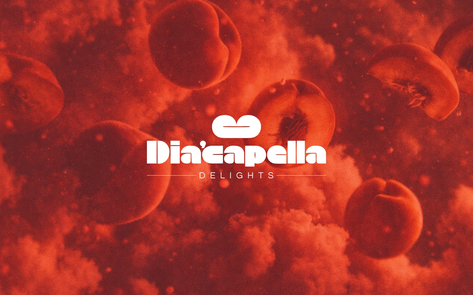
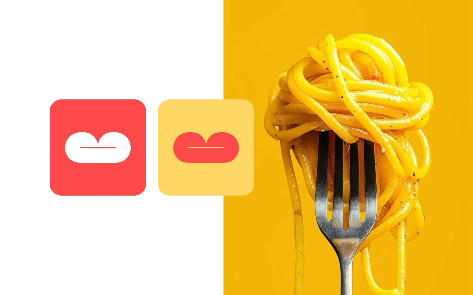
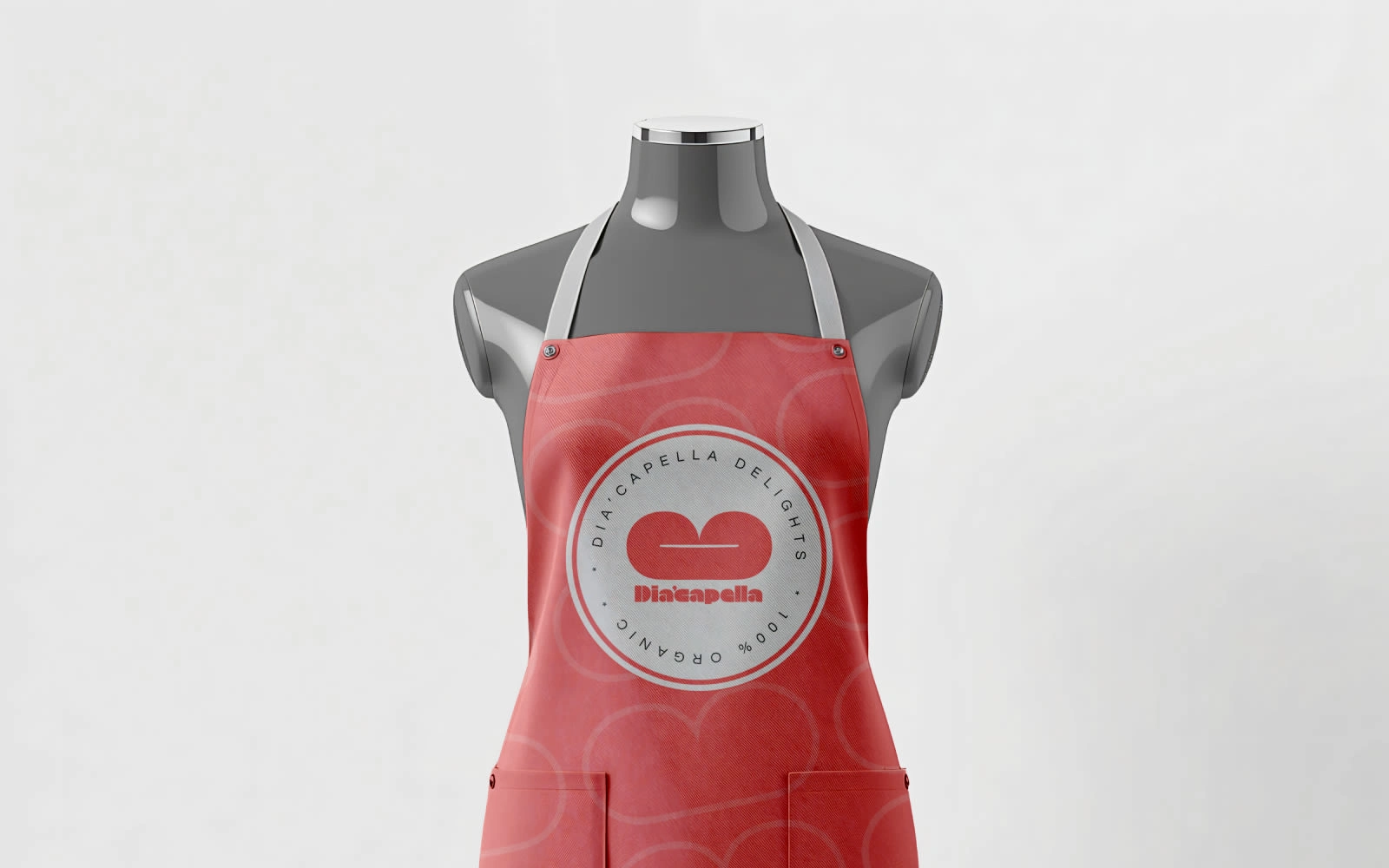
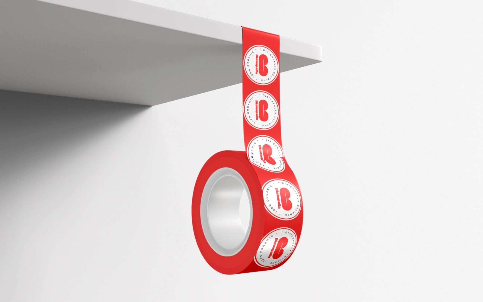
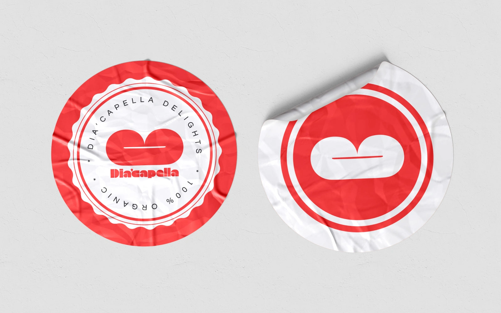
Primary Assets: A custom-weighted wordmark with a "lips" emblem that doubles as a symbol of taste and vocal harmony.
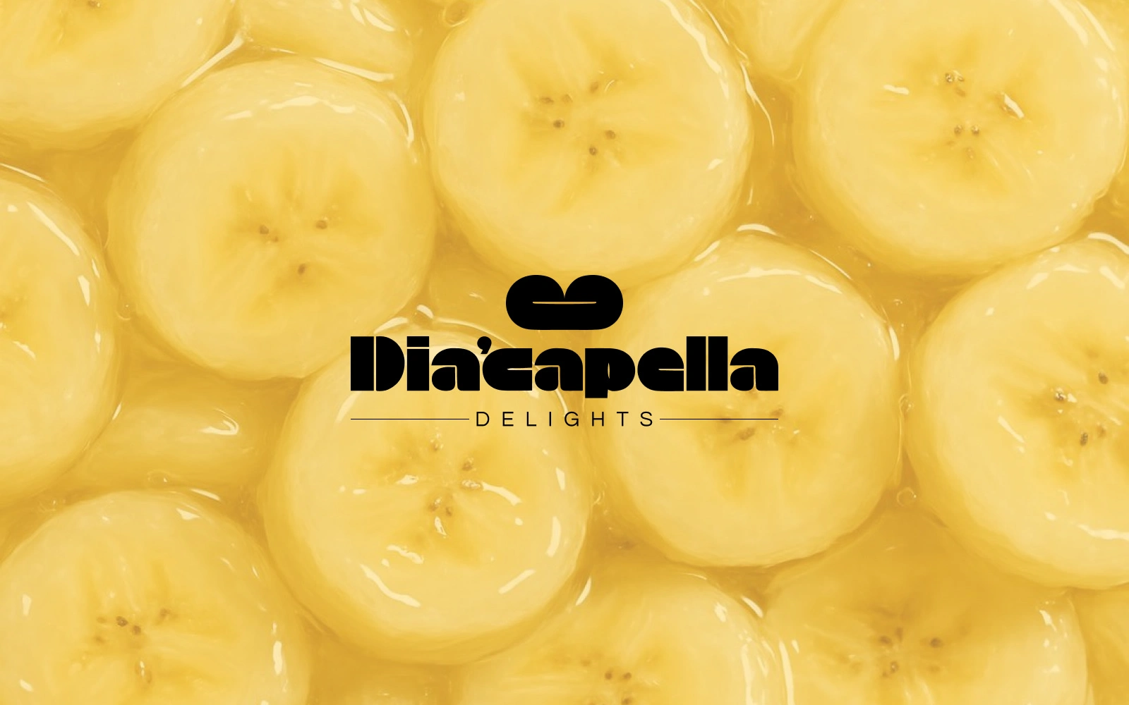
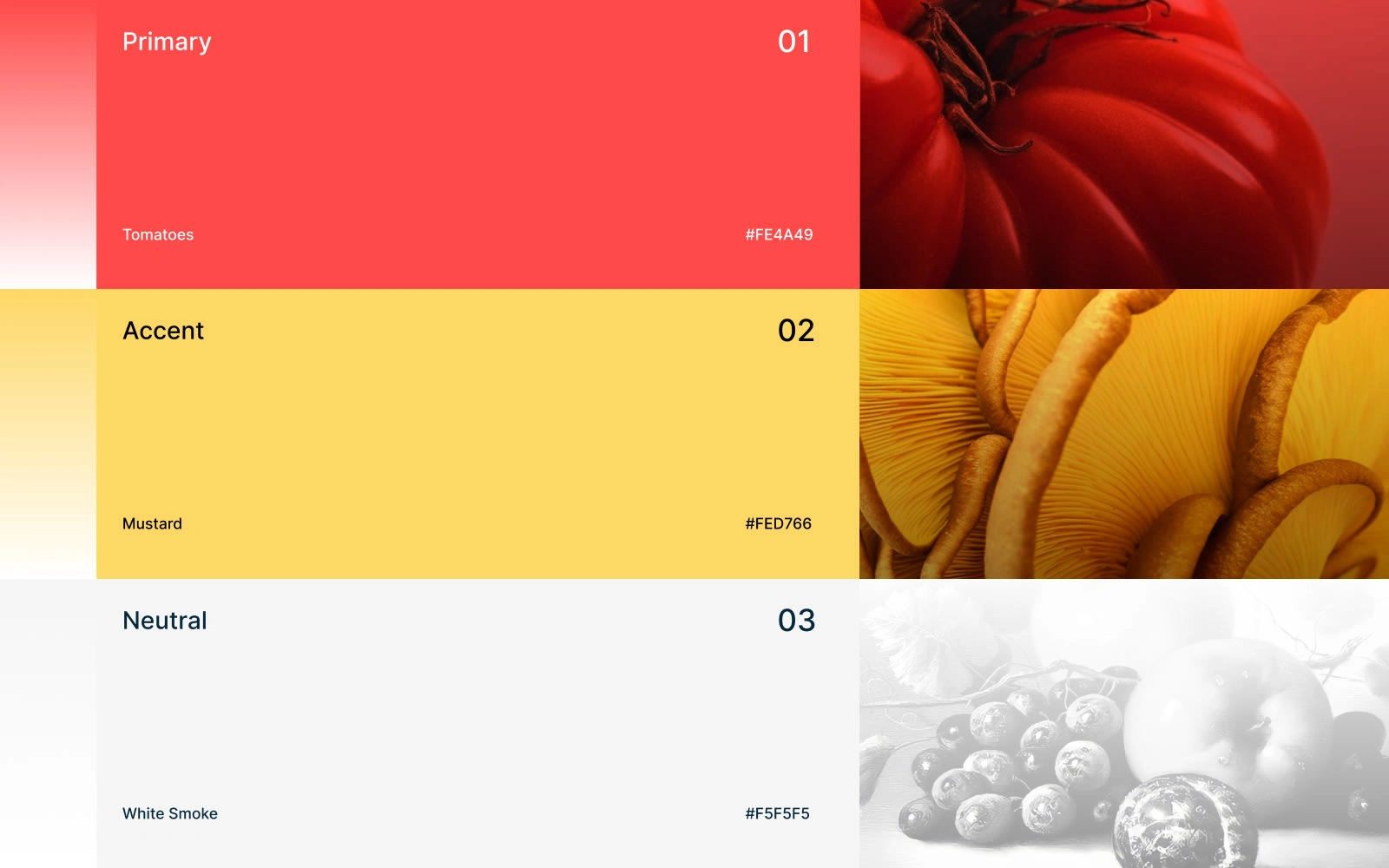
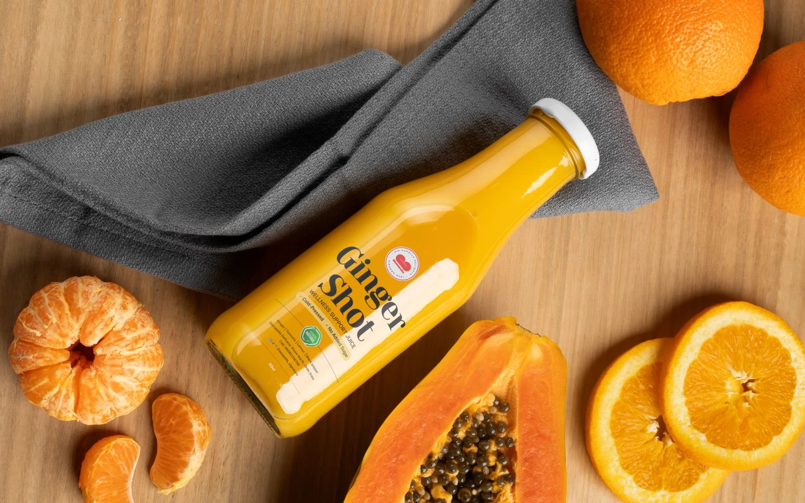
Color Palette: A vibrant, appetite-stimulating red as the primary backdrop, paired with a sunny yellow (#FED766) for accents. This combo is designed to stand out on crowded refrigerator shelves.
Usage Rules: The logo should primarily appear in white-out (knockout) on the brand red to maintain maximum "pop."
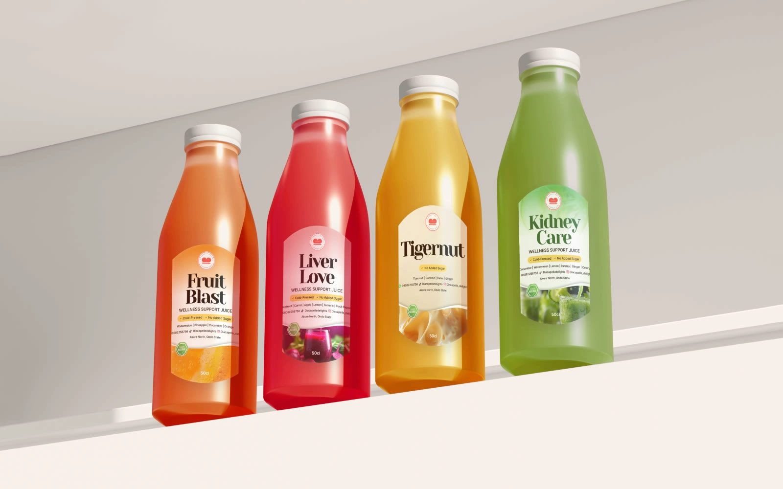
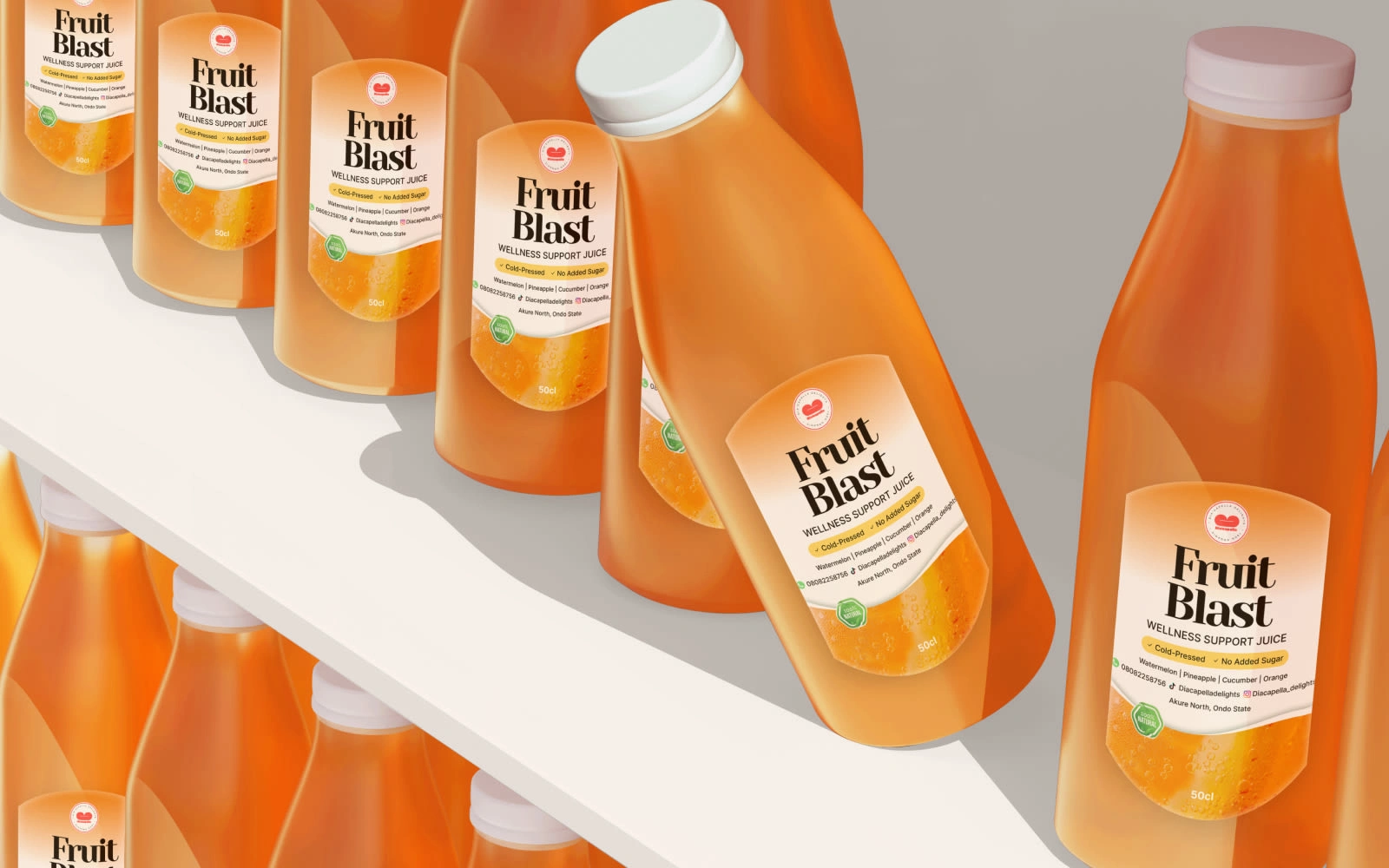
Product Placement: For clear juice bottles, the logo is designed to sit centrally, allowing the natural color of the smoothie or soup to act as a secondary texture behind the bold white text.
Process Note
The challenge here was the letter spacing. Because the font is so heavy and "chunky," I had to manually adjust the kerning to ensure it didn't look like a single white block from a distance. I added a slight curve to the baseline of "Dia’capella" to give it a bouncy, melodic feel that lives up to its name.
Outcome
The result is a brand that feels "premium-pop." It’s friendly enough for a quick juice grab but structured enough to look like a high-end packaged soup brand you'd find in a specialty grocer. It avoids the "boring health food" trope by leaning into bold, unapologetic joy.
What I'm proud of
I’m most proud of the iconography. The lips icon is simple enough to be embroidered on an apron or embossed on a bottle cap, yet it carries the entire personality of the brand satisfaction, flavor, and a bit of a playful "singing" attitude.

Deliverables
Core Logo: High-res master files in Red/White and Yellow/White.
Typography Suite: Guidance on using chunky display fonts vs. clean sans-serifs for ingredient lists.
Packaging Concept: Digital mockups for soup containers and smoothie bottle labels.
Brand Pattern: A repeating "lips" pattern for use on wrapping paper or delivery bags.

Like this project
Posted Mar 4, 2026
Designed a bold brand identity for Dia’capella Delights, a vibrant culinary brand.
Likes
0
Views
0