CrowdChain Brand Identity Development

Oguntade Olufemi


Context
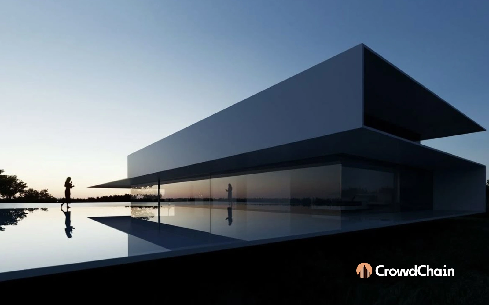
Real estate has always felt like a "closed-door" club. When I started on CrowdChain, the mission was clear: break those doors down. We were building a marketplace that allows someone to buy an entire building or just a 5% stake in one. My job was to create a visual identity that felt as secure as a deed but as accessible as a mobile app.
Exploration: The Three Houses
Early on, I played with a literal interpretation, three connected houses. I wanted to show "community" and "linked assets." It was friendly and approachable, but it felt a bit too much like a neighborhood HOA or a standard realtor's business card. It lacked the "Chain" element, the sense of a high-tech, fractional investment engine.
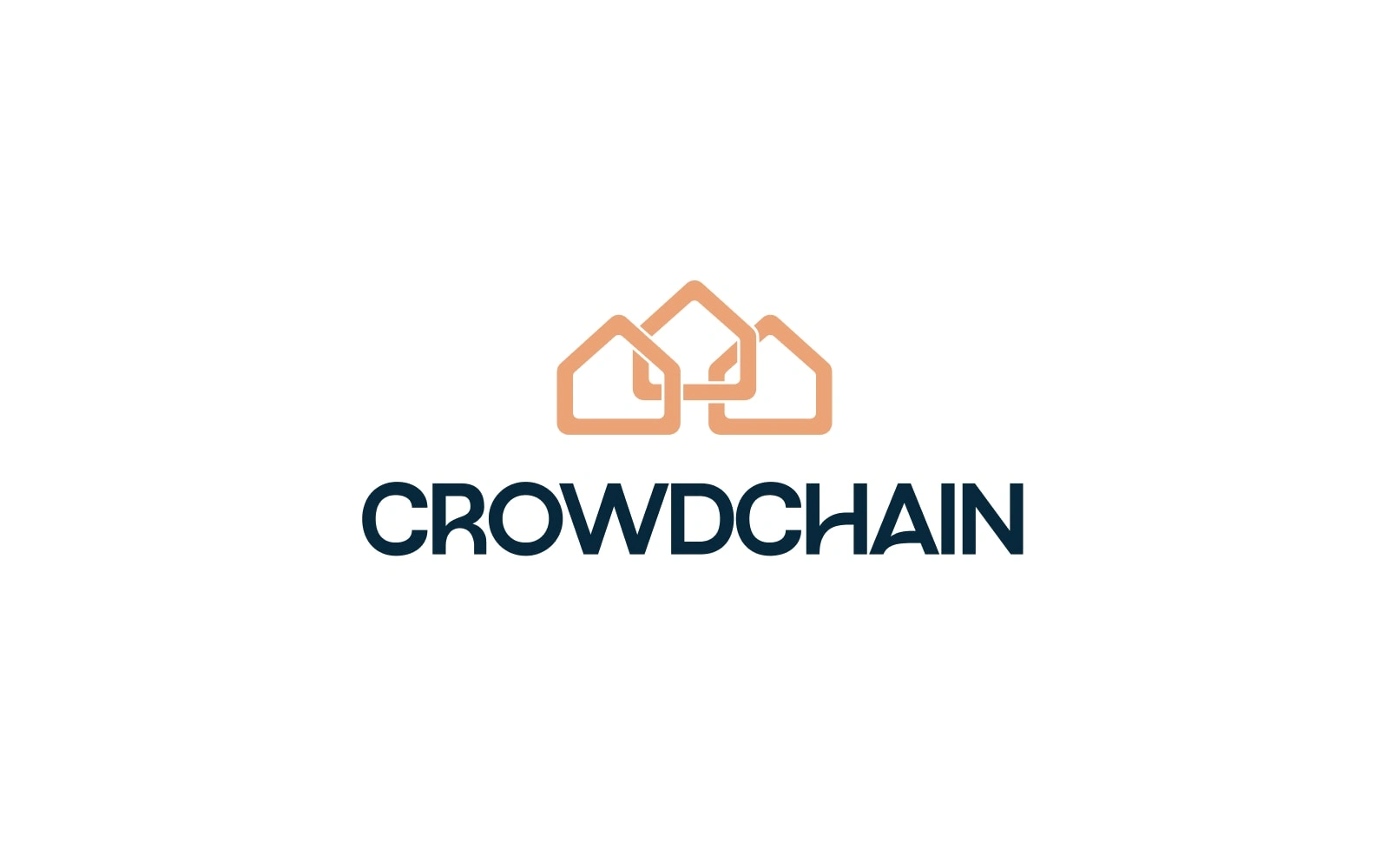
The Pivot
I realized that CrowdChain isn't just about houses; it’s about growth and layers. I pivoted away from literal rooftops toward an abstract "rising" silhouette. I moved to a bar-chart motif that doubles as a skyscraper. This shift allowed the brand to speak to both the person renting a home and the investor tracking their percentage-based portfolio.
The System I Shipped
I delivered a lean, high-impact brand system designed for trust.
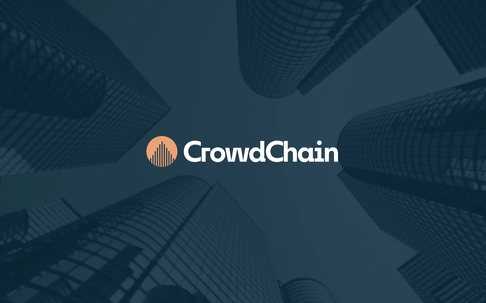
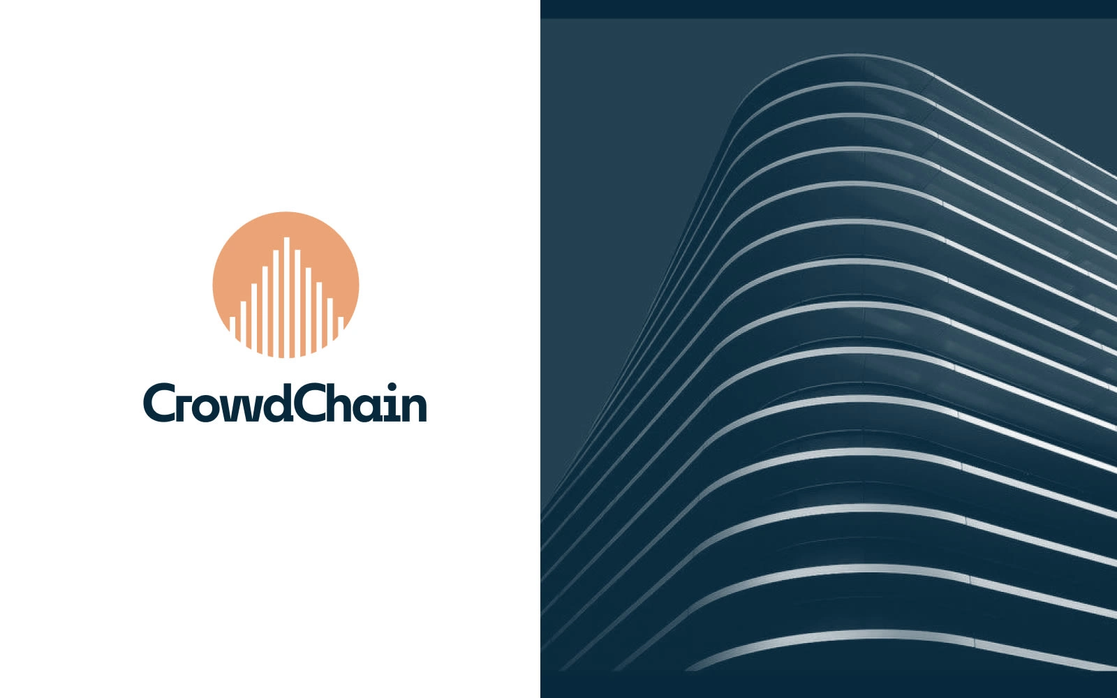
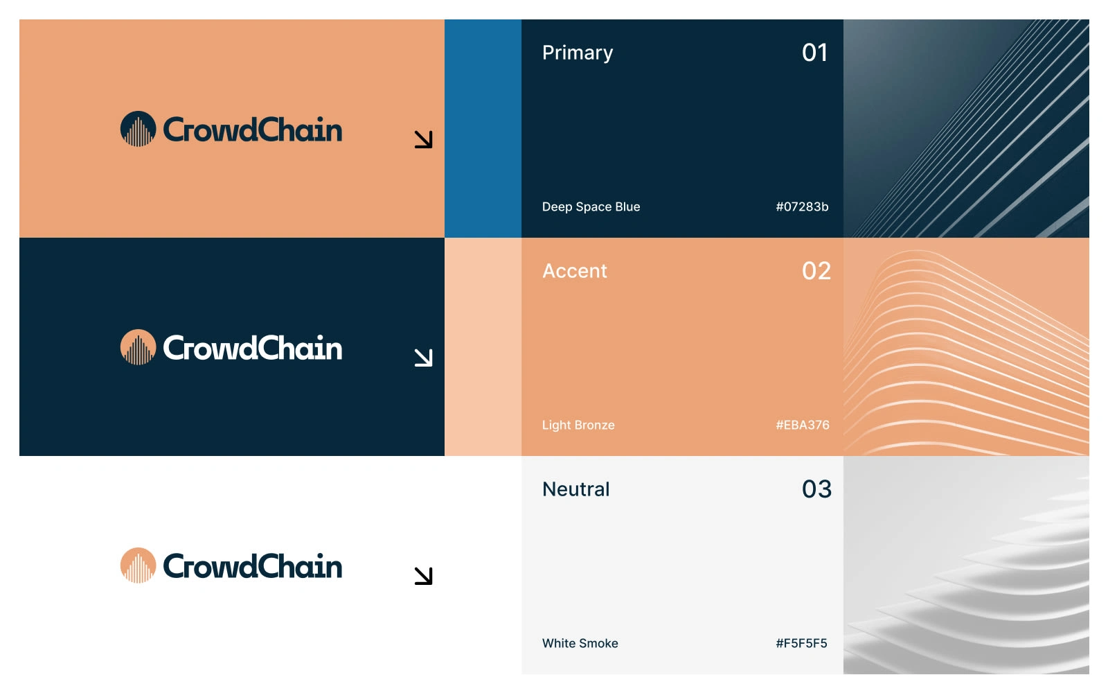
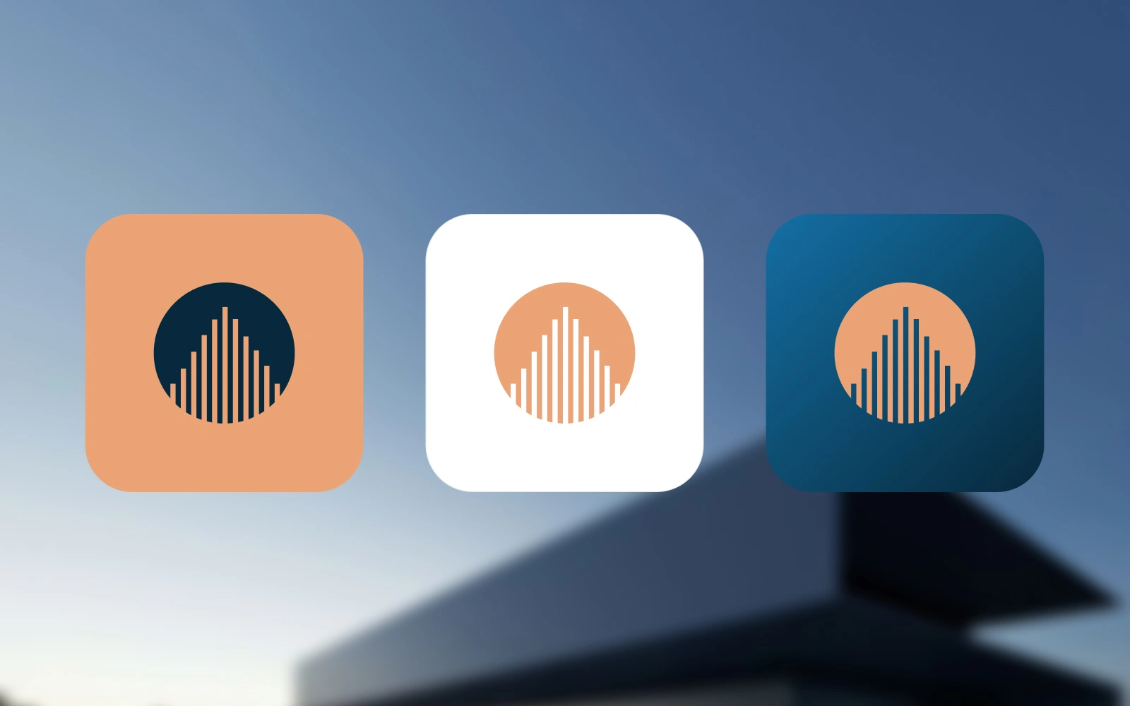
Primary Assets: A centered "Sun & Structure" logo. The navy background (#002133) provides the "bank-level" security feel, while the peach/terracotta (#F5A97F) adds a modern, human warmth.
Usage Rules: The logo must always have a "safe zone" equal to the width of the central bar. No gradients, solid colors only to maintain legibility on property signage.
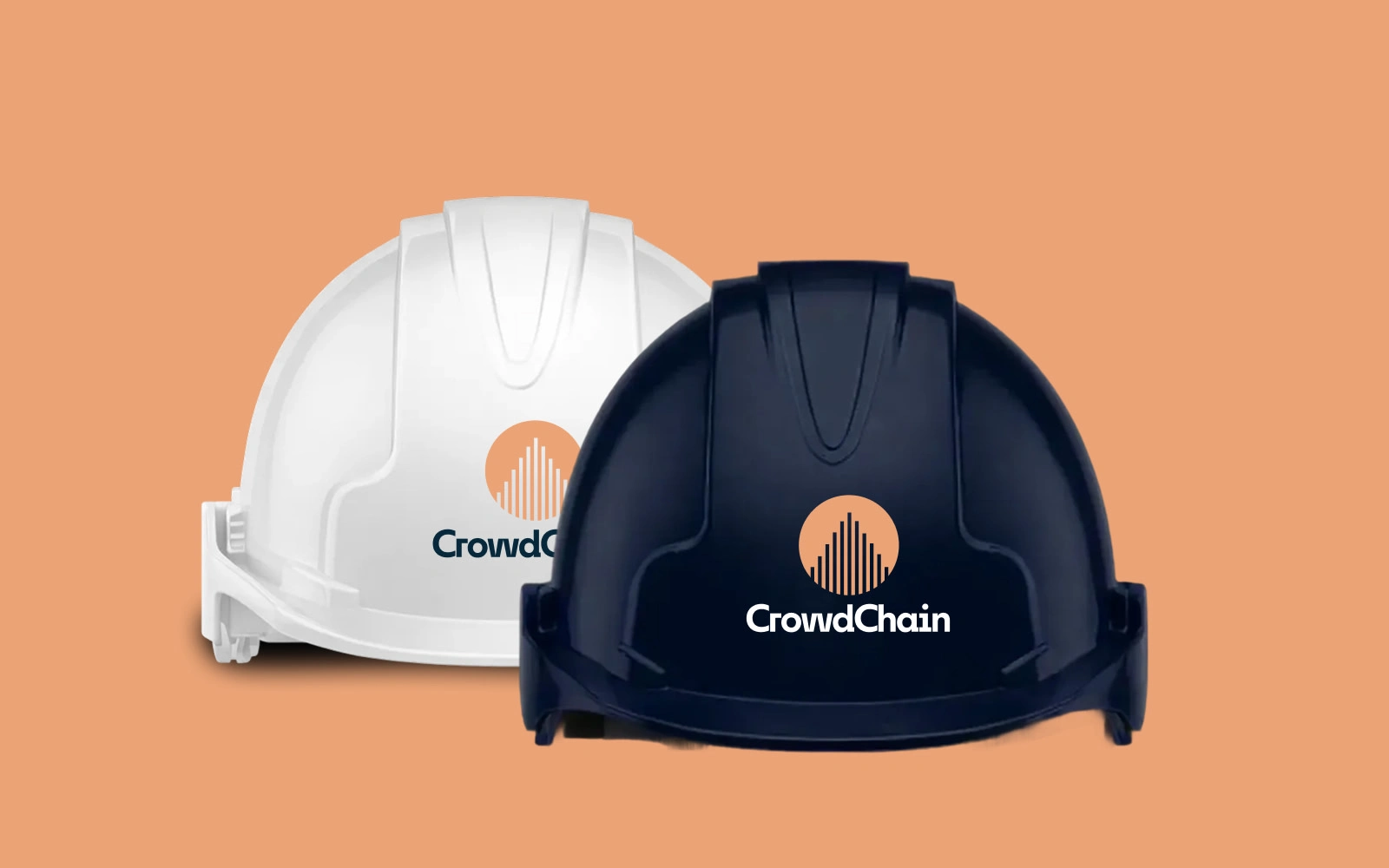
Product Placement: On the landing page, the logo sits top-left as a seal of approval. For fractional listings, I designed a "Verified" badge using the same bar-motif to show the property has passed Admin review.
Guidelines: Typography is bold and high-contrast (White on Navy) to ensure that CTAs like "Invest 5%" or "Book Visit" are impossible to miss.
Process Notes
I spent a lot of time perfecting the spacing between the vertical bars. If they were too close, the logo blurred at small sizes (like a mobile favicon); too far apart, and it lost the "building" silhouette. I settled on a mathematical progression where the bars peak in the center, creating a focal point that draws the eye upward.
Outcome
The final identity feels institutional yet innovative. We successfully launched a platform where a "Buy" button and an "Invest" button live side-by-side without confusing the user. The logo acts as a bridge between the physical world (buildings) and the digital world (fractional ownership).
What I’m Proud Of
I’m most proud of the balance. Real estate branding is usually either very "boring corporate" or "flashy crypto." I managed to find a middle ground—a mark that looks just as good on a legal document as it does on a smartphone app.
Deliverables
Brand Mark: High-resolution SVG and PNG exports.
Color Profile: A digital-first palette (Hex/RGB) optimized for web accessibility.
UI Components: Custom iconography for "Land," "Building," and "Fractional" categories.
Mini Style Guide: A one-pager covering logo spacing and typography.
Like this project
Posted Feb 24, 2026
Developed a high-impact brand identity for CrowdChain using innovative visual elements.
Likes
1
Views
1