What improved most in this

Juan Amisano

What improved most in this homepage redesign?
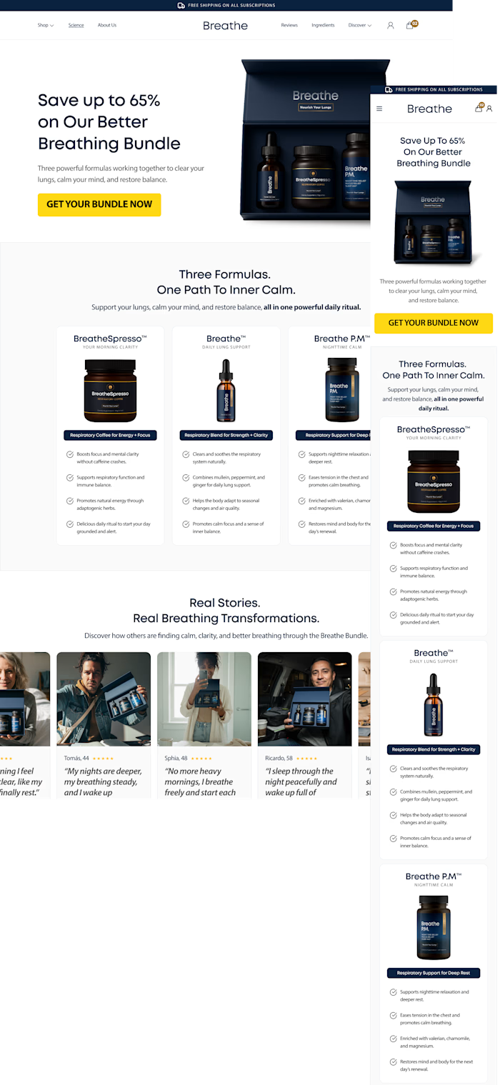
Trying to simplify the experience, improve product clarity, create stronger visual hierarchy, and make the entire journey feel more premium and conversion-focused.
Main focus:
• cleaner structure
• better spacing & hierarchy
• mobile-first UX
• improved product presentation
• stronger CTA visibility
• more premium visual direction
• reduced cognitive overload
• clearer trust & value communication
Curious which direction feels stronger to you visually and from a UX perspective.
Like this project
Posted May 12, 2026
What improved most in this homepage redesign? Trying to simplify the experience, improve product clarity, create stronger visual hierarchy, and make the enti...
Likes
0
Views
2