Samaritan House Geelong • Winter Appeal Brochure Design
Kirraley Hardiman
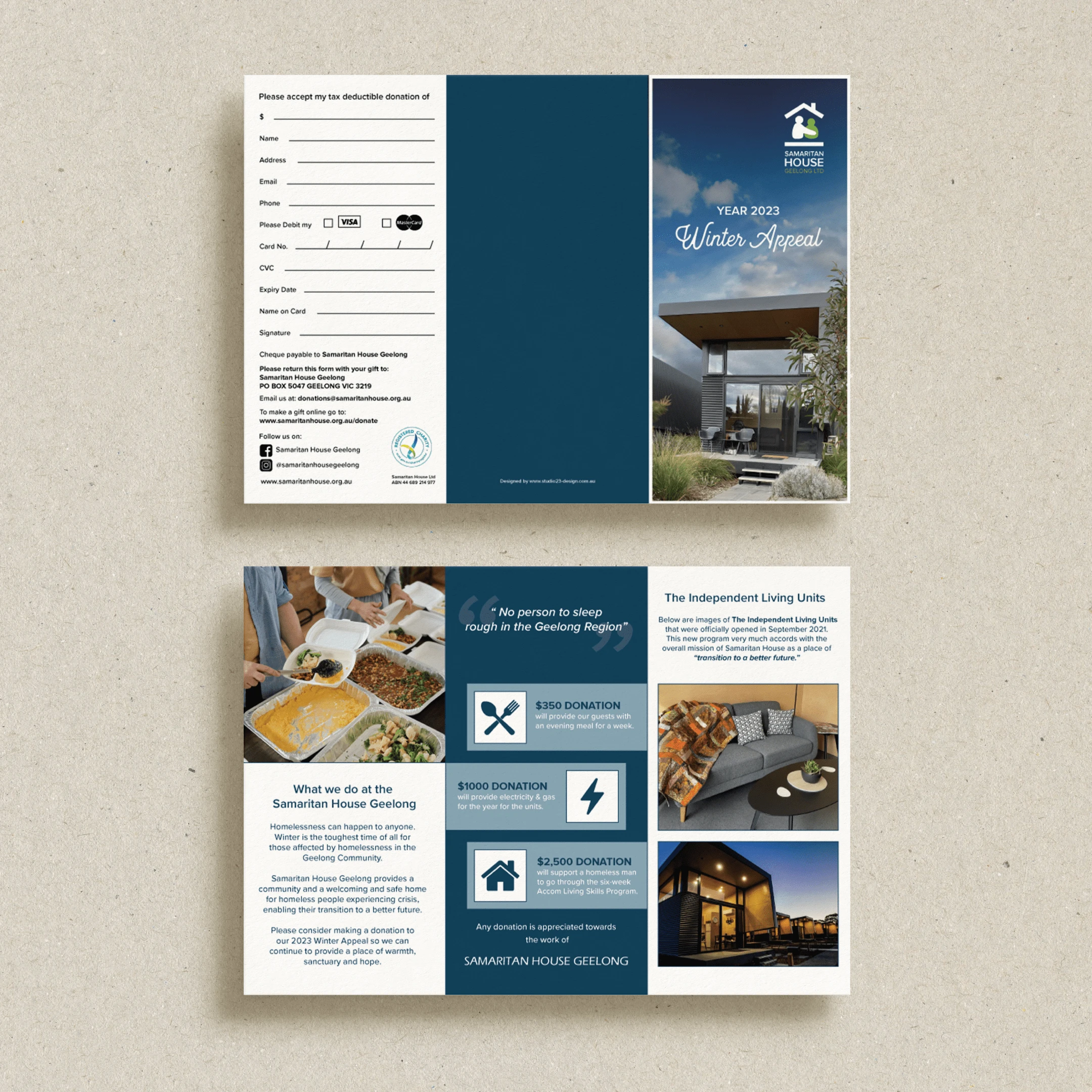
A not-for-profit dedicated to providing shelter, dignity, and pathways forward for men experiencing homelessness, Samaritan House Geelong launched their Winter Appeal to call on community support during the most vulnerable months of the year. This brochure was designed to communicate their mission with clarity and compassion, encouraging donations that directly impact lives.
Project Brief:
Blue
Clean
Trustworthy
Purposeful
Deliverables:
Brochure
Design Notes:
• A calm, structured layout designed to build trust while guiding the reader through the organisation’s impact and donation options.
• Rich navy and soft neutral tones reflect warmth, stability, and professionalism, echoing the safe haven Samaritan House provides.
• Emotive imagery and intentional whitespace offer a balance of urgency and dignity, highlighting the real stories behind the cause.
• Clear call-to-action elements make it easy for donors to engage, while reinforcing the message: “No person to sleep rough in the Geelong region.”
Like this project
Posted Jul 31, 2025
Designed a brochure for Samaritan House Geelong's Winter Appeal to encourage donations.
Likes
0
Views
1
Timeline
May 1, 2023 - May 8, 2023