Landing Page Design with Elementor, Single Page Website design
Project Goals:
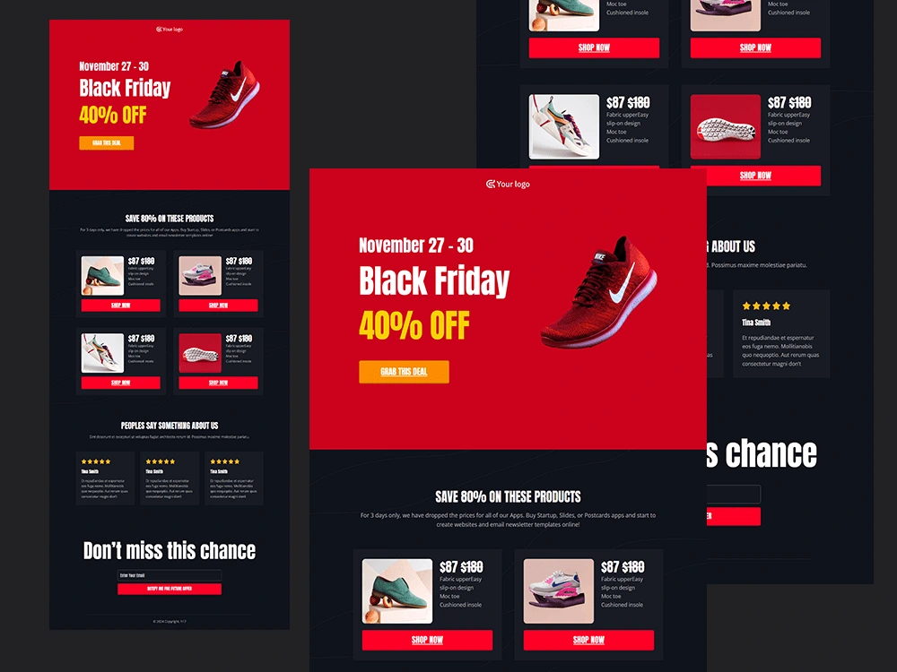
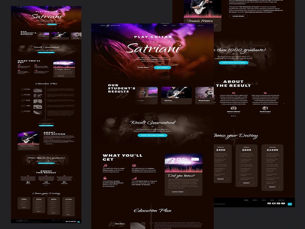
The goal was to create a high-converting, visually appealing single-page website or landing page using Elementor. The client wanted to highlight their product/service, provide an intuitive user experience, and drive conversions (sign-ups, purchases, inquiries). The landing page needed to be responsive, optimized for performance, and aligned with the client’s brand identity.
Solution:
I used Elementor, a popular page builder plugin for WordPress, to design and develop the landing page. The following steps were followed to create a functional, aesthetically pleasing, and conversion-optimized single-page website:
Discovery & Goal Setting:
I started by understanding the client’s objectives, target audience, and the desired outcome of the landing page. Whether the goal was to collect leads, sell a product, or promote a service, I clarified key messaging, branding, and design preferences to create a tailored plan.
Wireframing & Layout Design:
Based on the goals, I created a wireframe to outline the layout, ensuring a seamless user experience. I defined key sections such as the hero section, features/benefits, testimonials, call-to-action (CTA), and contact form. Each section was strategically placed to guide users through the content smoothly.
Elementor Setup & Customization:
Using Elementor, I set up the page’s structure. Elementor’s drag-and-drop interface allowed for precise control over the design, including typography, spacing, and colors. I customized pre-built templates for maximum design flexibility and ensured each element was responsive and aligned with the brand’s identity.
Engaging Hero Section:
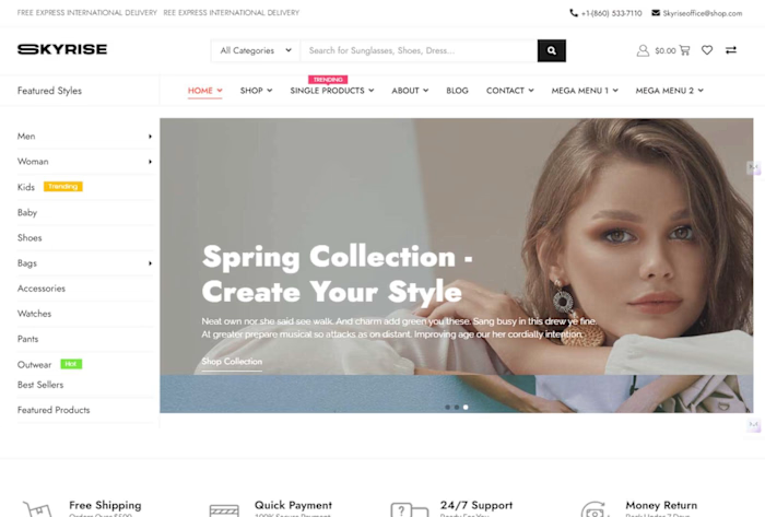
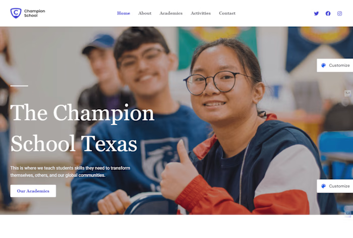
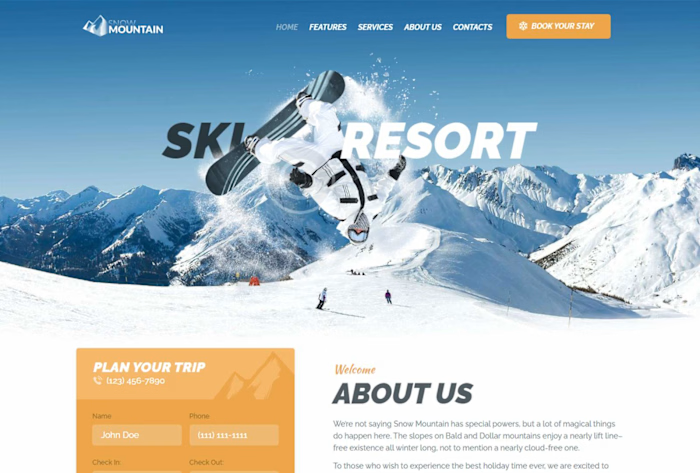
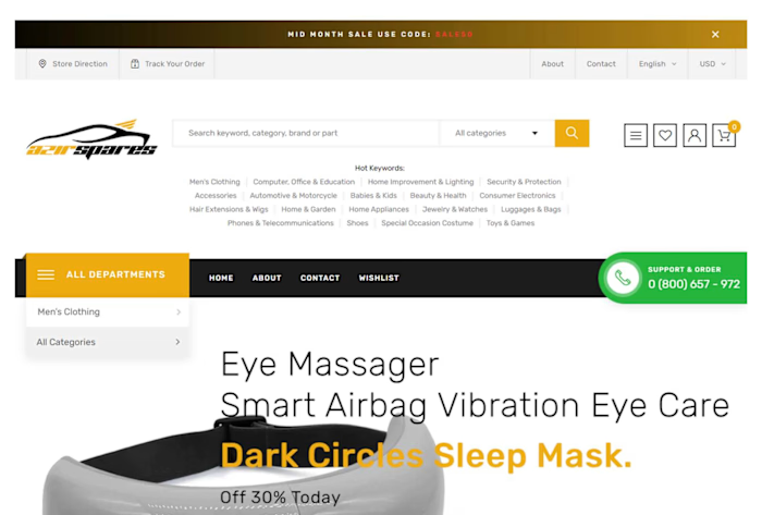
The hero section, which is the first thing users see, was designed with a strong headline, compelling subheading, and a clear call-to-action button. High-quality imagery or video was used to instantly engage visitors and communicate the value proposition.
Compelling Content:
I crafted persuasive content to highlight the benefits and features of the product or service. Short, impactful paragraphs and bullet points made it easy for users to scan the information. The page was kept concise, focusing on what the visitor needed to know to take action.
CTA Optimization:
Multiple calls-to-action (CTAs) were strategically placed throughout the page to guide visitors towards conversion. Whether it was a sign-up form, purchase button, or inquiry submission, the CTAs were clear and prominent, making it easy for users to take the next step.
Social Proof & Testimonials:
I included sections for testimonials, case studies, or logos of trusted brands/clients to build credibility and trust. Positive reviews and customer success stories were showcased to influence purchasing or sign-up decisions.
Responsive Design:
Using Elementor’s responsive design features, I ensured the landing page looked great on all devices—desktop, tablet, and mobile. All text, images, and buttons were optimized to maintain functionality and visual appeal on smaller screens.
Performance Optimization:
To ensure fast load times, I optimized images, utilized lazy loading for heavy content, and reduced unnecessary scripts. Elementor’s clean code and performance settings helped ensure the landing page loads quickly, improving user experience and SEO.
SEO Optimization:
I optimized the landing page for search engines by configuring SEO-friendly URLs, adding meta titles and descriptions, and using proper header tags. This improved the page’s chances of ranking well for relevant search terms, driving organic traffic.
Testing & Quality Assurance:
I tested the landing page across multiple browsers and devices to ensure compatibility and smooth performance. I also ran a series of tests on forms, CTAs, and links to ensure everything worked as expected before the launch.
Launch & Post-Launch Support:
After final approval, I launched the landing page and provided post-launch support. This included monitoring the page’s performance, ensuring everything was functioning correctly, and making any necessary adjustments.
Impact:
The final landing page had a significant impact on the client’s business:
Increased Conversion Rate:
The clean, professional design, coupled with a strong CTA and persuasive content, led to a higher conversion rate, whether for leads, sign-ups, or purchases. The design helped keep visitors engaged and encouraged them to take the desired action.
Brand Consistency:
The landing page design aligned with the client’s overall brand identity, reinforcing their messaging and values. It helped improve brand recognition and gave a professional, trustworthy impression to visitors.
Mobile-Friendly:
With a responsive design, the page functioned flawlessly on mobile devices, offering a smooth and engaging experience for mobile users, which increased time spent on the page and reduced bounce rates.
Faster Load Times:
The performance optimization ensured that the page loaded quickly, leading to a better user experience and a reduced likelihood of visitors leaving due to slow page speeds.
Higher Search Rankings:
The SEO optimization helped the page rank better on search engines, leading to more organic traffic and increased visibility for the client’s offering.
Summary:
The Landing Page Design with Elementor for a Single Page Website provided a high-converting, visually appealing, and mobile-responsive page that successfully met the client’s goals. By focusing on design, content strategy, optimization, and conversion elements, the project achieved significant results in terms of user engagement, conversion, and brand presence.

Like this project
Posted Oct 12, 2024
Designed a high-converting landing page using Elementor, optimizing user experience, mobile responsiveness, and clear calls to action for increased conversions.

