Built with Framer
LiveFlow FP&A website design and Framer development
Approve request to show earnings
View

Jithin Kumar
Verified


LiveFlow
LiveFlow is a Y Combinator W21 company that announced a $13.5 million Series A led by Valar Ventures in September 2024.
For our 2025 website project, the challenge was to make its FP&A product easier to understand. Finance teams needed to see what it does, which problems it solves and how it works with their existing systems.
We designed the marketing website in Figma and built it in Framer. Our scope covered the FP&A website and its interactions, not Flow ERP or the underlying finance application.
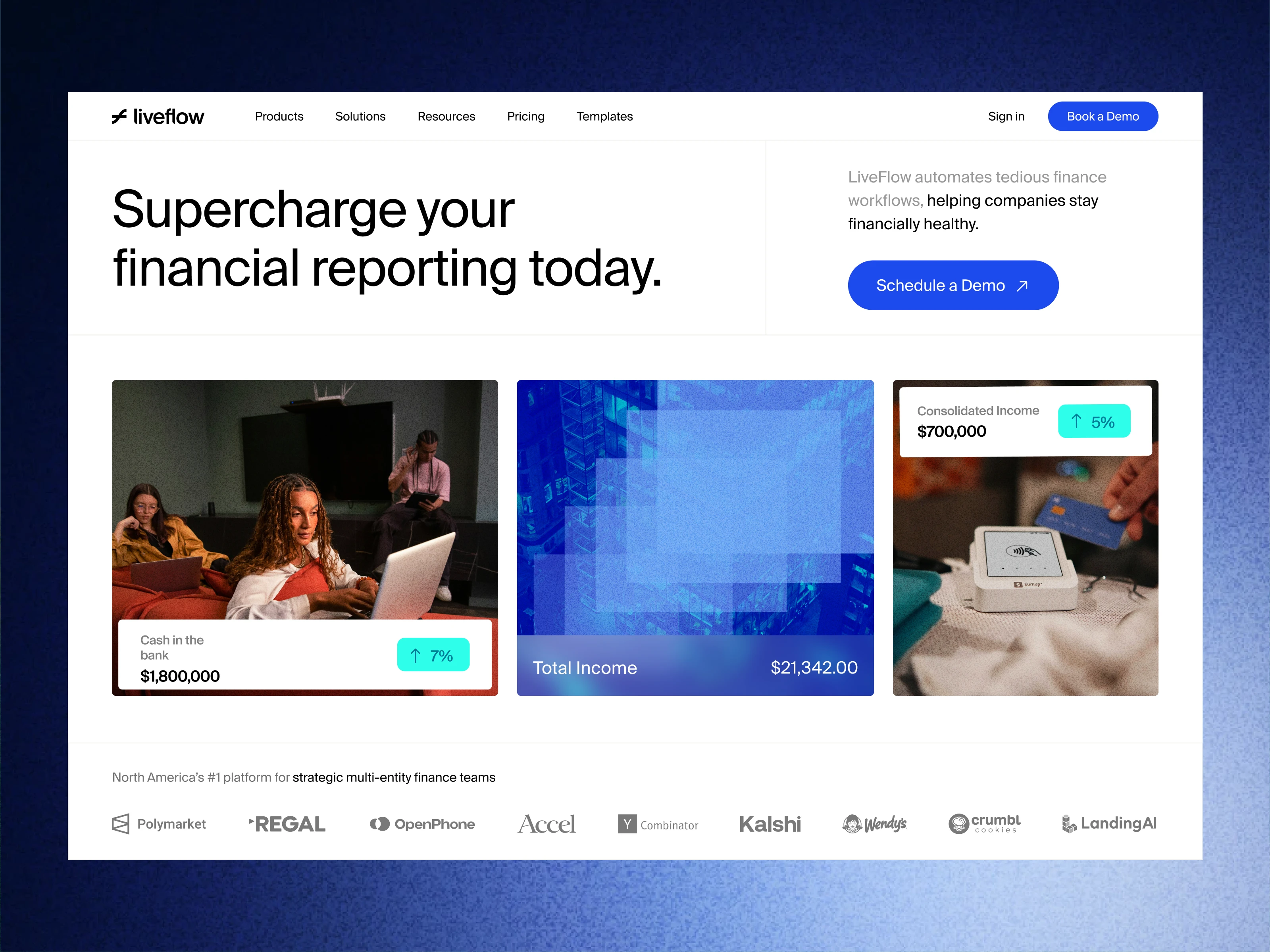
Show where the product fits
The site explains how LiveFlow supports financial reporting in Excel and Google Sheets, account consolidation and budgeting. It also answers an important buying question: teams can use the FP&A product without replacing their existing ERP.
Connect the product to the buyer's needs
Industry sections cover construction, healthcare, food and beverage, and retail. Each connects the software to a specific business need. For construction teams, that includes job costing and reporting across projects.
This gives visitors a relevant starting point instead of asking everyone to work through the same feature list.
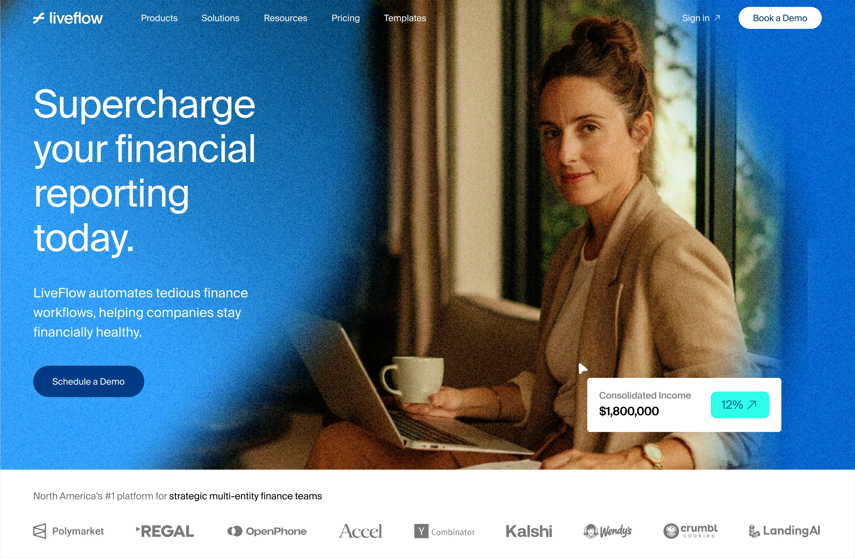
Make the details easier to follow
We used navy, blue and white across the layouts, with product illustrations and financial UI details beside the written explanations.
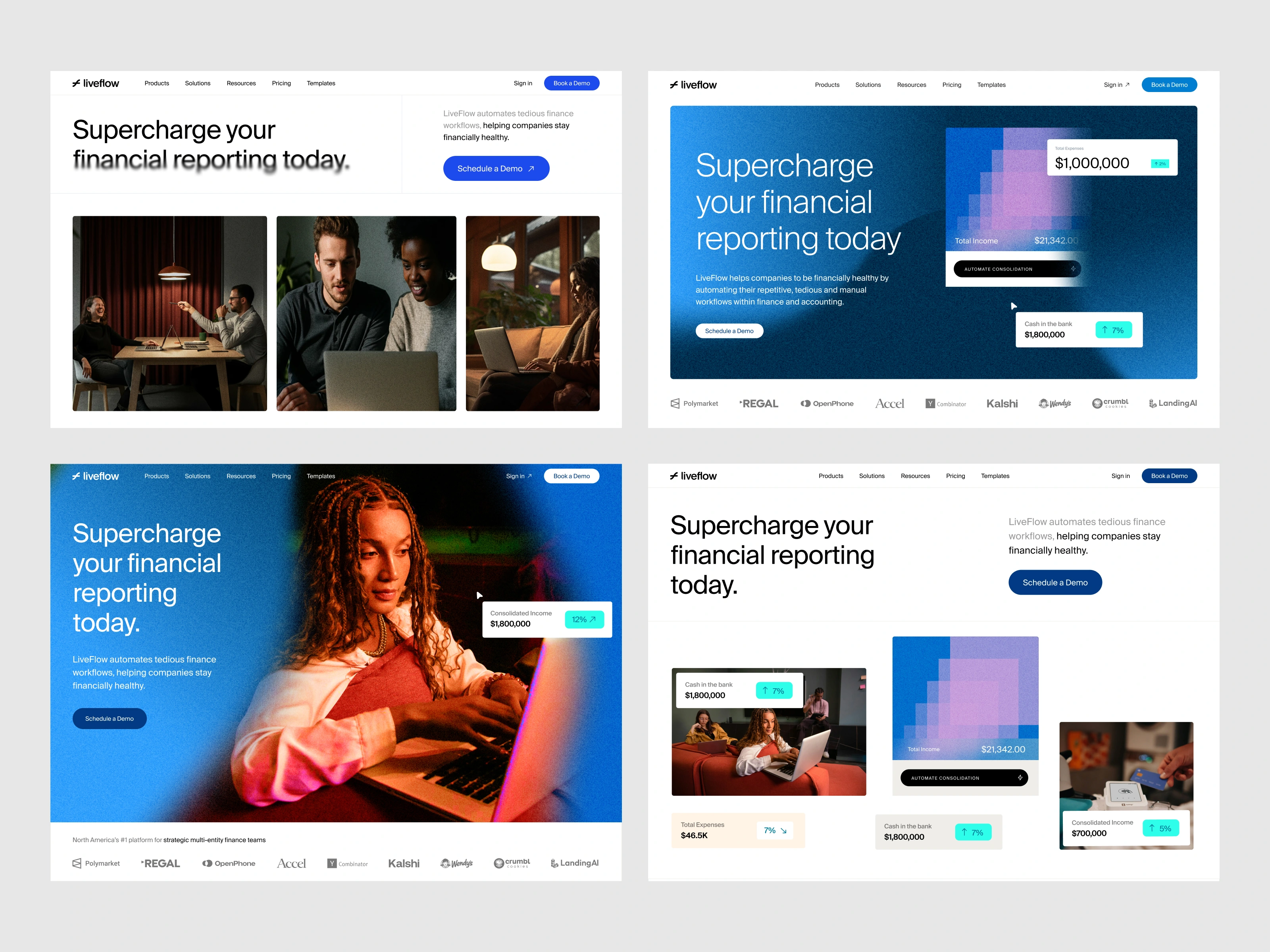
Hero Explorations
Customer logos support the product story. Demo calls to action give interested buyers a next step. Scroll reveals and hover states add movement to the Framer build.
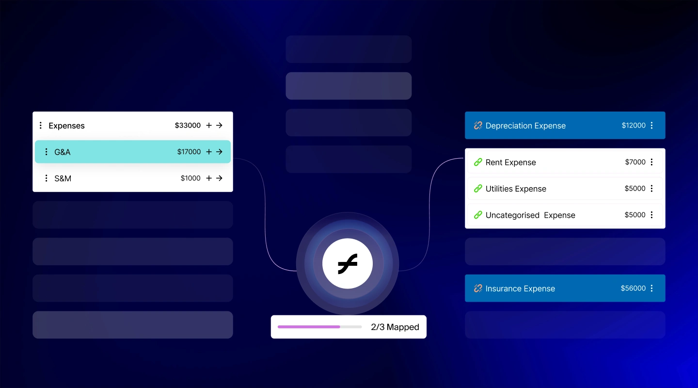
Graphics Design For Sections
The image labelled "Hero Explorations" shows alternative designs considered during the project, rather than presenting every variation as part of the live website.
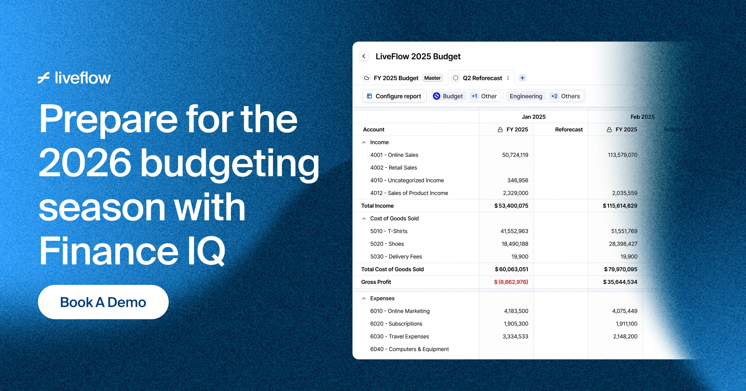
Website Cover Design
What we delivered
We delivered the FP&A marketing website in Framer, including industry sections, product visuals and interactions, following the design work in Figma.
Need a website that explains a finance or SaaS product? Send us your current site, the scope you have in mind and your target launch date on Contra.
Like this project
Posted May 18, 2026
We designed and built LiveFlow's FP&A marketing website in Figma and Framer, explaining its reporting, consolidation and budgeting tools.
Likes
0
Views
49
Timeline
Jun 26, 2025 - Sep 17, 2025
Clients
LiveFlow