E-commerce for jewelry shop Tellme

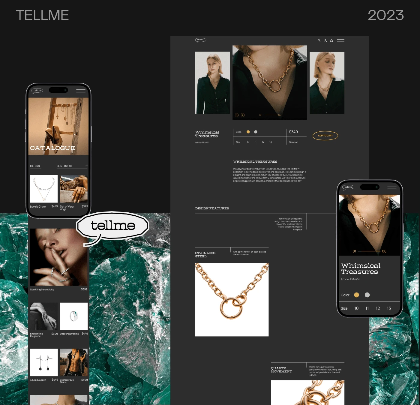
Before designing the website, I carefully considered the client's preferences and agreed upon a simple, minimalist approach with a prominent layout. The website showcases vibrant photos and videos against a serene graphic backdrop, ensuring a captivating visual experience.
In order to stand out among the multitude of online jewelry stores that typically use light shades, I opted for a sophisticated dark gray tone with accents of the brand's distinctive yellow color.
Watch a full case on a Behance↓
Like this project
Posted Oct 2, 2023
Tellme is an innovative jewelry brand that offers stylish and versatile jewelry featuring large diamonds, perfect for any occasion.


