Helping Docswell go from MVP-level idea to a public launch
Helping Docswell go from MVP-level idea to a fully fledged public launch as the solo designer in the team
Docswell (now Therasee) is a B2B company aimed at helping mental health clinics digitize their operations. I worked as the solo designer helping them go from 0 → 1.
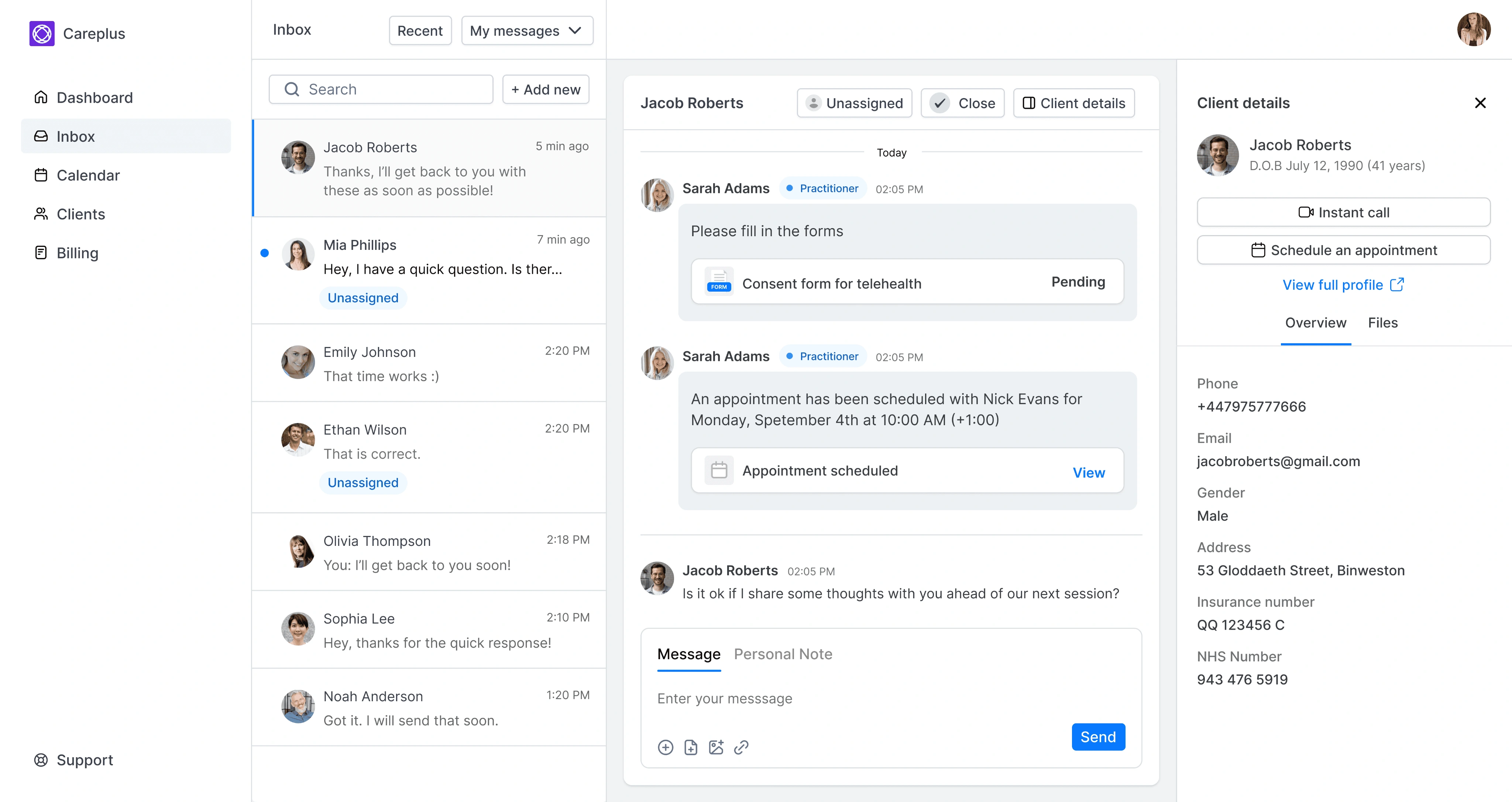
Overview
Docswell is a practice-management service that helps medical clinics digitize their workflow using a practice and a client portal.
I was tasked with redesigning the entire portal to make sure it is ready for actual users and potential future investors.
There was an initial design created without much emphasis on the user experience. Following the green light to spend resources to build a fully-fledged product, the company decided to hire a product designer to help with design.
Results
Successfully converted an MVP-level idea into a customer-ready web application. The product was initially launched to test users and is now live for public with a new branding (Therasee)
Design process
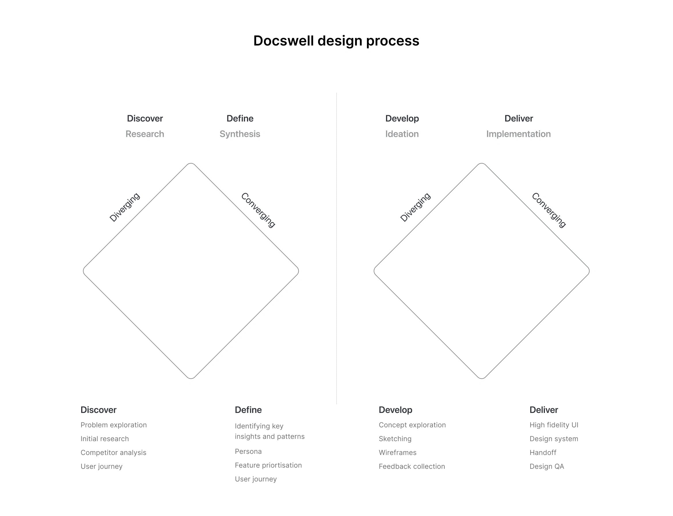
At Docswell we based our process on the Double Diamond concept. We wanted to make sure we understand the problem, ideate the proper solutions and create a visually-appealing product.
Understanding the problem
At first, I wanted to understand the problem space I'm working on. Both in terms of the user needs and also specific company needs for the revised portal.
We kicked off this stage by conducting UX discovery workshops. This included conducting user interviews with clinic managers and potential patients.
I used affinity mapping to group the insights we recorded into common themes.
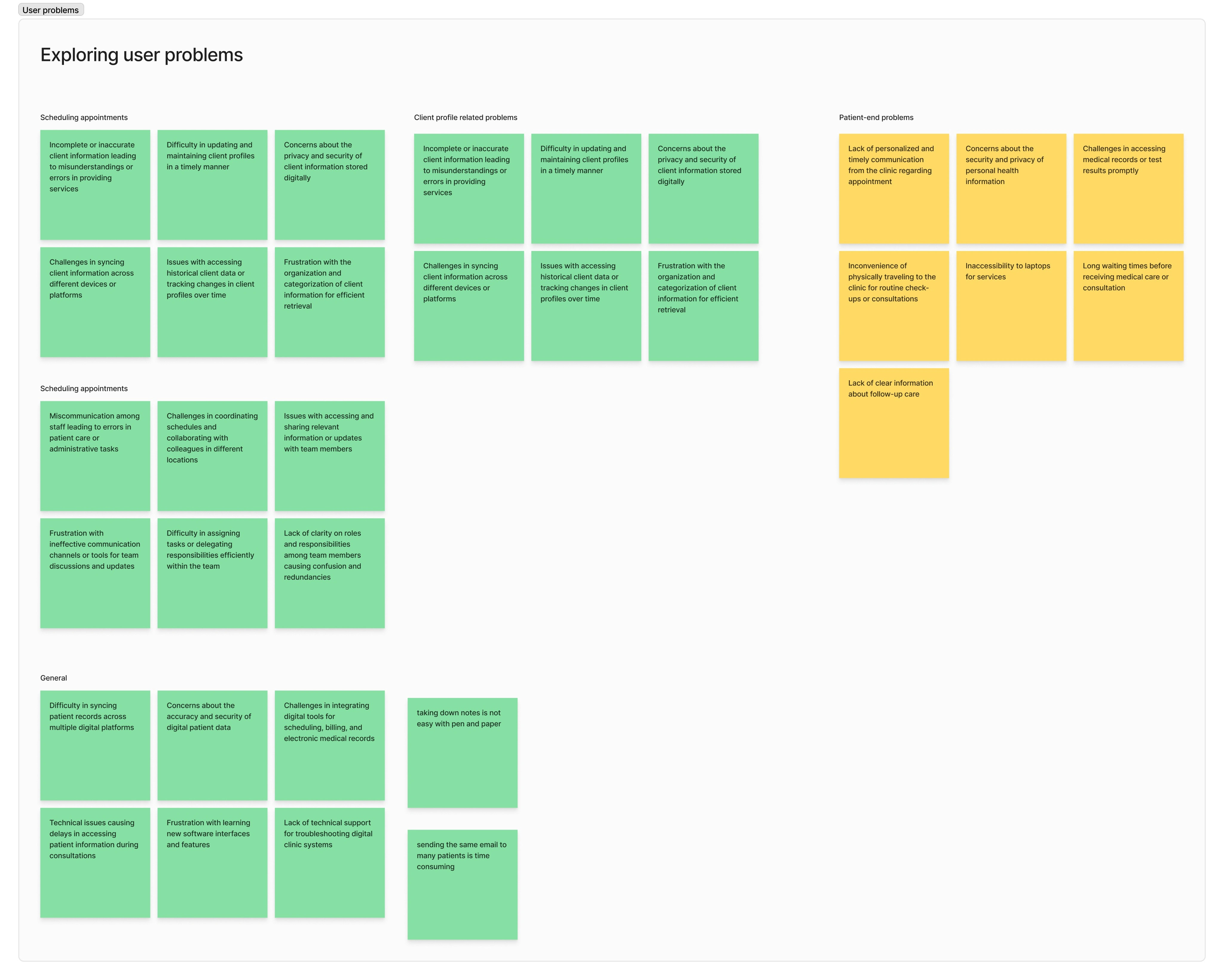
Problem:
"Clinicians have to jump across multiple platforms to manage the patients full journey. This uses up a lot of time and makes for a tedious workflow".
This gave us a broader problem to work with. We were then able to identify the clinician's individual pain points when it comes to digitizing their workflow.
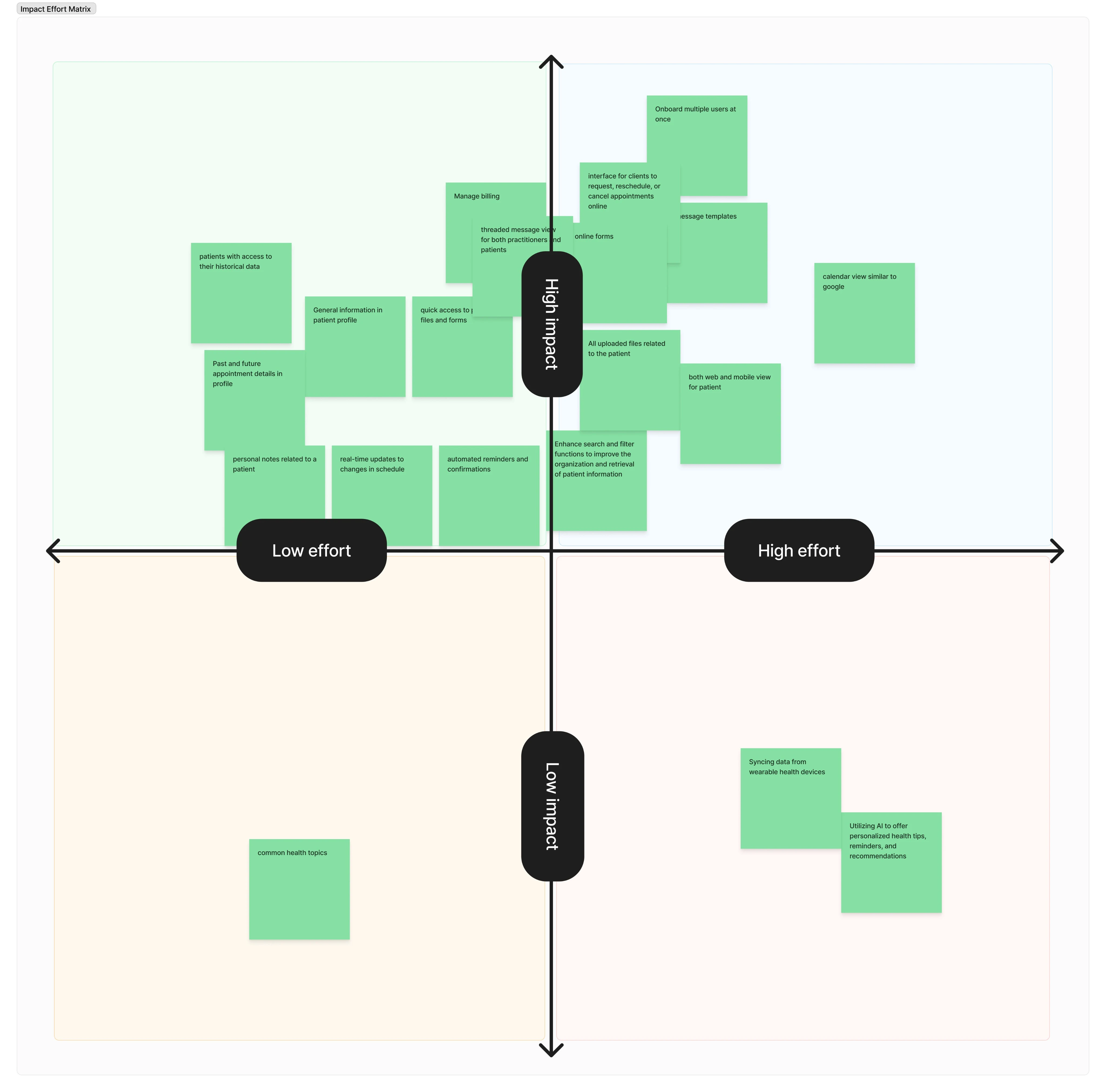
Once the we had a good idea about the user problems, the team then started brainstorming on feature ideas that could be used to address these problems.
We then priortized the features using an impact - effort matrix.
Wireframing solutions
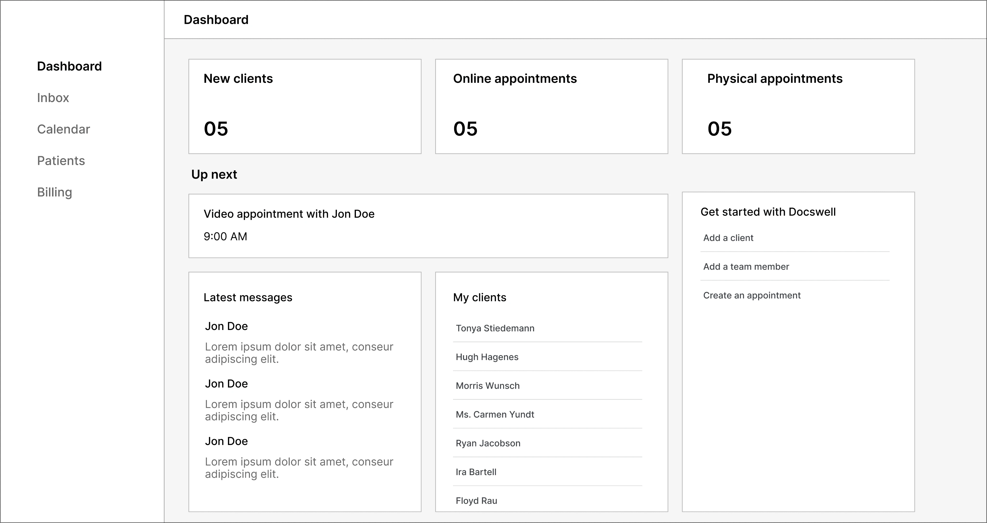
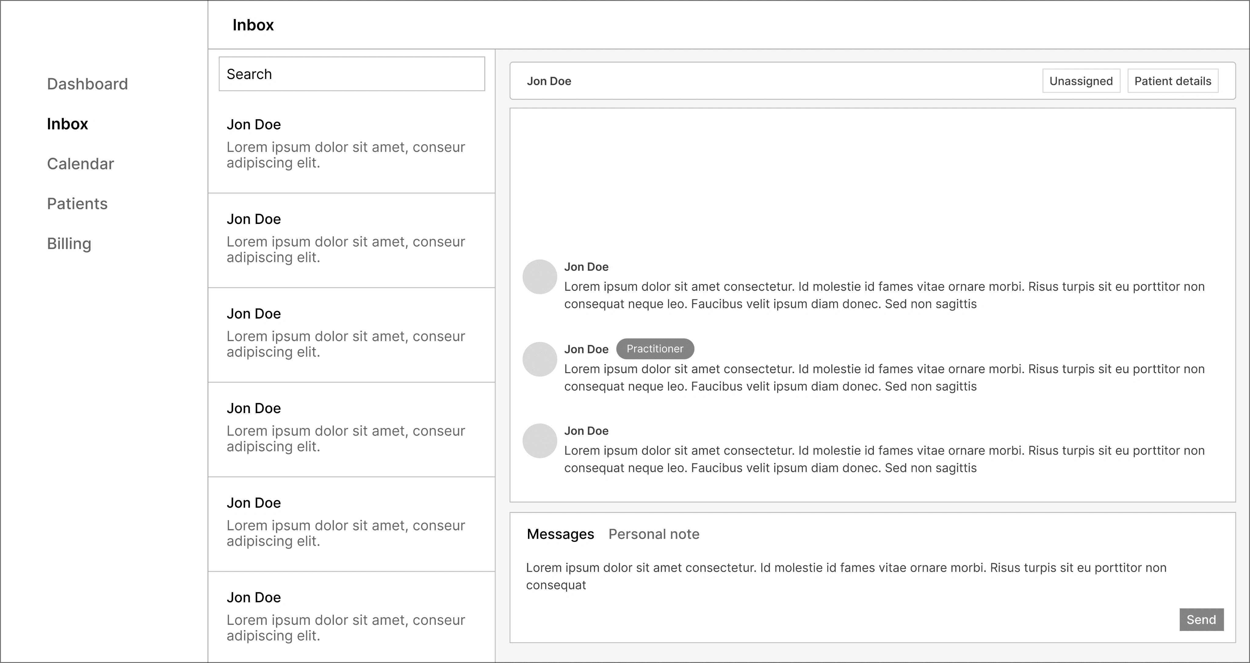
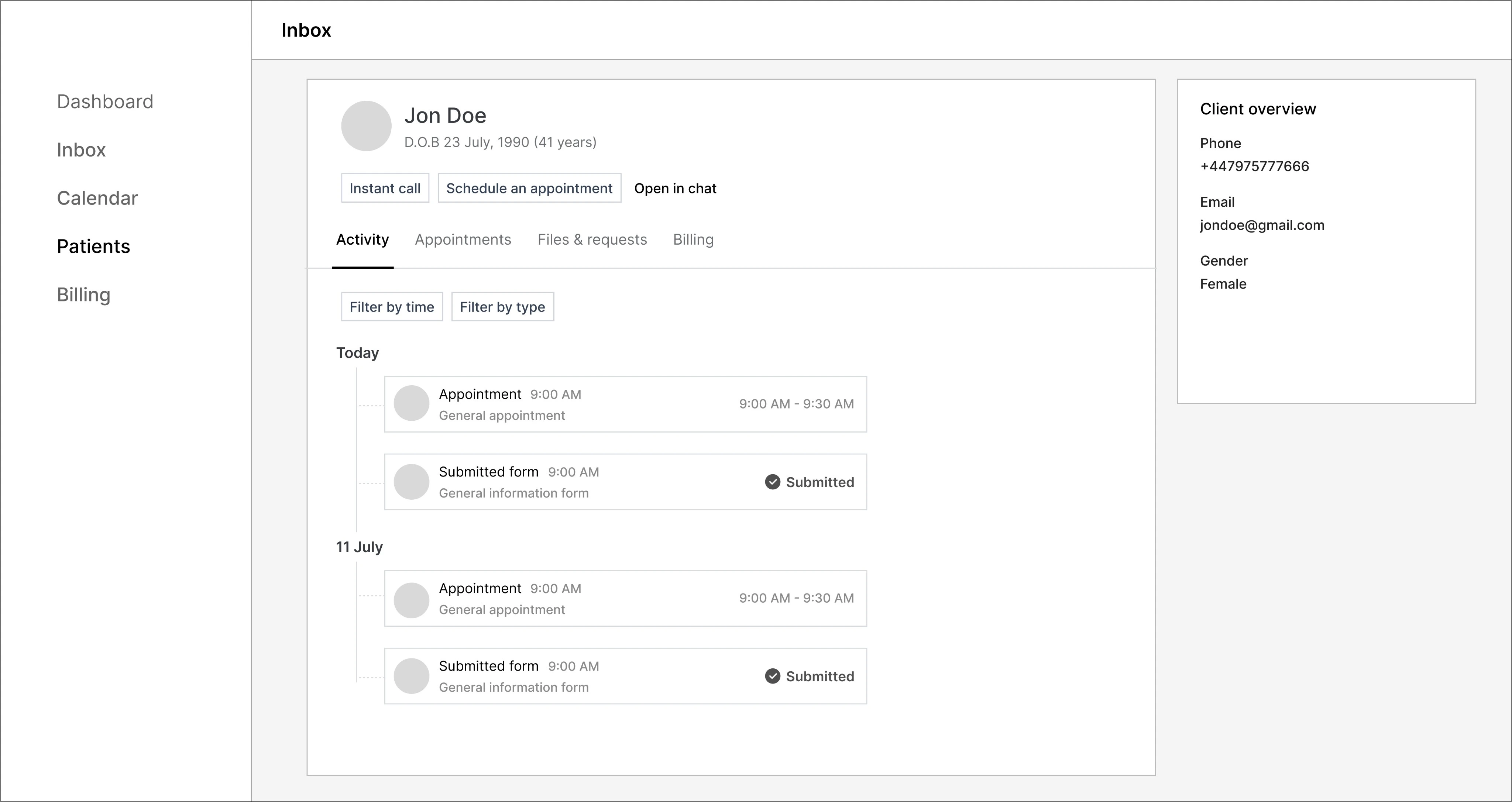
Based on the identified user problems and the feature exploration, I started wireframing some solutions to gather some early feedback before committing to a fully-fledged UI and design system.
Final UIs
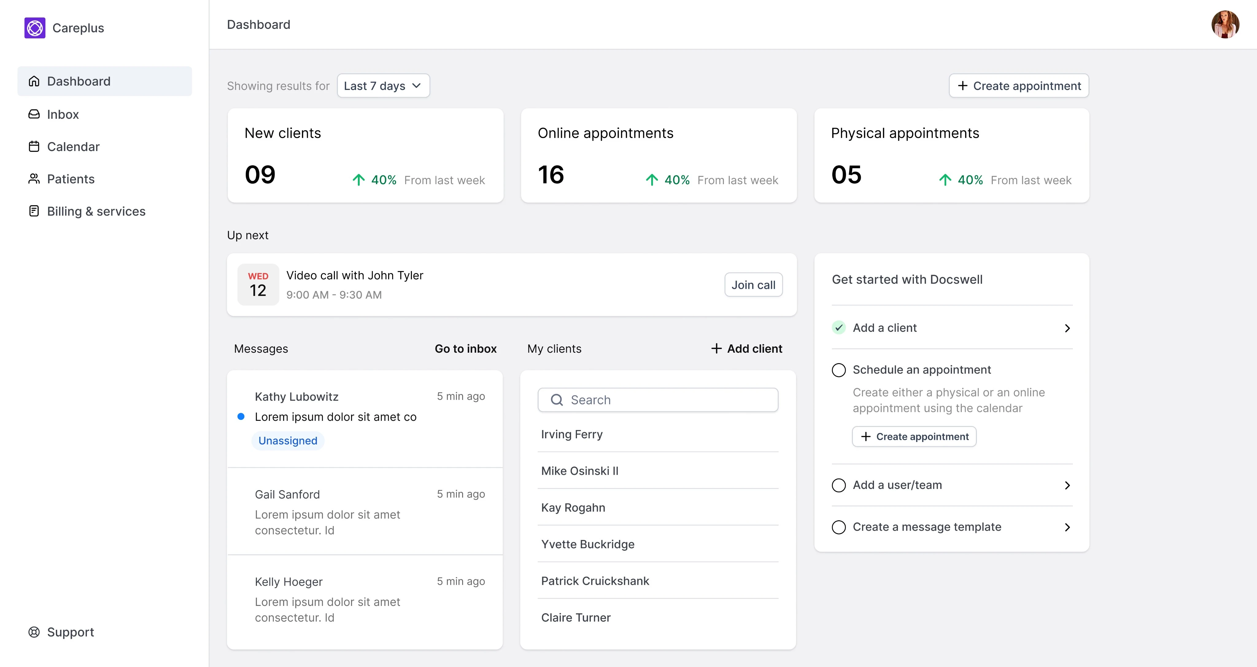
I created high-fidelity mockups in Figma while making sure I collaborated closely with the engineers in the team.
I made sure to engage with me to show places that require more designs or decide when we have to make some compromises.
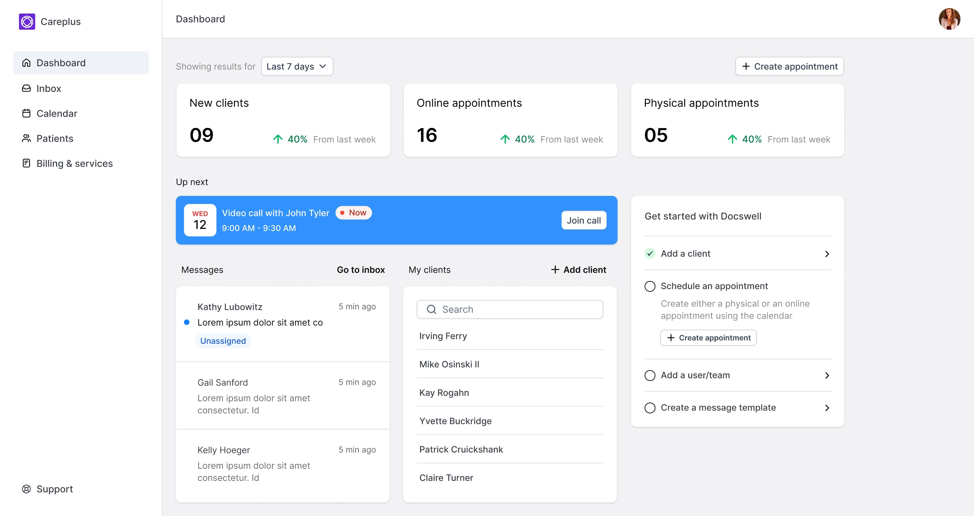
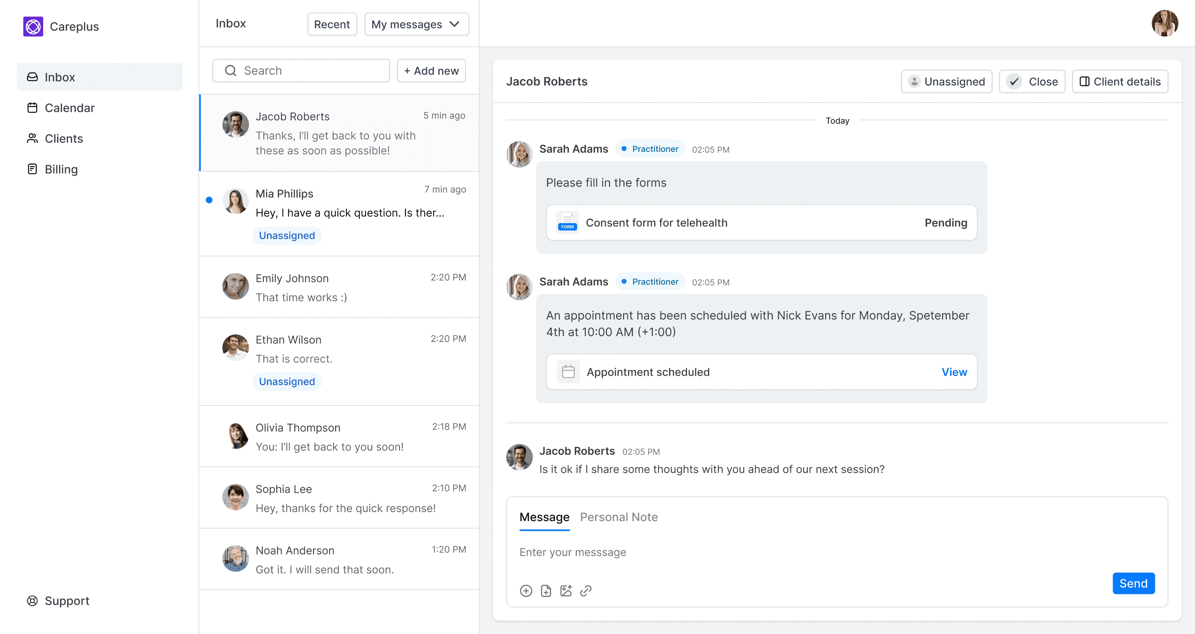
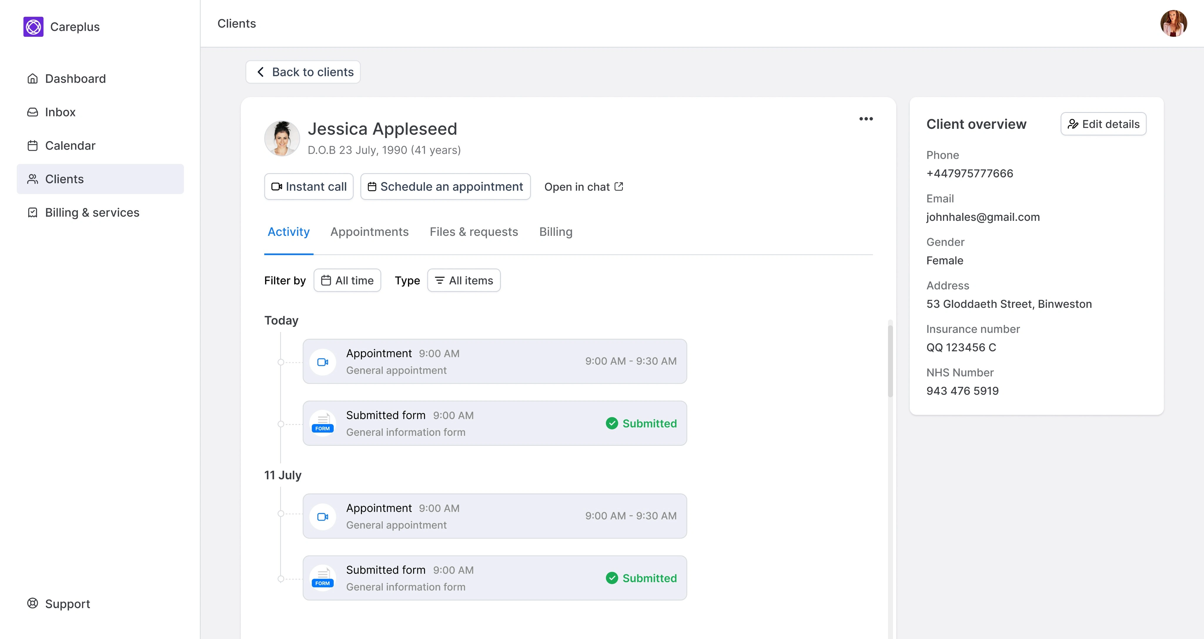
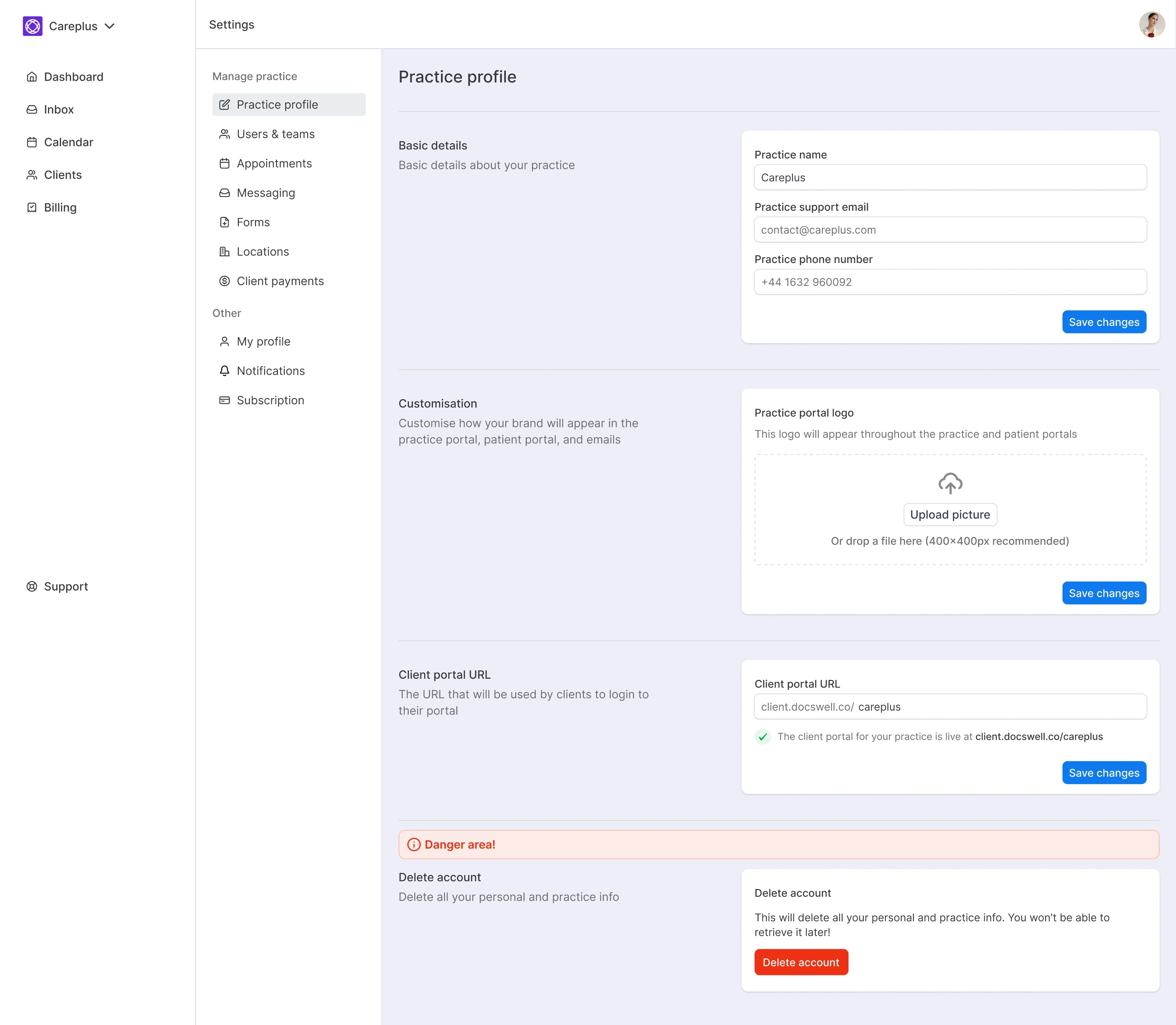
Design system
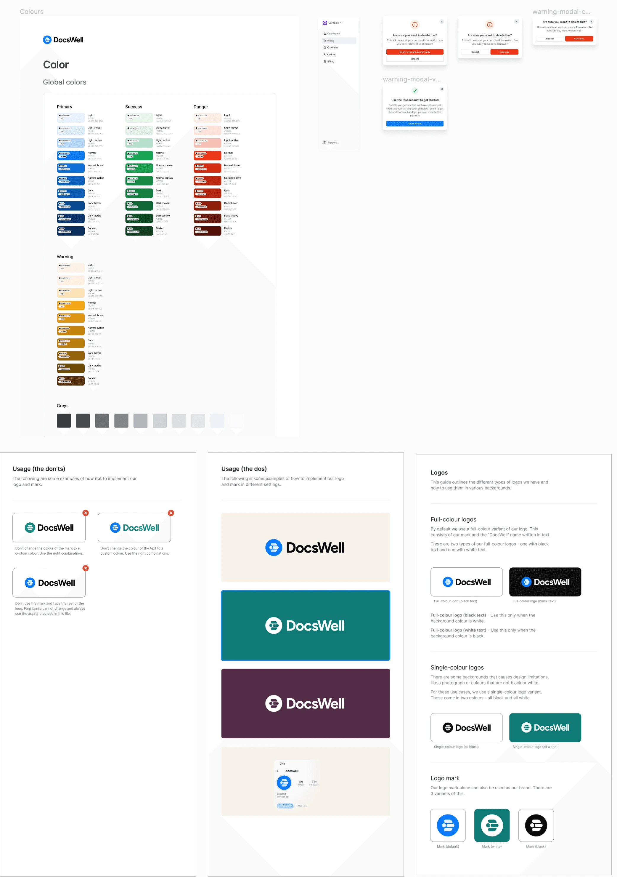
Below is some screenshots of the design system I created for the project. It contains a new set of colors, some ui components and a set of brand guidelines.
Takeaways
The new design was received with high praise from the stakeholders and also with the initial users we tested with. We tested the new design with a few mental health institutes and the response was very positive.
Main things I learned:
Leading the design of an early stage startup - For the first time in my career, I was tasked with leading all aspects of design during the early MVP stage of the product. I played a pivotal role in the product strategy and design decisions.
Immensely increased my technical skills with auto-layout - This was also the first main project where I invested a lot in learning and implementing auto-layout as much as possible in the designs. It clearly showed me how much time it saves as well as how scalable your designs become with using it.
Improved my collaboration with engineers - I was heavily involved in discussions with the developers in the team almost everyday. This helped me understand how syncing up helps speed up the process and also increase the quality of the end implementation.
Like this project
0
Posted Jul 5, 2024
Portfolio containing my selected work
Likes
0
Views
0


