Diving deep (actually) for an AI-powered Scuba Photography App
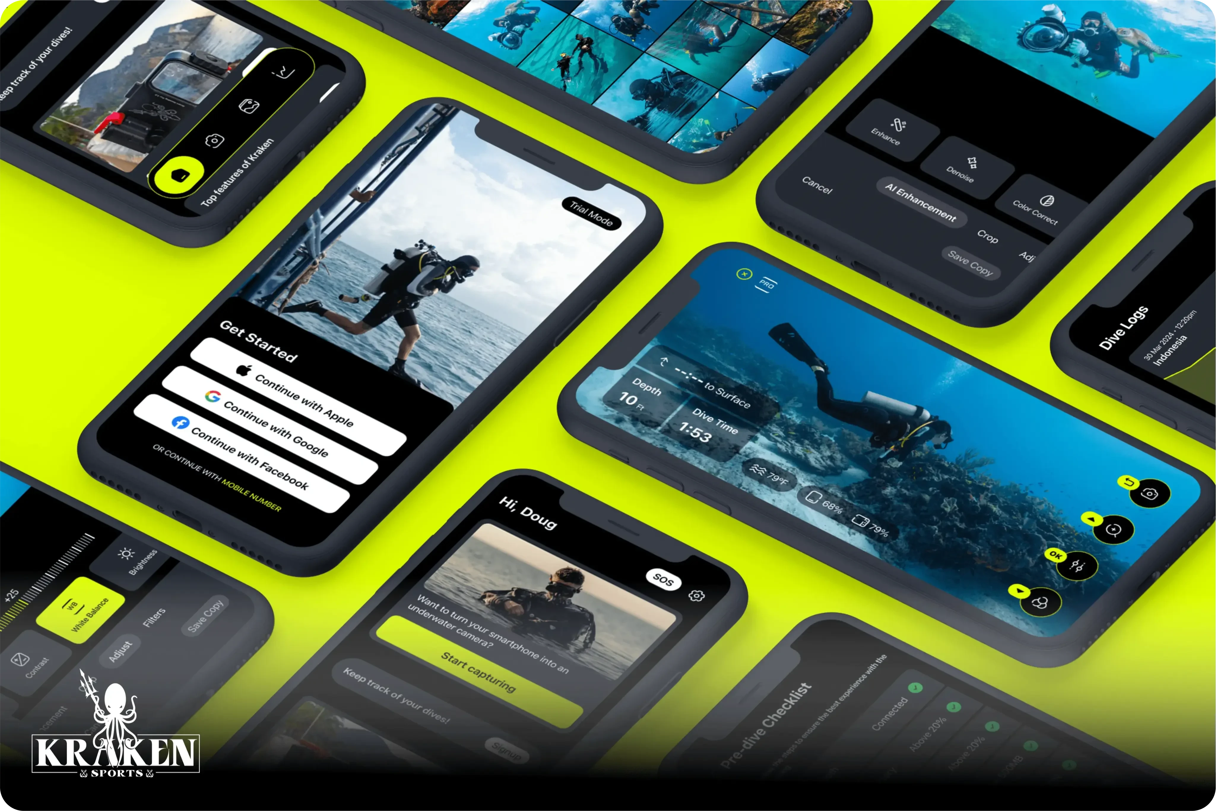
Imagine transforming your smartphone into an underwater camera that captures stunning photos with the same ease as snapping a selfie on land. With smartphone cameras reaching new heights of capability, capturing breathtaking images has become second nature for many. And as scuba diving becomes a favorite adventure for thrill-seekers, the challenge was clear: how can we make underwater photography effortless? Enter Kraken, the AI-powered app set to revolutionize underwater photography. Dive into the exhilarating journey of blending technology, empathy, and passion. Here’s a glimpse into my design process and the adventures that brought Kraken to life.
Setting Sail: The Vision and Understanding the Deep
Kraken is an app designed to work with sports dive housings for smartphones - some of which can withstand depths of up to 80m. Our mission was clear: to craft a seamless user experience for an app that not only enables stunning underwater photography but also functions as a dive computer and a dive log. The journey began by aligning with our client on a shared vision statement, ensuring everyone was on the same page and ready to dive in.
To truly empathize with our users, we dove deep into creating detailed personas and empathy maps. We interviewed recreational divers and PADI-certified dive instructors, resulting in the personas of Emily, the Recreational Diver, and Alex, the Dive Instructor. These personas grounded our design decisions in real user needs and experiences, ensuring we didn't get lost in the depths of development without a clear direction.
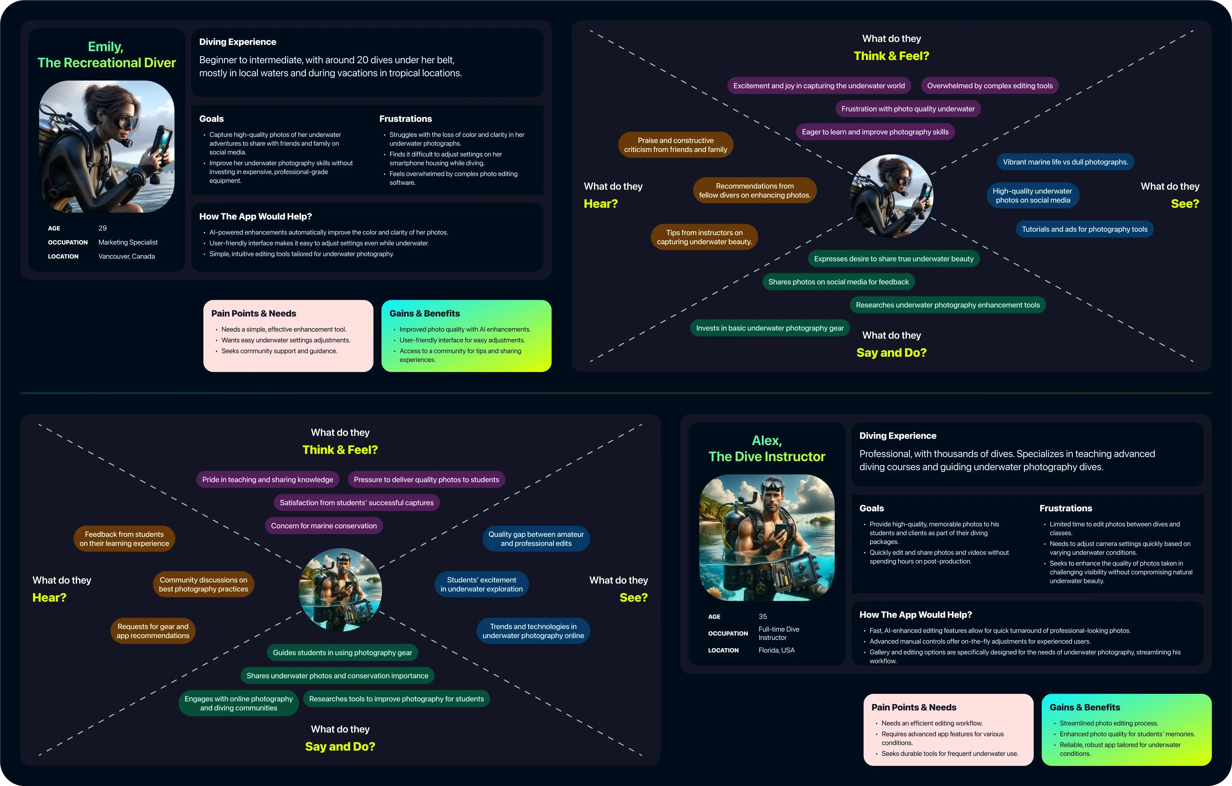
User Persona and Empathy Maps
Navigating the Depths: Ideation and Feature Prioritisation
The initial feature set for Kraken was mapped and prioritised using the KANO and MOSCOW models, balancing client requirements with user needs. With a clear roadmap, we sketched user journeys and low-fidelity wireframes on paper. This hands-on process ensured we focused on convenience and usability, keeping our heads above water.
Deciding how to prioritize camera features was a challenge since the app required a wide range of functionalities, including camera lens switching, video mode, slo-mo, zooming, adjusting shutter speed and white balance, applying filters, and manual focus. All these features needed to be accessible via the available five buttons and trigger on the dive housing. Our user interviews revealed that many new divers felt anxious about operating their gas tanks and communicating underwater, so we didn't want to overwhelm them with complex interactions. Most users were happy with simply being able to click photos easily, get good images, and share them on social media.
We decided to keep only the essential features—lens switching, zoom, video mode, and quick filters—on the initial interface. The remaining features, like slo-mo, adjusting shutter speed and white balance, manual focus, grid, and quality settings, were neatly tucked into a menu for our pro users.
Diving In: Real-World Testing and Iteration
One of the key challenges was designing an intuitive camera interface. The sport housing device has 5 physical buttons and one shutter, so once your smartphone is locked in - you can only interact with the physical buttons. This meant interactions had to be concise and efficient. To simulate this, we hooked up an XBOX controller to Figma and simulated the five physical buttons, restricting tap interactions and forcing us to prioritise essential features. This unique approach led to a streamlined user experience that didn't overwhelm the user, avoiding any potential design shipwrecks.
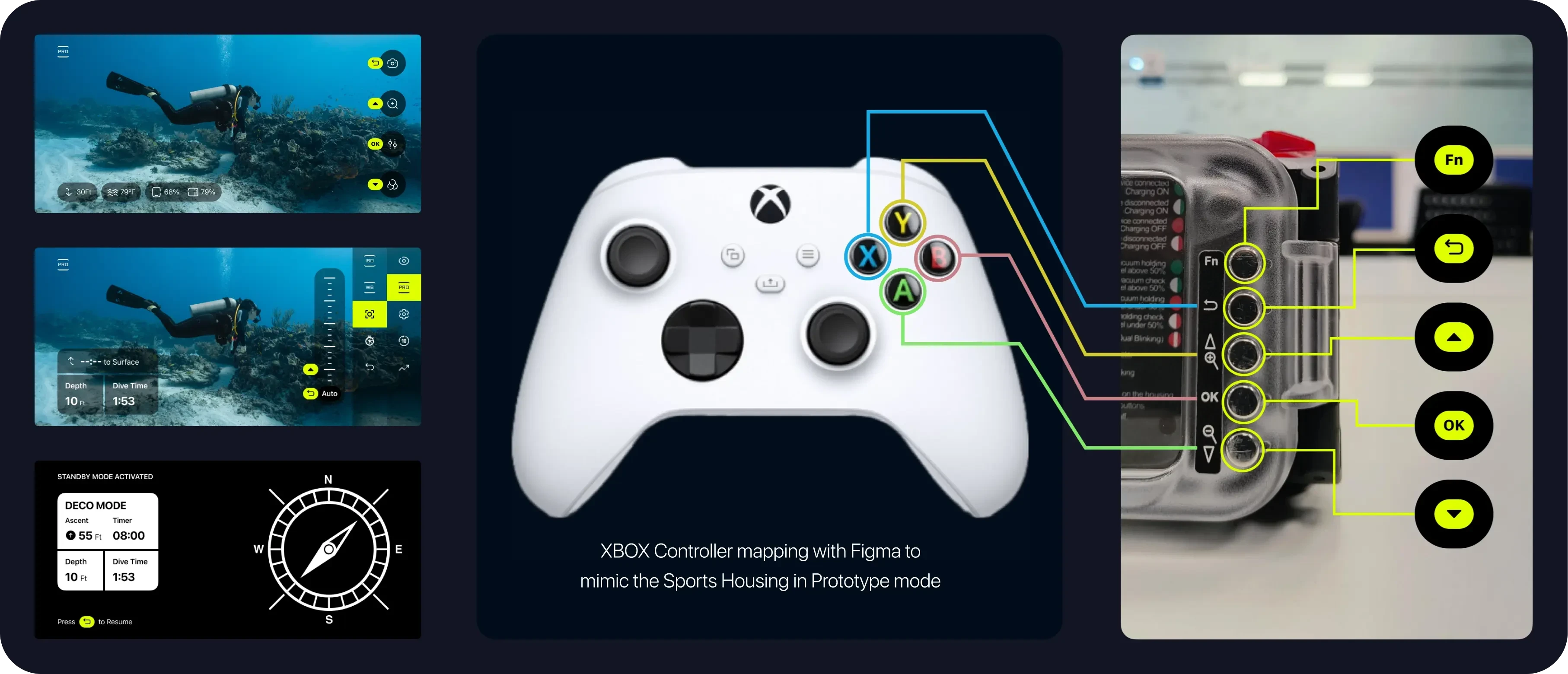
Camera UX prototype testing via an XBOX controller
My love for swimming came in handy as we tested our prototype. Initially, I jumped into a swimming pool to gauge the intuitiveness of our design. After tweaks, I took a dive trip to Kerala, testing the app in real-world conditions for the first time. The experience was invaluable, providing firsthand insights that informed further refinements.
We got the prototype tested by our client and his diver friends in Canada, further honing the app's usability to ensure it was smooth sailing for all users.
I still remember the awe of my first dive—encountering vibrant corals and marine life, only to find my photos lacked the same vibrancy. This personal frustration became a driving force in our design process.
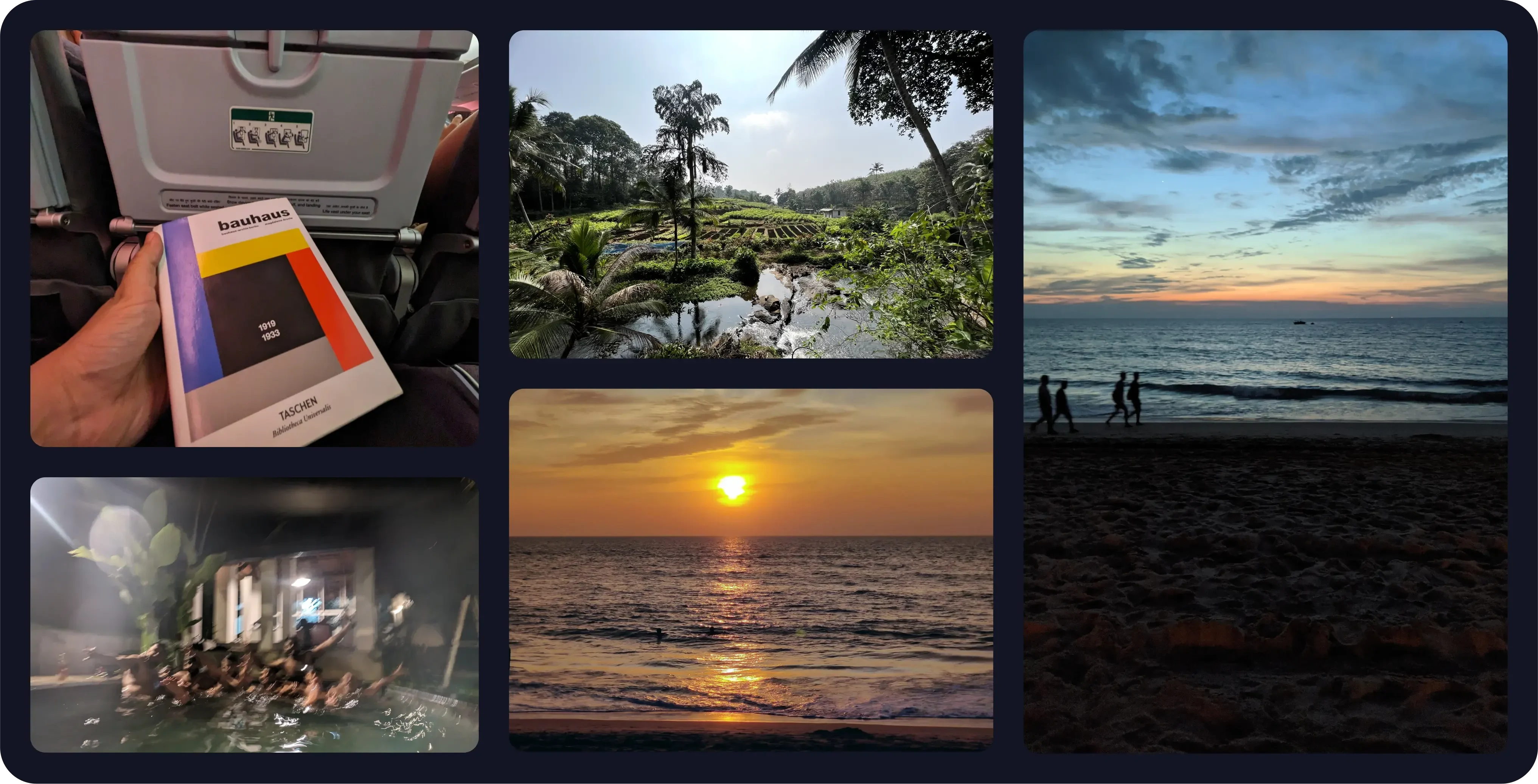
Here are a few shots from my Kerala trip to test the prototype. The initial blurry photos due to focus issues led us to design a more intuitive UX, bypassing manual settings easily and reducing phantom button presses
Charting the Course: Designing for Usability and Efficiency
When deciding on the UI colors, we delved into research papers from sources such as the U.S. Naval Submarine Medical Centre and Defence R&D Canada. These studies led us to two critical conclusions: fluorescent colors provide better contrast and visibility underwater, and black is preferred over white for background color.
Additionally, considering that OLED displays constitute about 50% of the smartphone market, we realized we could save on battery life by using absolute black (#000) for significant portions of the screen. Unlike LCD panels, OLED displays turn off pixels to show black, thereby conserving battery. This nudged us towards a dark theme, with black as our primary background color. For the accent color, we chose a fluorescent green inspired by radar machines and HUDs in submarines, ensuring high visibility and a modern, sleek look.
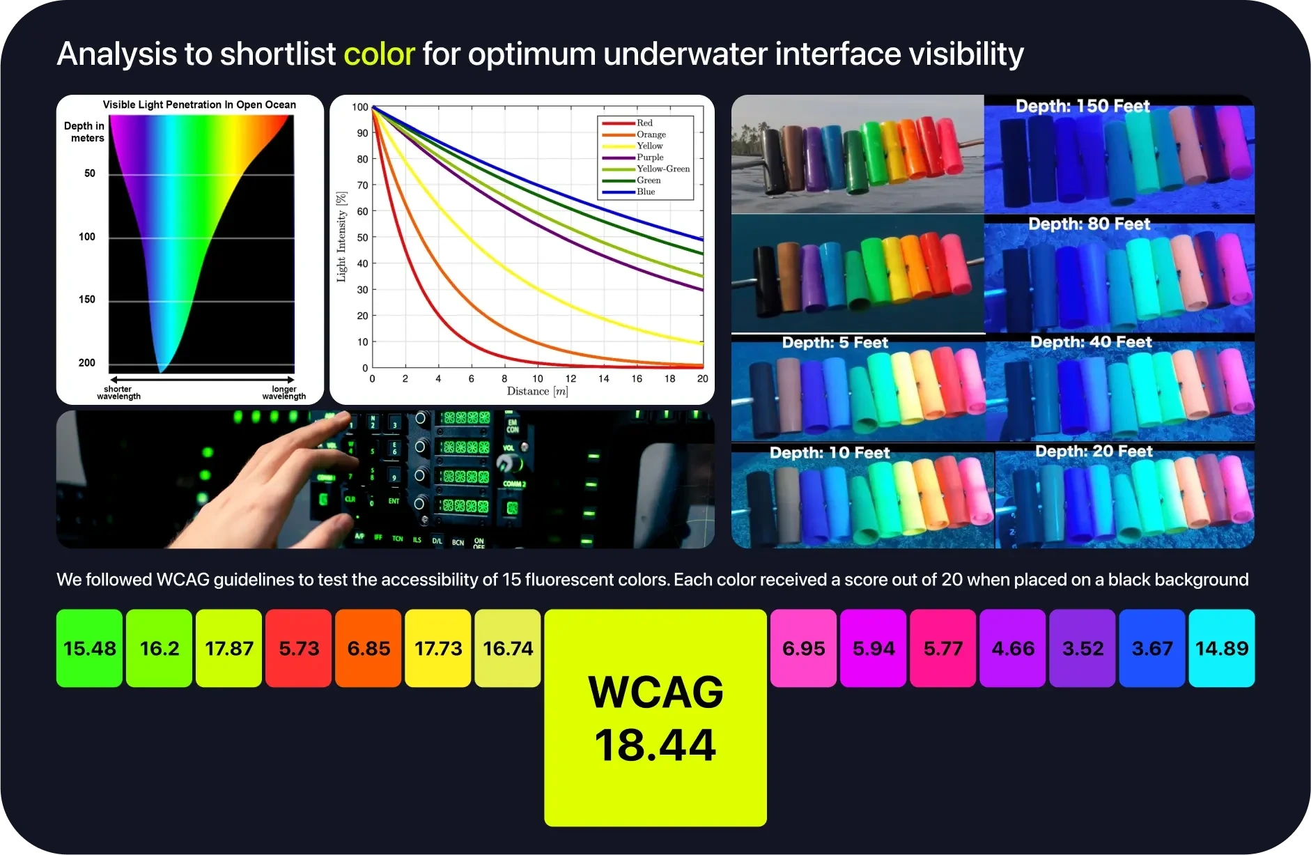
Process of shortlisting the ideal primary color
Another challenge was determining the appropriate font size for underwater readability. We analyzed data to verify if the ergonomic guideline for font size selection used in air, which states that a font size 1.5 times the smallest accurately readable value is comfortable, would be suitable underwater.
Our findings indicated that the minimum font size that can be accurately read underwater is 3.9pt, equivalent to 14px. This discovery guided us in setting the typography for the camera interface, establishing a baseline for the rest of the UI. By adhering to these guidelines, we ensured that our app's text remained legible and user-friendly, even in the murky depths.
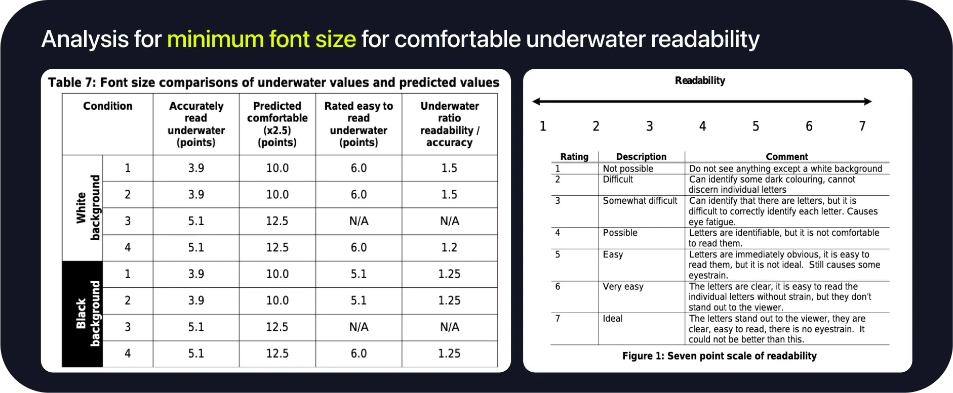
Table 7 shows that in this study, the ratio of font size that is "very easy" to read to the minimum font size that can be read accurately is less than the factor of 2.5 recommended for comfortable reading in an air environment. For all conditions except turbid-light condition, a factor of 1.5 is sufficient to provide divers with a font that is very easy to read, with high accuracy and readability scores.
Overcoming the Abyss: Visibility and Color Challenges
A common experience for new scuba divers is the surprising lack of vibrant colors underwater. Water absorbs light rapidly, and after just 300 feet, no visible light remains. Although recreational divers don't typically venture this deep, light absorption is a critical factor at all depths. As divers descend, colors disappear in the following order: red, orange, yellow, green, blue, and violet. This results in underwater photographs that are predominantly blue, green, or dark, causing the vivid corals and marine life to appear dull and lifeless.
To address this issue, we turned to extensive research papers on underwater color correction. I had to brush up on my mathematics to comprehend these papers. Specifically, solving integrals related to light refraction and backscatter—the phenomenon where light bounces off tiny particles in the water and re-enters the camera, adding noise to the image—was crucial. This comprehension revealed that most color correction techniques aim to adjust for these refractions and the varying distances of objects in underwater scenes.
Armed with these insights, we are collaborating closely with our AI/ML team to develop a model capable of effectively correcting underwater images. This involves training the AI to recognize and adjust the specific color distortions caused by underwater environments.
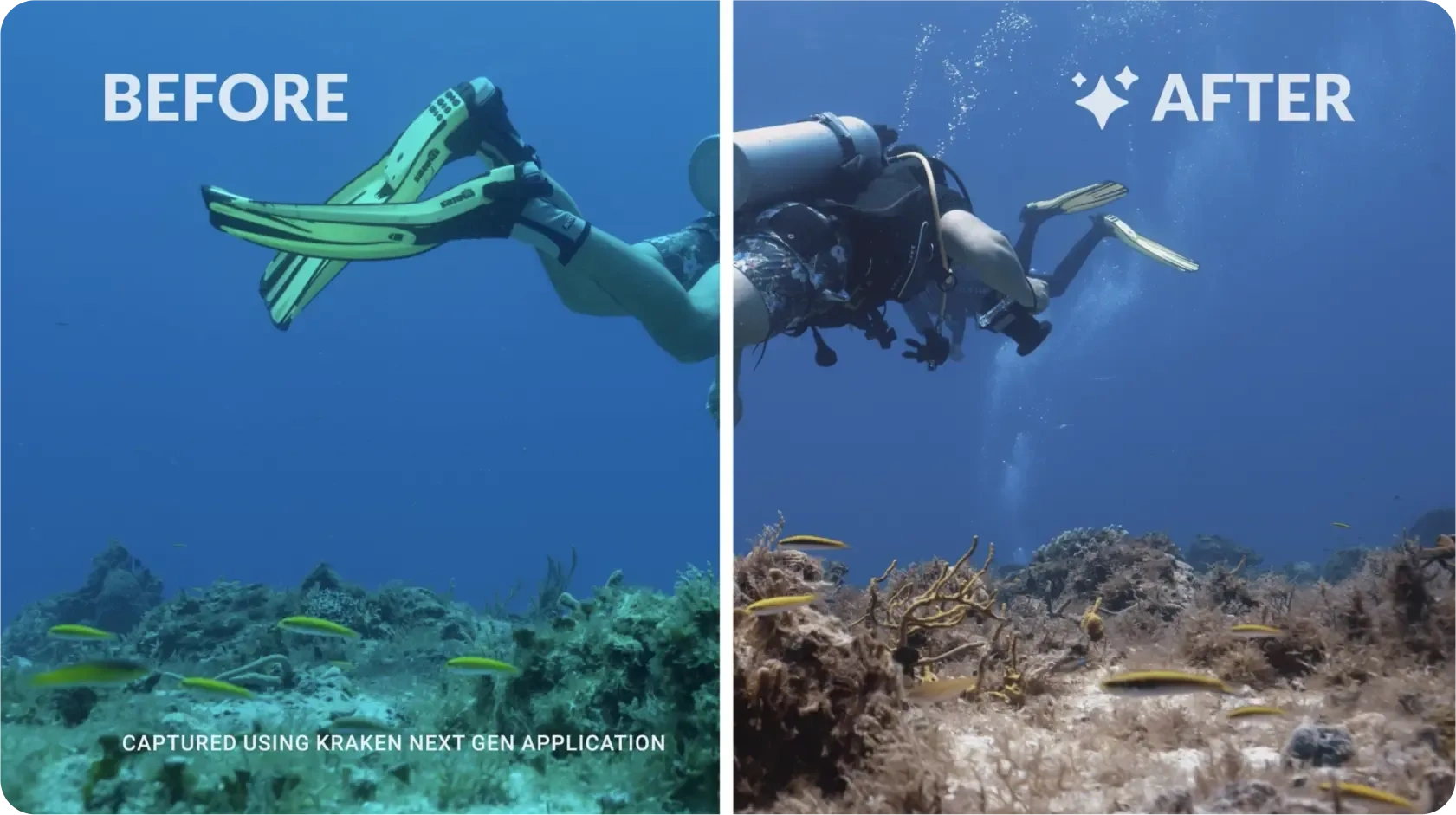
Before-after sample of AI enhancement
In addition to the AI model, we designed five distinct color filters to enhance underwater visuals. These filters were created using Lightroom and then translated into native code with the assistance of OpenGL. The filters included:
Ocean Blue: Adjusts the natural blue tones while correcting color distortions.
Lush Green: Adjusts the greens for better visibility and vibrancy of marine plants and algae.
Golden Glow: Adds warmth to the images, bringing out hidden yellows and oranges.
Cinematic: Provides a dramatic, movie-like quality to underwater scenes.
Deep Sea: Enhances contrast and detail simulating images taken at greater depths.
These filters were crafted not only to improve the visual appeal of underwater photographs but also to ensure they were social-media friendly.
Heading to the Surface: Development and Future Plans
Next we focussed on creating the shippable designs for iOS and Android. We desided to use system default fonts and styles to comply with Jetpack Compose (Android) and SwiftUI (iOS). Using default modals, permission intents, margins and spacing values saved us time setting up the UI and allowing more time to be allocated to the development of AI feaures and optimising camera performance.
Currently, the design is prototyped and ready, with the dev team working in sprints to complete the code. Our next step is to establish a design system, ensuring future releases can leverage reusable components and ship quicker.
The journey of designing Kraken has been one of empathy, innovation, and adventure. Every dive, every interaction, and every line of code brings us closer to a product that will revolutionise underwater photography. This project has been a testament to the power of understanding users deeply and crafting solutions that genuinely enhance their experiences. As we continue to navigate the waters of development, we're excited to see Kraken make waves in the world of underwater photography.
Like this project
Posted May 24, 2024
Explore my journey of empathy, innovation, and meticulous design, crafting an AI-powered app for stunning underwater photography.
Likes
0
Views
297

