Starbucks Website Redesign
Sundas R.
Posted Apr 29, 2026
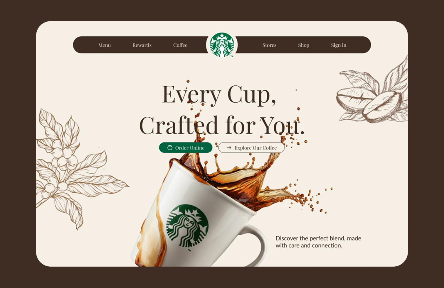
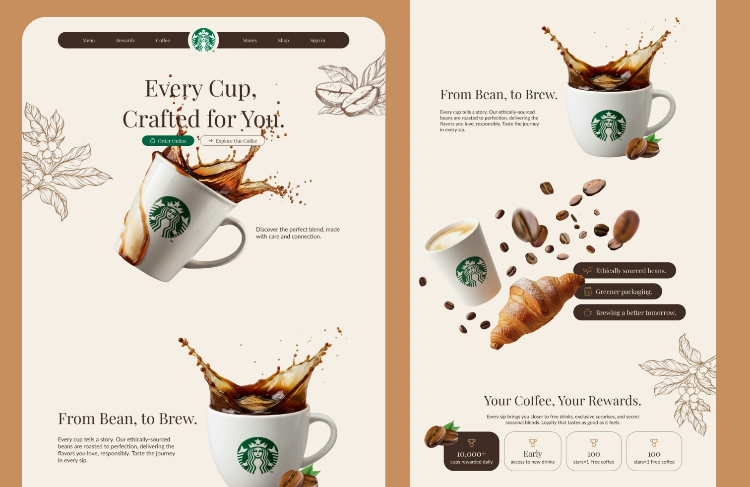
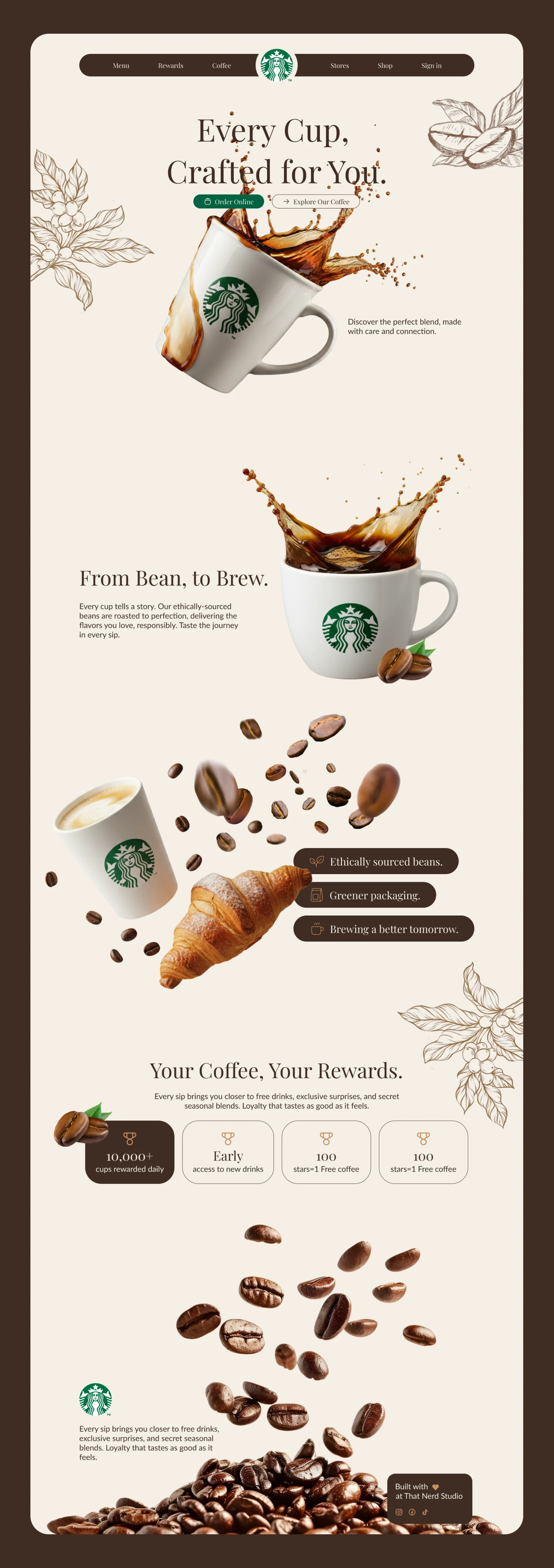
This project began as a personal exploration rather than a redesign exercise. I wanted to rethink how a brand as familiar as Starbucks could feel on the web if the focus shifted from structure to experience. Instead of repeating traditional section layouts, I approached the homepage like an editorial story, where motion, spacing, and visuals guide the user naturally. The design leans into calm confidence rather than loud branding. Design Focus Editorial-style layout that avoids repetitive section patterns Transparent, floating product imagery used as visual anchors Subtle scroll-based motion to create rhythm and flow A warm, coffee-inspired color palette that feels premium and inviting Rather than designing for conversion alone, I designed for mood, pacing, and presence. The goal was to make the site feel less like a corporate interface and more like the moment you pause with a cup of coffee.