Designing High-Performance Graphics for Tradeify
Reetaish K.

When I started working on Tradeify, the brand was at a very different stage.
Back in September 2024, their social presence wasn’t as strong as it is now.
The company itself was doing well, but visually the content didn’t reflect that level.
The designs felt outdated, inconsistent, and not aligned with a top prop firm that traders trust with real money.
My role was simple on paper — create graphics when needed.
But very quickly, it became clear that the real work was not just making posts.
It was about building a visual system that could scale with the brand.
Making the brand feel premium, not just active
Since Tradeify operates in the prop trading space, trust and clarity matter more than decoration.
Most graphics had to include numbers, payouts, winners, offers, rules, or metrics.
If the layout isn’t structured properly, the design starts feeling cluttered and unprofessional.
So my focus from the beginning was:
Clean but premium visuals
Strong typography hierarchy
Consistent layouts across platforms
Modern fintech style, not flashy marketing style
Clarity first, decoration second
Over time, this approach helped the brand feel more established, more reliable, and more consistent across all platforms.
Designing for speed, scale, and performance
This was not a slow design project. Most of the work happens in fast cycles —
sometimes ads needed in the same day,
sometimes multiple creatives for testing,
sometimes new banners, carousels, or affiliate graphics every week.
Because of that, I started building reusable systems instead of designing everything from scratch.
Layout templates for ads
Structures for affiliate graphics
UI-style components for data & stats
Reusable boxes, cards, and info sections
Consistent spacing and typography rules
This made it possible to keep the visuals consistent even with fast turnaround.
And speed became one of the biggest strengths of this workflow.
What I worked on
Over time, the work expanded into almost every visual area of the brand.
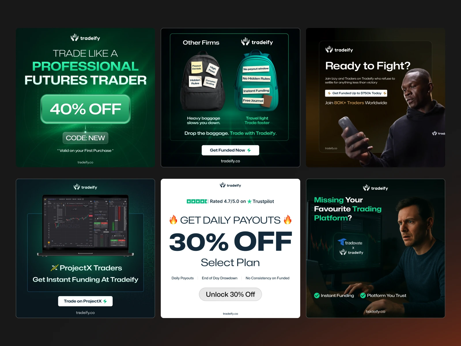
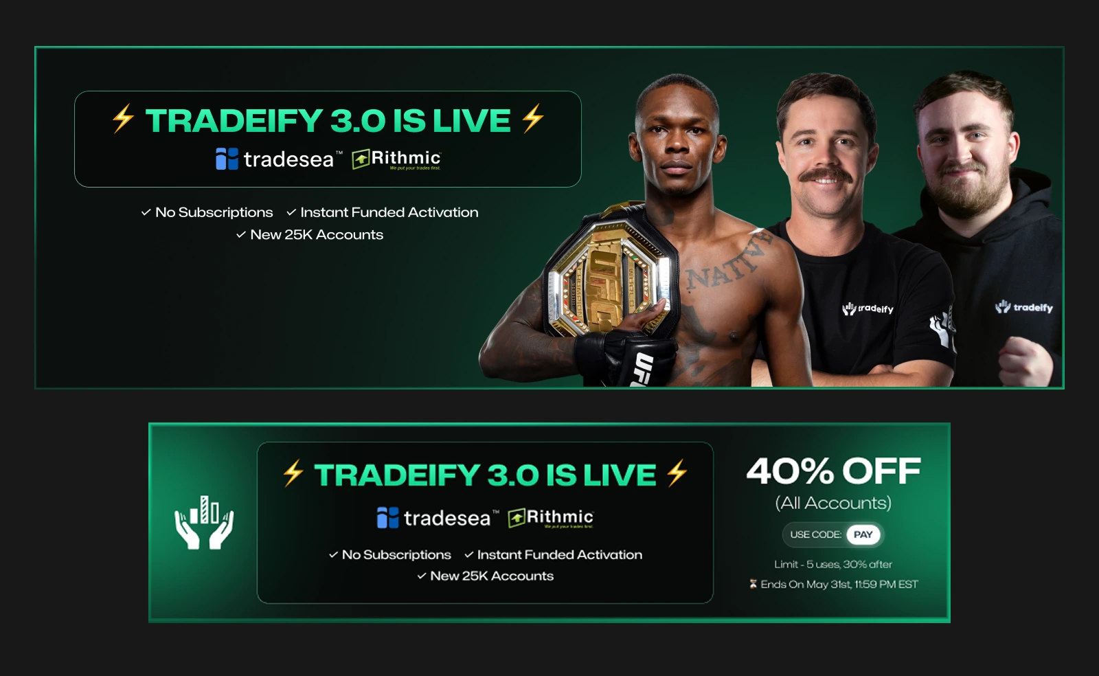
Ads & Performance Creatives
Conversion-focused designs for Meta & Google
Built with strong hierarchy, clear USP, and trust elements
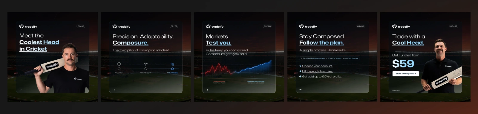
Social Media & Carousels
Educational posts, announcements, giveaways, results, and updates
Designed for readability and engagement
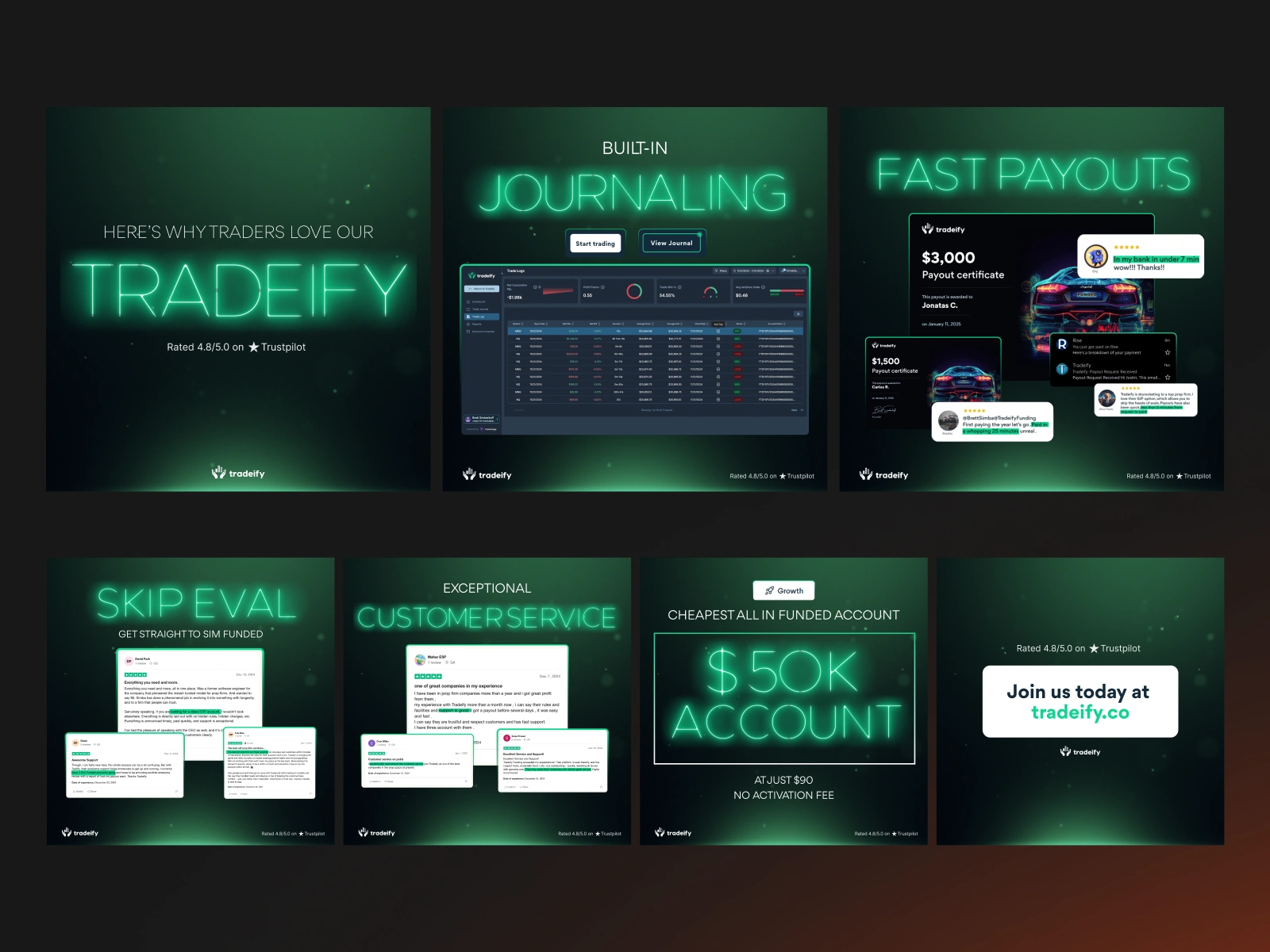
Affiliate & Promo Graphics
Template-based layouts for fast production
Consistent style across campaigns

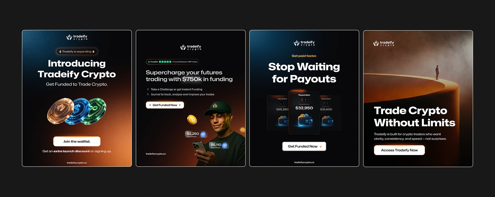
Tradeify Crypto
Graphics for the crypto side of the brand
More dashboard-style, data-driven visuals
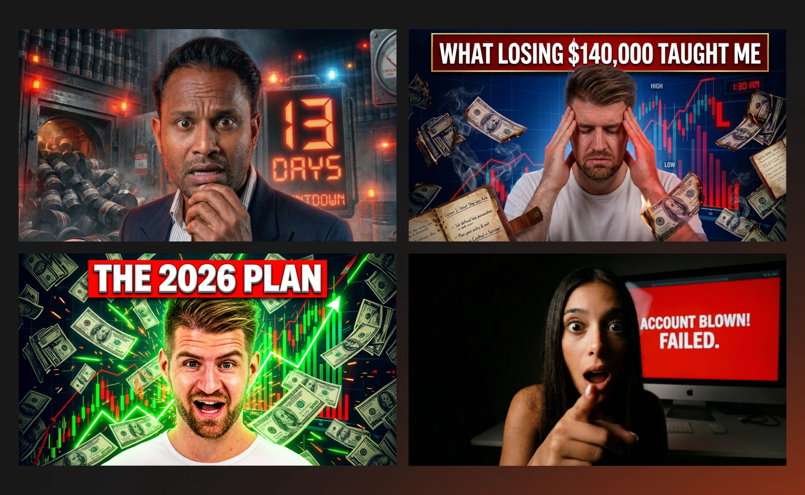
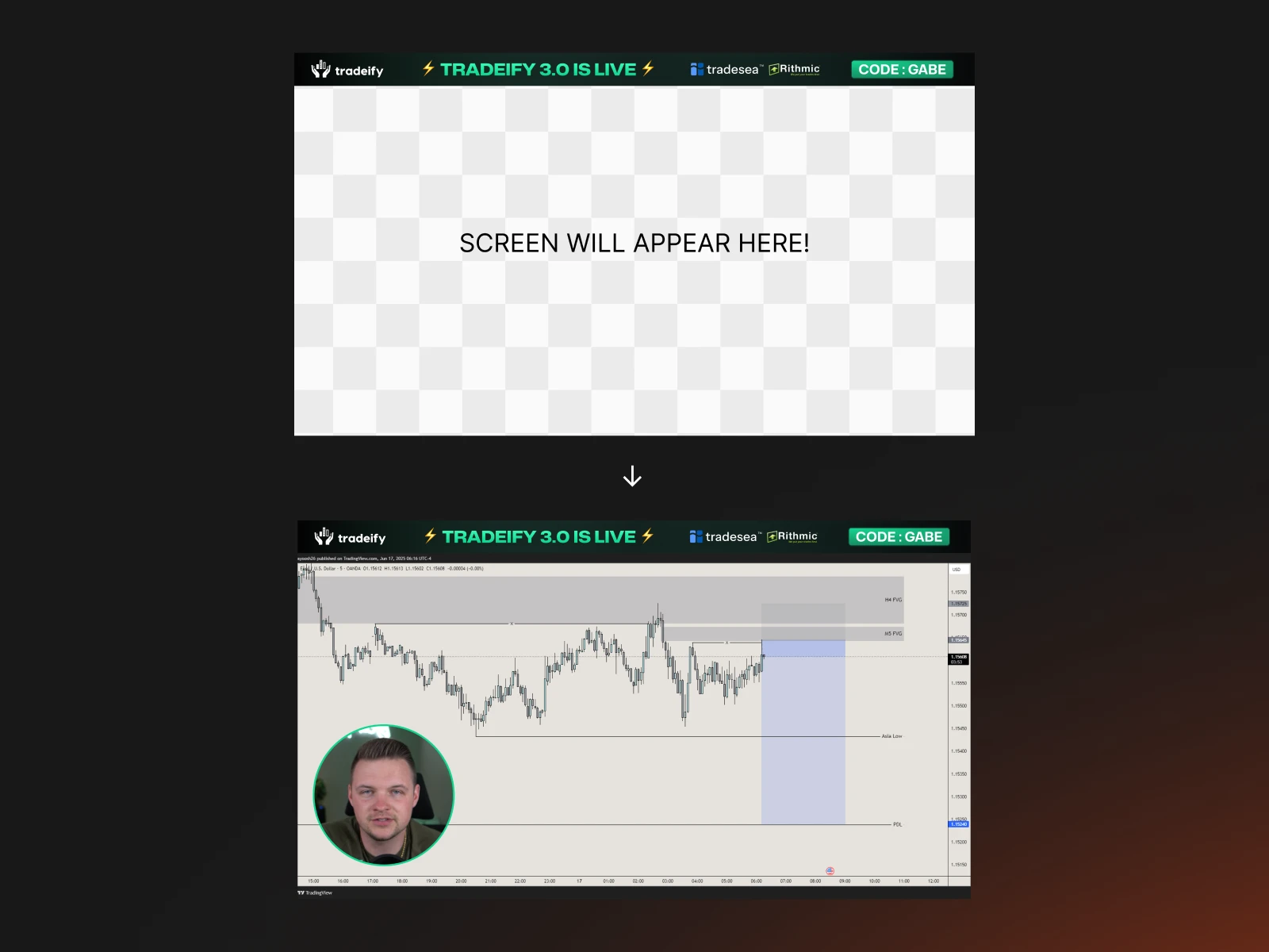
Tradeify TV
Thumbnails, stream layouts, and content graphics
Designed to feel like a proper content platform
Banners, Emails & Landing Visuals
Marketing assets used across different platforms
UI & Layout Elements
Stream overlays, layout structures, info cards, and custom UI-style components
Process & workflow
The process was very iterative.
Most designs go through feedback → adjustment → refinement → final.
Sometimes multiple versions for testing, especially for ads.
Typical flow:
Understand the goal of the graphic
Decide layout first, not colors first
Build structure in Figma
Add UI elements, hierarchy, and spacing
Refine typography & alignment
Iterate based on feedback
Convert into reusable layout if needed
Because the brand produces a lot of content,
thinking in systems became more important than thinking in single designs.
Tools I used
Figma — main design & layout work
Photoshop / Canva — asset editing & quick adaptations
Miro / Google Slides — idea discussion & planning
Envato — assets & resources
Slack — communication & feedback
AI tools also became part of the workflow:
Midjourney — visual exploration & references
ChatGPT / Claude / Gemini — copy ideas, structure, and iterations
Impact on the brand
Over time, the visual quality of Tradeify improved a lot compared to the early stage.
Ads started performing well across Meta & Google
Social graphics became more consistent
Content production became faster
Layouts became clearer even with heavy data
Affiliate creatives followed the same system
The brand started looking more premium and established
I also received feedback for fast turnaround, consistency, and creative layouts, which became important because the content volume is high.
For a prop firm, clarity is more important than fancy visuals — and that became the main design principle across all work.What this project taught me
Working on Tradeify improved my design thinking a lot.
I learned that consistency matters more than creativity alone.
Small details like spacing, copy placement, or hierarchy can change how professional a design feels.
I also learned how different layouts perform differently on different platforms,
especially when the goal is conversion, not just aesthetics.
This project pushed me to get better at:
Designing fast without losing quality
Building systems instead of single posts
Keeping visuals clean even with a lot of information
Thinking about performance, not just design
And that’s something I’m proud of — the graphics didn’t just look good, they actually worked.
Like this project
Posted Mar 2, 2026
Created high-performance ad creatives, social graphics, and visual systems for Tradeify, improving brand consistency, speed, and clarity across all platforms.