
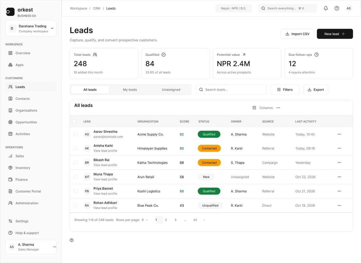
Orkest leads workspace with summary cards, ownership views, search, filters and the complete record table. Full original Figma frame; design content is sample data.
The project and my part in it
Orkest combines CRM, sales, inventory and finance in one workspace. I worked on its navigation, record lists and forms. The challenge was to make a large product feel familiar without making every module work in exactly the same way.
I focused this story on leads. Someone needs to find the right record, understand who owns it and decide whether it is ready to become a contact and an opportunity. That sequence gave the CRM screens a practical order.
What shaped the design
Several business modules share the same workspace.
Lists need enough detail to compare records without overwhelming the next action.
Creating, editing and converting a lead have different responsibilities.
THE DESIGN CHALLENGE
How can one workspace support different business jobs without making people relearn the interface at every module?
I started with the list because that is where the next task becomes visible. The form and detail view then carry the same lead forward, with more information as the decision becomes more specific.
01 / Find the lead that needs attention
Find the lead that needs attention
All leads, My leads and Unassigned answer a simple question: whose work am I looking at? I kept those views close to search and Filters, while the rows carry qualification details. Ownership and readiness remain separate, so an unassigned lead does not disappear inside a score.
The filter screens show the next part of the task: choose criteria, see what needs correcting and check the result. Showing these states together makes the list easier to understand than a single polished table.
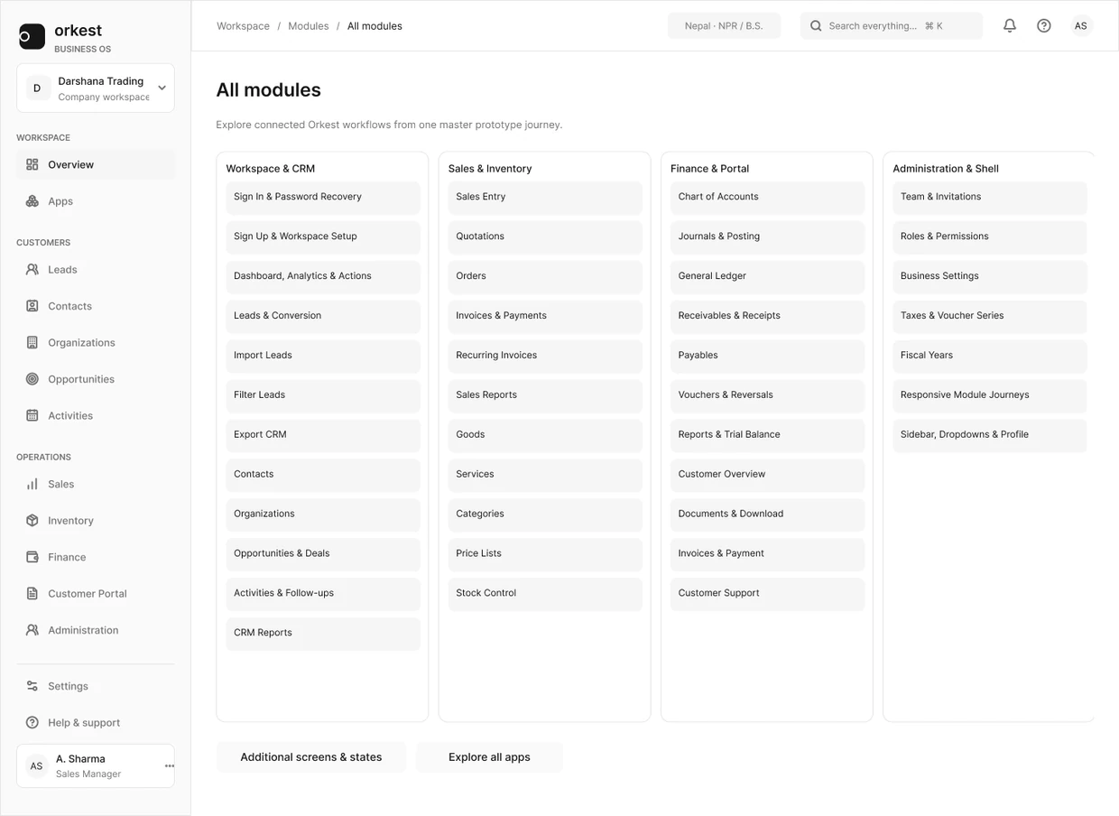
Orkest current module directory groups workspace capabilities into navigable business areas. Complete original Figma frame; design content is sample data.
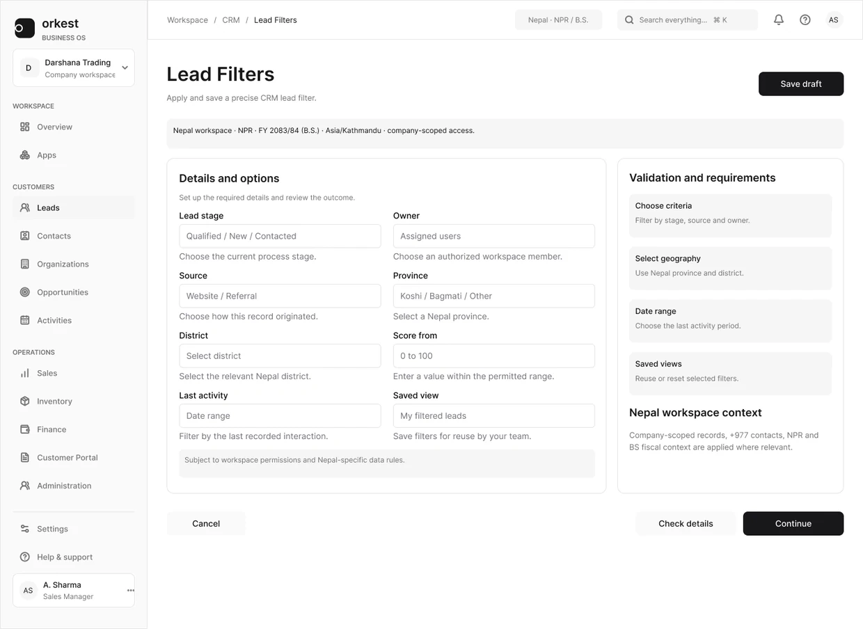
Orkest lead-filter form separates criteria from scope and the action to apply filters. Full original Figma frame; design content is sample data.
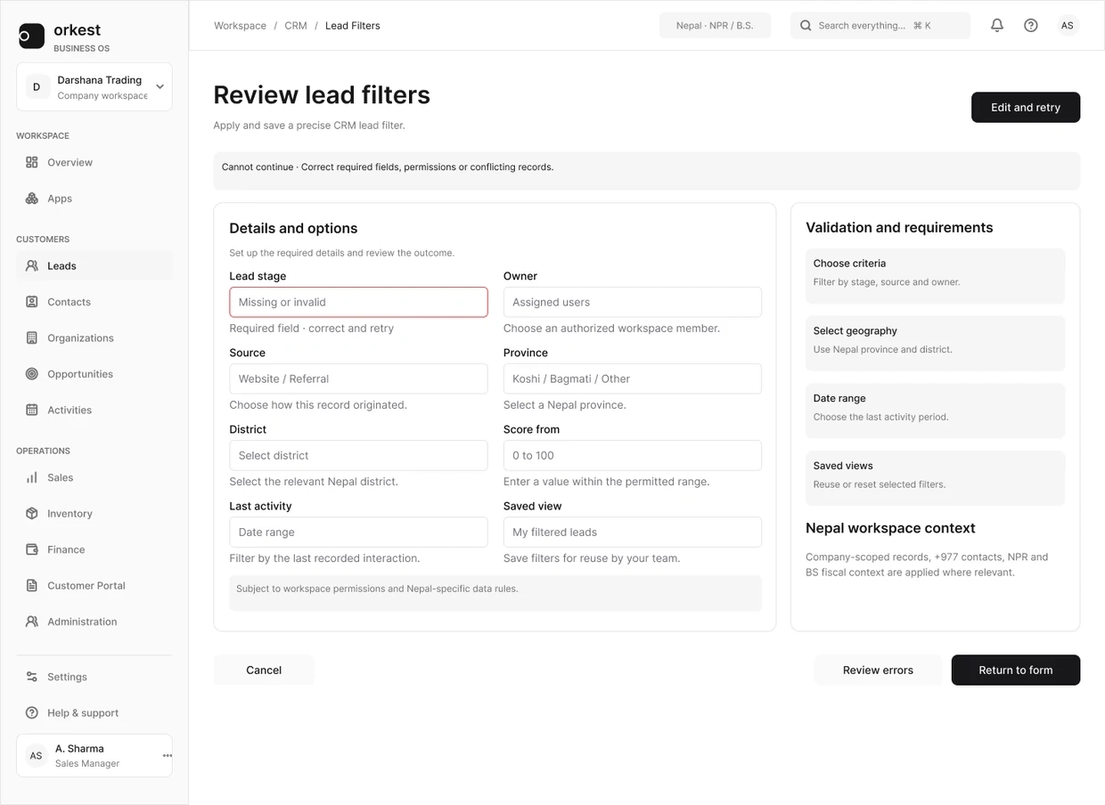
Orkest filter review state presents field feedback while retaining the surrounding workspace. Full original Figma frame; design content is sample data.
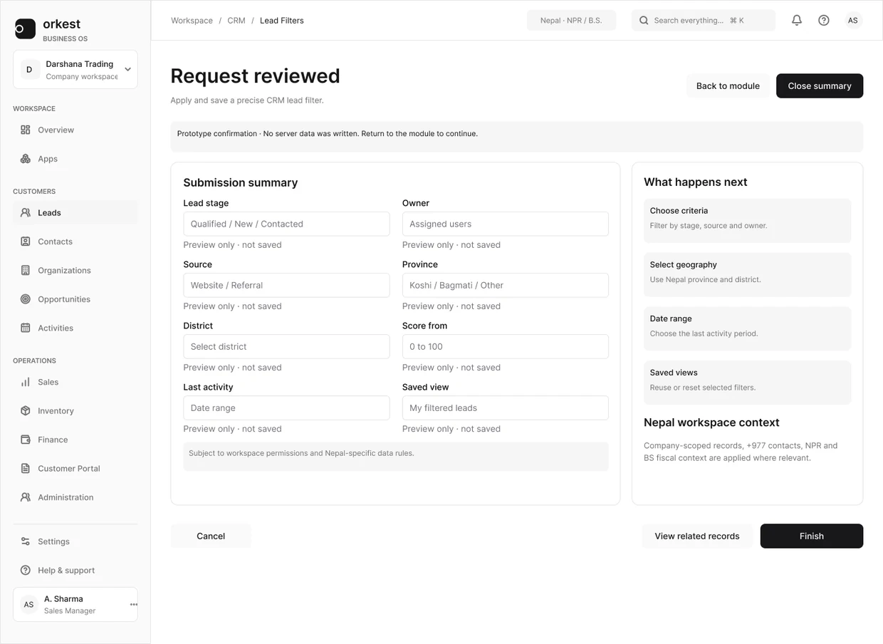
Orkest filter confirmation presents the reviewed request and the next available action. Full original Figma frame; design content is sample data.
The list needs enough information to choose a record; the detail view can carry the explanation behind it.
02 / Make creating and editing feel connected
Make creating and editing feel connected
The create-lead form groups contact information and qualification. A side panel explains what follows, including that the score is calculated after saving. The form can collect the input without pretending an unsaved lead already has a settled result.
Editing uses the same record structure, with guidance about saving and duplicate checks. For handoff, I would keep the open rules beside these screens: which fields are required, who can assign an owner and what stays filled in if saving fails.
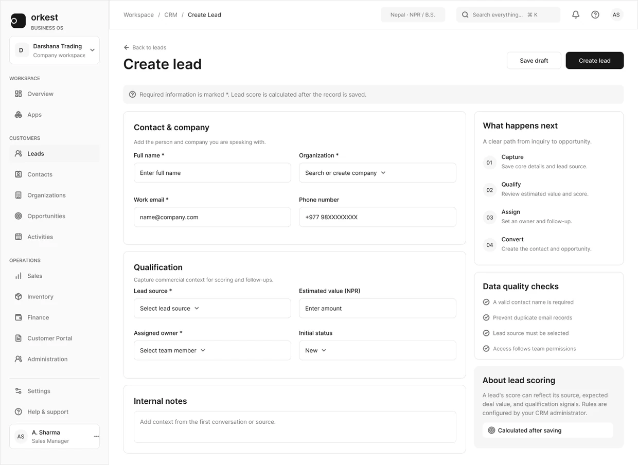
Orkest create-lead screen with grouped contact and qualification fields and a next-step explanation. Full original Figma frame; design content is sample data.
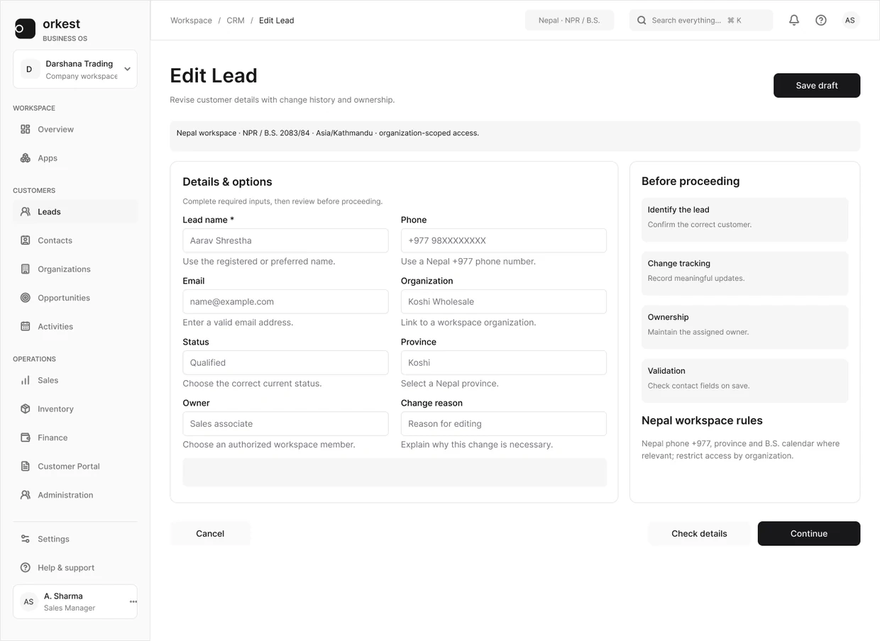
Orkest supporting edit-lead form keeps record fields, save behavior and duplicate-check guidance together. Complete original Figma frame; design content is sample data.
A shorter form is useful only if it still collects what the next person needs.
03 / Explain what conversion will do
Explain what conversion will do
The detail panel brings the lead information back together before conversion. Its explanation says that conversion creates a contact and an opportunity while keeping the lead history. That gives the action a meaning beyond its button label.
I used the same approach across the workspace: keep location, record identity and action priority familiar, then let each module add the detail its task needs.
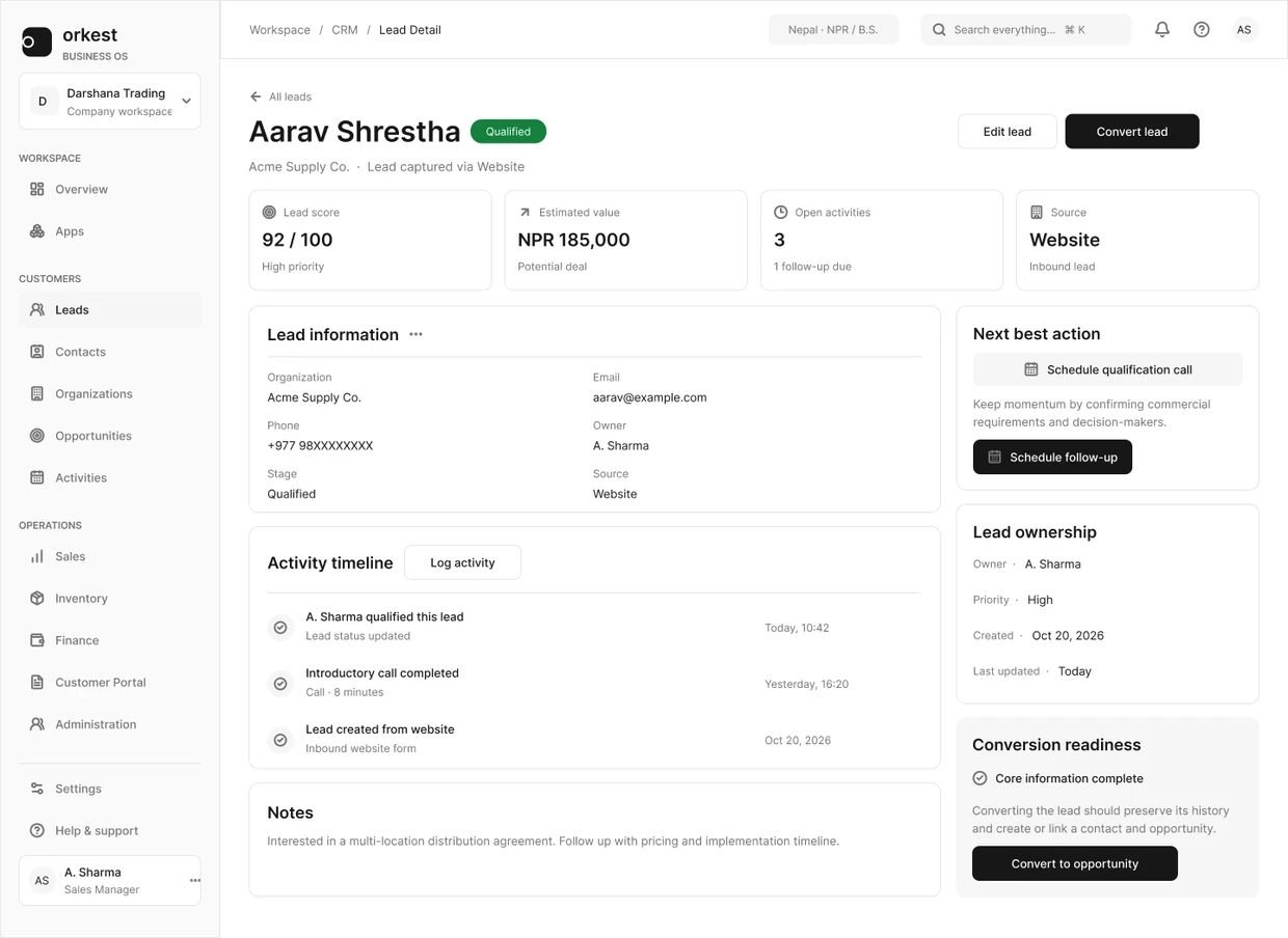
Orkest full lead-detail workspace connects record identity, activity history and conversion readiness. Full original Figma frame; design content is sample data.
Shared patterns should save people from relearning the interface without forcing every business task into the same form.
What I delivered
The design work connects the module directory, lead list, filter states, capture form, edit form and conversion detail. Together, they show how the record moves through the CRM.
Outcomes and next steps
The screens give the team a concrete sequence to build and review. I do not have measured task-time or adoption results for this work.
What I would test next
Find an unassigned lead, apply a filter and switch ownership views. Can the person explain which records are now included?
Follow a failed save into retry and conversion. Check that ownership, input and record history survive each transition.
What I learned
A useful shared system starts with repeated tasks. In this case, ownership, record identity and the next action were more useful foundations than a collection of matching cards.
About the screens
Original CRM design screens with sample data. These explain my design contribution; server validation, permissions and cross-module synchronization require implementation testing.
Related work and reading
RELATED EXPLORATION
SaaS product design
RELATED EXPLORATION
Role-based dashboard decisions
RELATED EXPLORATION
Operational filter UX
NEXT FILE / YOUR PRODUCT Let’s talk
0 likes · 0 views · Nov 7, 2026
Orkest CRM/SaaS workspace: navigation, lead lists, filters, forms and conversion flows; delivered Figma screens and patterns for handoff.
