Scienture Landing Page
Danyelle Sage
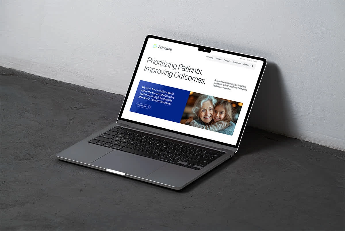
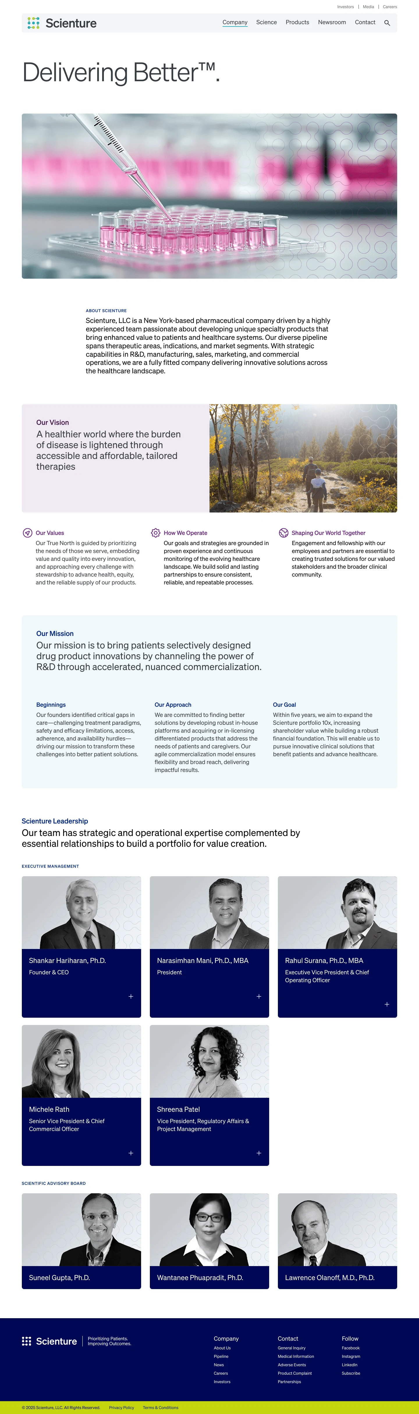
The Scienture website was designed in Figma as part of a strategic digital initiative to align with the brand’s 2025 Impact Report and overall visual identity. The project focused on building a cohesive and scalable web design system that prioritized accessibility, flexibility, and a seamless user experience across multiple screen sizes.
Working within the existing brand guidelines, I refined the color system by creating tints and shades for primary colors and implementing a structured token-naming system. I developed a typography hierarchy that streamlined content presentation while eliminating unnecessary redundancies. Grid layouts were designed with adaptability in mind, allowing for early alignment on layout considerations before component development. I also created a set of core UI icons, including navigation, engagement, and functional symbols, ensuring visual consistency across the site.
This project reinforced a strategic and scalable approach to web design, enabling Scienture to effectively communicate its mission and impact through a visually compelling and user-friendly experience.
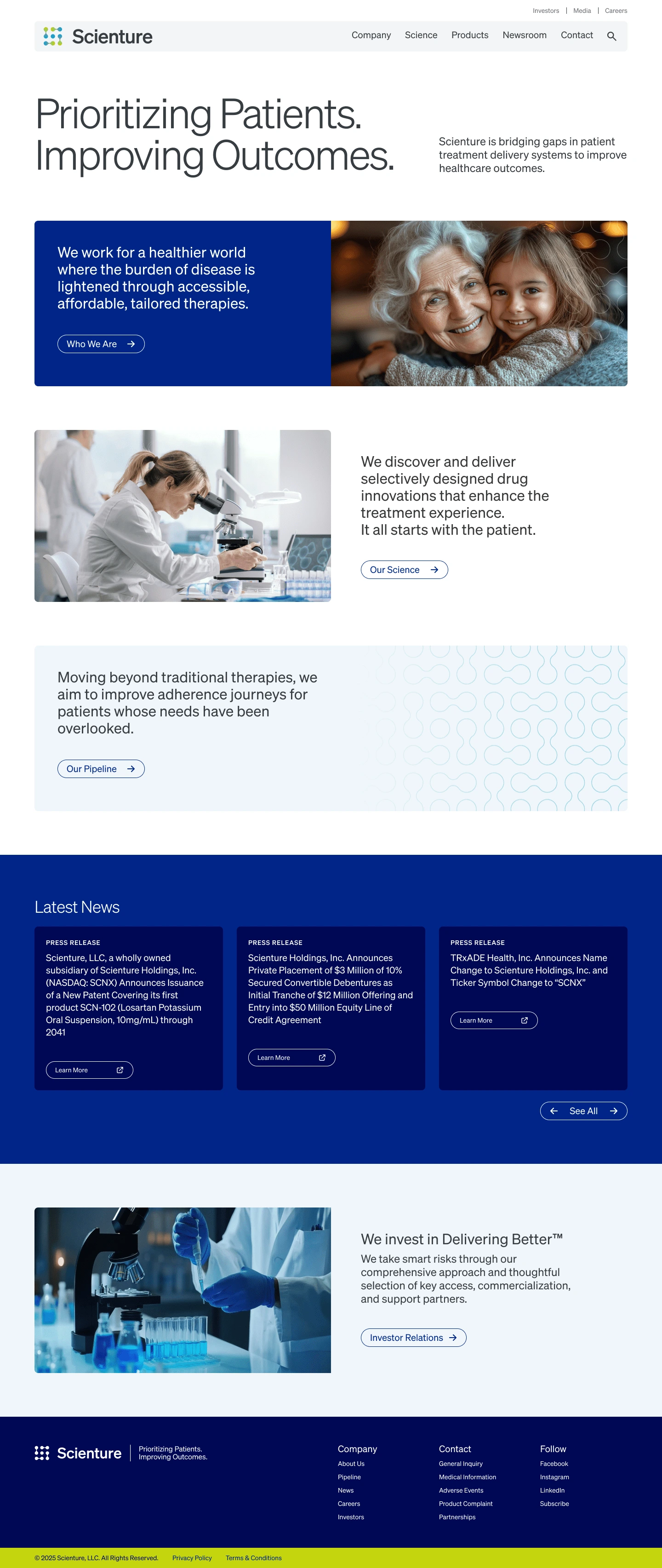
The design incorporates the brand’s colors, typography, and visual elements, reflecting Scienture’s innovative and cutting-edge nature. The use of white space allows for a smooth, uncluttered flow of information, while strategic placement of images and icons enhances the user journey.
Like this project
Posted Mar 8, 2025
The Scienture Website Design creates an intuitive, responsive site with modern aesthetics, blending innovation, usability, and seamless functionality.
Likes
0
Views
283