Youthful Rebrand to Supplement Company for the Aged

Aurella Afanou

Like this project
Posted Jun 26, 2025
Leading redesign question: why do young people get the aesthetically exciting and cool branding? Infusing aging with jubilation
Likes
0
Views
9
Timeline
Nov 1, 2024 - May 1, 2025


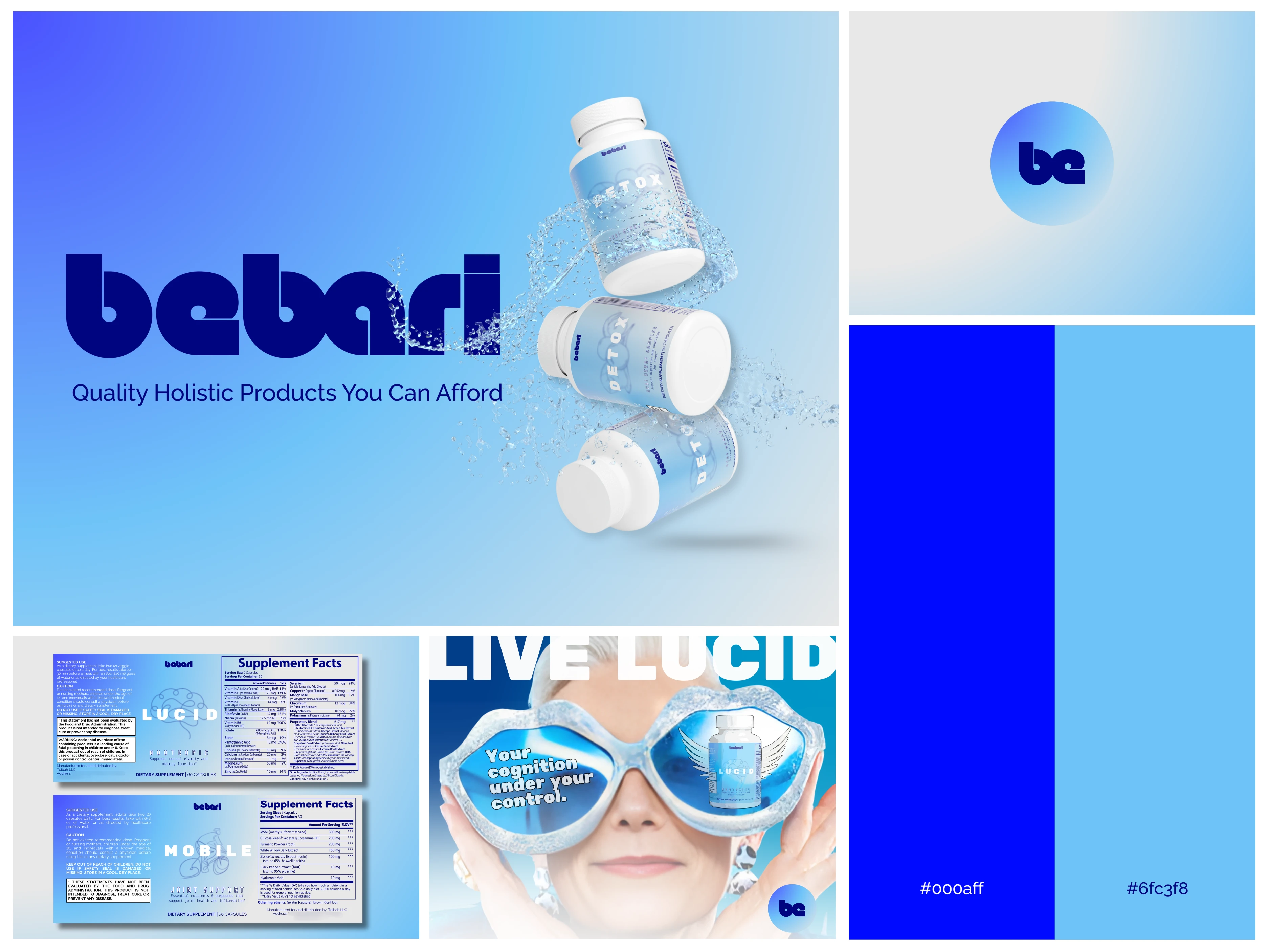
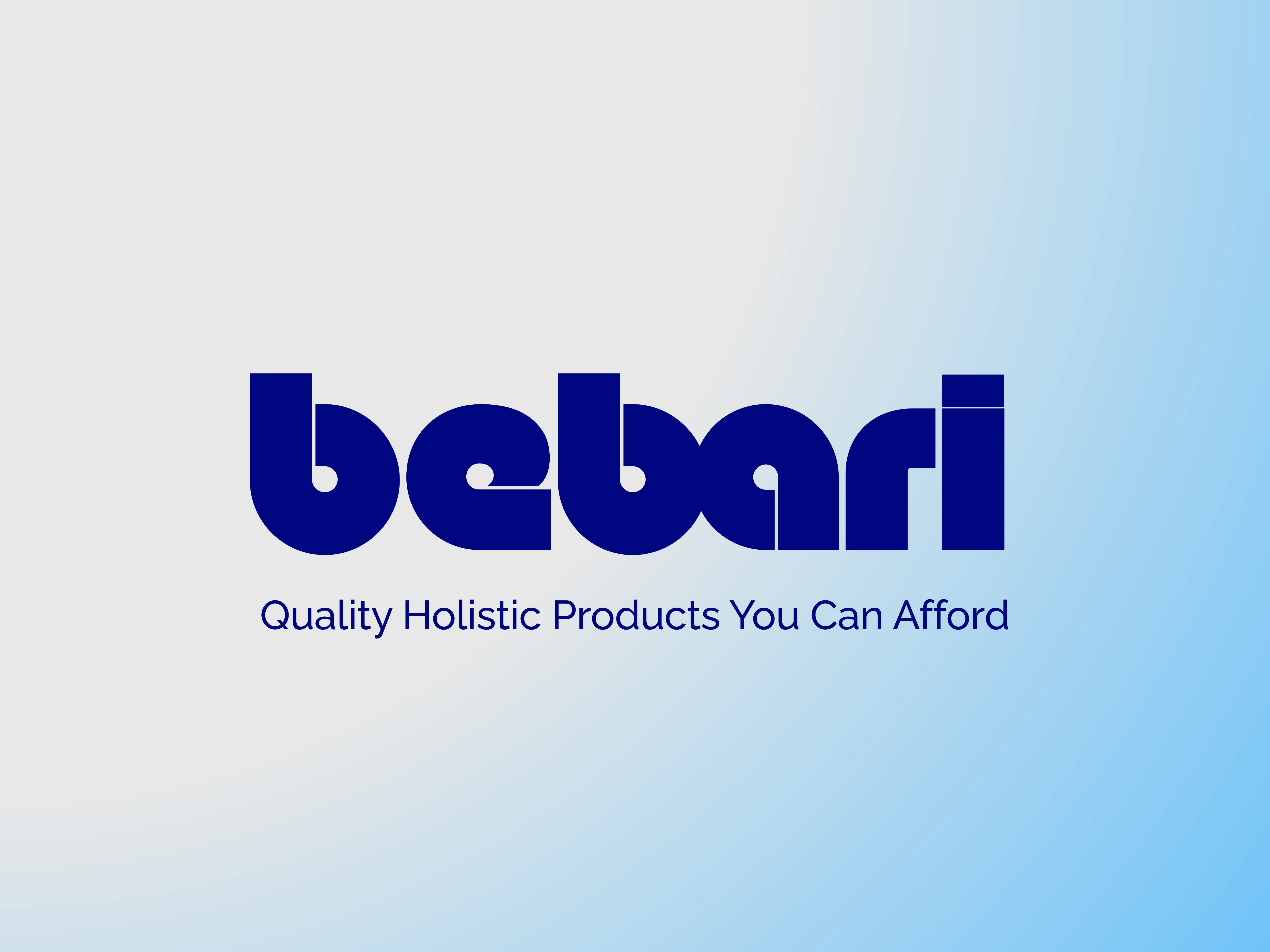
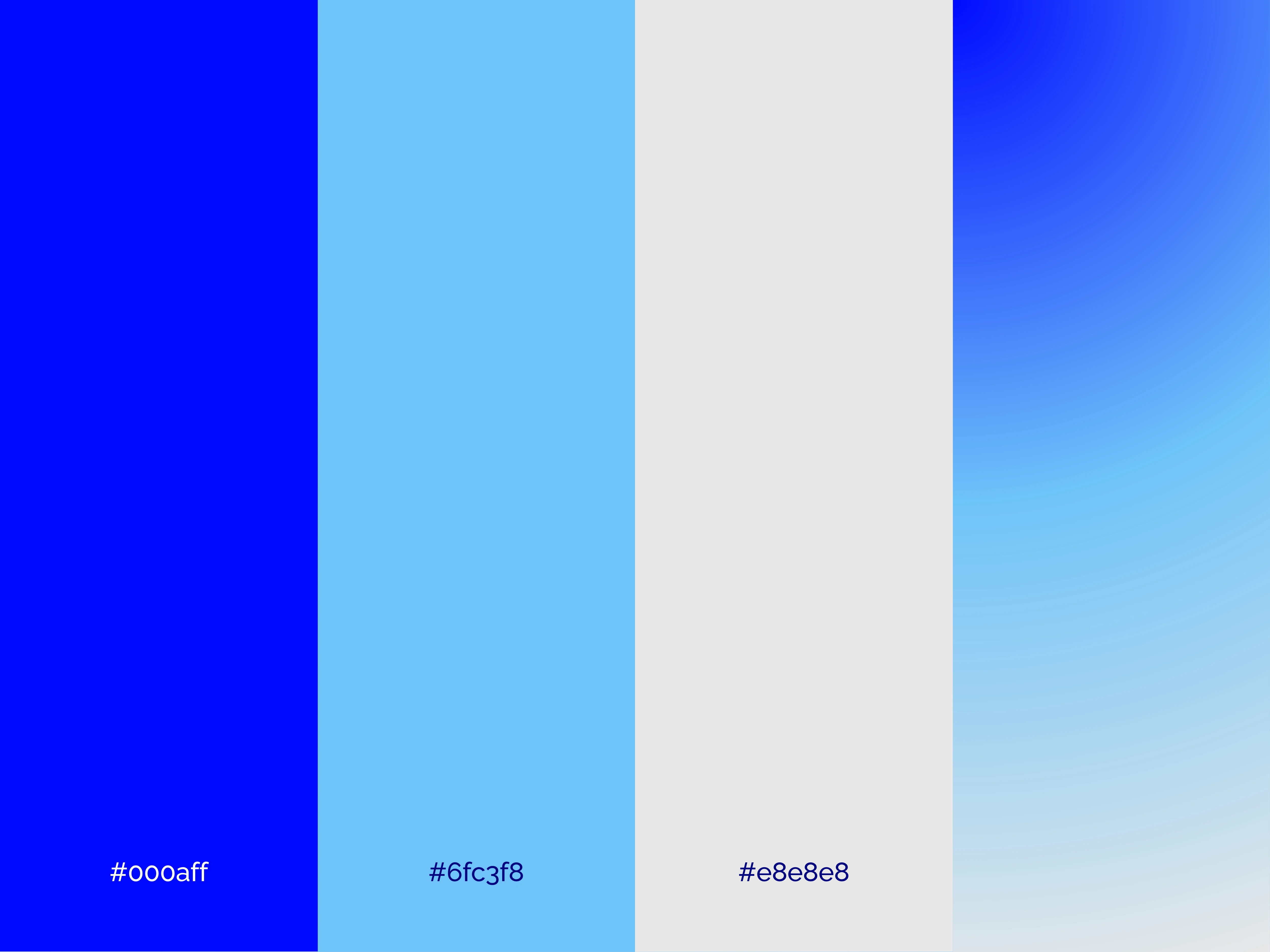
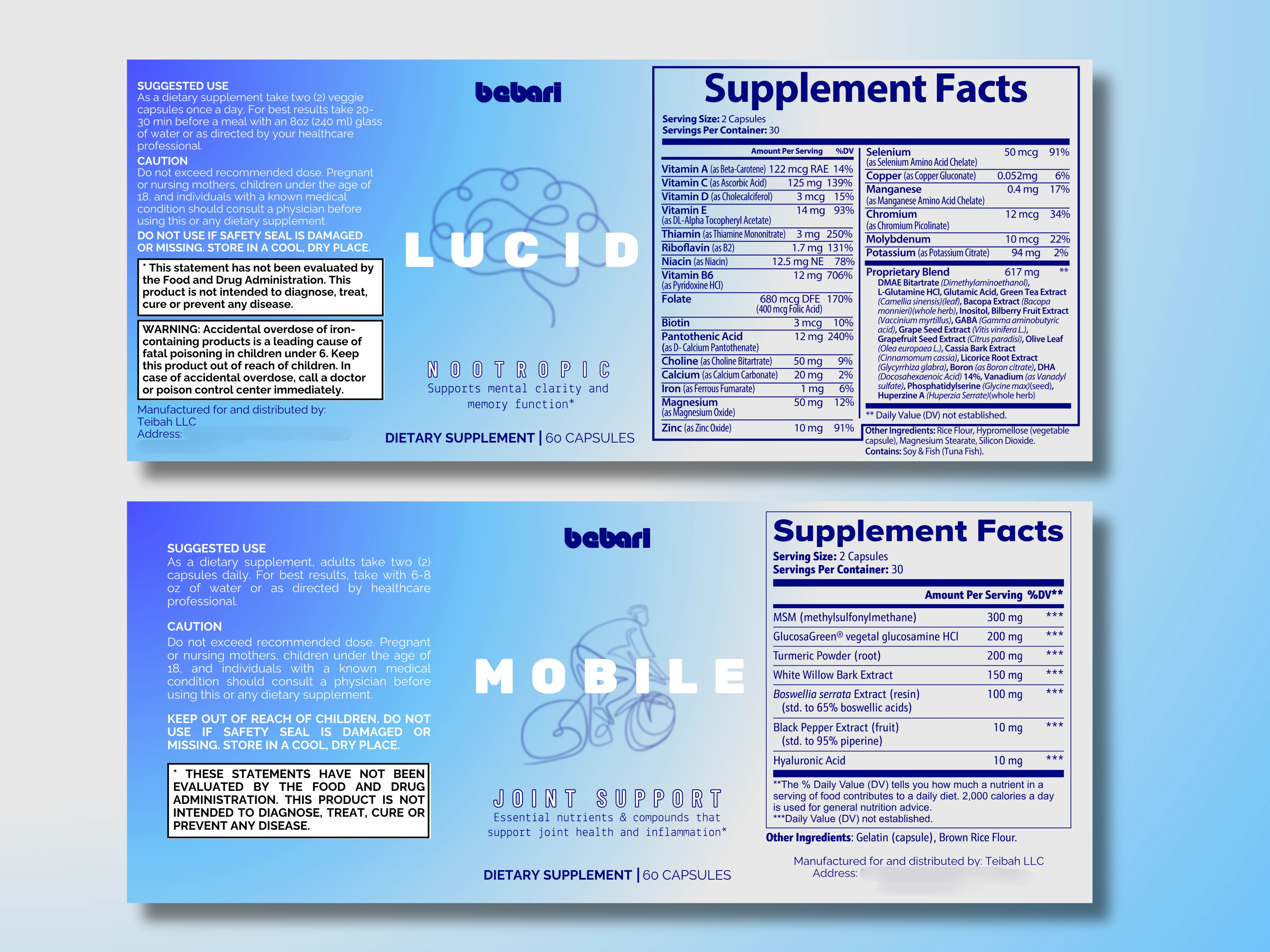
BARI WELLNESS REBRAND - BEBARI
This is a redesign done for a supplement brand whose target audience is older consumers. The goal behind the rebrand was to revive the company's image into something youthful and fun. Aging shouldn't be devoid of joy and exuberance. And I intended to transform the tone of this brand into being full of joy.
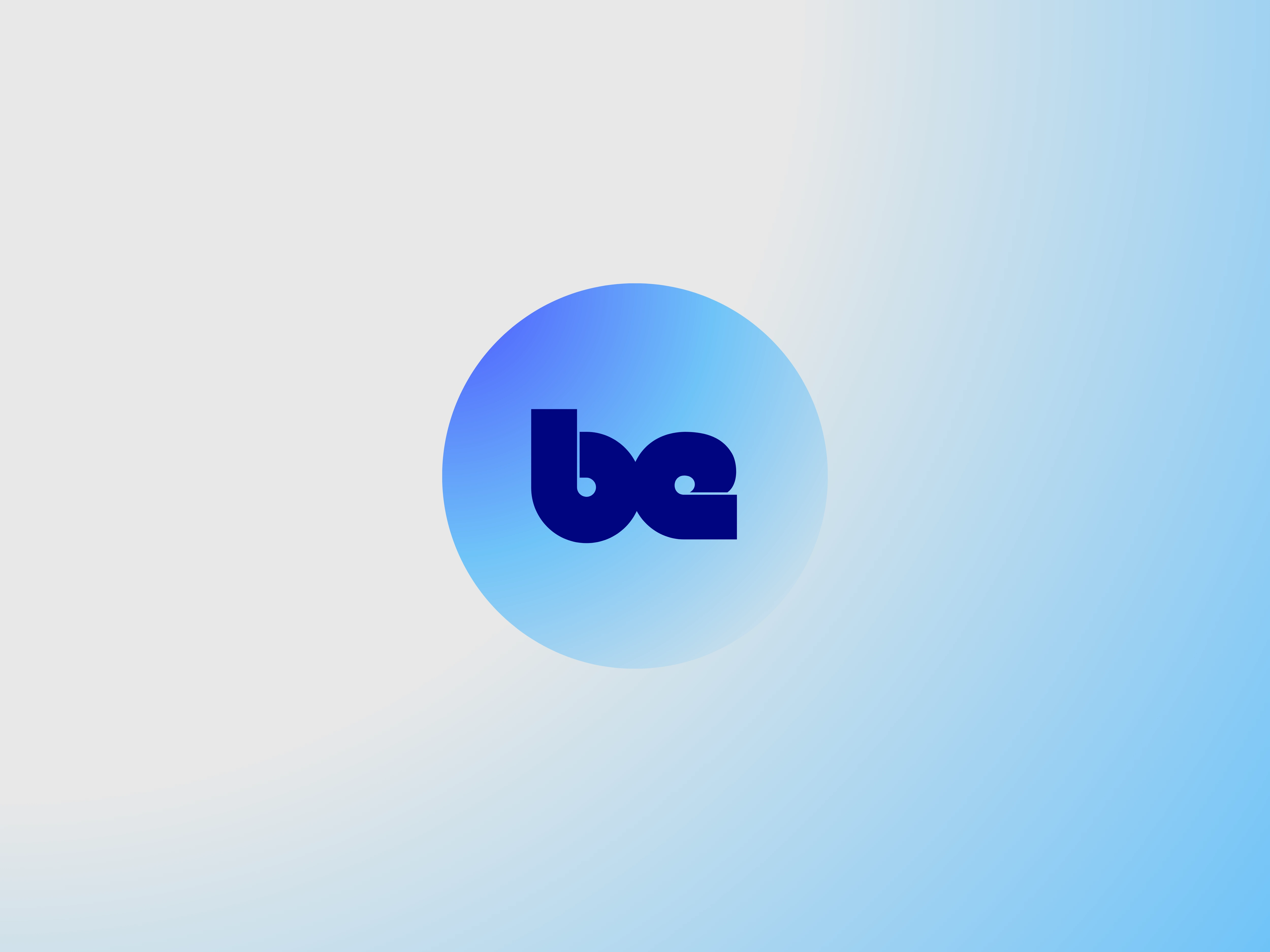
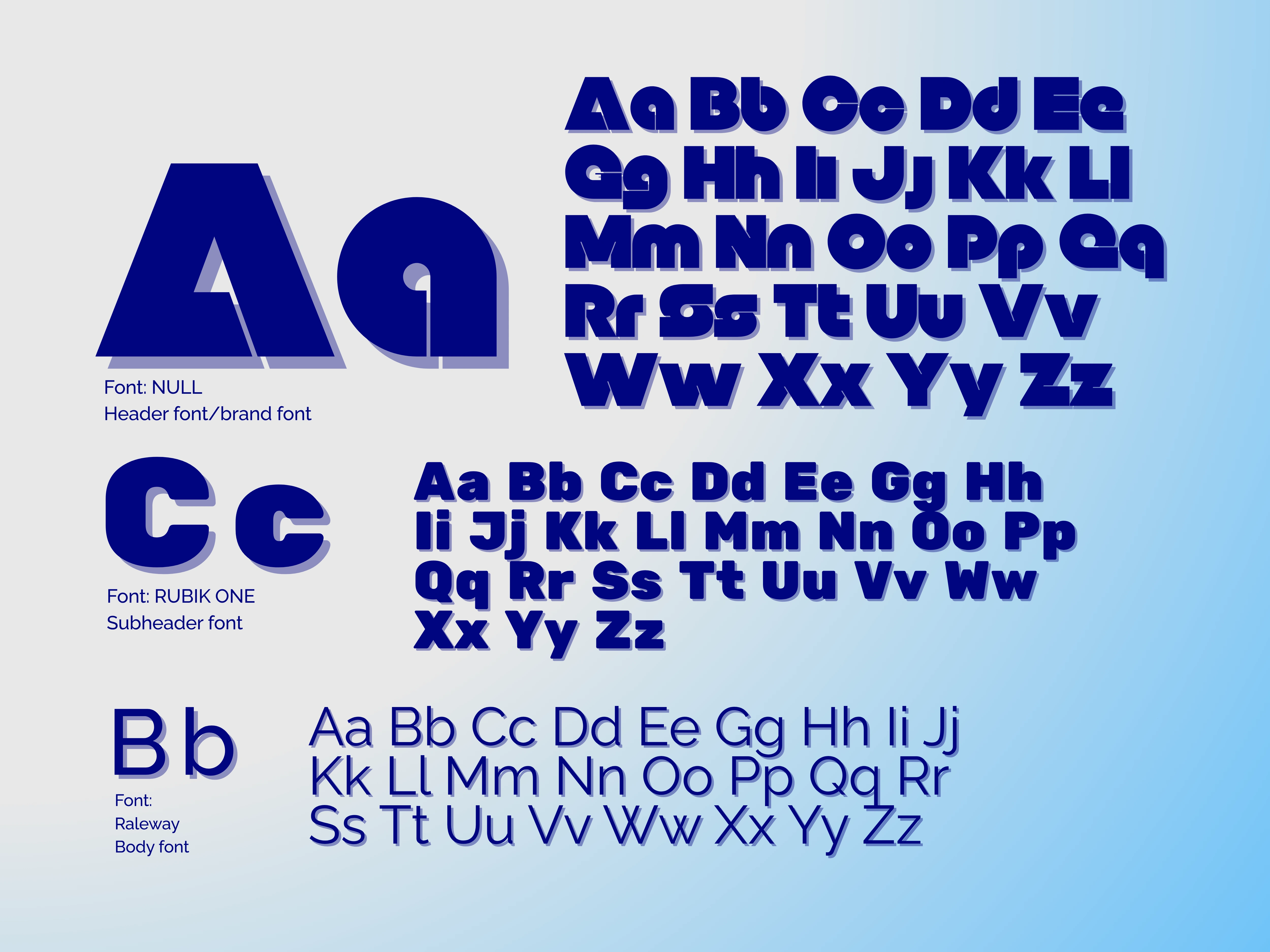
First step was to make the brand fonts bolder not only to be easier to read, but also block lettering takes up space very well. The title font/logo font needed to be noticeable enough to stand out and unique enough to be memorable.
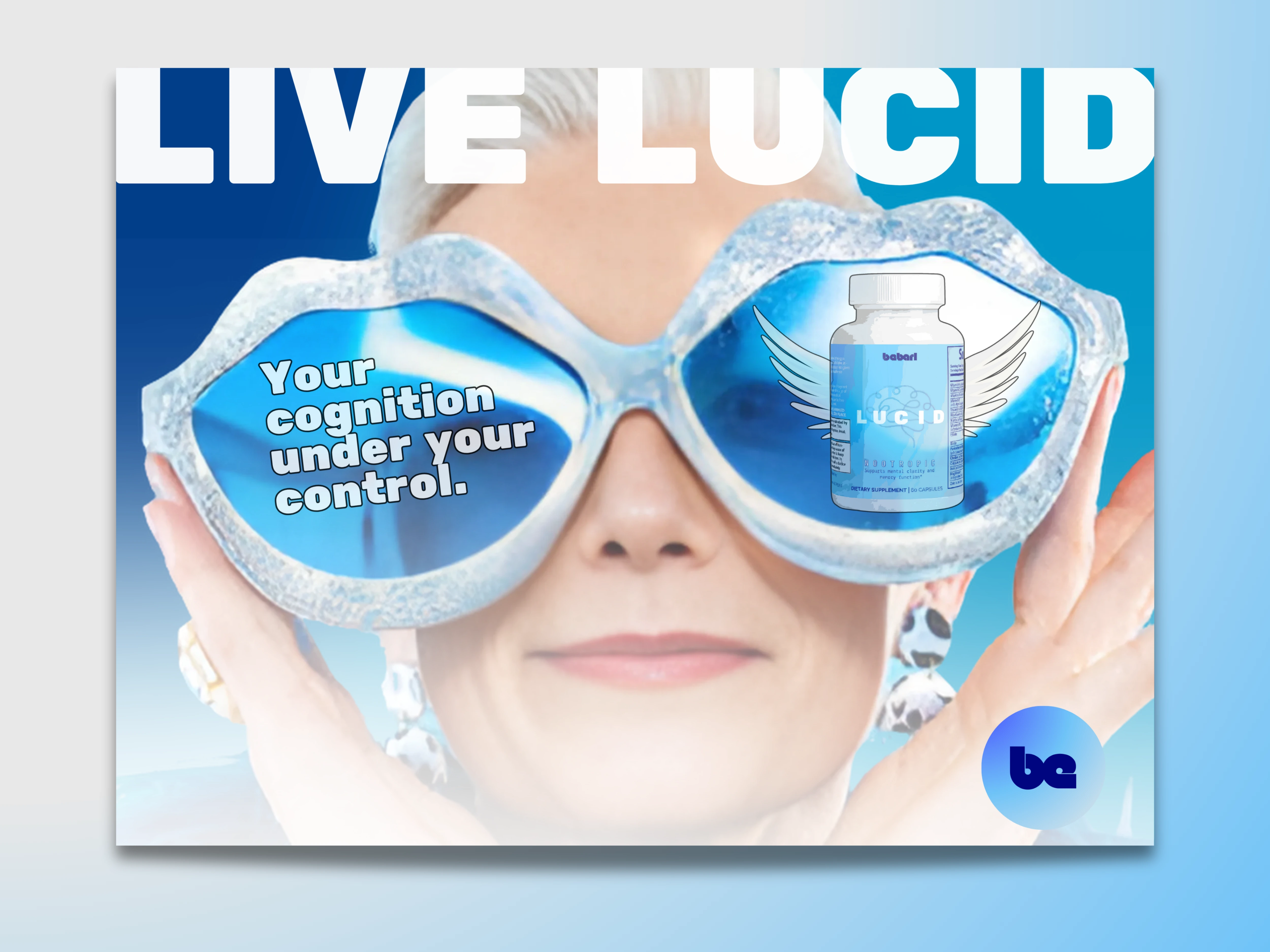
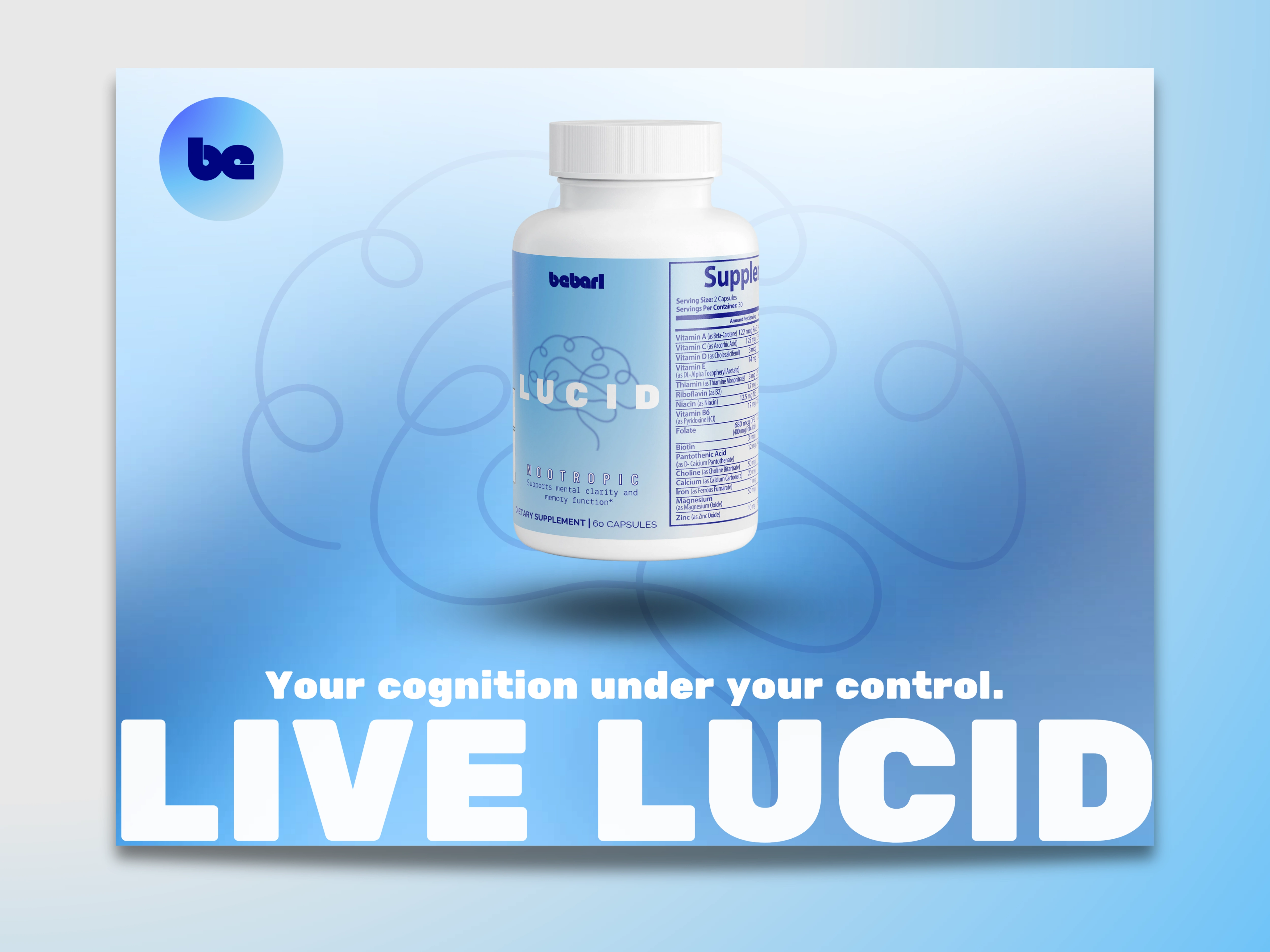
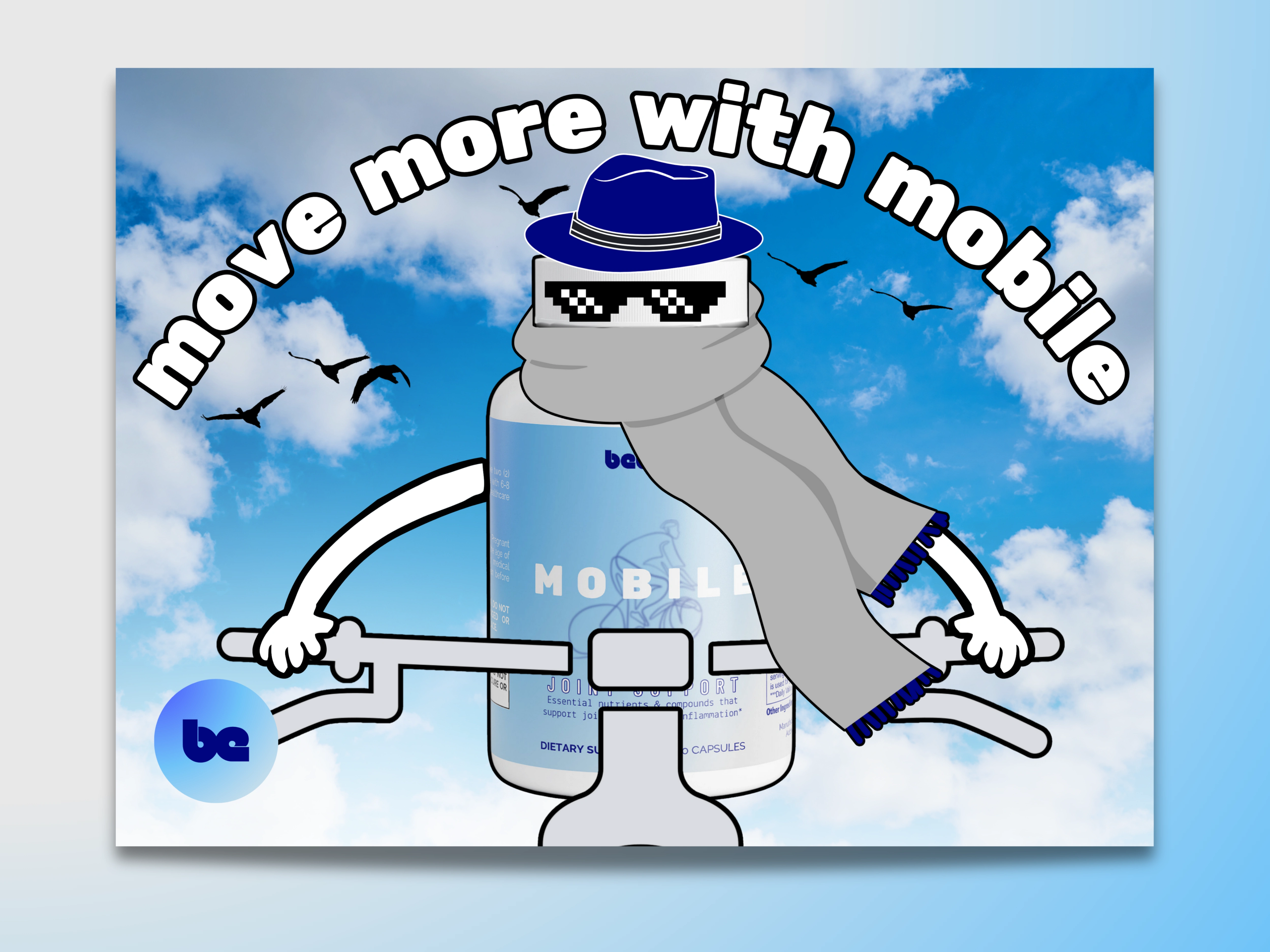
The goal for the promotional material was "LIVELY". Continuing with the theme of being relevant and youthful I went with a tone that leaned heavily on being fun. I thought it would be cheeky to depict the supplement like the angel on your shoulder.