Built with Framer
Triaguard - Framer website development

Anky C.
Verified


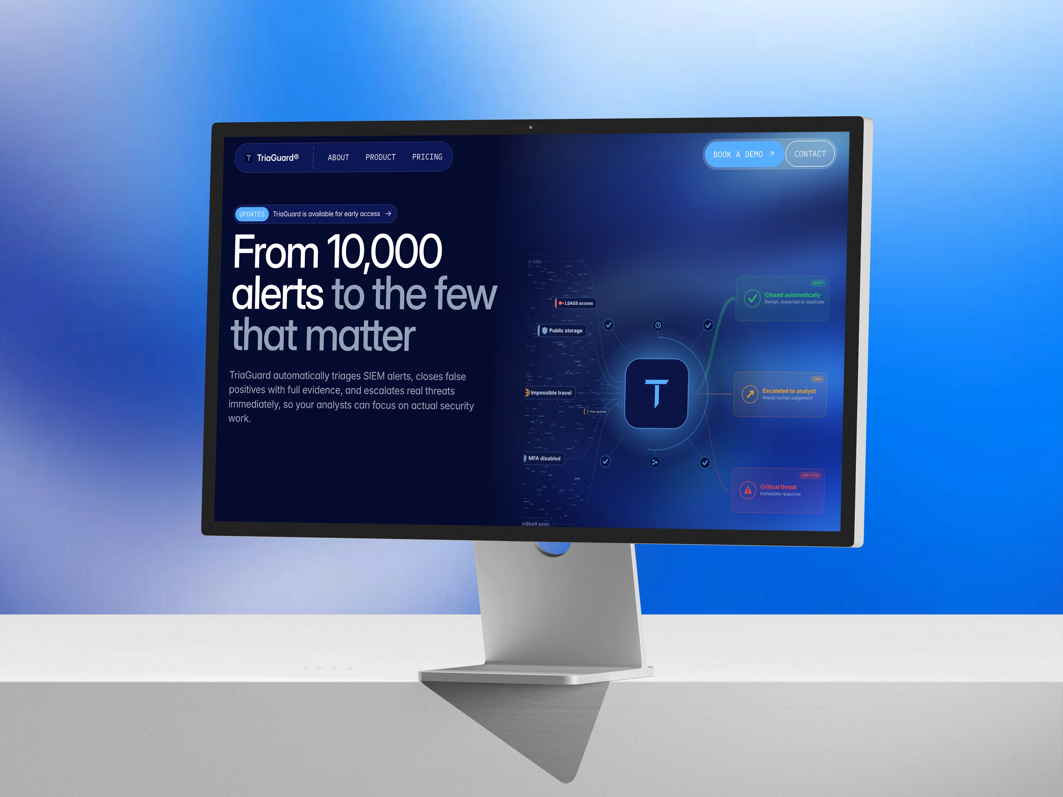
Triaguard
Making a complex security product feel simple, clear, and trustworthy.
Website Design · UI/UX · Framer Development
Triaguard came to me with a simple goal: build a website that could explain their product clearly and make the brand feel more credible.
The challenge was that the product itself is quite technical. There was a lot of information to communicate, but putting everything on the page would only make the experience harder to understand.
So I approached the website around one question:
How can we make something technically complex feel simple enough to understand at a glance?
Starting with the experience
Before jumping into visuals, I focused on how someone would move through the website.
The experience was structured around five key pages: Home, Product, About, Pricing, and Contact. Each page had a specific purpose, but they all worked together as one continuous journey.
The homepage introduces the product and its value first. From there, users can explore how it works, understand the company behind it, look at pricing, and eventually get in touch.
I wanted the website to answer questions naturally instead of forcing visitors to search for information.
Making the complex feel simple
One of the biggest challenges was communicating a security product without making the website feel like technical documentation.
I kept the interface clean and gave the content plenty of breathing room. Instead of filling sections with long explanations, I used visual hierarchy, product focused UI, and smaller content blocks to gradually introduce the information.
The idea was to let the visuals do some of the explaining.
This also helped create a stronger sense of trust. The website feels technical enough to belong in the security space, but approachable enough that someone unfamiliar with the product can still understand what Triaguard actually does.
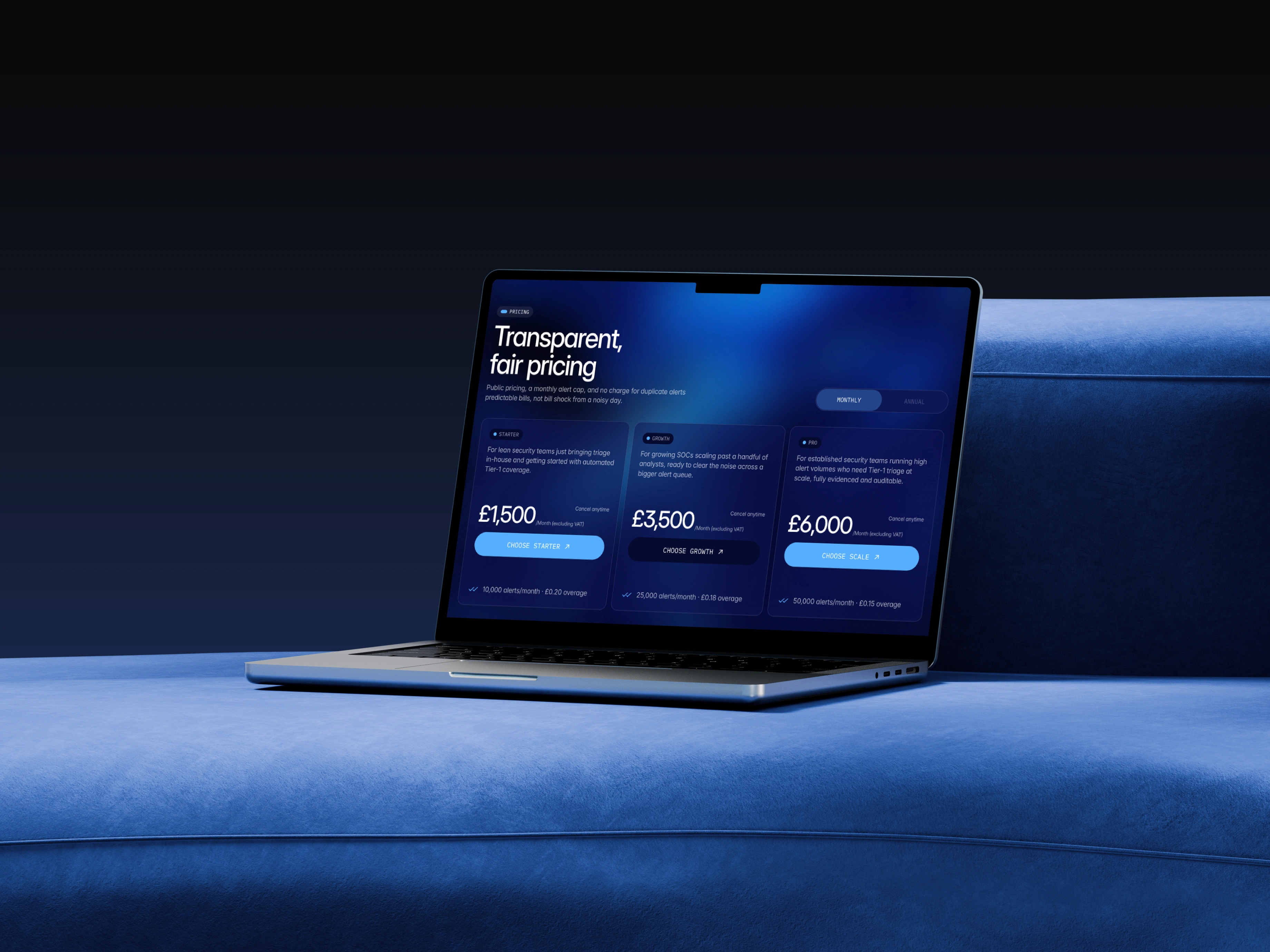
Building the visual language
Visually, I wanted Triaguard to feel confident and modern without falling into the usual cybersecurity aesthetic.
The design uses strong typography, generous spacing, structured layouts, subtle details, and carefully placed interactions to create a more refined experience.
Every element had a job. Nothing was added simply to fill space.
That restraint helped the important information stand out.
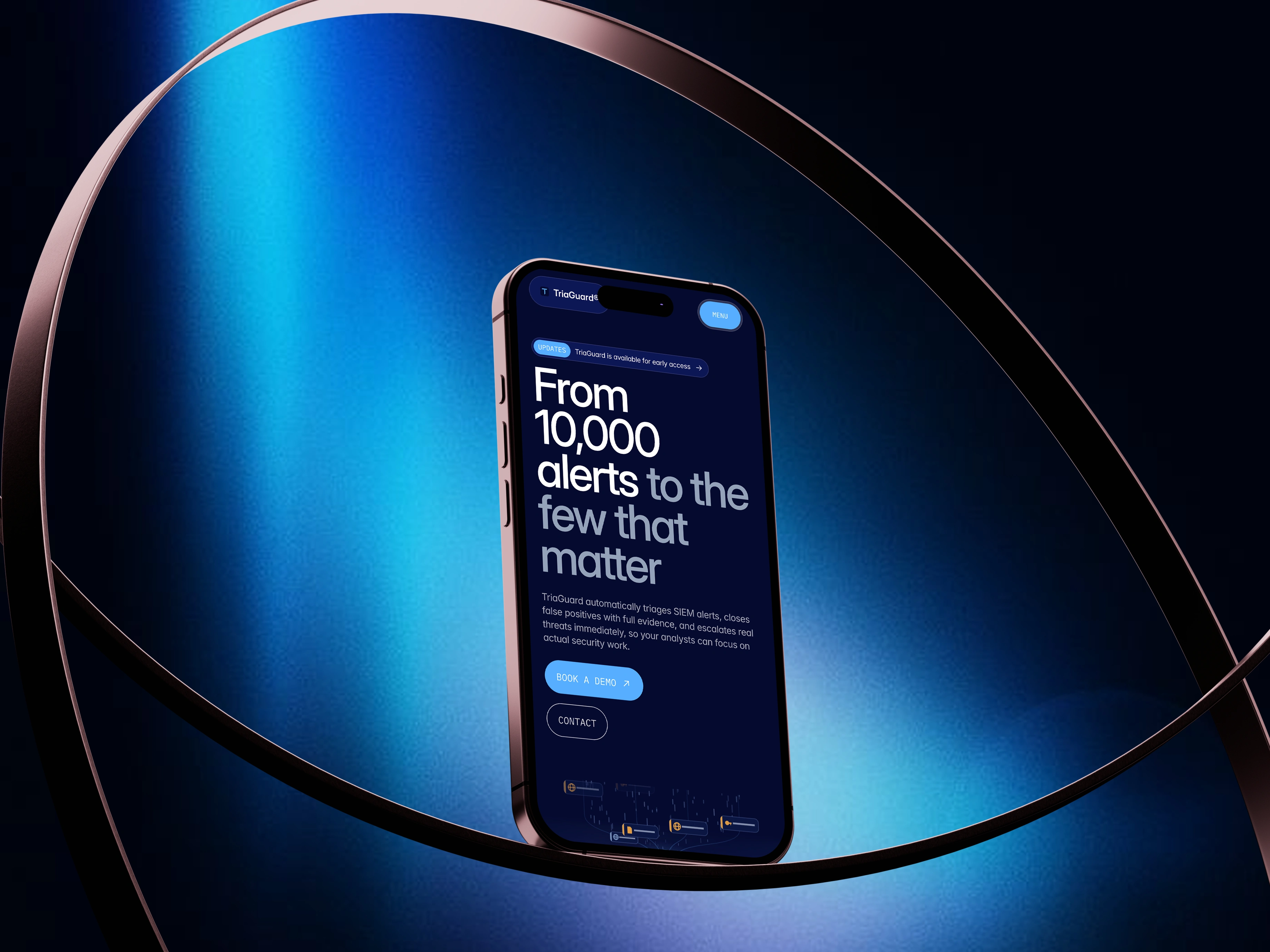
The final experience
The final website gives Triaguard a much clearer way to communicate what they do and why it matters.
More importantly, it creates a smoother path for someone discovering the product for the first time.
Understand the problem.
Discover the product.
Build confidence.
Take action.
That became the foundation of the entire experience.
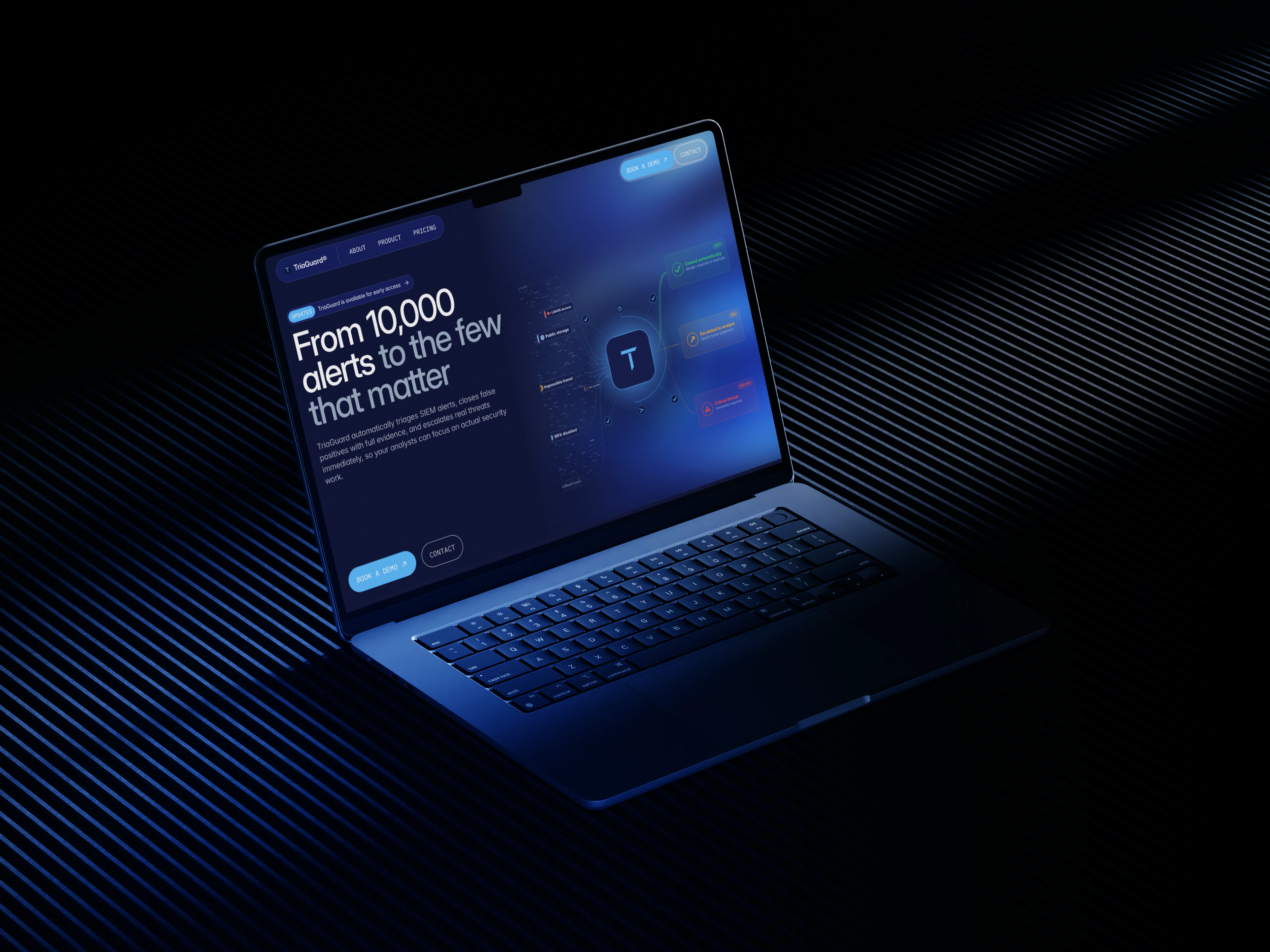
My role
I worked across the project from UX and visual design through responsive design and Framer development, bringing the website from structure to a finished, launch ready experience.
Book a call ❇️
If you’re building products where clarity, conversion, and flow matter, I’d be glad to help shape that experience.

Like this project
What the client had to say
Really helpful, gave us a lot of good tips and great to work with. Would recommend.


Cameron Bailey, TriaGuard
Jul 28, 2026, Client
Posted Sep 2, 2026
Designed a user-friendly website for Triaguard security product.
Likes
10
Views
168
Timeline
Jul 19, 2026 - Jul 28, 2026
Clients
TriaGuard