Netflix: The Social Component
What if Netflix included more social features to engage its audience?
Overview Of The Project
Netflix is one of the most popular streaming services in the world today. Its customer base skyrocketed during the peak of the Coronavirus pandemic and the Company has been able to maintain the momentum. This is because the app does well in serving its primary function seamlessly thereby retaining the attention of its customers. It has several awesome features such as offline availability of shows, parental control and supervision settings, push notification features, etc. Oh and did I mention the algorithmic movie and series suggestions? I'm pretty sure most of us cannot imagine a life without Netflix at this point.
User satisfaction is of utmost importance in any industry. So many streaming services are competing for attention in an already saturated market. The comparison of an individual user experience on each streaming service will be the deciding factor in which app will be patronized.
My Role
UX design
UX research
UI design
Tools
Figma
Paper & Pencil
Useberry
Timeline
Overall: 2 weeks
Discovery & Research: 1 week
Design & testing: 1 week
Problem
In Q1 2022, Netflix had lost about 200k subscribers and it is predicted that it will lose even more. The Company now wants to create a new feature to appeal to the largest demographics of users who have disabled their subscription, the 18-25 year olds and the 25-34 year olds.
Solution
Including social features that will allow options to share what one is currently watching, make temporary posts that will last up to 24 hours, create friend lists, etc, will be essential in helping users combine the allure popular social media platforms. Users will also have the ablility to customise their experience and curate content. This inclusion of social and sharing components will be appealing to users with this age demographic.
Define
First, I looked at the problem in greater detail in order to define the scope of the project via the 5W questions (What? Who? When? Where? Why?) This helped with narrowing down the essential details of the project and will avoid confusion down the line.
Subsequently, I took a look at Netflix within the context of its competitive environment. It is important to take account of what other similar service providers are doing and offering the users. This way we can spot the gaps and in corporate the solutions into our platform upgrade.
Interviews
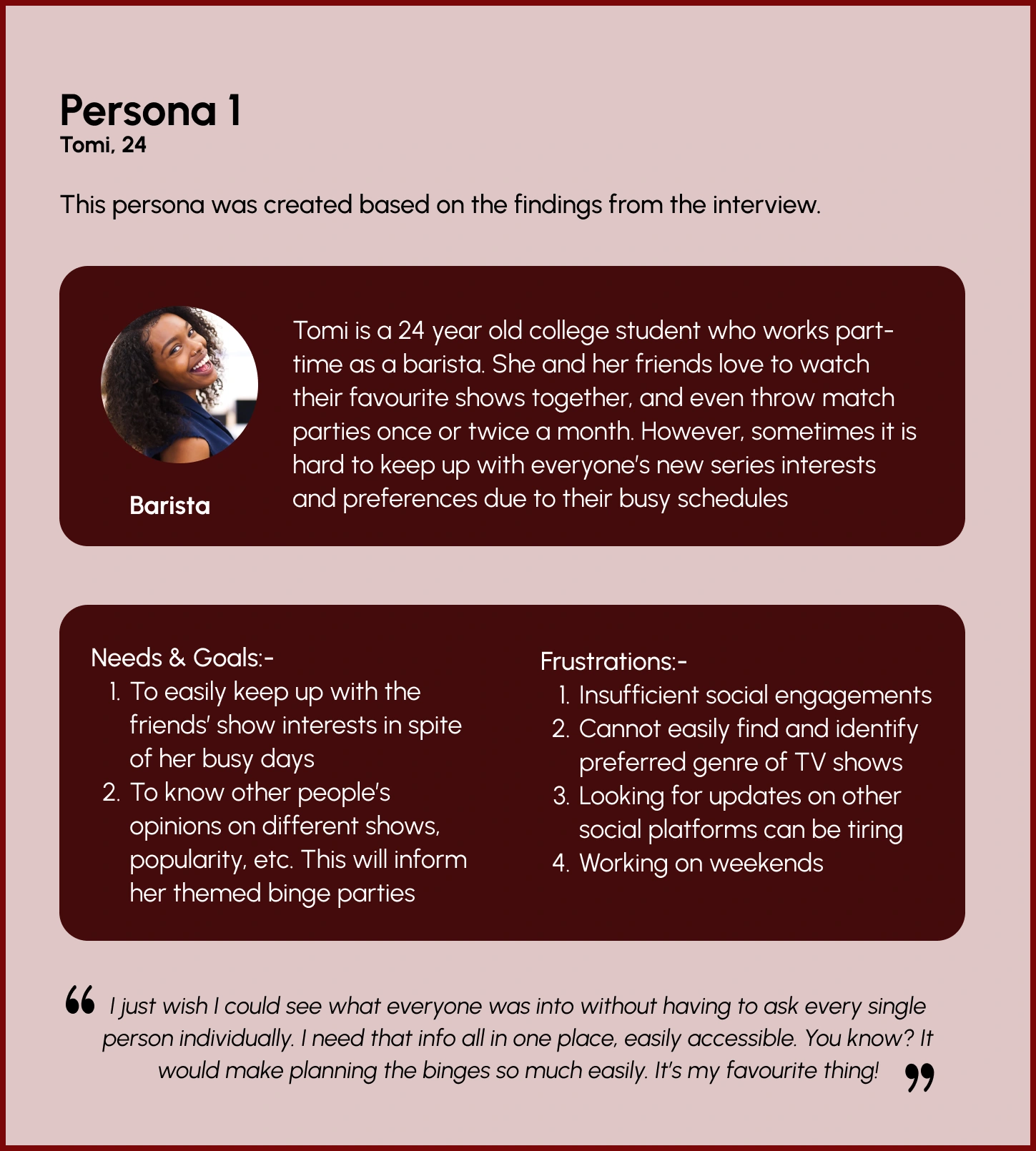
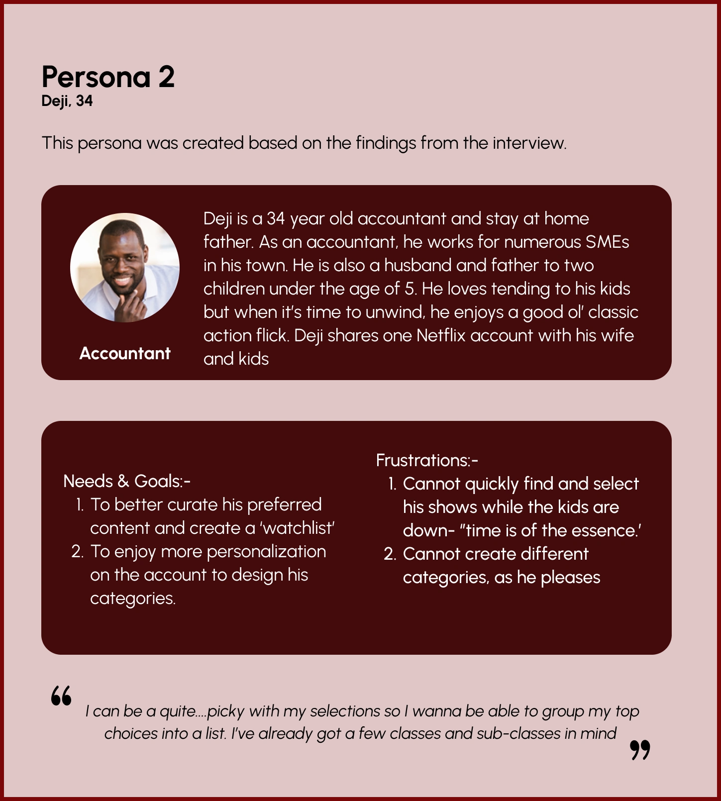
During the ideation phase of the project, I conducted user interviews to build personas and to inform the next steps of the design. It helped keep in mind the preferences of users as opposed to any initial or presupposed ideas..
Then, I prepared an interview script with 10 open-ended questions, focusing on our target audiences’ experiences, preferences, and grievances. In 3 days, I recruited and interviewed 8 users remotely. Some of the key findings are shown below:
Increased curation of content to specific user interests is required.
Users would enjoy more social engagement on their streaming platforms.
Users would enjoy more personalisation of their accounts
Users want to see content best suited to them with minimal effort in finding it
Users want a more seamless means of watching tv shows remotely with their friends
This led to the following insights:
Availability of 24-hour post sharing feature (of user's current viewing interest) and voting polls could boost engagement as this similar social media posting
Voting polls or tabs will help users see what other friends 'like' or 'dislike' . This is another touch incorporating popular social media trends.
Access to data from specific user posts and follower poll analytics will allow for better curated content by the algorithm. This could provide a competitive advantage similar to other service providers such as Apple and Amazon who also access to other consumer data outside of taste in series.
Users require more personalisation on their account. Features to include greater playlist creation and curation can help satisfy that need
Screen design displayed in a mockup
Screen design displayed in a mockup
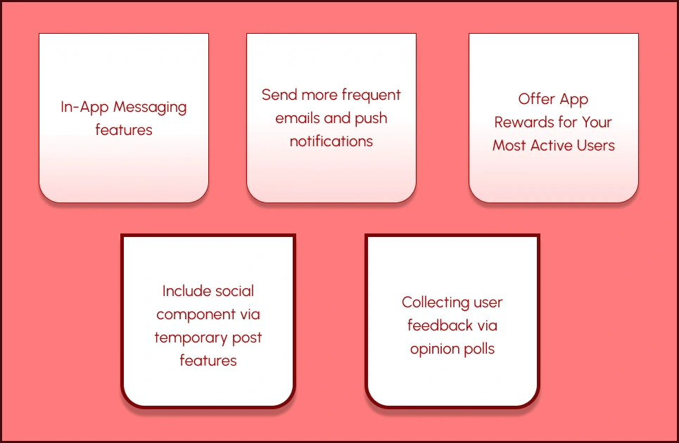
Outcome of the brainstorming process
Ideate
After a few sessions of brainstorming and concept validation, I settled on:-
Including a social component:- Temporary posts features to allow engagement between users as more likely to stay on your app when they feel a sense of belonging from their online communities
.
Collecting user feedback via opinion polls:- This is another method of encouraging involvement, participation and belonging
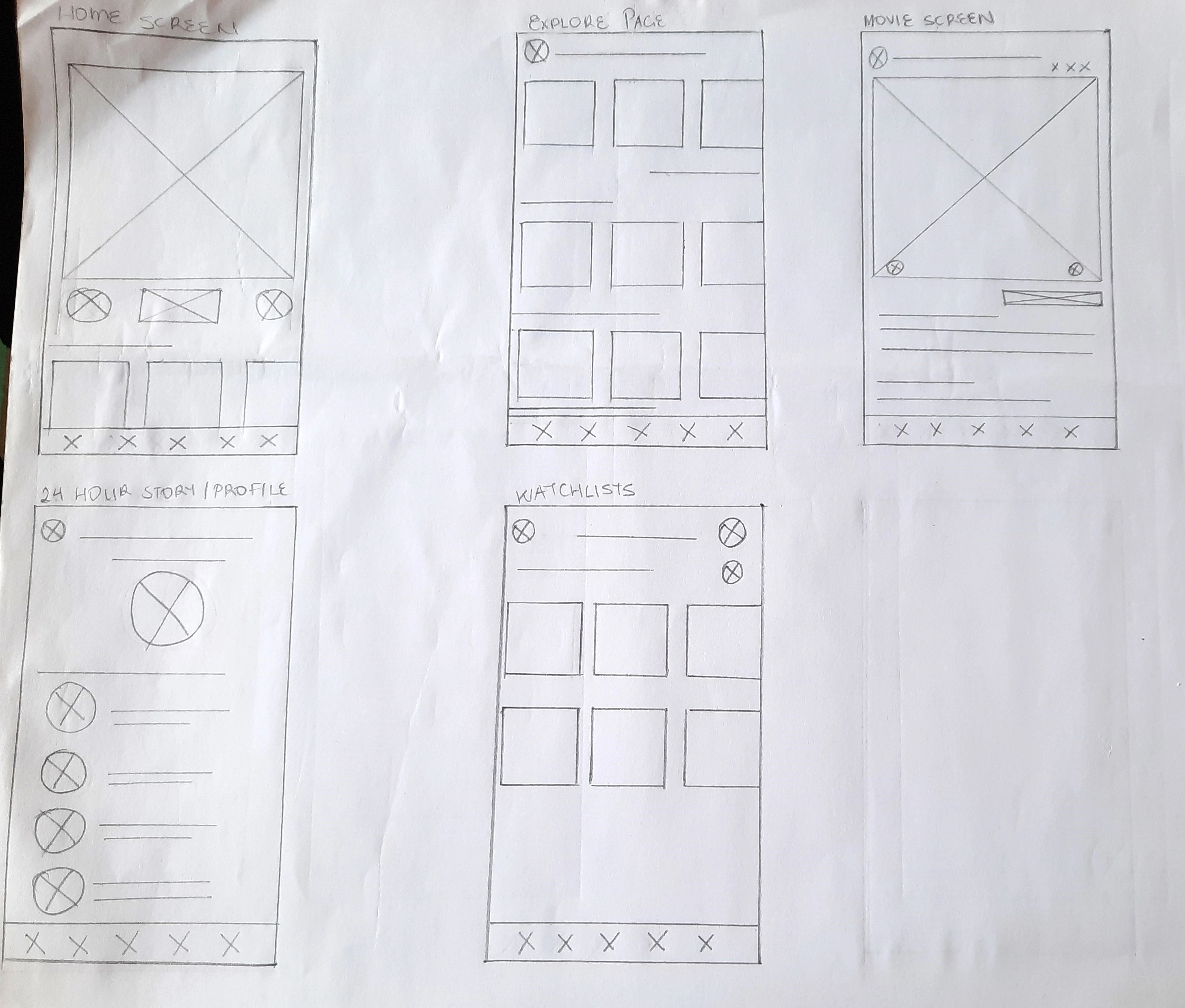
Pencil Drawn Low Fidelity Wireframes
Wireframes
Low fidelity wireframes were sketched out based on solutions proposed. There were updated once feedback was received from respondents.
High fidelity wireframes were then created and used for the prototype.
User Interface Design
Initial low fidelity wire frames were hand drawn and then final screens high fidelity were designed in Figma. The first few three were created based on the research and analysis above while others were derived from the existing app. These were inputted for a wholistic view.
There is viewing frames depicting what the friend list and active stories in a familiar way.
There is a polling bar to vote showing 'like' (thumbs up) and 'dislike' thumbs down
'My watchlist' screen showing user's personalised playlists.
The aesthetic remains true to the Netflix theme which users have become accustomed to
Testing
Testing was conducted remotely via Useberry. Both male and female participants aged between 18 and 45 were organized in the participant pool in order to test the prototype. The participants were given the task of testing the new features. This would give insight into how easy this feature is to operate as well as whether or not it is of interest.
Heat mapping revealed that users were able to navigate the concept of the 24hour story feature . Navigating the voting poll feature was also seamless, however creating new playlists proved slightly more difficult. This prompted further modifications to enable a smoother task completion process.
A "+" CTA button was included after the title on the 'MY Watchlists' screen to support user intuition.
Result
Information gathered from testing and evaluation resulted in the proposed updated version of the app design shown below:
Users' objective of enjoying a more socially engaging streaming experience was achieved through like and dislike polls
Users appreciated the 24-hour ‘currently watching stories’ as they can easily view their friends' interests as well as share their own.
Users enjoy a more seamless process of finding their preferred shows outside of Netflix algorithmic recommendations and ‘Continue Watching’ banners. They now have "watchlists" created through their personal categorisation
Learning
User preferences must always be the main focus. There is always room for improvement, no matter what stage of business you are in. It is the duty of the business to keep up with user trends and adapt their product or services accordingly.
Thank you for reading my case study!
Want to work with me? Feel free to contact me at yvonneobaraye@gmail.com
Like this project
Posted Feb 25, 2024
This case study investigates the slowly declining audience of the popular service, identifies how best to impede it and proffers user-centered solutions
Likes
0
Views
8

