Promote.fun - Branding
Dominik Mészáros
Case Study: Promote.fun Brand Identity
Client: Promote.fun
Scope: Brand Strategy, Visual Identity, Typography System, Brand Guidelines
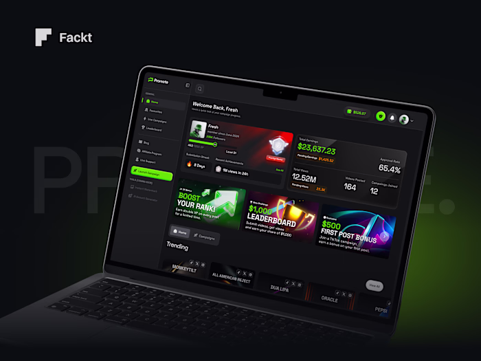
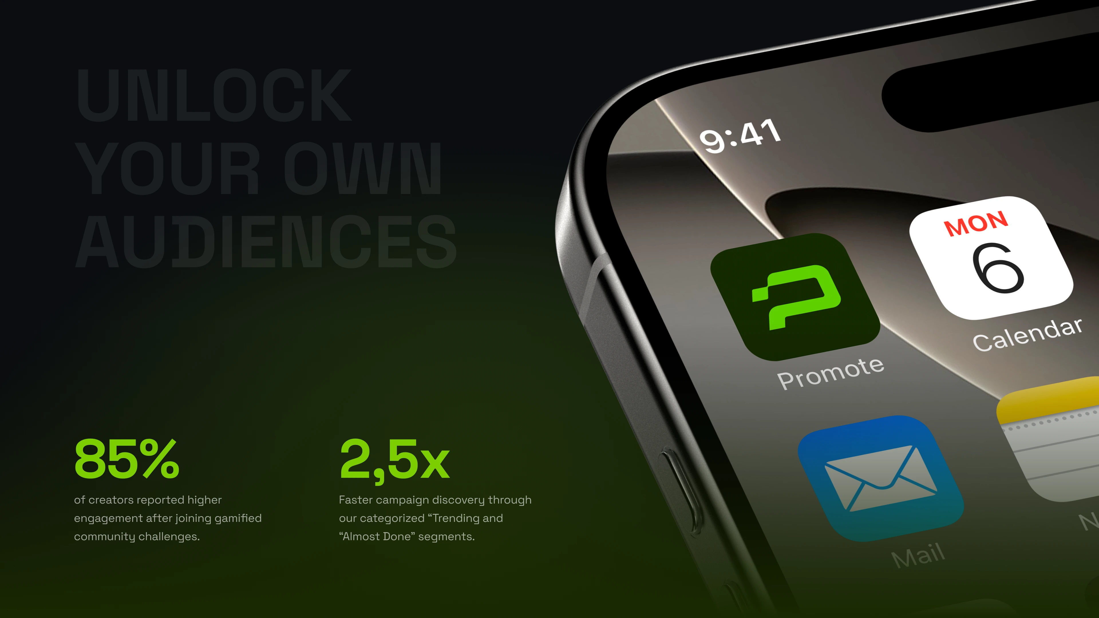
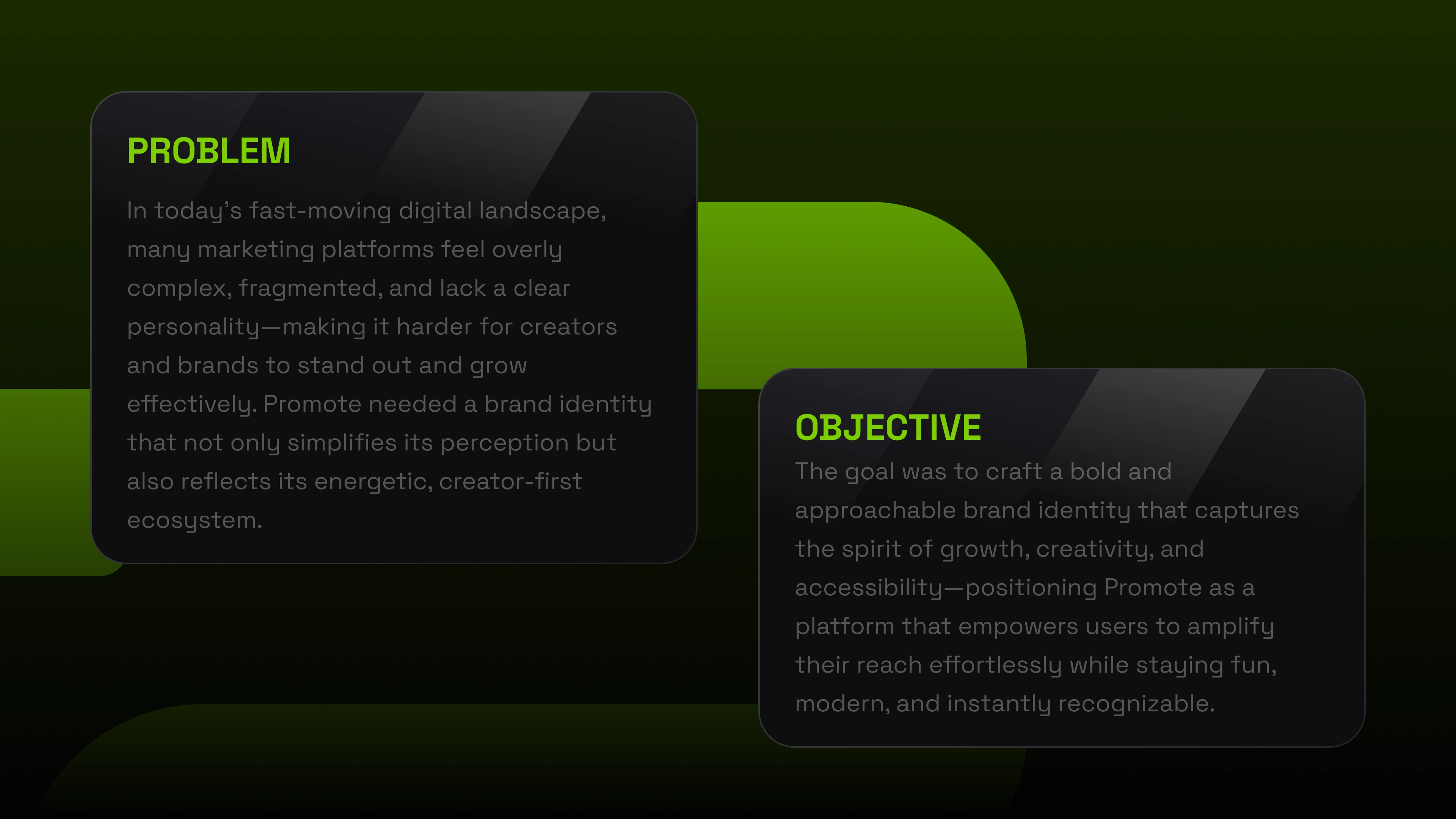
Promote.fun partnered with us to build a brand identity that could match the ambition of their platform — a performance marketing marketplace connecting creators and brands through radical transparency. The challenge was to create a visual language that felt energetic and modern without falling into the generic SaaS aesthetic that dominates the space.
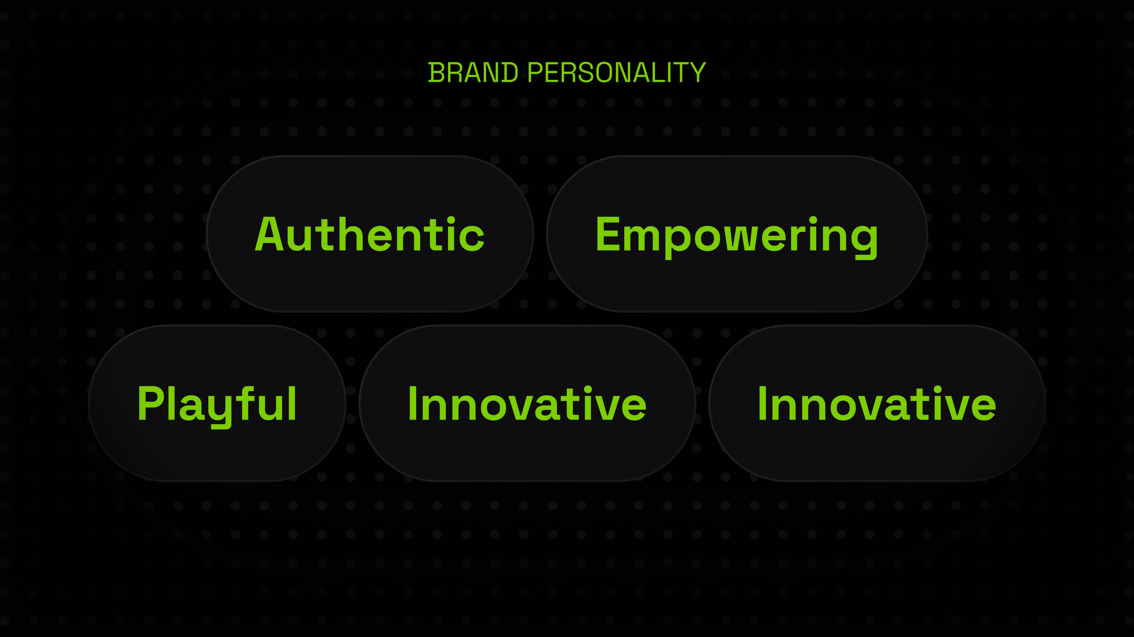
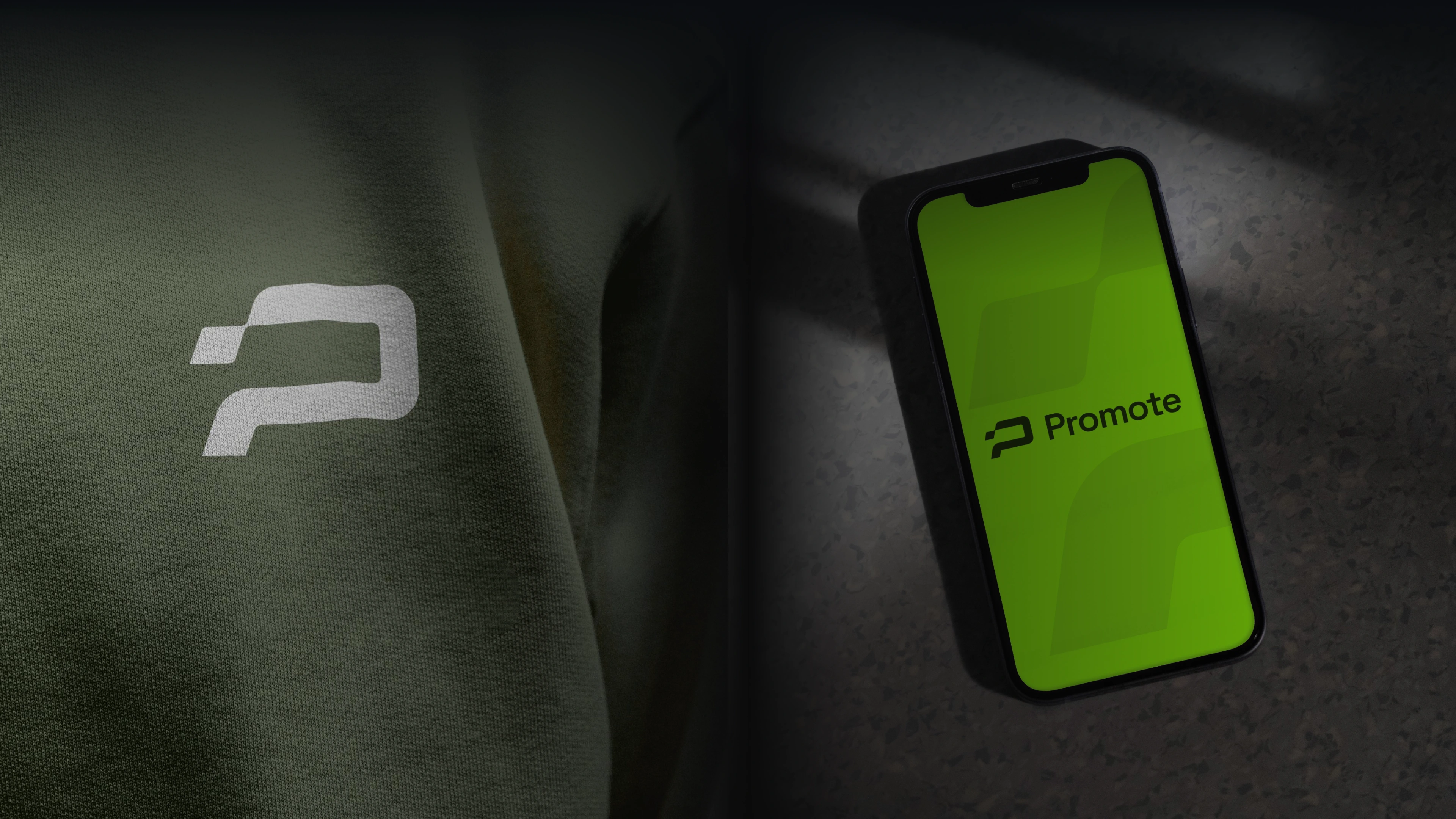
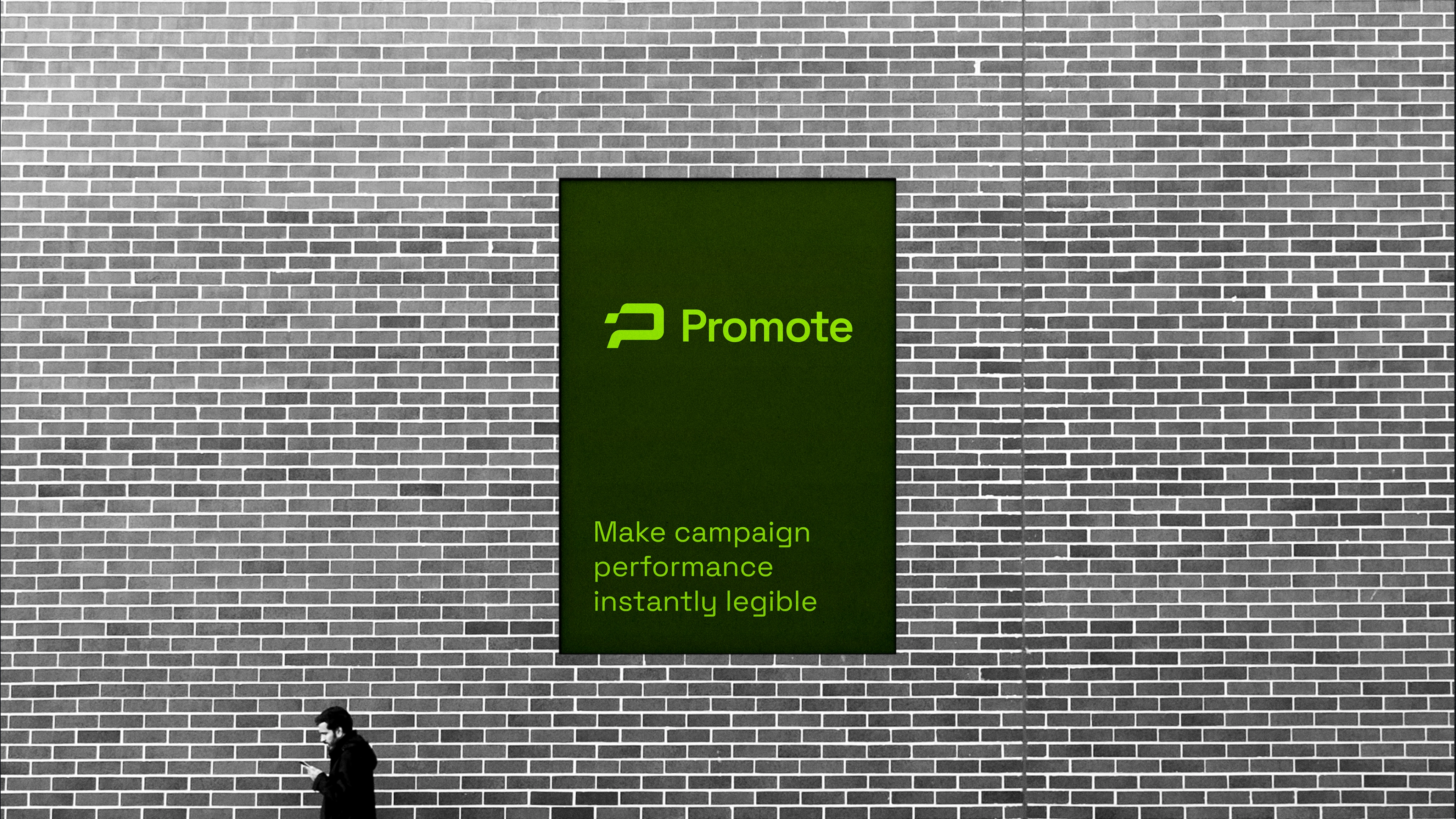
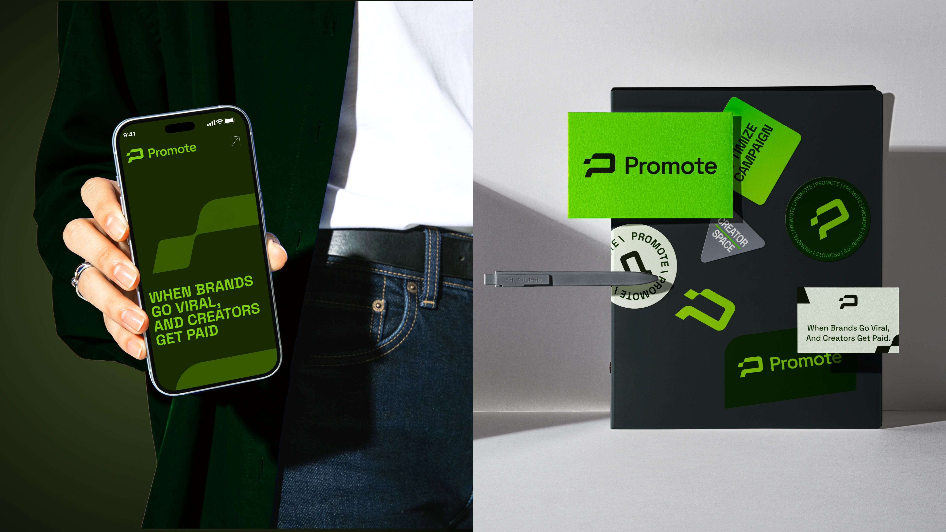
Our goal was to design a brand that signals performance, trust, and momentum from the first impression. We focused on crafting a bold, high-contrast identity that could work across product interfaces, marketing materials, and social presence while remaining instantly recognizable and ownable.
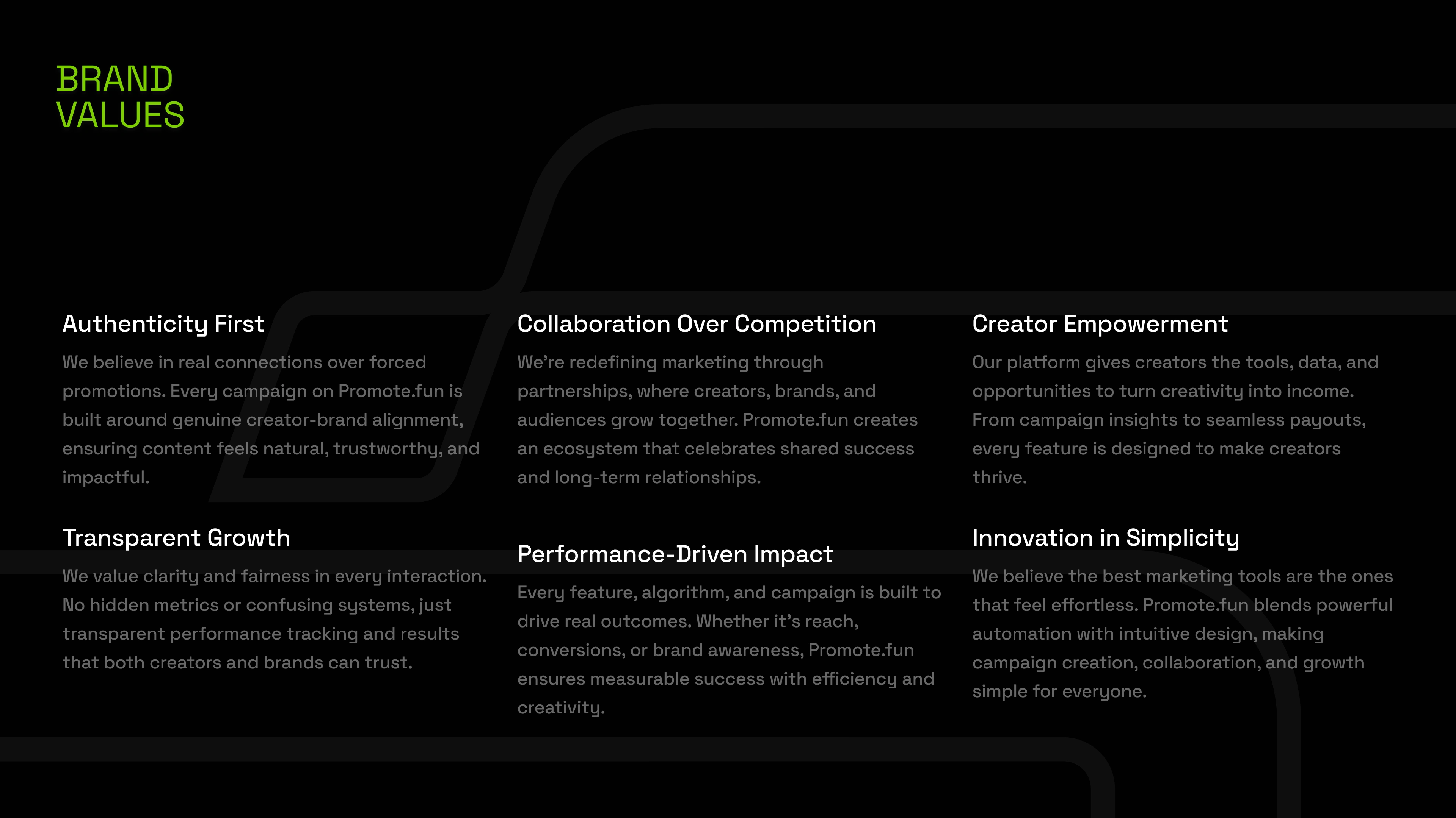
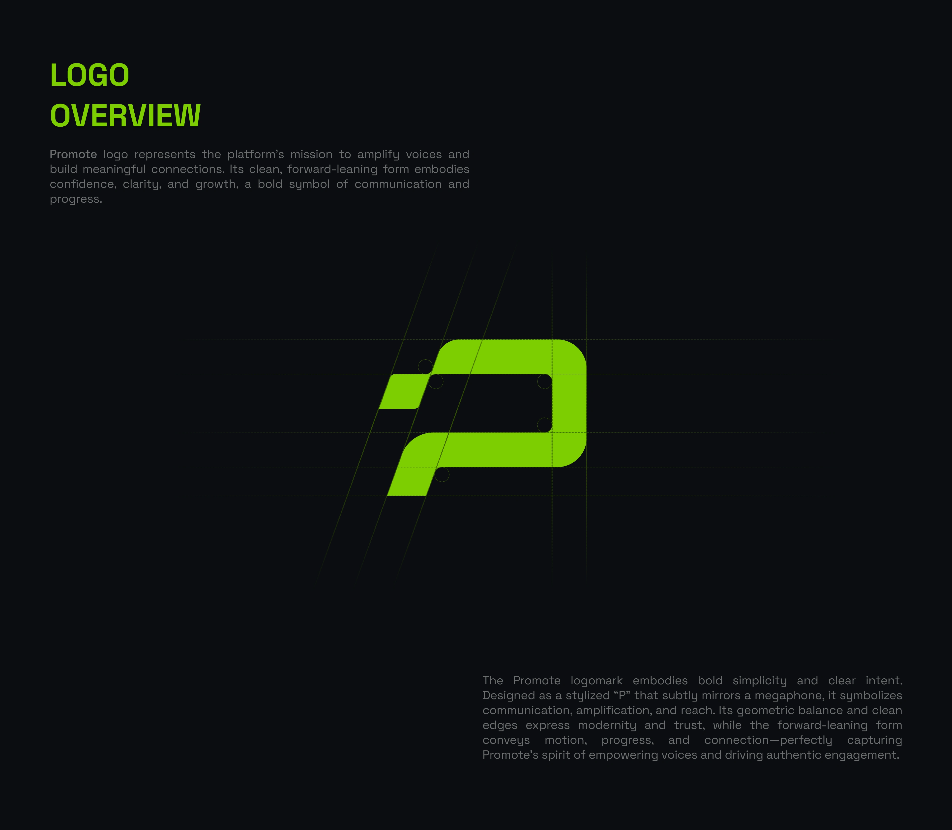
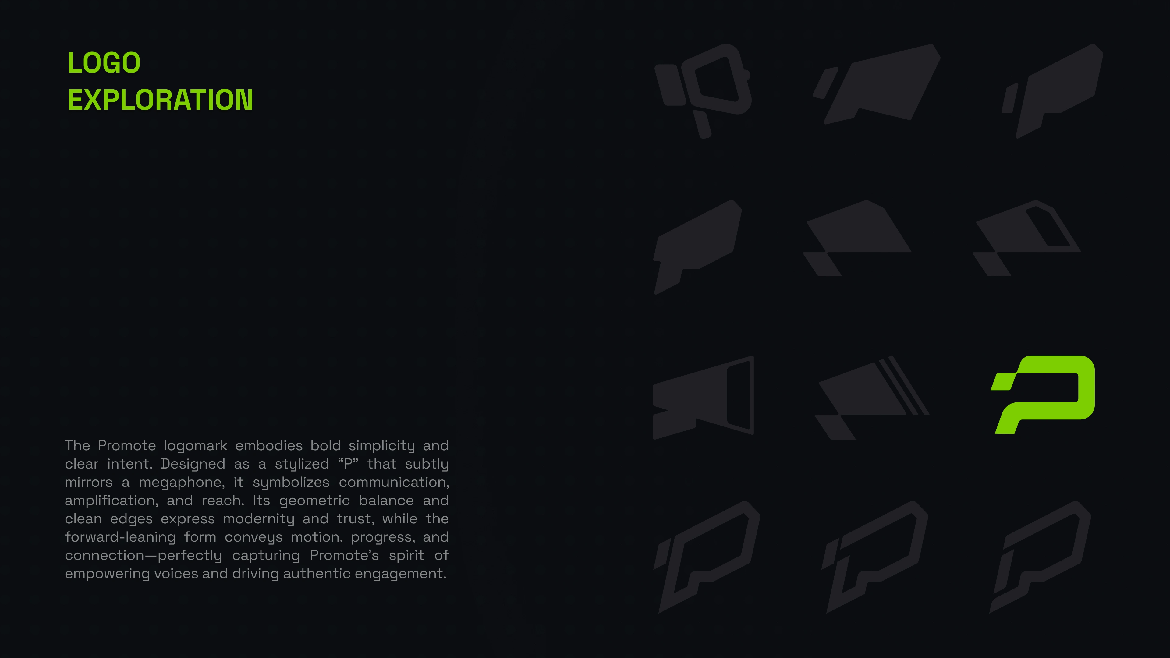
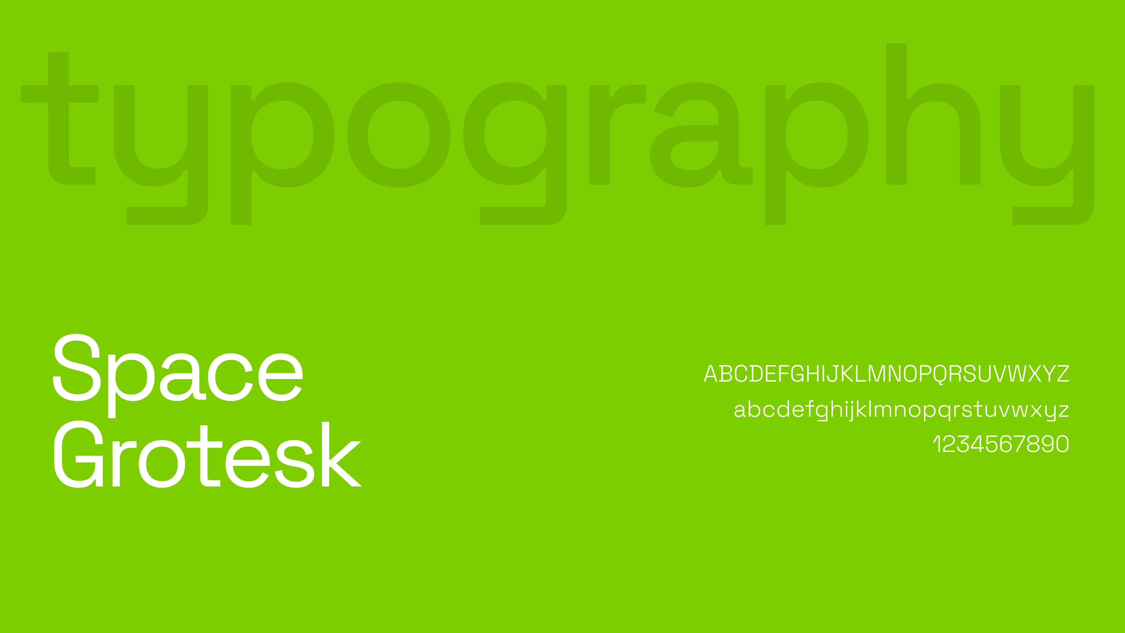
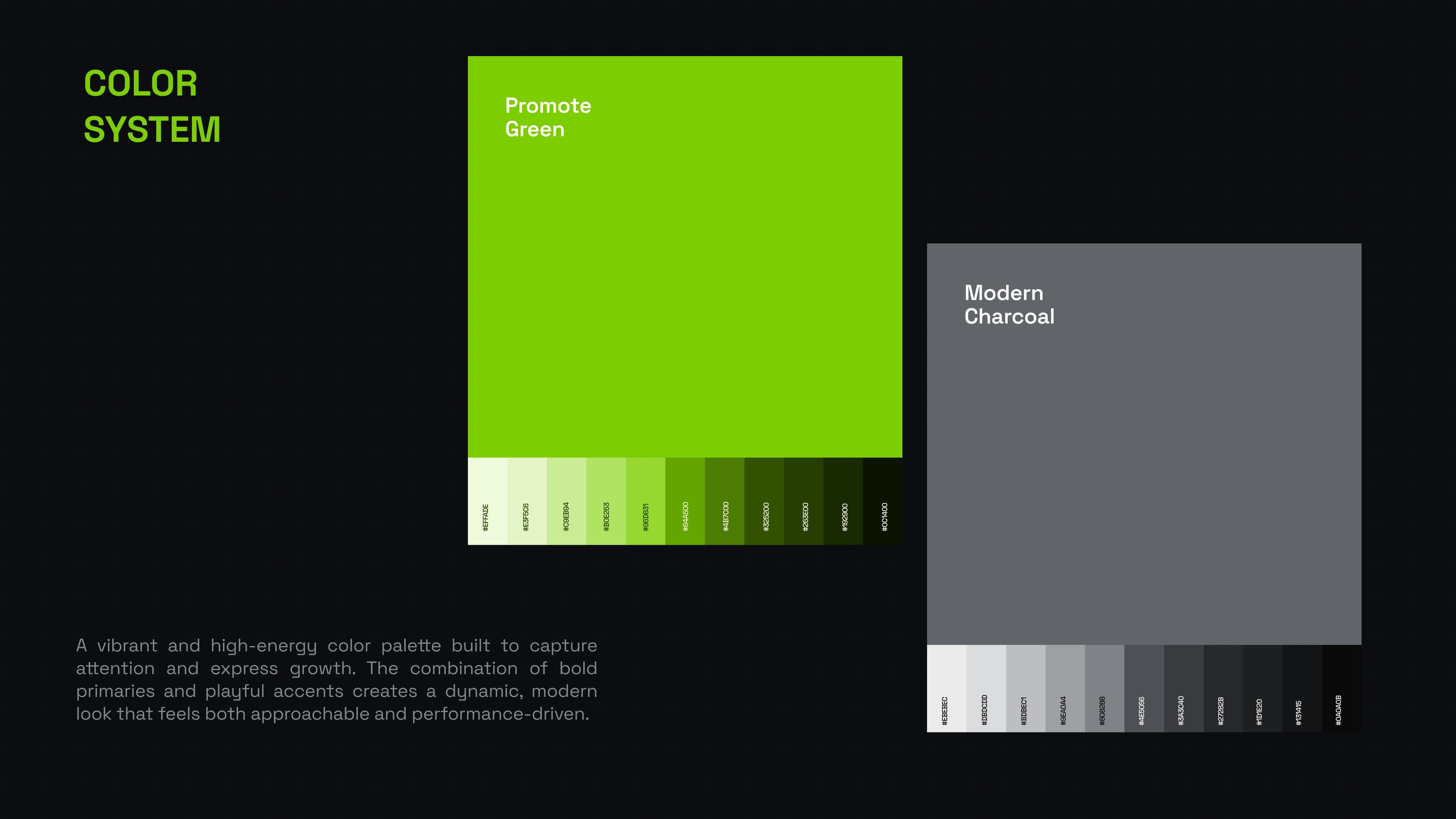
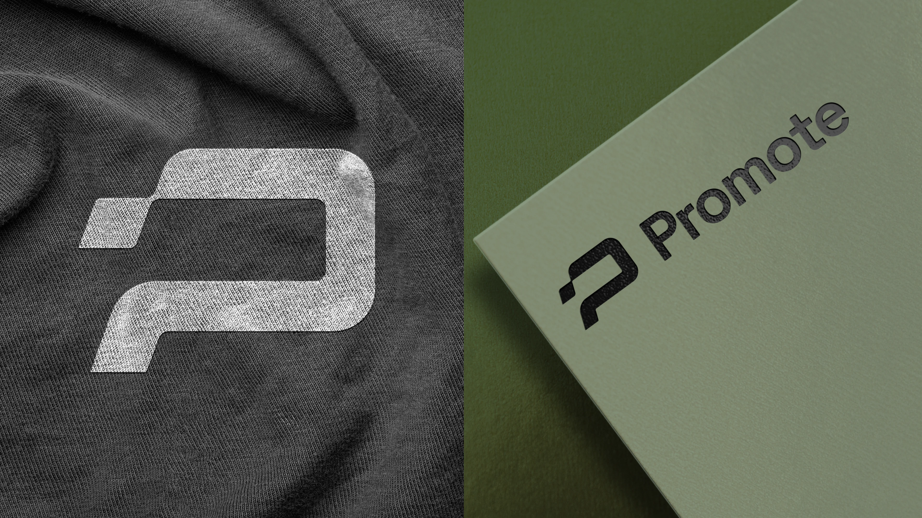
The process started with brand strategy, defining the core values and positioning that would differentiate promote.fun in a crowded market. From there, we developed a signature neon green accent palette paired with a dark, minimalist foundation — a deliberate choice to evoke energy and focus rather than sterile professionalism. Space Grotesk was selected as the brand typeface for its geometric clarity and versatility across both display and UI contexts. We built out a full visual system including color rules, typography scales, iconography style, and brand application guidelines to ensure consistency across every touchpoint.
The Result:
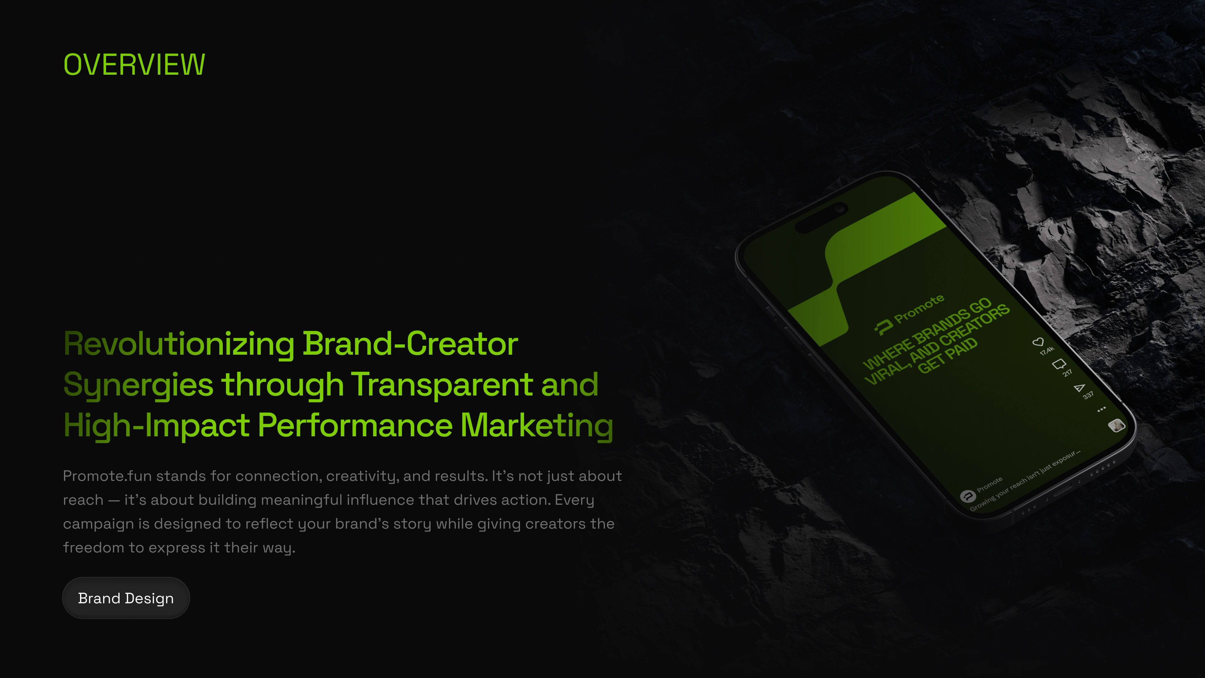
A distinctive, performance-driven brand identity that positions promote.fun as bold, trustworthy, and built for the next generation of creator-brand collaboration. The brand now carries a clear visual voice that scales seamlessly from product UI to pitch decks, social content, and beyond.
Like this project
Posted Apr 11, 2026
A high-energy brand identity for promote.fun - neon accents, sharp typography, and a visual language that makes performance marketing feel bold.
Likes
0
Views
14