Zocket Landing Page Redesign

Željko Milivojević

Zocket — Landing Page Design
Zocket is a digital advertising platform built to simplify campaign creation, optimization, and performance tracking for growing businesses. The project focused on designing a clear, conversion-oriented landing page in Figma that communicates value immediately and positions the product as reliable rather than experimental.
The core problem was positioning. Advertising tools often overwhelm users with dashboards, metrics, and promises of growth without explaining how the product actually helps them make better decisions. This creates distrust and cognitive fatigue before engagement begins.
The objective was to design a landing page that explains Zocket’s value within seconds, reduces perceived complexity, and guides the user toward action without pressure. The page needed to feel structured, professional, and scalable for future marketing iterations.
I was responsible for the full landing page design in Figma, including layout structure, UX flow, visual hierarchy, and component design. The focus was not on visual novelty but on clarity and control.

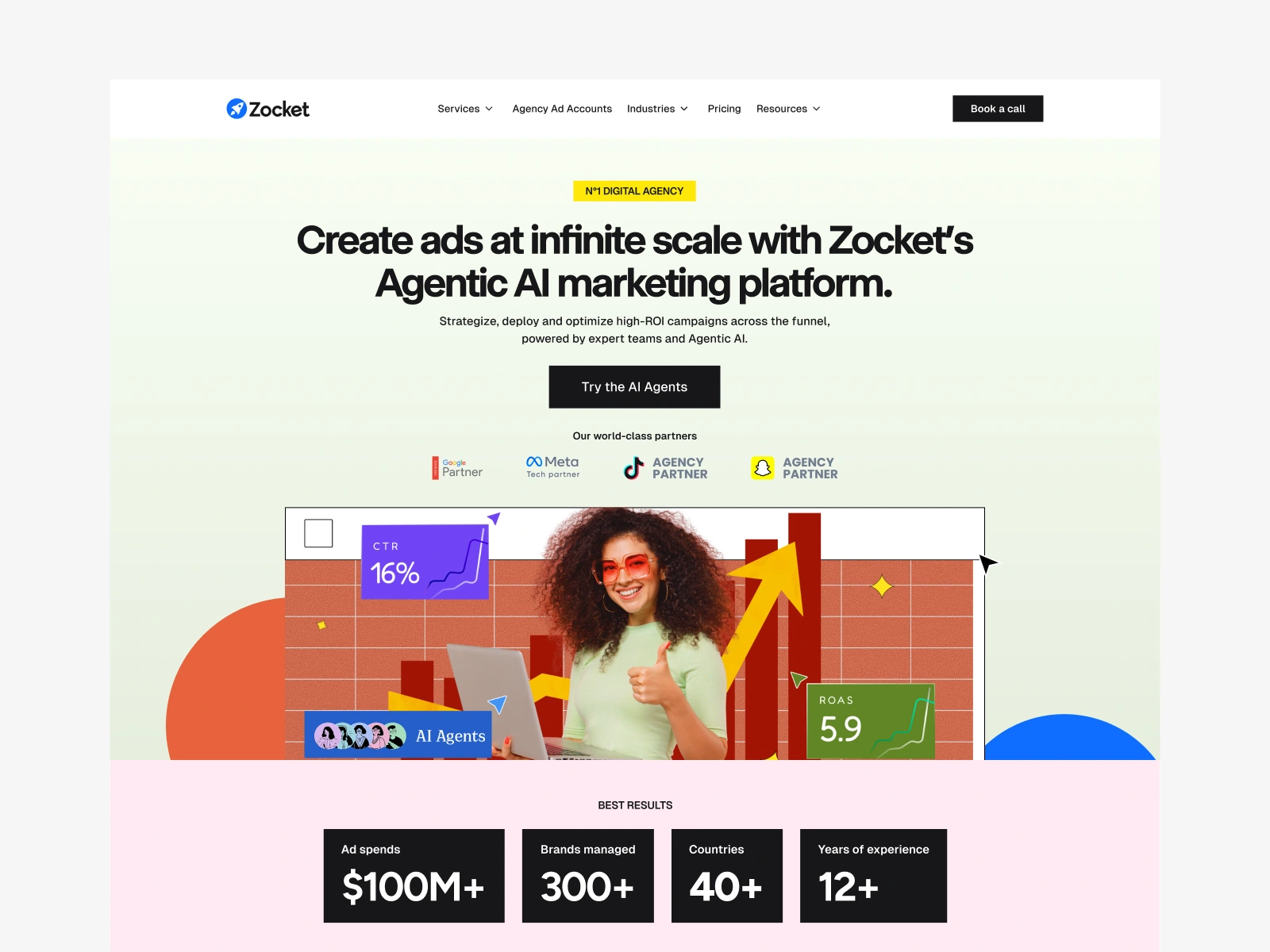
Zocket hero screen
The information structure follows a direct narrative. The hero section establishes what Zocket does and who it is for without metaphors or inflated language. Each following section deepens understanding by answering one question at a time, moving from value to process to outcomes. Feature exposure is restrained and always framed through user benefit.
From a UX standpoint, the design minimizes decision fatigue. There is one dominant action and no competing paths. Spacing, alignment, and rhythm are used to slow the user just enough to absorb information without friction. Every section earns its place by supporting comprehension or trust.
The visual system is clean and systematic. A neutral color palette reinforces seriousness, while accent colors are used strictly for emphasis and interaction cues. Typography hierarchy carries the majority of communication, allowing users to scan quickly while still understanding the full message when reading linearly.
The landing page was designed with modular components to support scalability. Sections can be reordered, expanded, or reused without breaking the system. This makes the design suitable not only for launch but for long-term marketing use.
The final result is a landing page that presents Zocket as a controlled, dependable advertising platform. It avoids exaggerated claims and instead relies on structure, clarity, and logic to build confidence. The design prioritizes understanding and trust as prerequisites for conversion.
This project demonstrates disciplined landing page design, strong control over hierarchy and flow, and the ability to communicate complex SaaS products through calm, deliberate interfaces.
Like this project
Posted Dec 24, 2025
Designed a clear, visually engaging, and conversion-focused landing page for Zocket using Figma. Crafted to guide users smoothly toward key calls-to-action.