Designing CareLink: Trust and Usability in Healthcare App

Sahil S


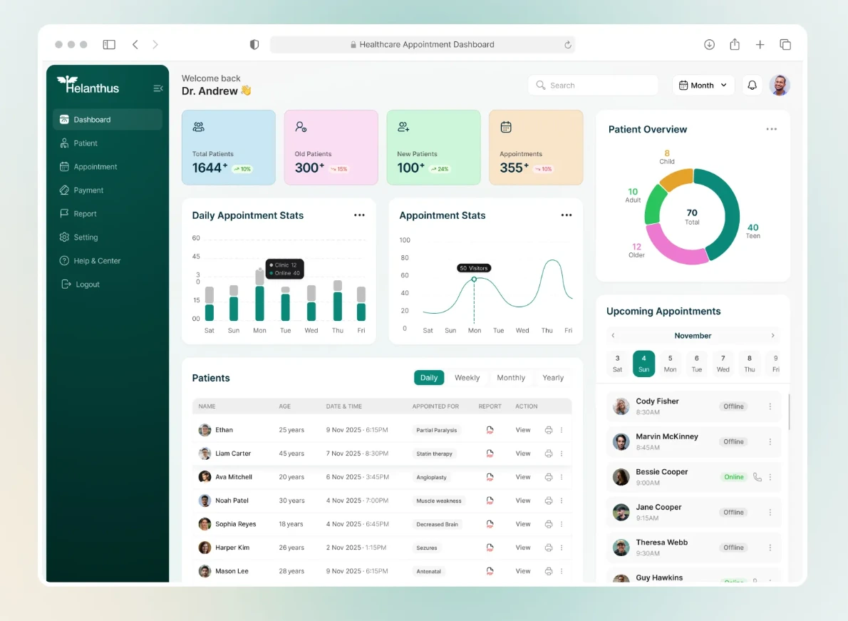
CareLink: A Case Study in Designing for Trust in Healthcare
Overview
Project: CareLink — a patient-facing healthcare management app
Role: Product Design & Development (End-to-End)
Duration: 16 weeks (Discovery → Launch)
Platforms: iOS, Android
Team: [Fill in — solo build or team composition]
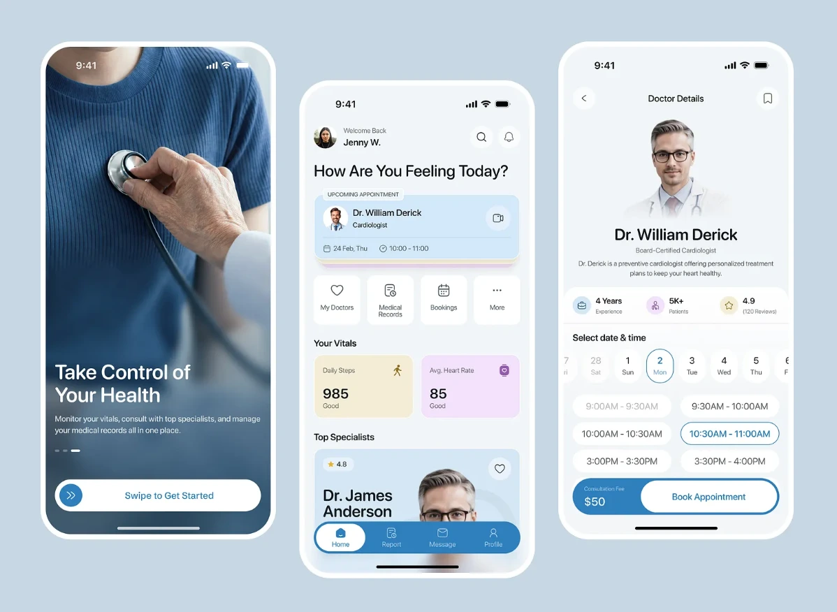
CareLink was built to address a problem that sits at the intersection of usability and anxiety: healthcare apps are often used by people who are stressed, in pain, or confused about their own care yet most are designed like generic productivity tools. The goal was an app where booking appointments, tracking medications, and understanding lab results felt calm, clear, and trustworthy, even for users with low health literacy or high stress.
The Problem
Healthcare apps face a unique combination of usability and trust barriers that most consumer apps don't:
Cognitive load under stress — Users often open the app while anxious (post-diagnosis, pre-appointment, managing a new medication), yet interfaces were dense with medical terminology and clinical jargon.
Medication adherence drop-off — Reminder-based systems were easy to dismiss and didn't adapt to a patient's actual routine, leading to missed doses.
Fragmented care picture — Appointments, prescriptions, lab results, and provider messages often lived in separate systems or portals, forcing patients to piece together their own care history.
Trust and privacy concerns — Patients hesitated to fully engage with apps that felt opaque about how sensitive health data was stored, shared, or used.
Goals & Success Metrics
Improve medication adherence through reminders that adapt to a patient's real schedule rather than fixed clock times.
Reduce comprehension friction — present lab results and clinical information in plain language, with medical terms available on demand rather than by default.
Unify the care experience — appointments, prescriptions, and provider communication in a single, coherent view.
Design for calm under stress — visual and interaction choices that reduce anxiety rather than add to it.
Meet healthcare data-handling requirements (e.g., HIPAA, or the relevant regional equivalent) without making the app feel clinical or cold.
Design Process
1. Understanding the Emotional Context
Unlike most product design, the starting point here wasn't just user goals — it was user state. Interviews and secondary research shaped a set of emotional personas (the newly diagnosed, the chronic condition manager, the caregiver) whose needs and stress levels differed significantly, even when their functional tasks overlapped.
2. Wireframing & Prototyping
Prototypes were tested with a focus on comprehension under simulated stress conditions — asking participants to complete tasks (e.g., "find out when to take your next dose") under a time constraint to mimic real-world urgency. Early versions that used dense dashboard layouts performed poorly; participants defaulted to a single, prioritized "what do I need to know right now" view.
3. Visual Design
A restrained, high-contrast palette avoiding alarmist reds except for genuinely urgent flags (e.g., a missed critical medication)
Plain-language summaries for lab results and diagnoses, with an optional "medical detail" expansion for users who want the clinical terminology
Generous whitespace and larger touch targets to accommodate users who may be accessing the app one-handed, in discomfort, or with reduced dexterity
4. Interaction Details
Adaptive medication reminders that ask about routine (e.g., "with breakfast" vs. a fixed time) rather than defaulting to rigid clock-based alerts
Unified timeline merging upcoming appointments, active prescriptions, and provider messages into one chronological view
Plain-language lab result summaries, generated alongside the original clinical report, with a clear visual indicator for values outside normal range — explained in context, not just flagged
Privacy-forward onboarding that explains, in plain terms, what data is collected and how it's protected before asking for any sensitive information
Technical Approach
Frontend: [Flutter] for mobile experience
Backend: [Node.js], with encryption at rest and in transit for all patient data
Compliance: Designed and built with [HIPAA / relevant regulation] requirements in mind from the architecture stage, including access controls, audit logging, and secure authentication
Integrations: [e.g., provider EHR system, pharmacy API, lab result feed] for pulling in real appointment, prescription, and lab data
Notifications: Adaptive reminder engine that adjusts timing based on patient-reported routine rather than fixed schedules
(Swap in your actual stack, compliance approach, and integrations for the final version of this case study.)
Challenges & Trade-offs
Challenge: Simplicity vs. Clinical Completeness
Simplifying lab results and medical information risked oversimplifying in ways that could mislead patients. The solution was a layered approach — a plain-language summary by default, with the full clinical report always one tap away, never hidden or replaced.
Challenge: Designing for High-Stress Use Without Being Patronizing
Early calming design choices (soft language, gentle color) risked feeling dismissive to patients managing serious conditions. Testing with real patients was essential to strike a tone that felt supportive without minimizing the seriousness of their situation.
Challenge: Data Privacy vs. Convenience
Features like biometric login and cross-provider data sharing improved convenience but required careful, transparent consent flows to maintain trust — particularly given how sensitive health data is perceived compared to other app categories.
Challenge: Regulatory Constraints on Iteration Speed
Healthcare-adjacent features (anything touching medication dosing or clinical data display) required more rigorous review and testing than a typical consumer app cycle, which shaped the release timeline and scope of the MVP.
Like this project
Posted Sep 6, 2026
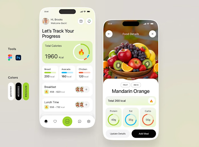
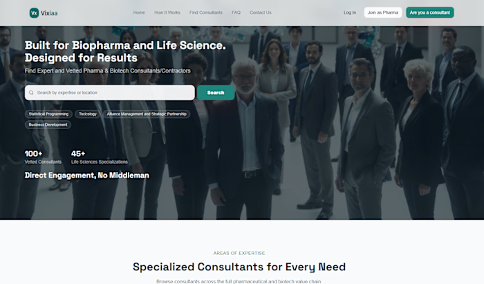
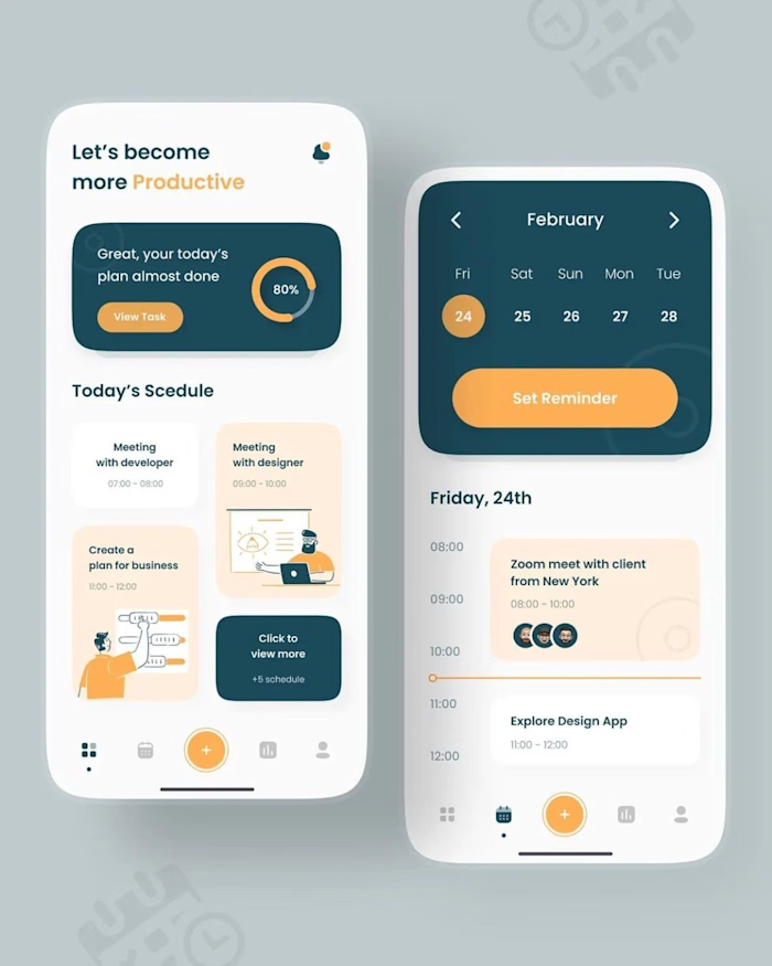
Designed CareLink app and website addressing usability and trust in healthcare.
Likes
0
Views
6
Clients
CareLink