Redesigning L'Oréal's Project Management Tool

Manon Pietri


Context
L'Oréal's internal Project Management Tool (PMT) was the backbone of how teams tracked projects and incidents. But it wasn't working. Users were drowning in information, struggling to find what they needed, and largely avoiding the tool altogether.
I joined a digital product studio as a UI Designer for 4 months (2 sprints), collaborating with a PM, a junior UX researcher, and a 19-person dev team. My primary focus was UI design, but I also contributed to UX research from the preliminary data analysis stage, building on the process the UX researcher had already initiated.
The Problem
Users found it difficult to navigate the PMT due to information overload, resulting in inefficiencies in locating specific details and managing projects and incidents.
Baseline Metrics
Before any redesign work, we benchmarked the tool across 55 survey participants and 9 usability test participants:
11 clicks to access essential SKU information
65% task success rate without assistance
96 hours average incident resolution time
7 minutes average time searching for information
1/5 user satisfaction score
19 logins/month on average, meaning the tool wasn't part of daily workflow
Research Insights
The principal persona was Project Managers (PMs). They used the tool extensively to plan, execute, and oversee projects, exclusively on desktop. The main pain point across participants: too much time spent searching for the information they needed.
Design Strategy
We framed the redesign around three core questions:
What are the main pieces of information PMs need?
Which information needs to be displayed simultaneously?
Which filters would be most useful?
This led to five design principles:
Critical information first: A central dashboard displaying essential data at a glance
Incident clarity: Clear differentiation between creating new incidents and opening existing ones
User-specific categories: Incident categories to help users track and manage their responsibilities
Customizable views: Multiple filters so users can tailor what they see
Column reduction: Fewer columns on the incident board to reduce clutter and improve readability
Design exploration and UI components
First Iteration & Testing
We tested the prototype on L'Oréal employees using A/B testing, usability tasks, brand perception evaluation, and user flow analysis.
Results after the first iteration:
Incident resolution time: 96h → 41h
Click depth for SKU details: 11 → 6 clicks
Task success rate: 65% → 82%
User satisfaction score: 1/5 → 2.9/5 (improved, but still low)
Dashboard and incident management screens
Second Iteration
Testing revealed three remaining issues:
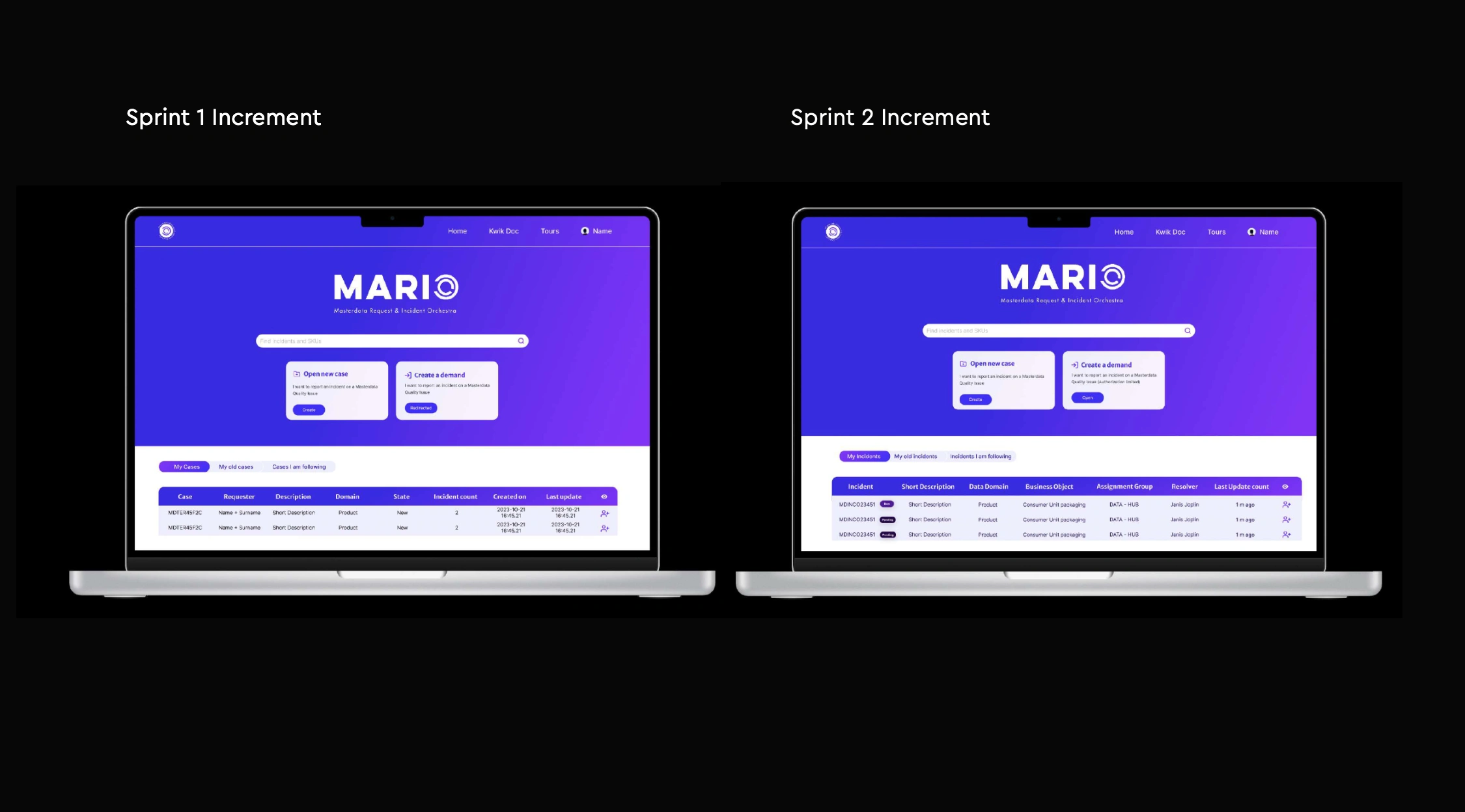
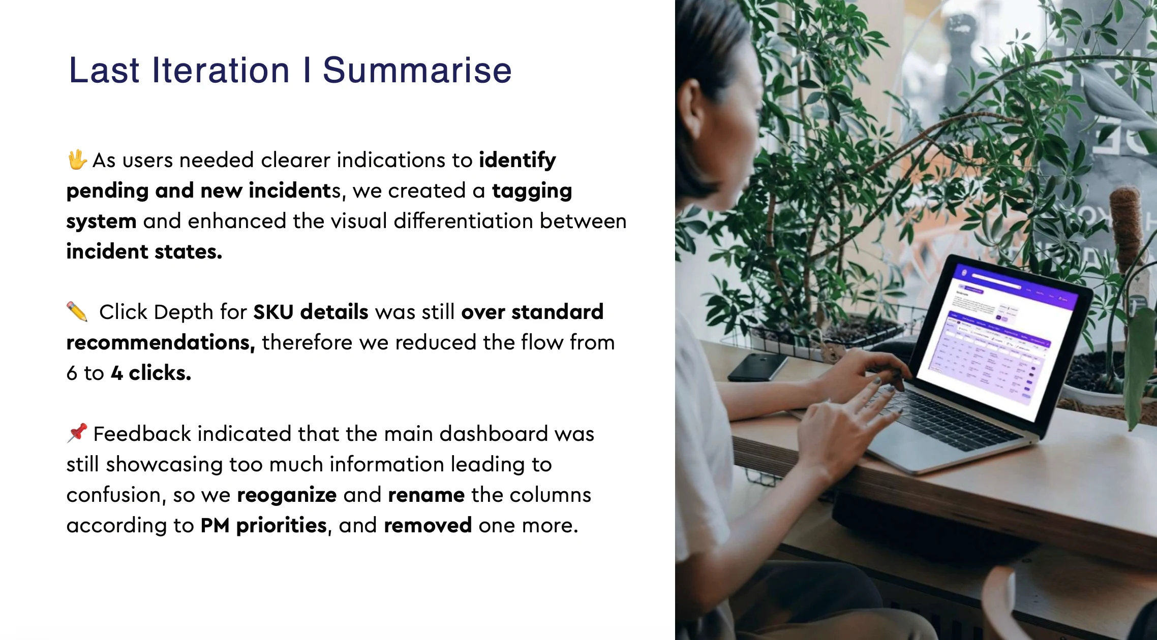
Incident states were unclear. Users needed stronger visual cues to identify pending vs. new incidents. We created a tagging system and enhanced visual differentiation between states.
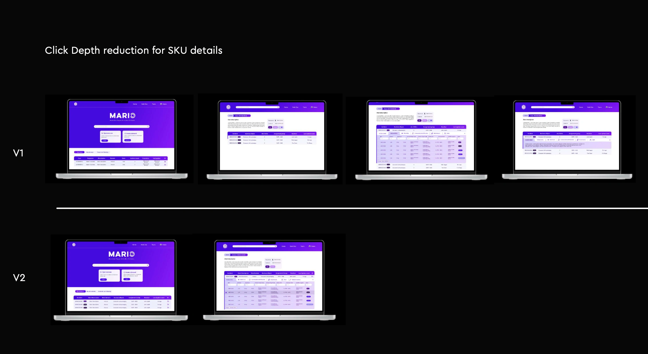
Click depth was still above standard recommendations. We reduced the SKU detail flow from 6 to 4 clicks.
The dashboard was still too dense. We reorganized and renamed columns according to PM priorities, and removed one more column entirely.
Final interface designs and component system
Final Results
Incident resolution time: 96h → 36h (62% reduction)
Click depth for SKU details: 11 → 4 clicks (64% reduction)
Task success rate: 65% → 89%
User satisfaction score: 1/5 → 3.9/5
Search time for information: 7 minutes → under 2 minutes
Monthly logins: 19 → 45+ (at least once daily, showing the tool became integral to daily workflow)
Like this project
Posted Jul 22, 2026
A 4-month UI design engagement that transformed L'Oréal's internal project management system, cutting incident resolution time by 62% and nearly doubling task success rates.