Java Factory Website Redesign
Ruhi Maharjan
Verified
Project Overview
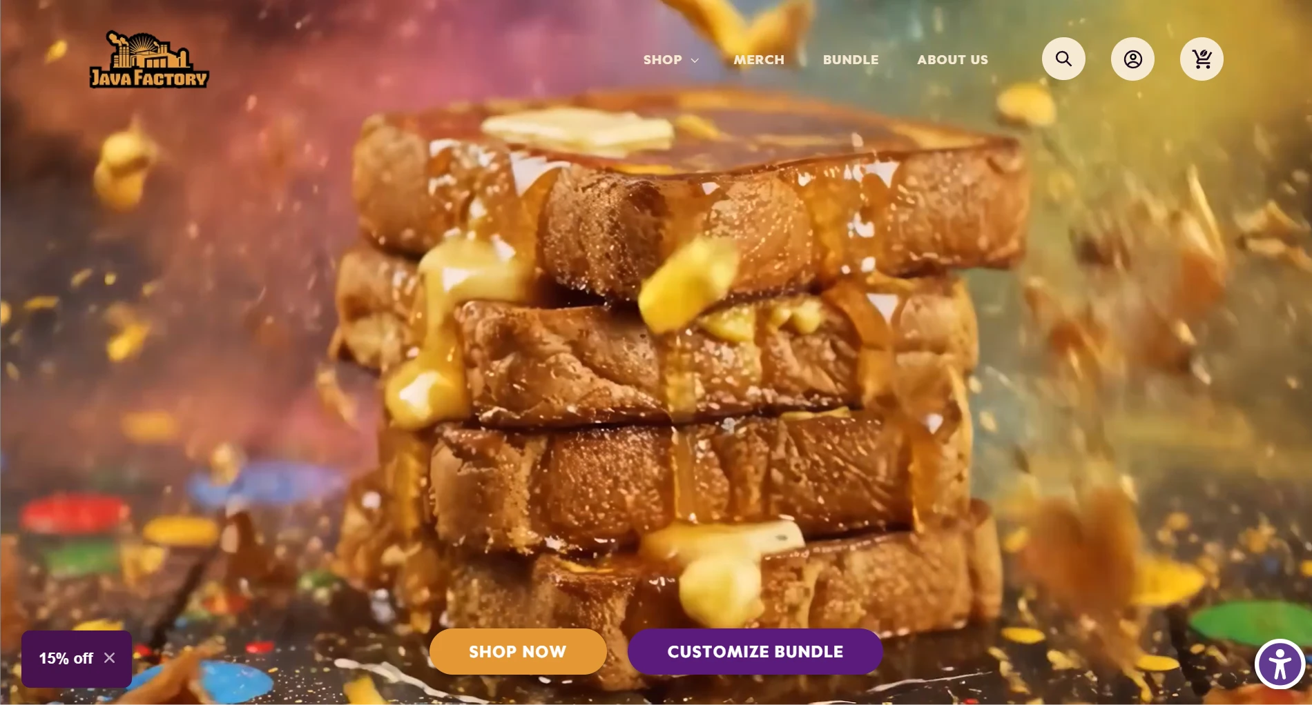
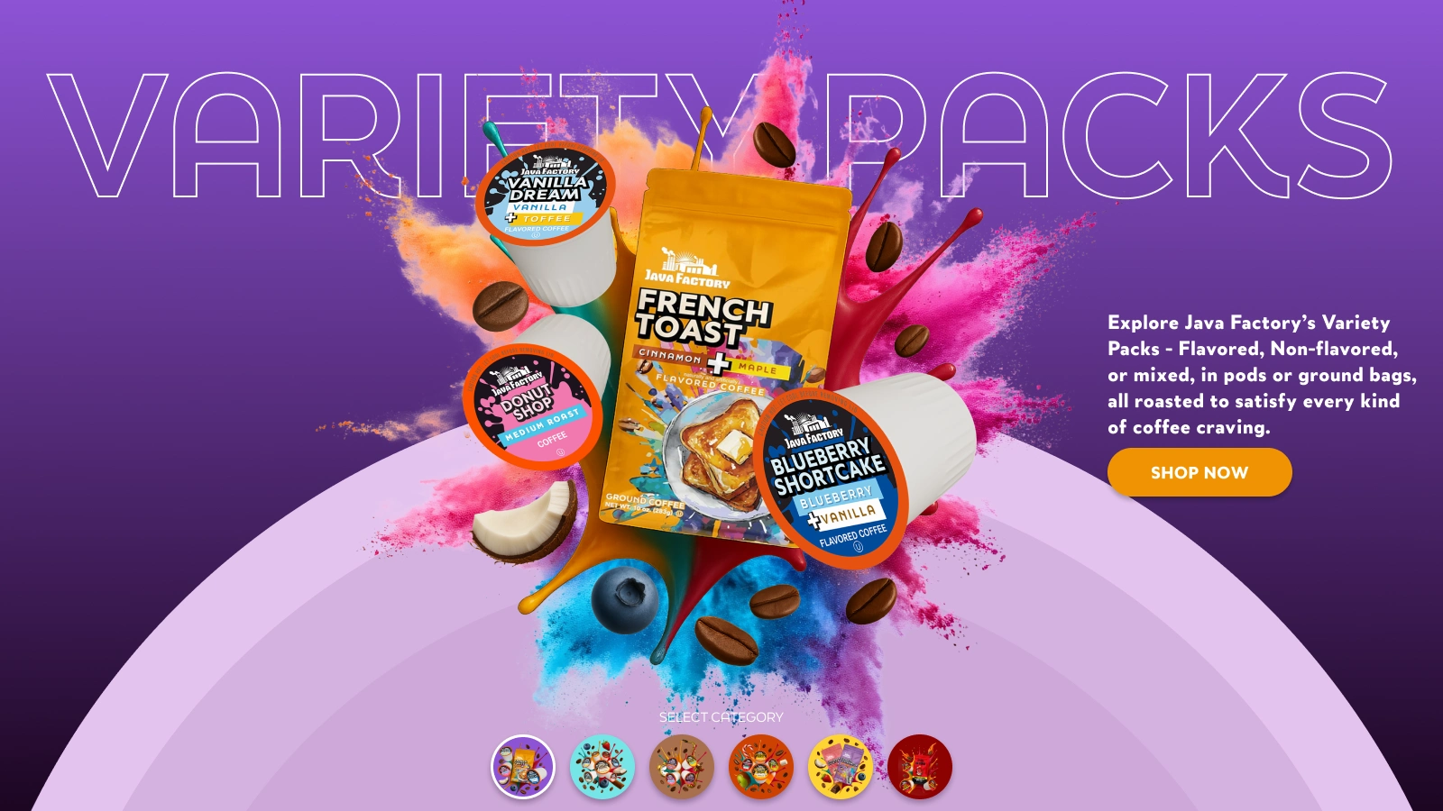
Java Factory, a playful and flavor-packed coffee brand, wanted a website that felt as bold and colorful as their unique blends. Known as the “Ben & Jerry’s of Coffee,” their brand personality is loud, flavorful, and unapologetically fun.
The goal?
To create a vibrant, animated, motion-rich website that expresses their identity while guiding users effortlessly through bundles, flavors, and recipes.
Objective
To design a fun, creative, and colorful website with engaging animations, bold typography, and an interactive user experience that mirrors Java Factory’s unique taste and brand energy.
My Role
UX Research & Strategy
UI Design
Interaction & Motion Design
Content Direction
Web Animation Concepts
Strategy & Approach
High-Fidelity Wireframing First
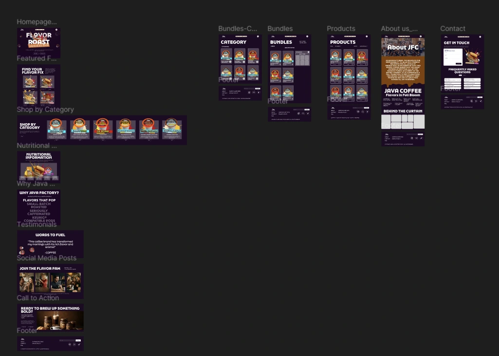
Wireframes (more like designs)
Before designing, we built a detailed high-fidelity wireframe of the homepage. This allowed the client to:
Clearly visualize each section
Understand content needs early
Approve structure before visual design
Align on animations and interaction points
Once approved, we transitioned into a full design exploration, focusing on bold visuals, fun copy, color diversity, and motion storytelling.
Design Direction
Java Factory’s brand is all about flavor personality, so the website needed to feel:
🎨 Colorful & expressive
⚡ Animated & energetic
🎭 Playful but premium
🌀 Smooth, scroll-driven, and interactive
We used:
Bright, bold color palettes inspired by their coffee categories
Lively typography that adds rhythm and energy
Micro-animations to make every scroll engaging
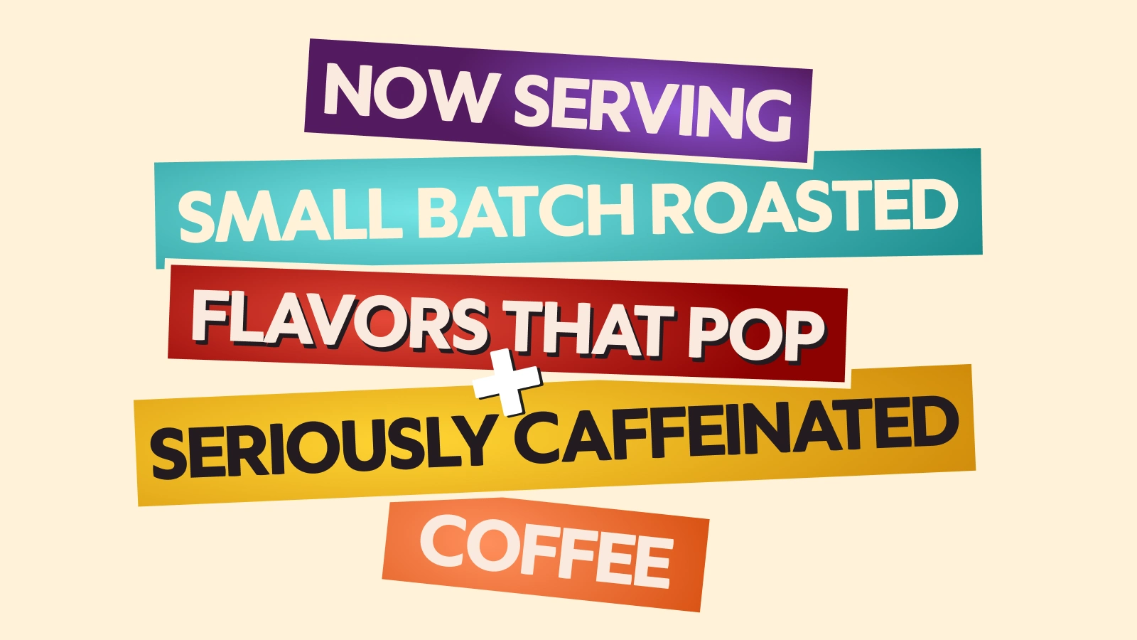
Playful copywriting, like “Bursting with Flavor” , “Spill the Beans" and "Java Factory Fam”, to reinforce their brand tone
Every element was designed to make users smile, scroll, and stay — turning a simple coffee browse into an experience.
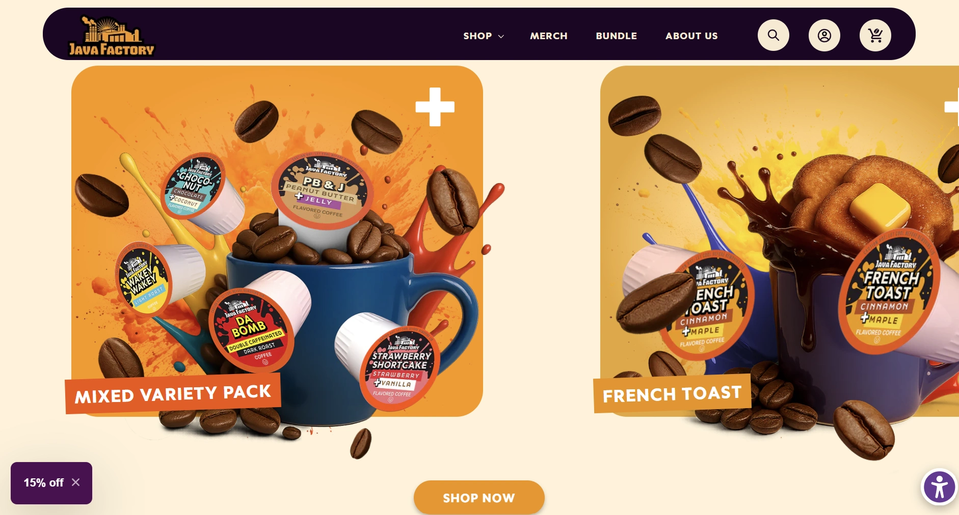
Challenges
One of the biggest challenges was creating a category section that highlighted six unique product bundles, each with a distinct color identity while still feeling cohesive within the overall design.
Another challenge was the bundle animation section. We wanted it to feel unique and interactive — something users would remember. Each section on the homepage was designed with custom animations, making scrolling not just intuitive but fun.
We carefully balanced motion and usability to ensure the website was delightful yet performant.
Category Section
Outcome
The new Java Factory website became a perfect reflection of the brand’s flavorful, fun, and fearless personality.
It successfully:
Created an immersive and interactive brand experience through animation.
Simplified navigation and user flow with a clear content hierarchy.
Helped showcase bundles and flavors more effectively.
Strengthened brand storytelling by aligning visuals, tone, and motion.
The result?
A website that’s just as bold, flavorful, and addictive as the coffee itself.
Takeaway
Java Factory’s redesign wasn’t just about creating a beautiful website — it was about crafting an experience that feels like the brand in motion.
From the fun-filled animations to the vibrant bundle sections, every detail brews up the same joy customers find in their morning cup.
Here's the link to the Java Factory website: https://javafactory.com/
Homepage video
Gifs used for JavaFam Page
Like this project
Posted Nov 17, 2025
Designed a vibrant, animated website for Java Factory, reflecting their bold and fun brand identity.
Likes
0
Views
7
Timeline
May 12, 2025 - Ongoing
Clients
Wicked Web