60-slide UX report for edtech founders: data visualization
Anna Lezhnina

Project Overview
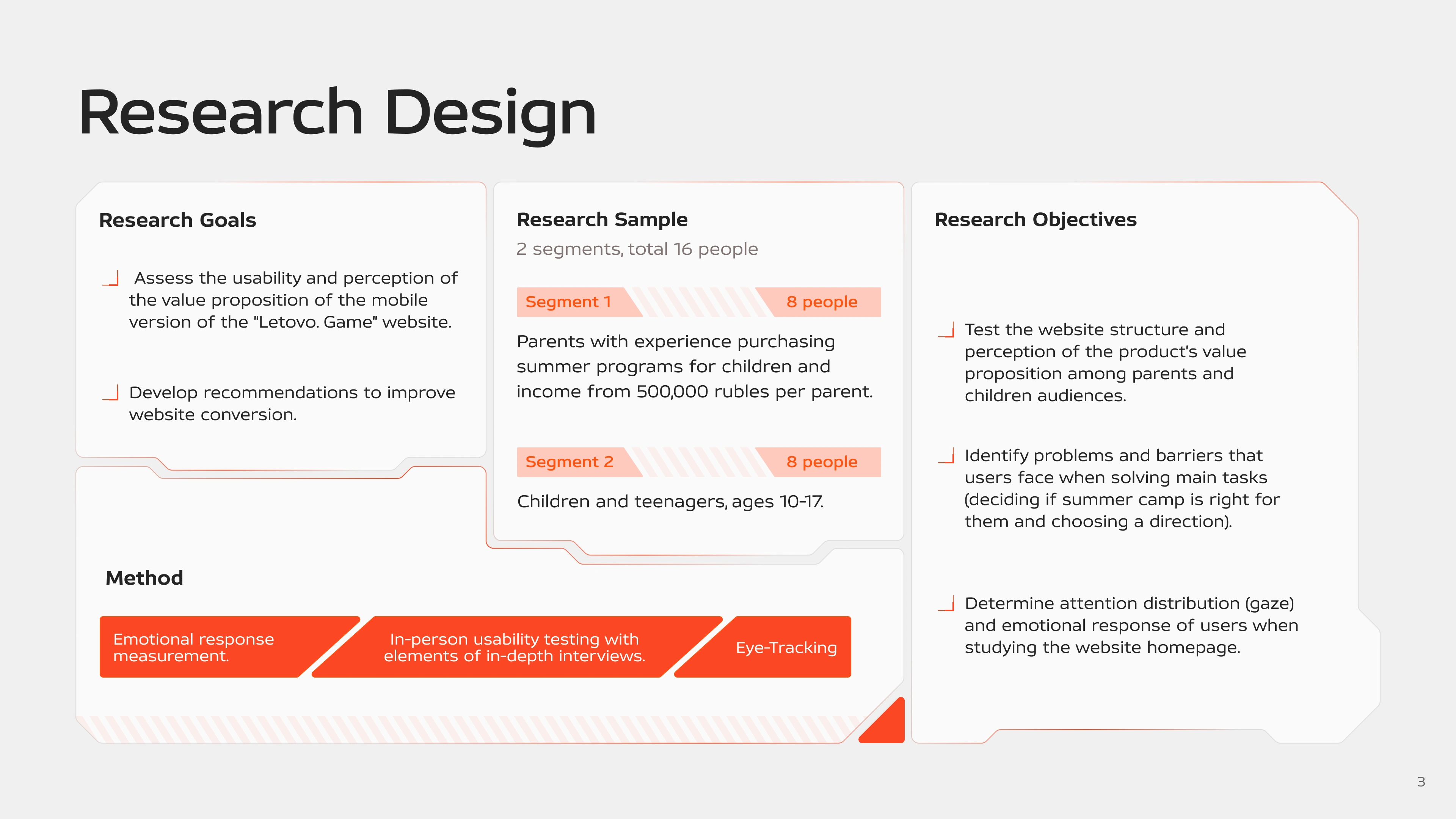
Design of a UX research report for Summer.Game — an educational summer program for teenagers. I transformed a large research dataset into a visually organized and easy-to-read report that shows the value of research through clear data visualization.
What I did:
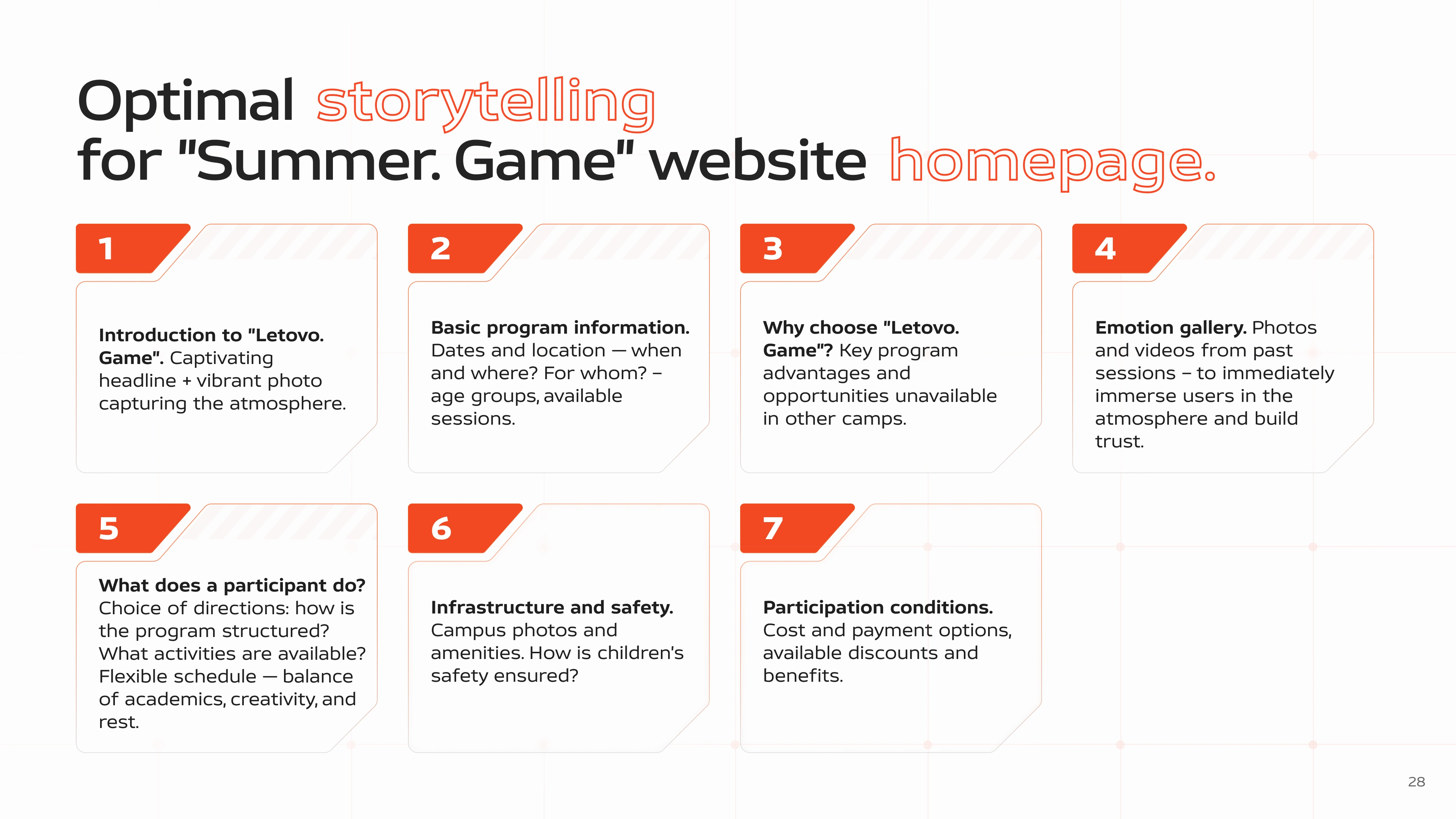
Visual System: developed a report design aligned with Summer.Game website style (red-orange palette, geometric frames, bold typography)
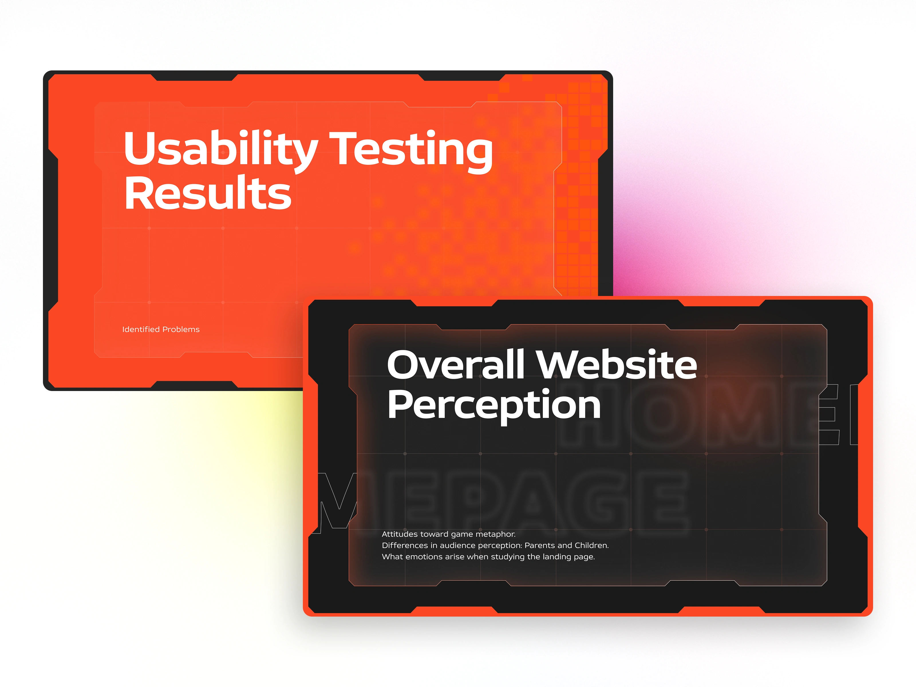
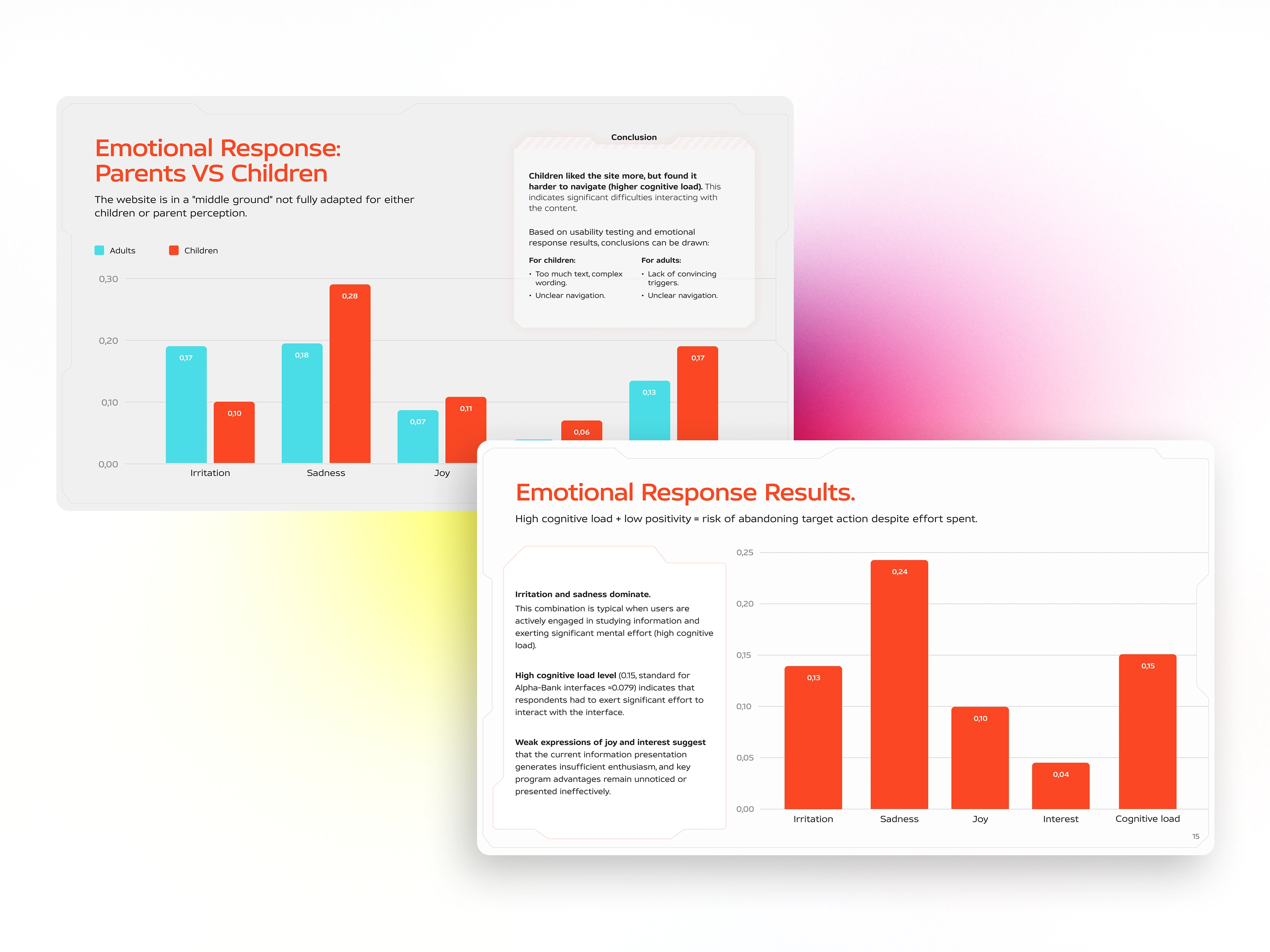
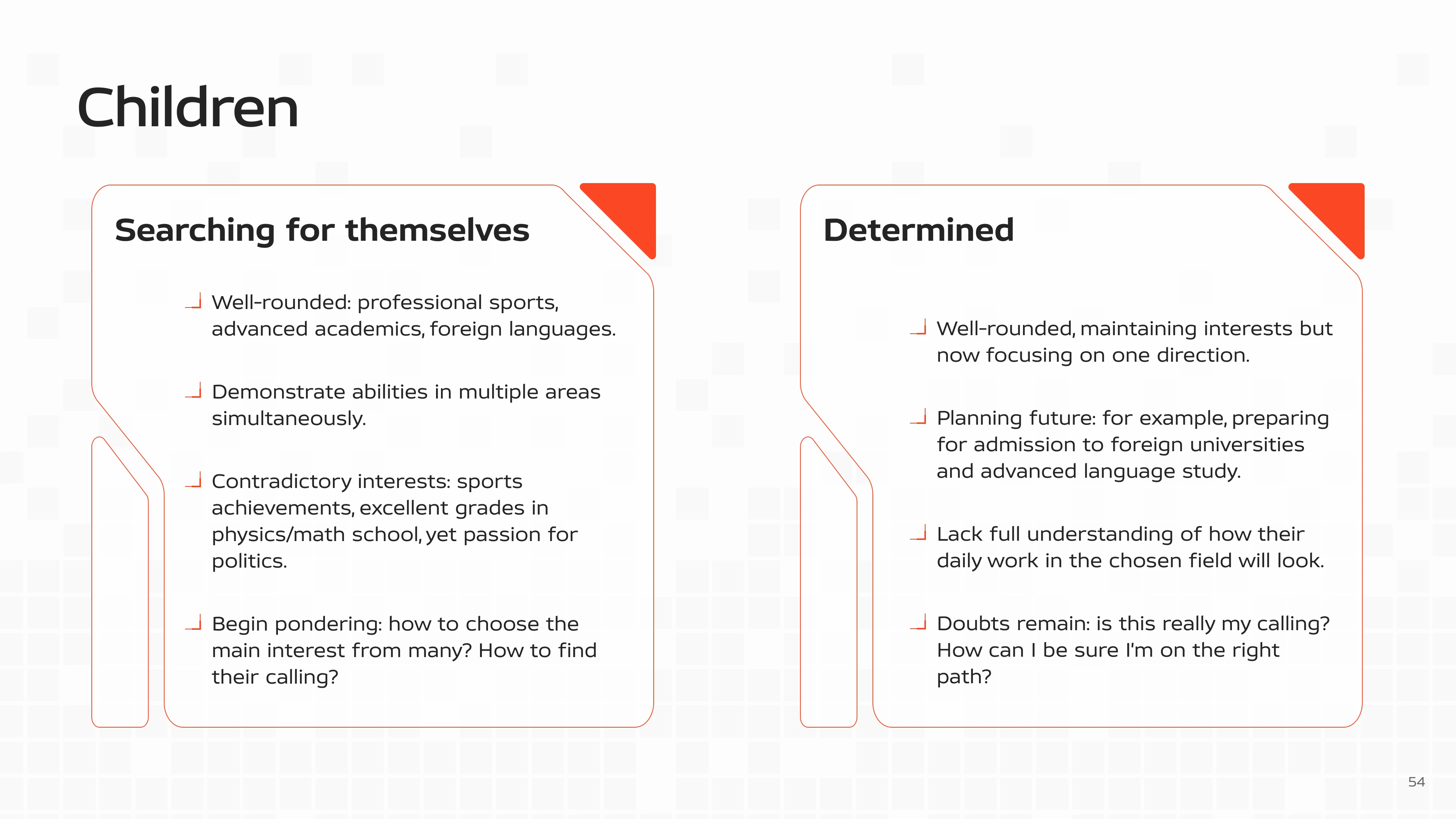
Data Visualisation: converted raw numbers into clear graphs and diagrams (emotional responses, parents vs children comparison, audience segments)
Iconography: selected icons and visual elements to highlight key findings and processes
Summary
The result is a 60+ slide report that works both as a research document and as a persuasive tool. Visual hierarchy uses contrast: orange elements emphasise key findings, while neutral backgrounds keep focus on the data.
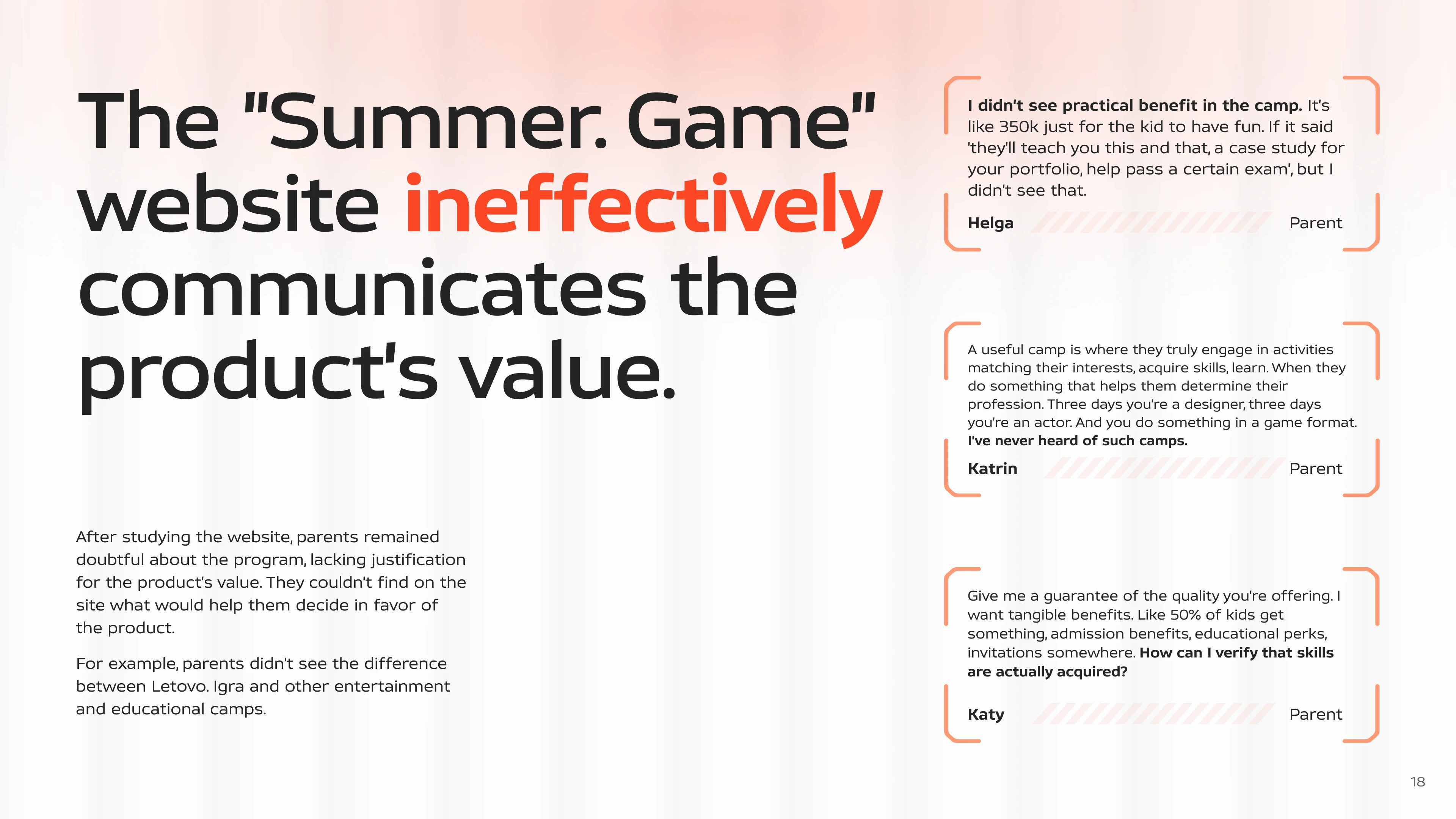
Each slide supports findings with numbers and user quotes. This format allows Summer.Game to use the report for internal website improvements and to demonstrate a data-driven UX approach to investors.

Have a B2B product that needs visual clarity? Let's work together 🤝
Like this project
Posted Jan 12, 2026
UX Research Report for an Educational Program Website. Visualised emotional response data and user insights through a design system aligned with the brand.
Likes
1
Views
10