
A good color palette can completely change how a product feels. 🎨
The same UI structure can feel luxurious, playful, futuristic, calm, or fresh — simply by changing the color system.
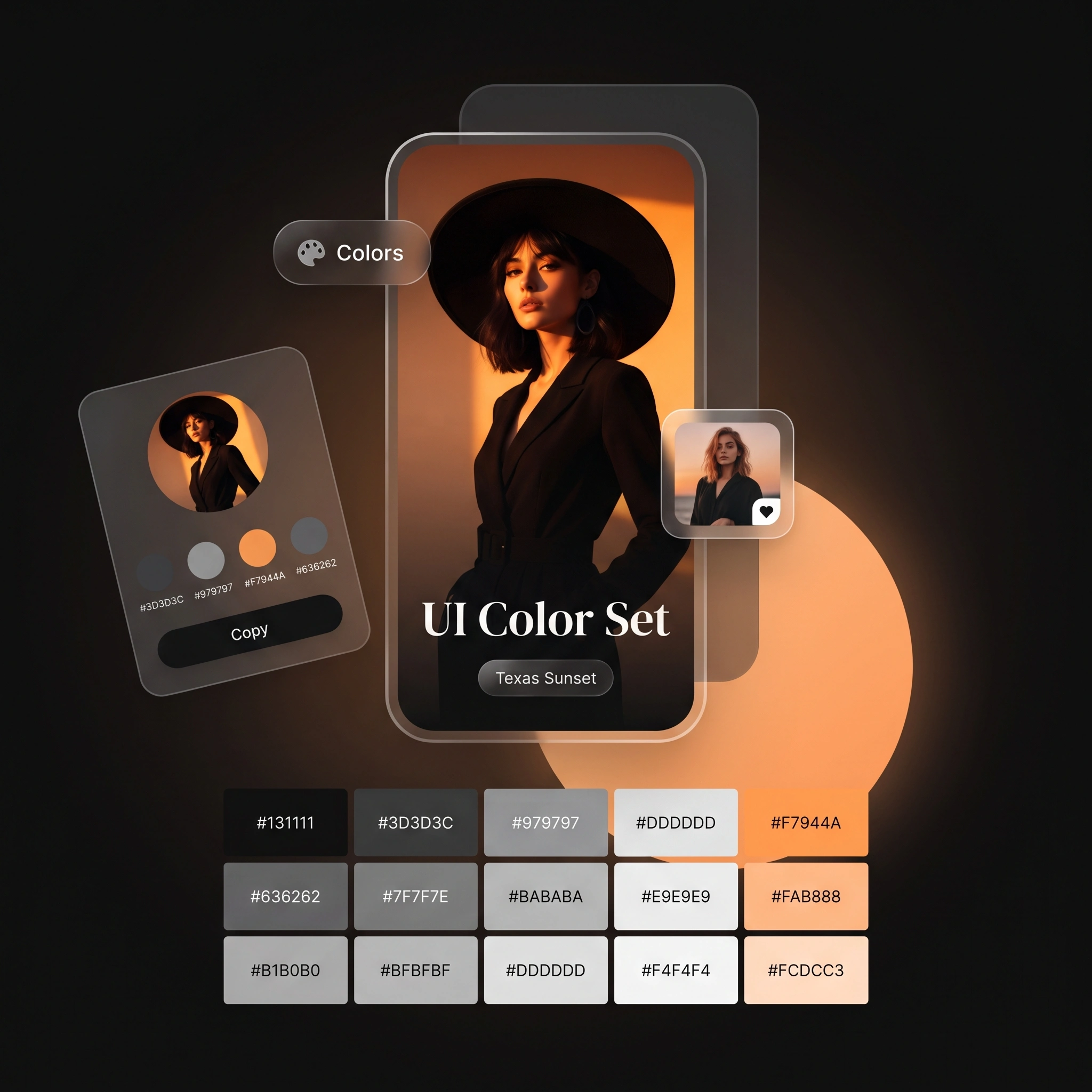
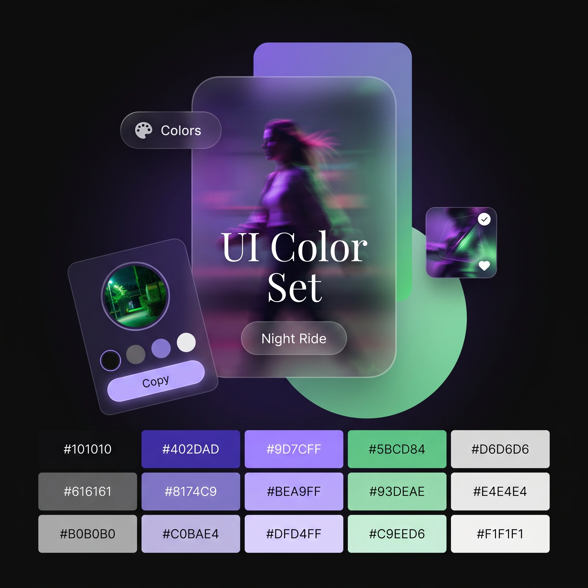
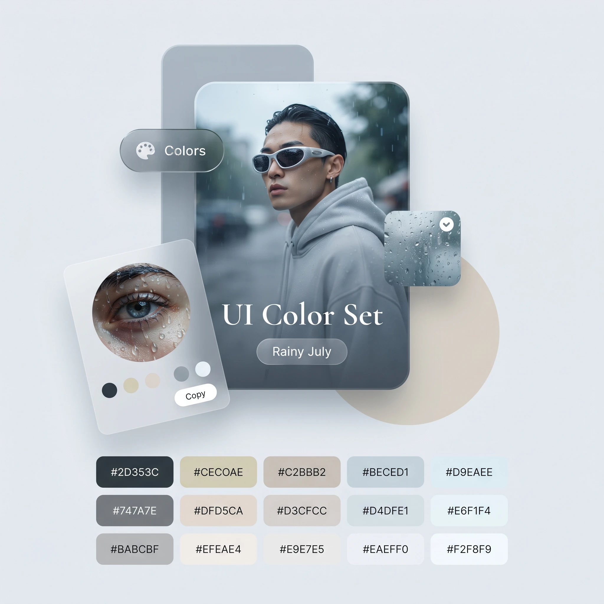
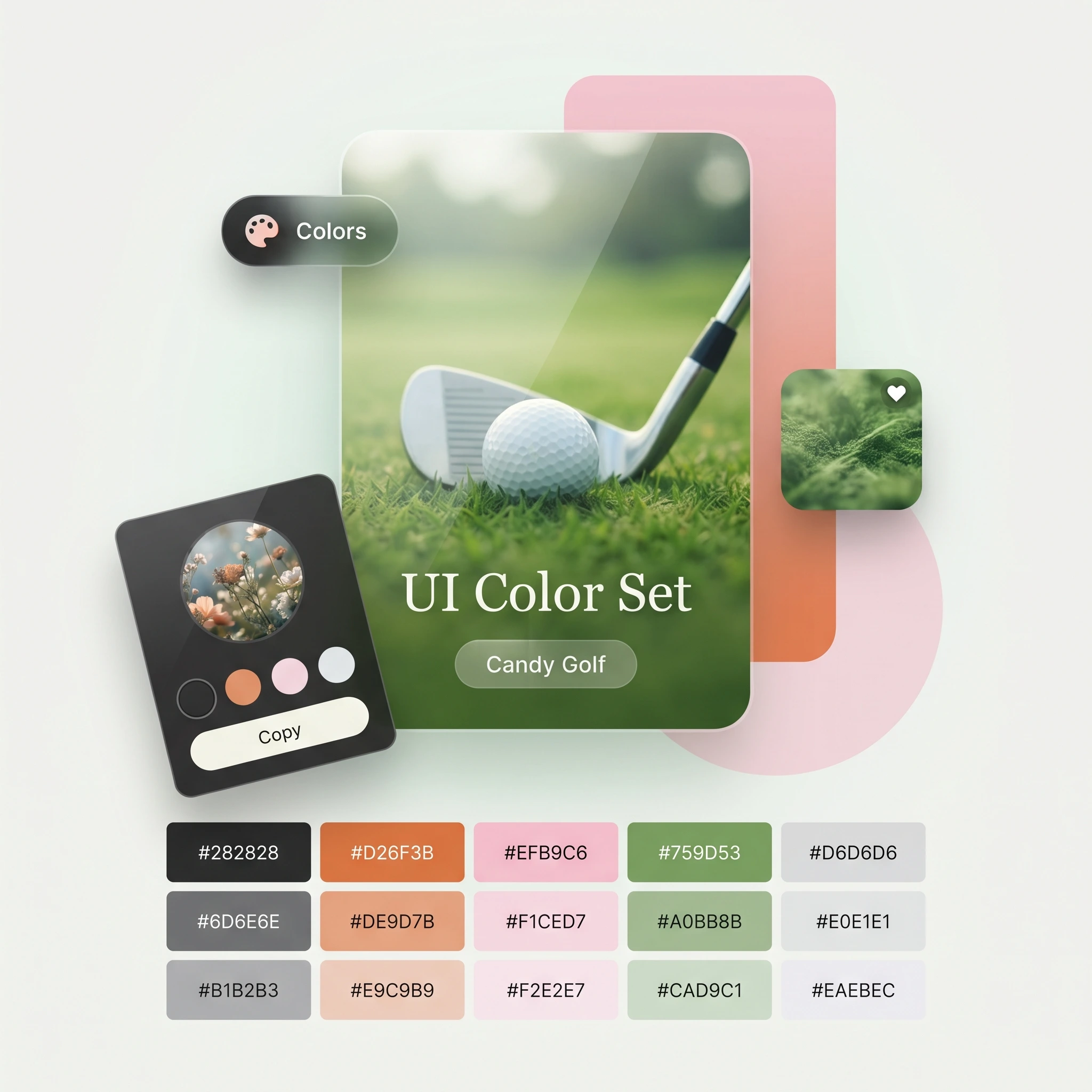
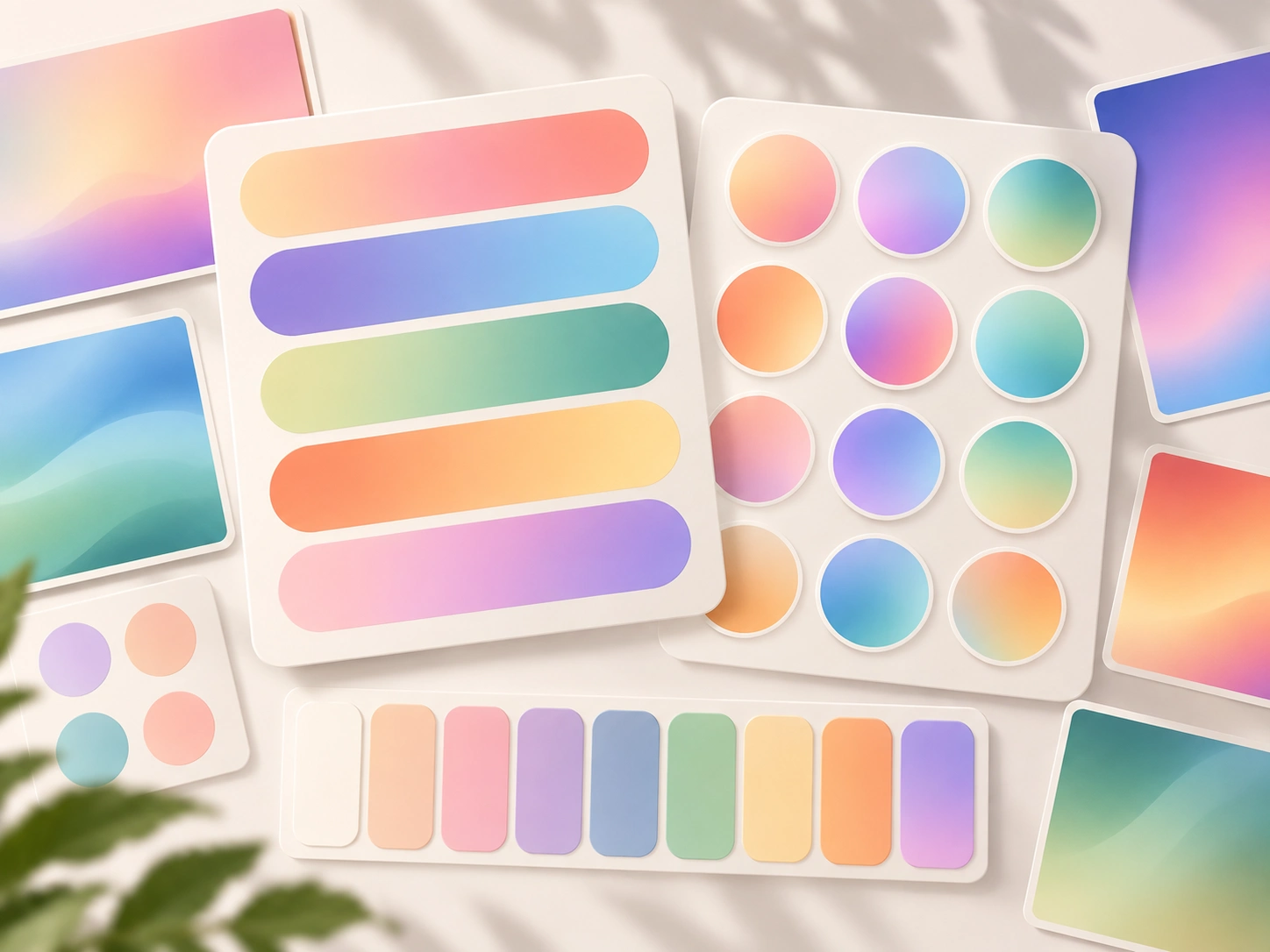
I created these 4 UI color palettes to explore different visual moods:
🌅 Texas Sunset — bold & cinematic
🍃 Candy Golf — playful & fresh
🌌 Night Ride — futuristic & energetic
🌧️ Rainy July — calm & sophisticated
But here's the important part:
Don't choose colors just because they look good together.
Think about:
→ What emotion should the product create?
→ Who is the target audience?
→ Which color should attract attention?
→ Which colors should stay in the background?
→ Is the contrast accessible?
That's how a color palette becomes a UI color system, not just a collection of pretty colors.
Which one is your favorite — 1, 2, 3, or 4? 👇
0 likes · 4 views · Aug 22, 2026
A good color palette can completely change how a product feels. 🎨 The same UI structure can feel luxurious, playful, futuristic, calm, or fresh — simply by ...


