
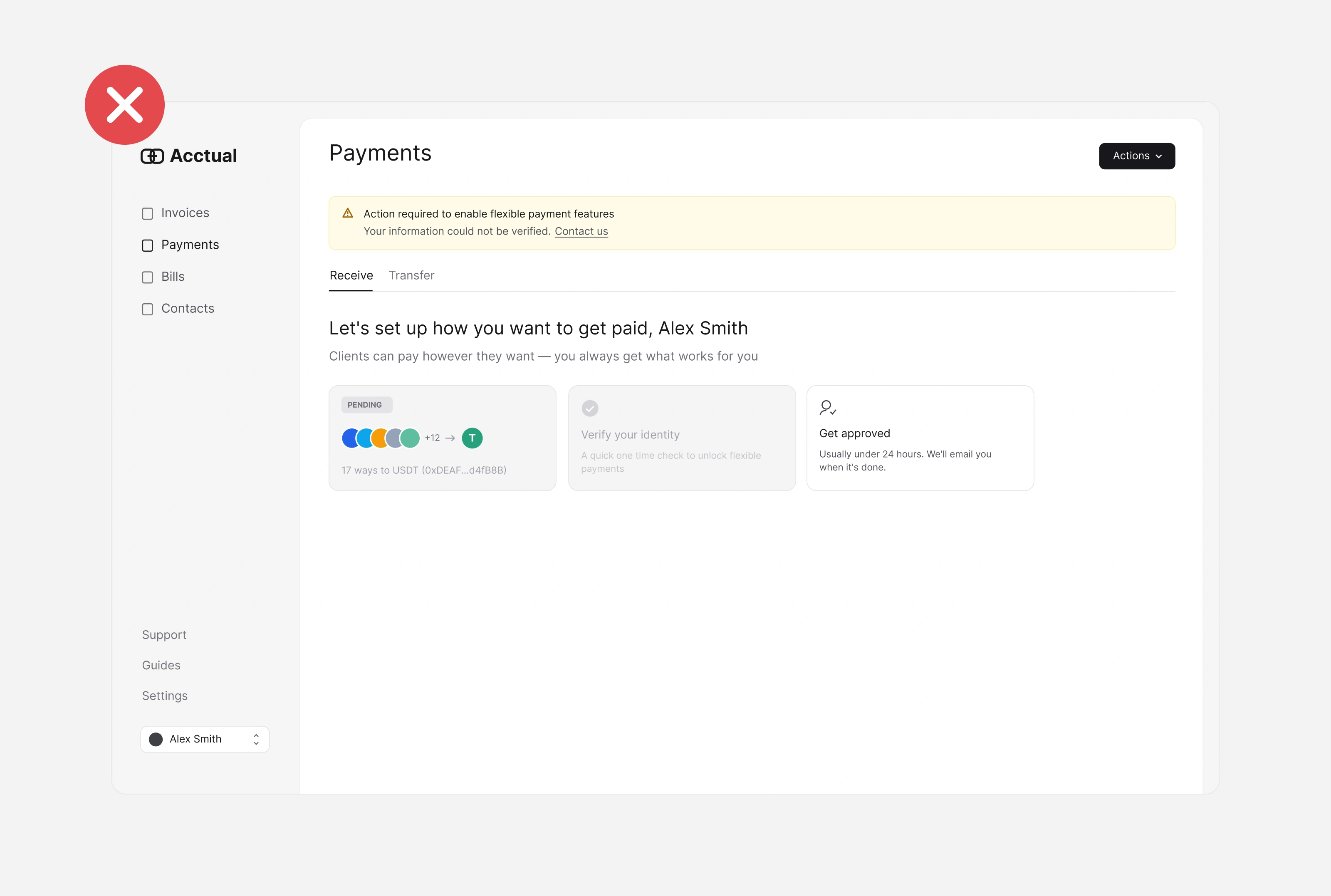
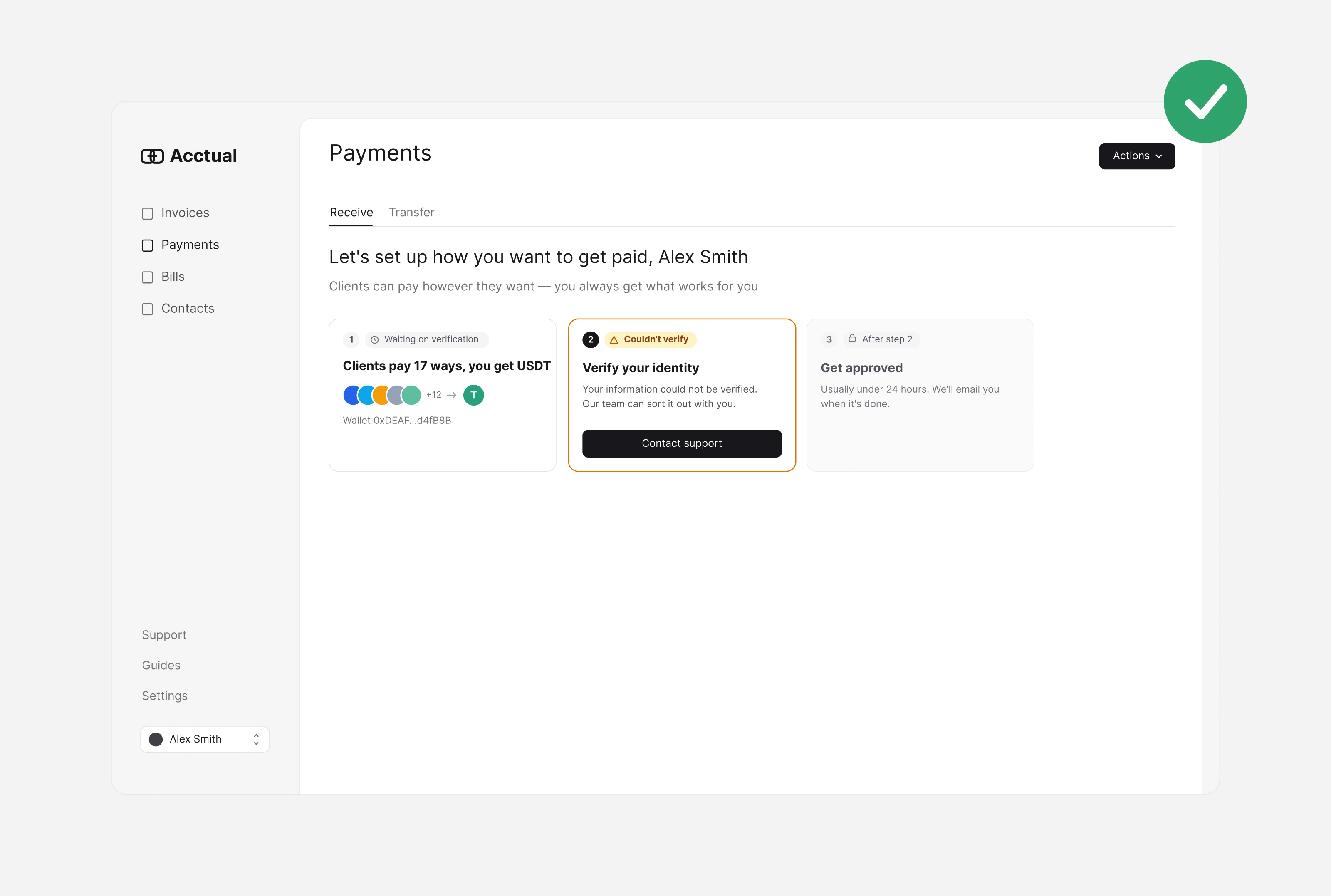
This is the payout setup page of an invoicing web app. Freelancers and small teams open it to start getting paid, and they come with one question: can clients pay me yet, and if not, what do I do next?
The original page answered that question twice, in two differentways.
What got in the way
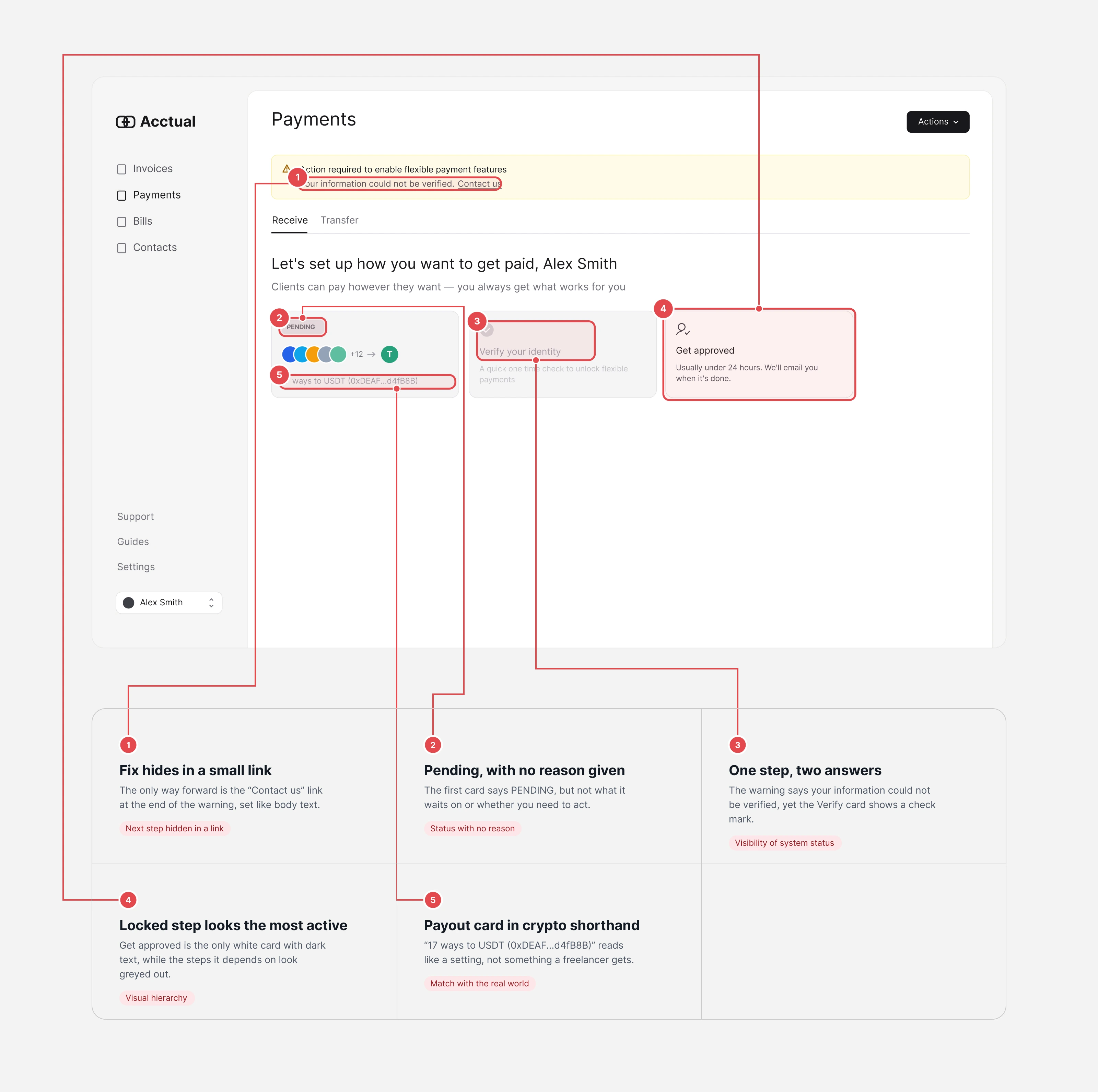
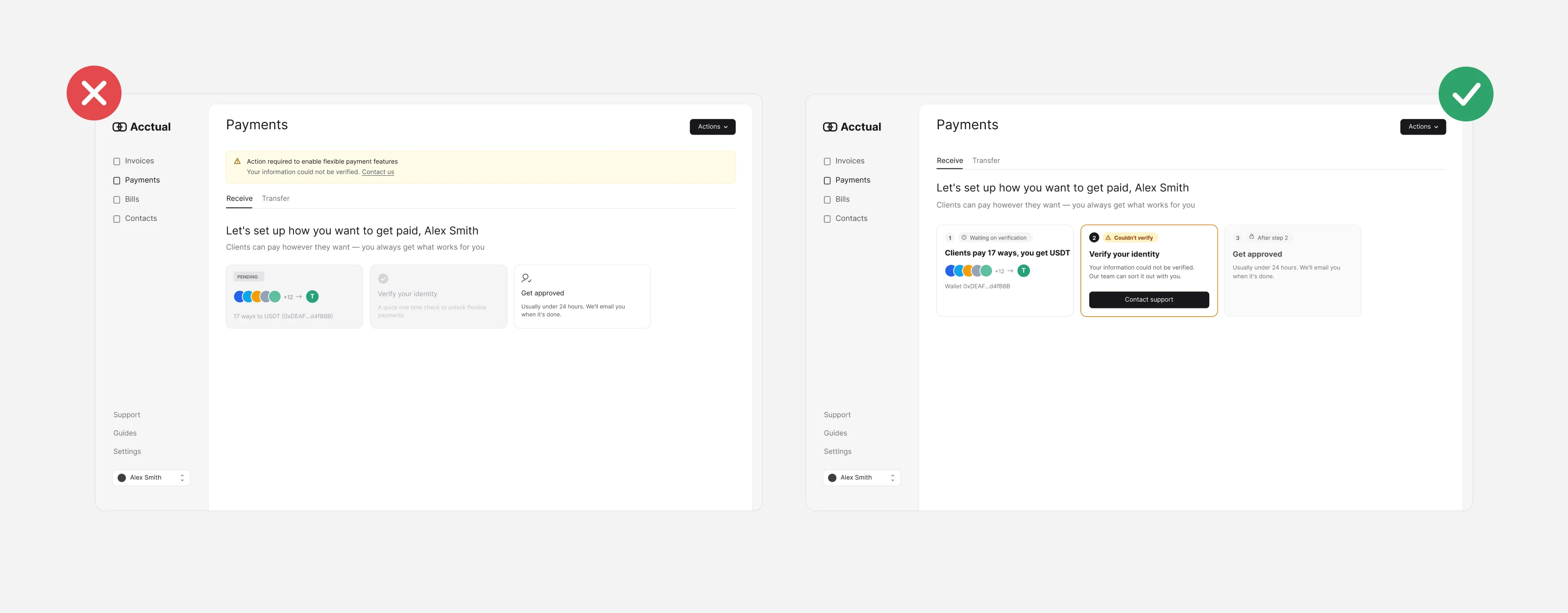
The fix hid in a small link. The only way forward was "Contact us" at the end of a warning sentence.
"Pending" with no reason. The first card never said what it was waiting on.
One step, two answers. The warning said verification failed; the Verify card showed a check mark.
The locked step looked the most active. "Get approved" was the only bright card, while the steps before it looked greyed out.
Crypto shorthand. "17 ways to USDT (0xDEAF...d4fB8B)" read like a setting, not a benefit.
What I changed
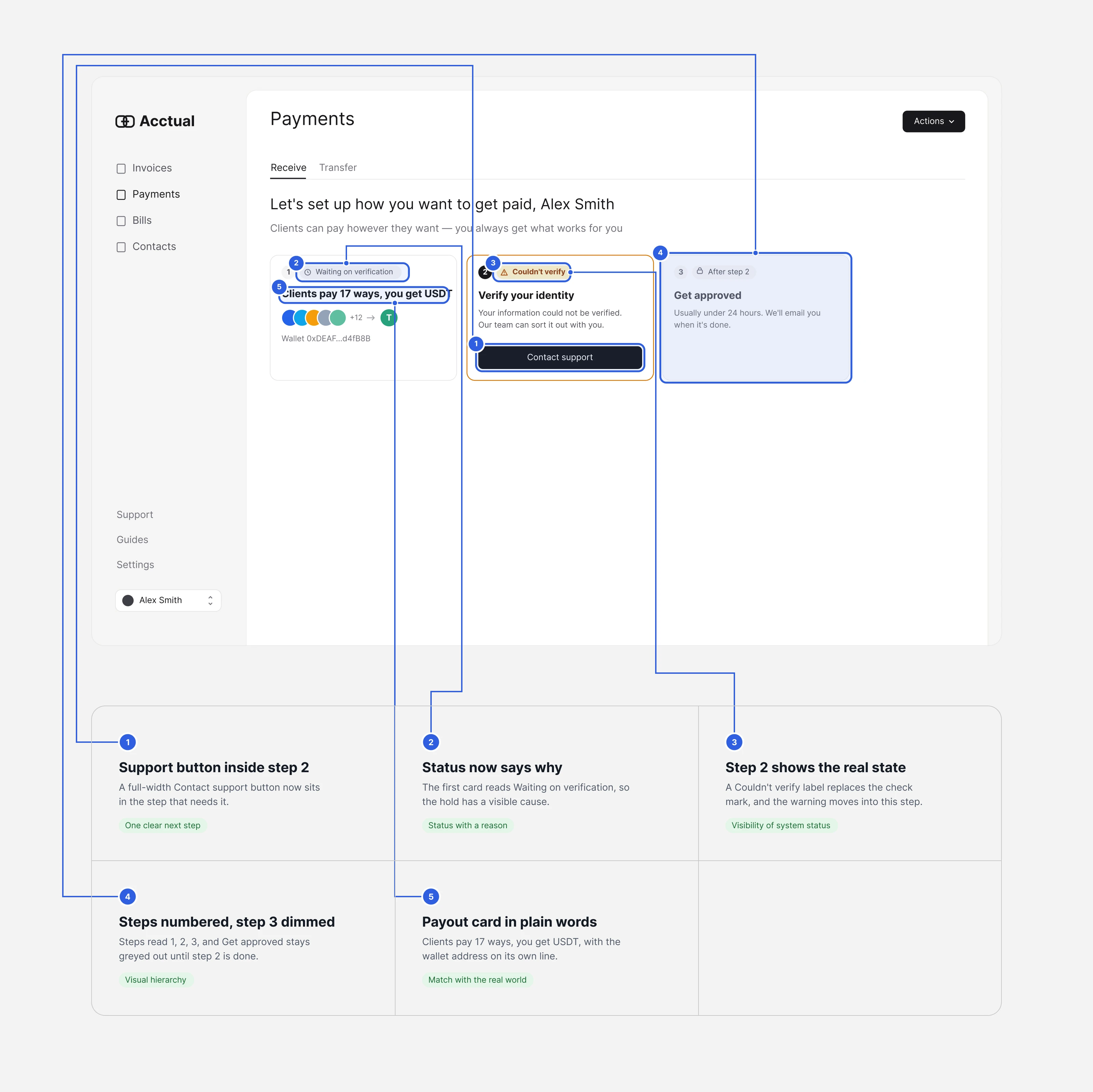
A Contact support button now sits inside the step that needs it.
The first card says "Waiting on verification".
Step 2 shows "Couldn't verify" instead of a check, and the warning moved into it.
Steps are numbered 1–3, and step 3 stays dimmed until step 2 is done.
The payout card reads "Clients pay 17 ways, you get USDT", with the wallet on its own line.
No new features. Only labels, order and one button.
How I'd validate it
This is an expert review of one screen, with no user data. I'd test it with a five-second test (what do you need to do next?") and a first-click test on the original and the redesign.
Self-initiated redesign. Original screen via Mobbin. Not affiliated with Acctual.
1 like · 3 views · Nov 14, 2026
Five small fixes that give a payout setup page one clear status and one next step.

