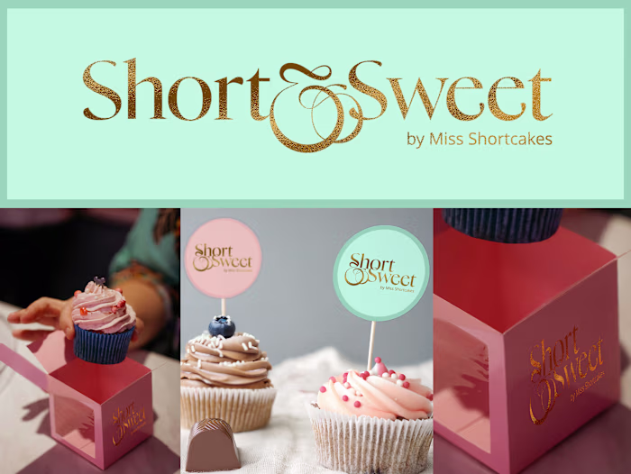
The Language Arts Studio - Website Design and Built
Samia Bukhari
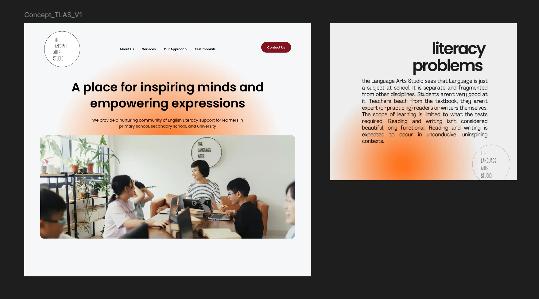
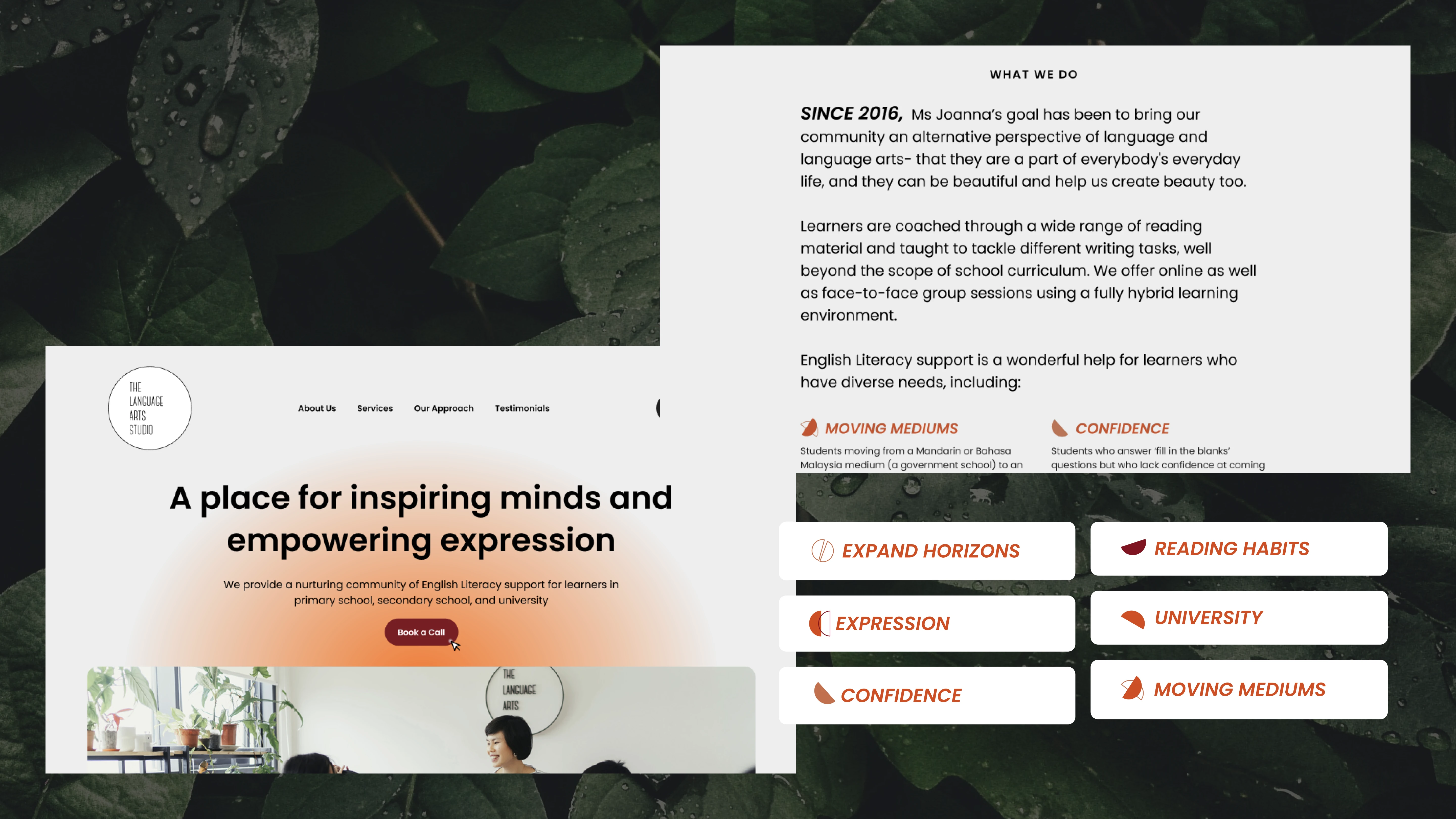
The Language Arts Studio
A place for inspiring minds and empowering expression
Project Brief
Joanna, owner of The Language Arts Studio, struggles to showcase her educational services to parents before their first interaction. Without a compelling way to communicate her offerings or visually highlighting her new studio, she risks losing interest from prospects who may not see the full value of her meaningful work.
Goals
Visual Experience: Provide a full visual experience of the services available through video and photos for parents to visualise; client to do a photoshoot of the physical space & record video of children's learning experience.
Brand Awareness: Expand brand awareness beyond the current facebook audience by creating social media templates that resonate with some visual identity that the site will follow. Focus on Instagram to attract younger parents on the said platform.
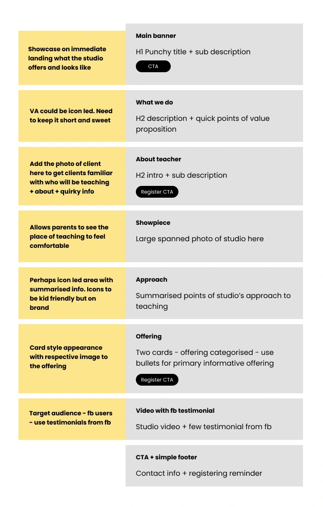
Digital Engagement: Create a digital presence; a website that acts as a centre for specific details of studio in terms of service, staff details, offerings, testimonials and contact details.
Project Deliverables
Web Style Guide (colors, typography)
Website design
Website development (in Webflow)
Basic SEO setup
Quality assurance conducted across site to ensure its responsive
Add-Ons
Custom iconography
Social Media Templates
Moodboard concept based on a social media template client liked in terms of color scheme
How the process begins
With the discovery form filled, the kick off meeting becomes easier to discuss identified goals, realign vision and show a visual concept of what could work. The visual concept is always backed by the information the client sends over about what they like, dislike and what they aspire to be along with whose their competitors and what values of their own company they would like to come through.
With the success of client loving the concept, we proceeded to the next step of creating the full mockup based on the low fidelity wireframe created during call.
Low fidelity wireframe created during discovery call
Creative Highlights
The mini visual identity created for the brand is based on the color palette that was commonly seem in the studio along with softer typography like Poppins to make it accessible for reading. Icons were created with two sets in mind based on the information provided. A concept of ray of positivity was created with the radial gradient.
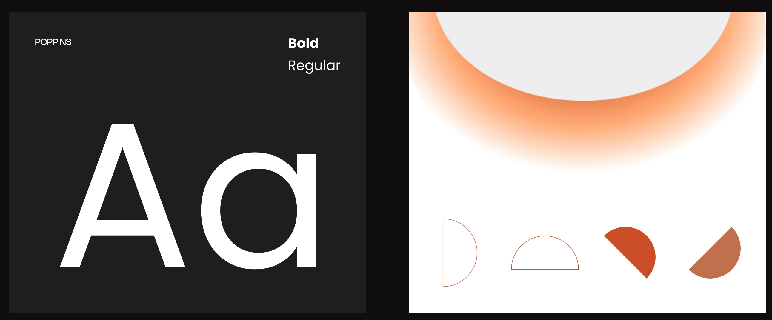
Poppins and abstract shapes with soft gradient resonating positive rays and friendliness
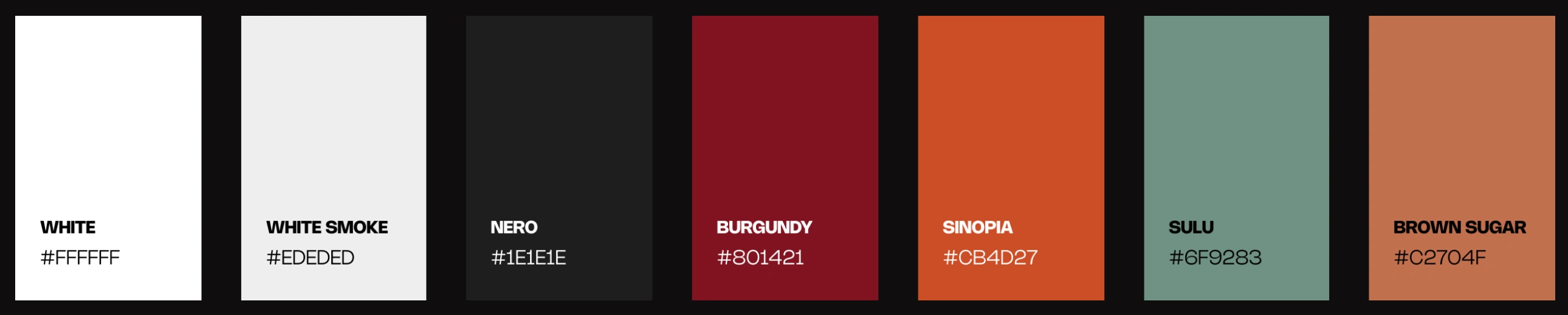
Color palette that was picked up based on the new studio location and items in it so brand feels familiar in both physical and digital space
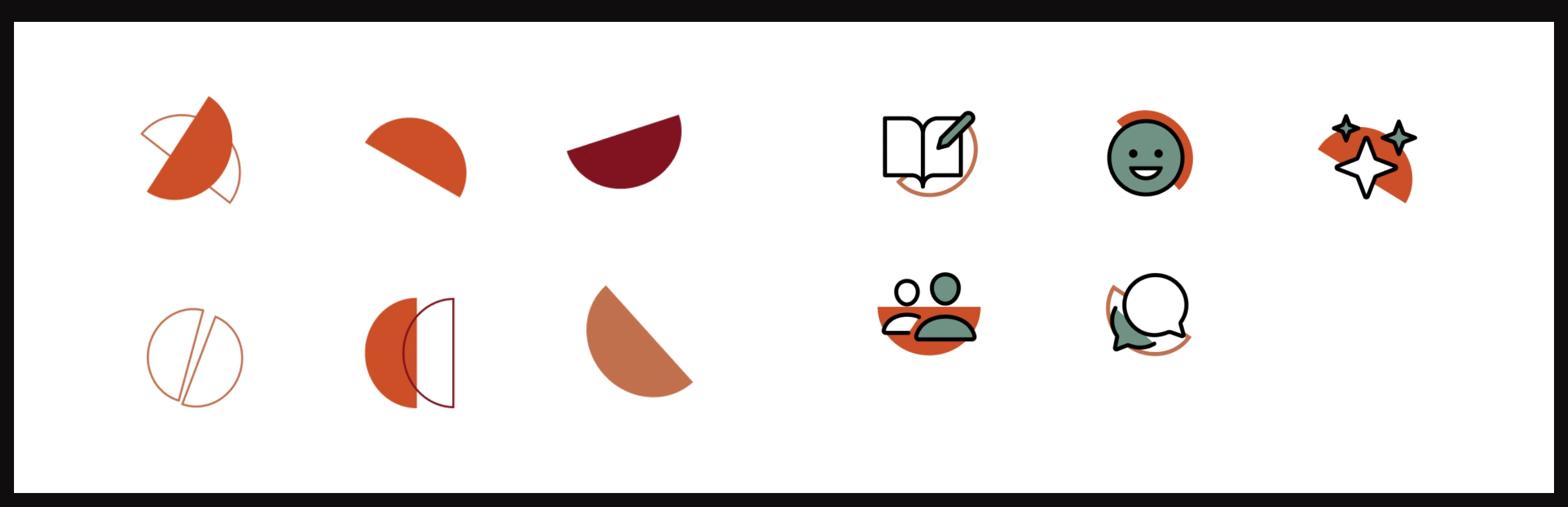
Icons are created to have similar mix of the abstract shapes along with educational items
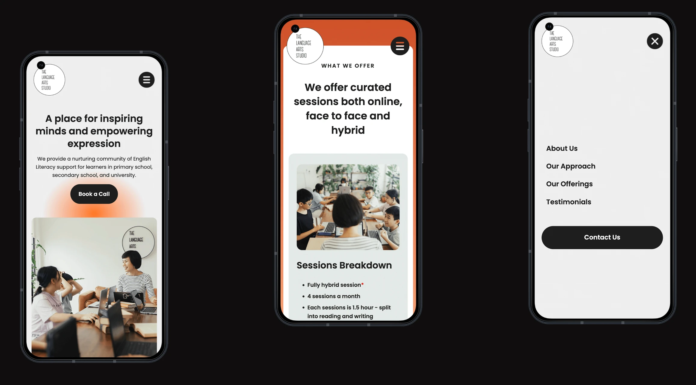
Ensuring website was made responsive in commonly used screens
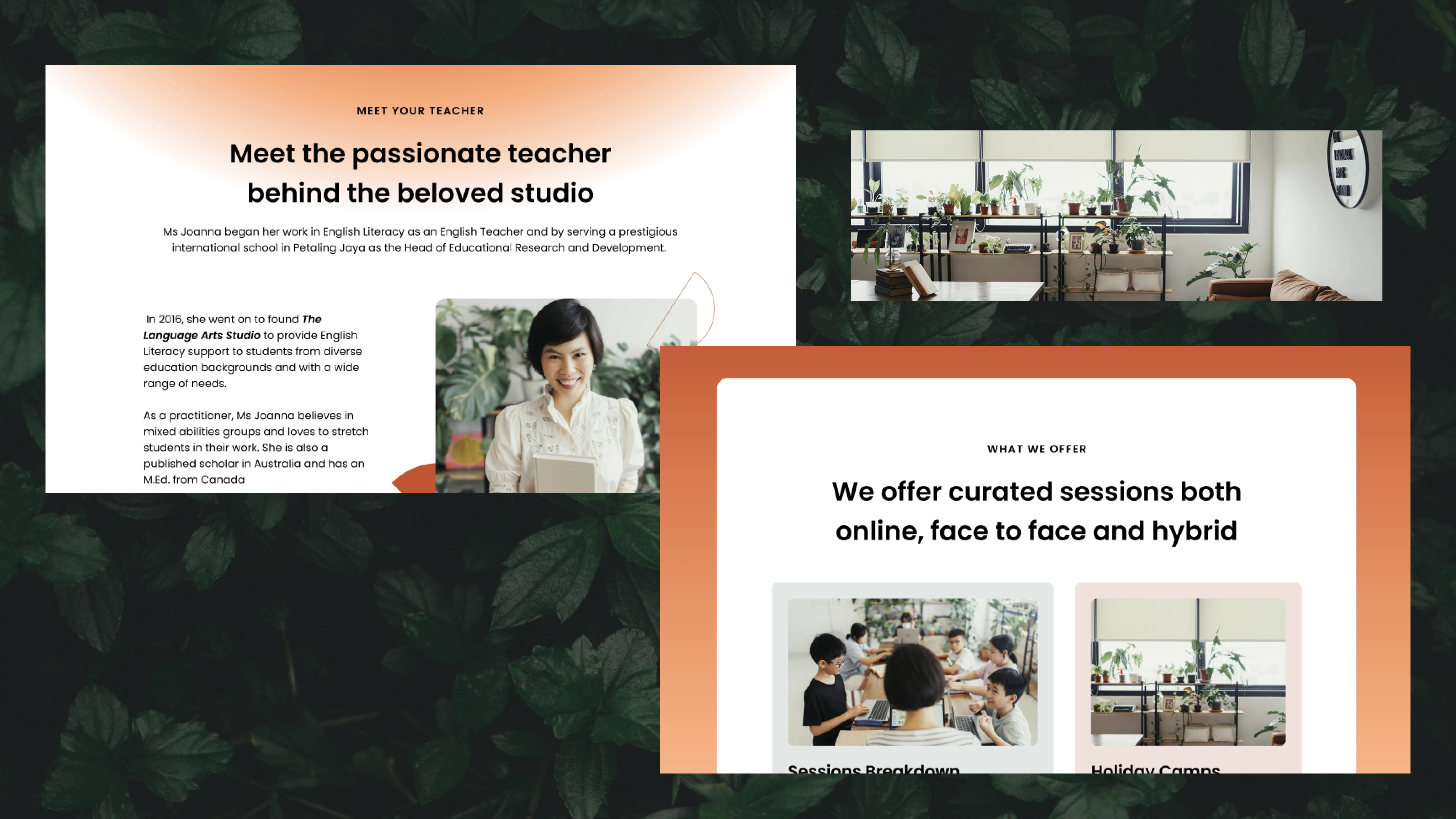
More snapshots of the site. Best part of it was having the real studio photos added into which elevated the site most.
Add On Service
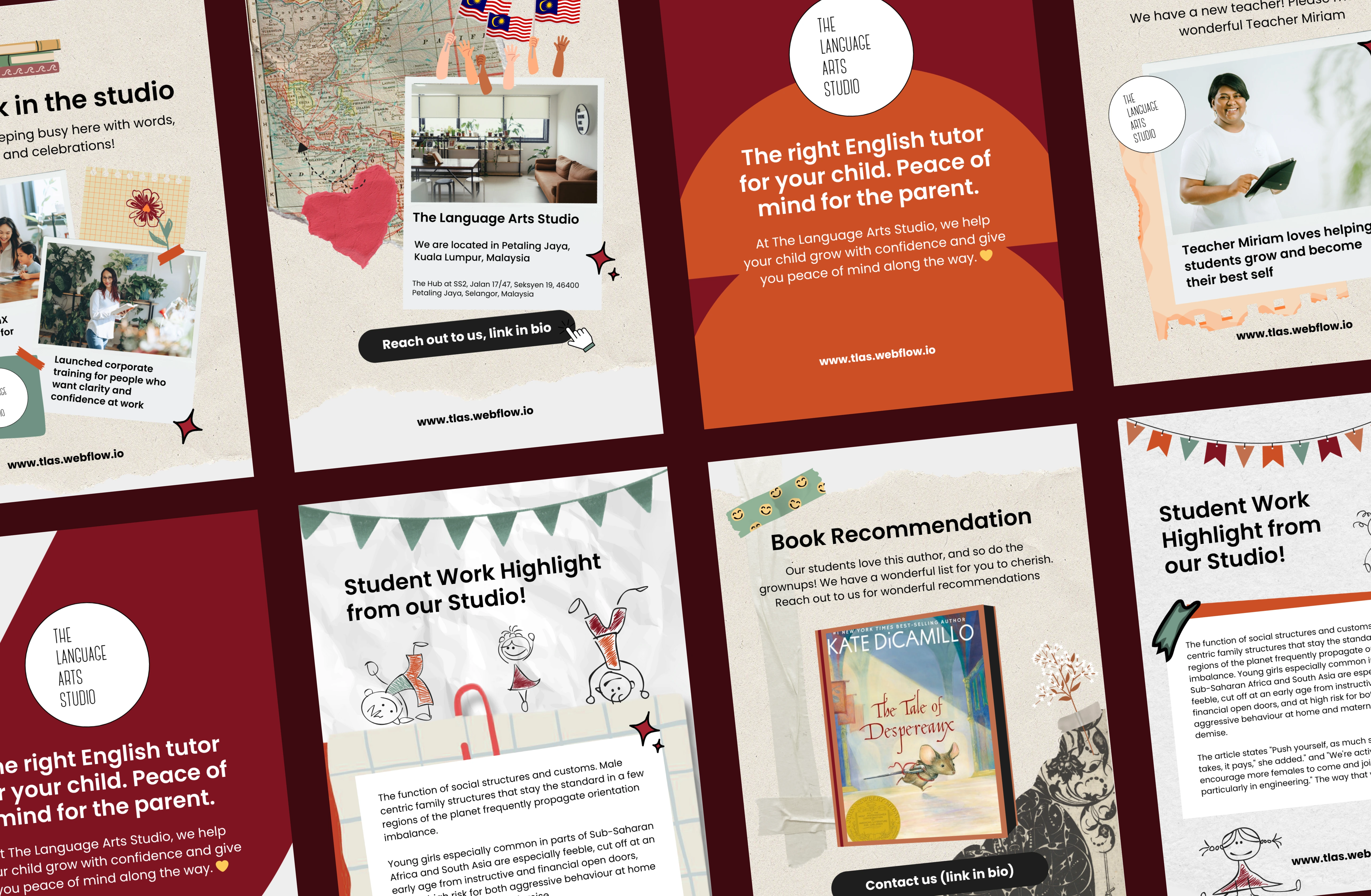
The client wanted to reach out to younger parents and this meant that the client would need to start trying Instagram. Because of which add-on services were created called Social Media Template design with the same visual identity.
Results & Impact
Client launched the site without domain and used the basic free plan of Webflow but connected it to their Google Business which allowed for users to still visit the site and had basic SEO setup.
After 3 months, client reported there was a 35% increase in bookings from parents
After 1 year, client hired 2 staff as the bookings were increase to 60% and needed to add more service.
After 2 years, client has hired 4 staff members and has 5 services with a launch on Instagram
This project shows how strategically creating a site which offers the solutions for exact pain points identified in business can make an enormous impact. Photos and videos of the service can allow the parents to feel comfortable signing up for service by experiencing without commitment This creative trust brought forward more bookings and essentially allowed the business owner to expand her offerings to keep up with the positive impact.
👩🏻🏫 If you are ever dropping by in the tropical city of Kuala Lumpur and are a parent whose looking for educational services for their child then please do visit the site at www.tlas.webflow.io
Like this project
Posted Jun 8, 2025
Created a website for an educational centre offering a visual showcase to help parents experience the service before making a full commitment for their children
Likes
8
Views
141
Timeline
Dec 6, 2024 - Dec 27, 2024
Clients
The Language Arts Studio