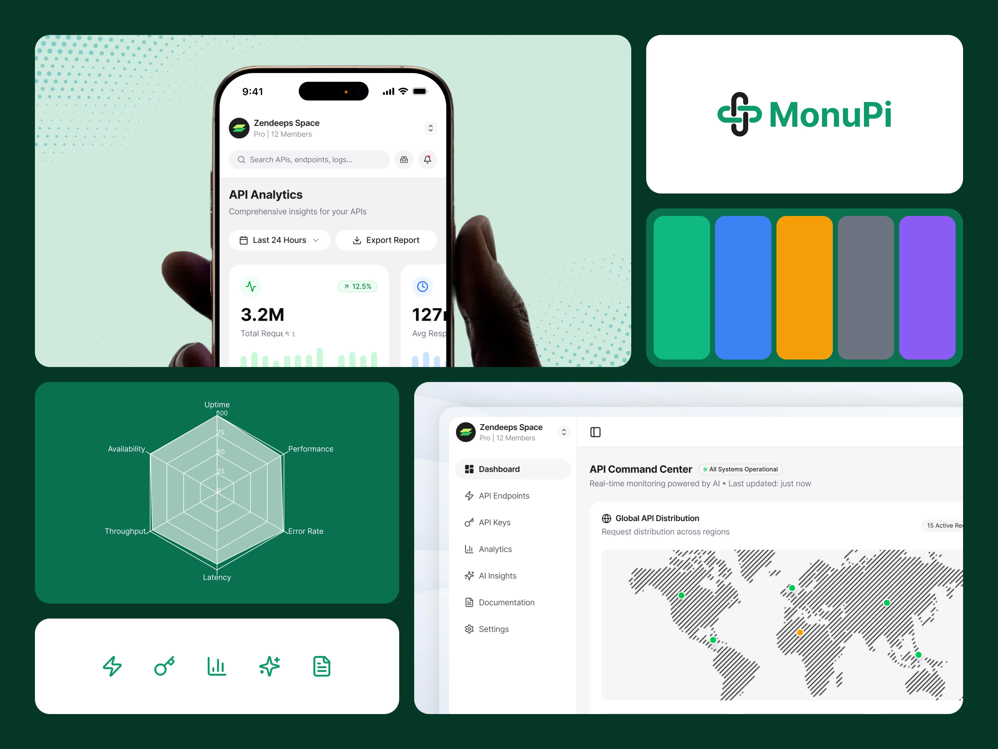
MonoPi: Unified API Workspace Design
Nurul Amin
MonoPi is a full product designed for teams who rely on APIs every day. The goal was to build a workspace where developers can monitor performance, test endpoints, review analytics, and take action without switching tools. Every part of the experience—from layout to microcopy—was shaped to reduce friction and help teams work faster.
The Problem
Engineering teams often use multiple tools just to perform simple API-related work. They switch between dashboards, Postman, logs, internal docs, and scattered monitoring systems. This slows down debugging, increases confusion, and makes it harder to understand what’s happening inside a production API.
MonoPi set out to solve this problem by creating one unified place where teams can monitor, test, and understand their APIs with clarity and speed. The challenge was to design an interface that feels simple even when the data behind it is complex.
User Pain Points
Developers shared a set of repeating frustrations. They had trouble finding performance bottlenecks quickly. Error spikes weren’t always easy to trace. API testing required extra tools, adding unnecessary steps to the workflow. Traffic patterns were hard to understand without digging into raw logs. Most dashboards gave numbers but not context. Teams wanted a tool that felt fast, dependable, and easy to read.
MonoPi addresses these issues by giving clear entry points, structured screens, and an environment where every insight has a purpose.
Tone & Voice System
The writing inside MonoPi follows a tone that stays calm, direct, and supportive. The goal was to avoid technical overload while still giving enough information for engineering teams.
The voice is simple, human, and confident. Labels are short. Messages guide the user rather than overwhelm them. Feedback feels helpful, not alarming.
This tone stays consistent across dashboards, alerts, testing screens, and system messages.
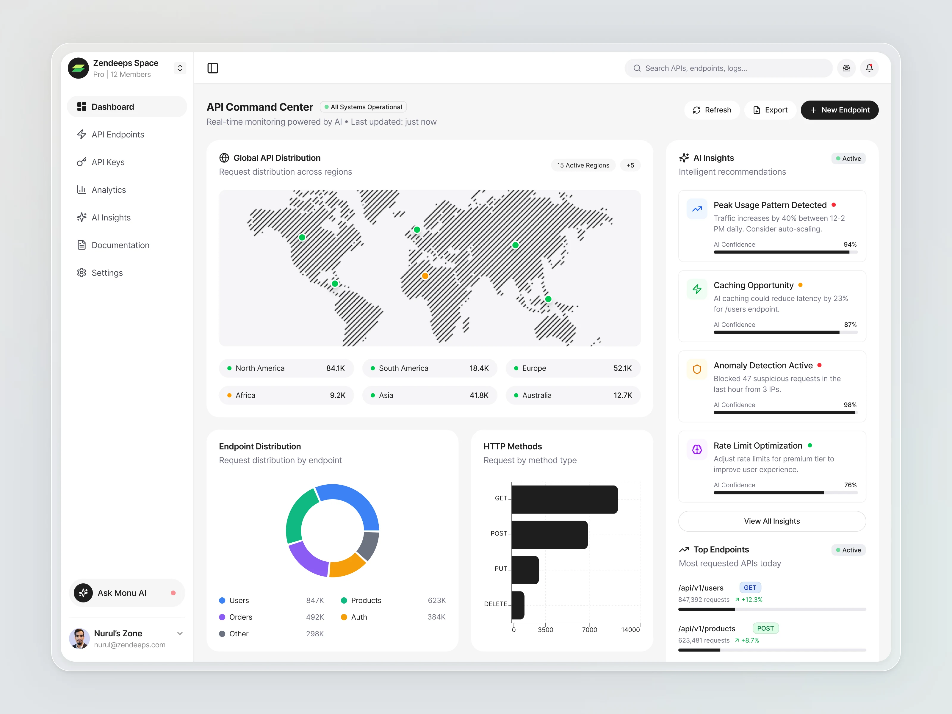
The biggest improvement MonoPi brings is clarity. The interface shows regions, endpoints, and methods without forcing the user to dig deep. AI insights reveal behavior patterns that teams often miss. Testing happens inside the same workspace, reducing context switching. Charts are clean and focus on trends instead of noise.
The analytics page helps teams understand long-term performance, not just real-time numbers. System metrics like CPU and memory show whether issues are tied to traffic or infrastructure.
Overall, the product helps teams spend less time searching and more time acting.
Reasoning Behind Design Decisions
The app works with data-heavy content, so spacing became a priority. Wide margins and clean grids keep the interface from feeling tight. Cards and charts sit on soft surfaces to reduce visual strain. Status colors are used sparingly—green for stable, yellow for caution, red for errors.
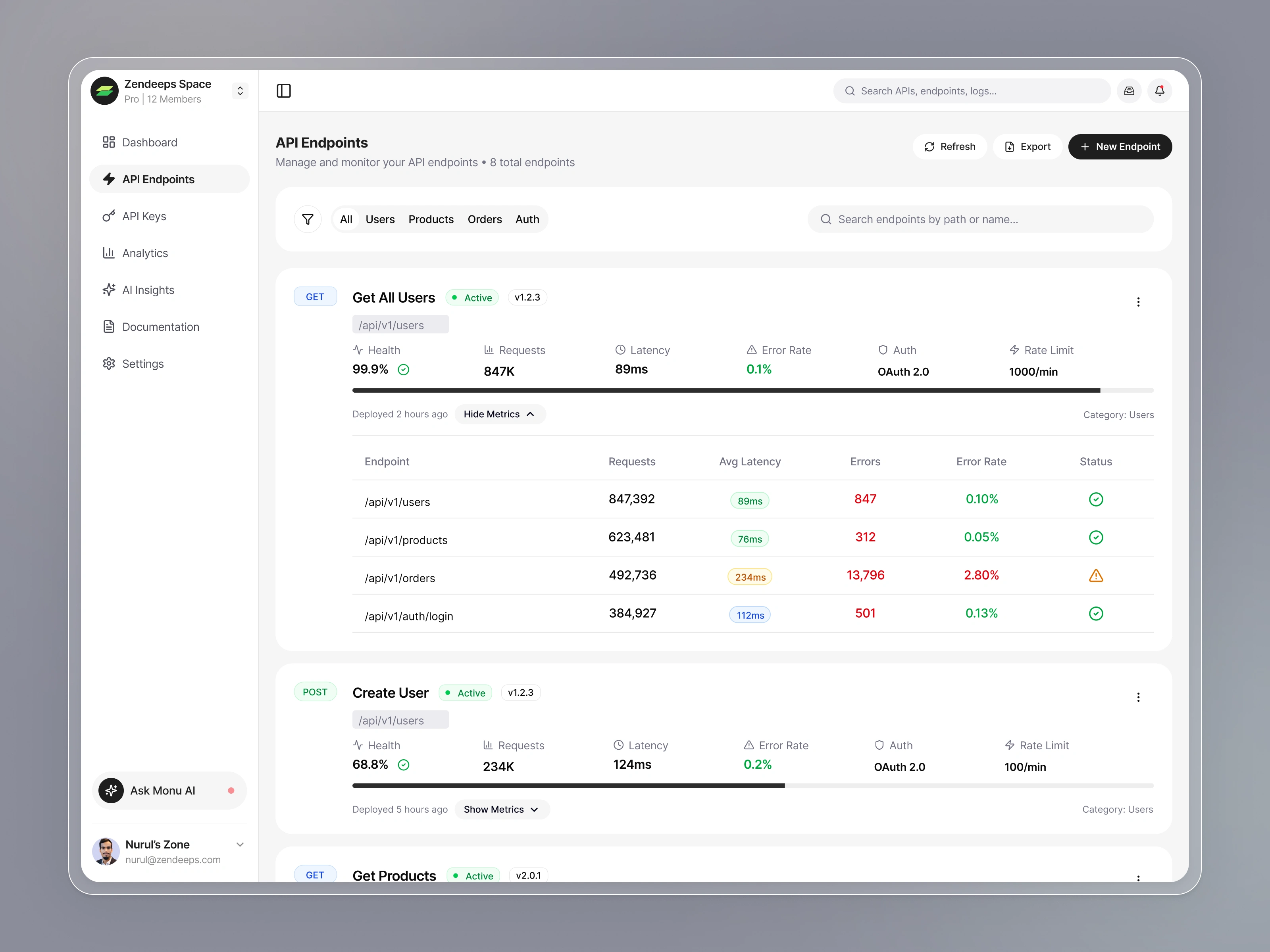
Tables were designed with enough separation between rows so users can scan quickly. Charts use simple shapes to avoid distraction. Icons help users understand complex metrics at a glance.
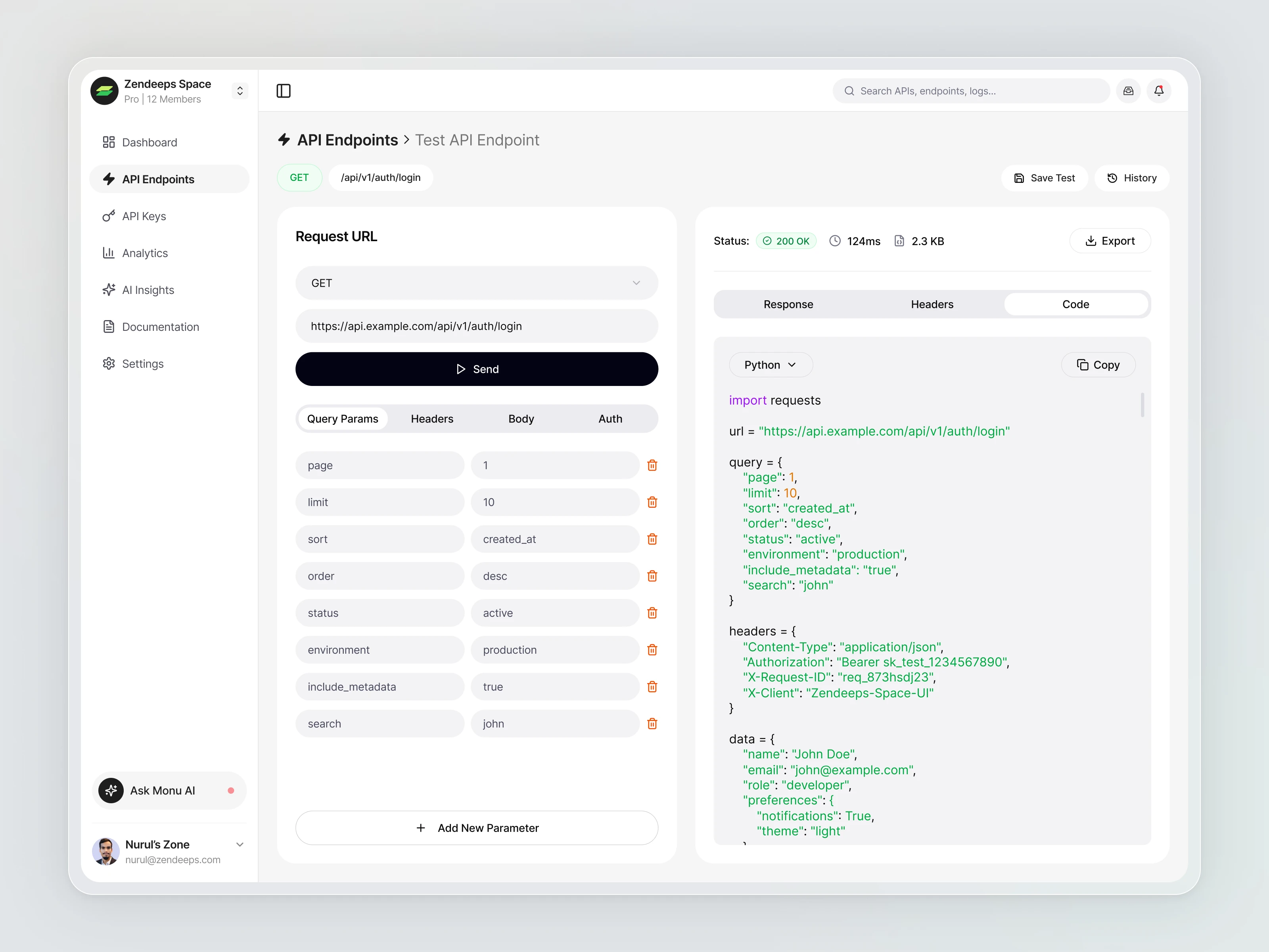
The request tester uses a horizontal split layout so developers can compare inputs and outputs without scrolling. Code snippets appear on the right to reduce cognitive load.
Every decision aimed to reduce friction, shorten decision time, and make the product feel dependable in daily use.
Like this project
Posted Nov 27, 2025
Designed MonoPi, a unified API workspace for monitoring, testing, and analytics.