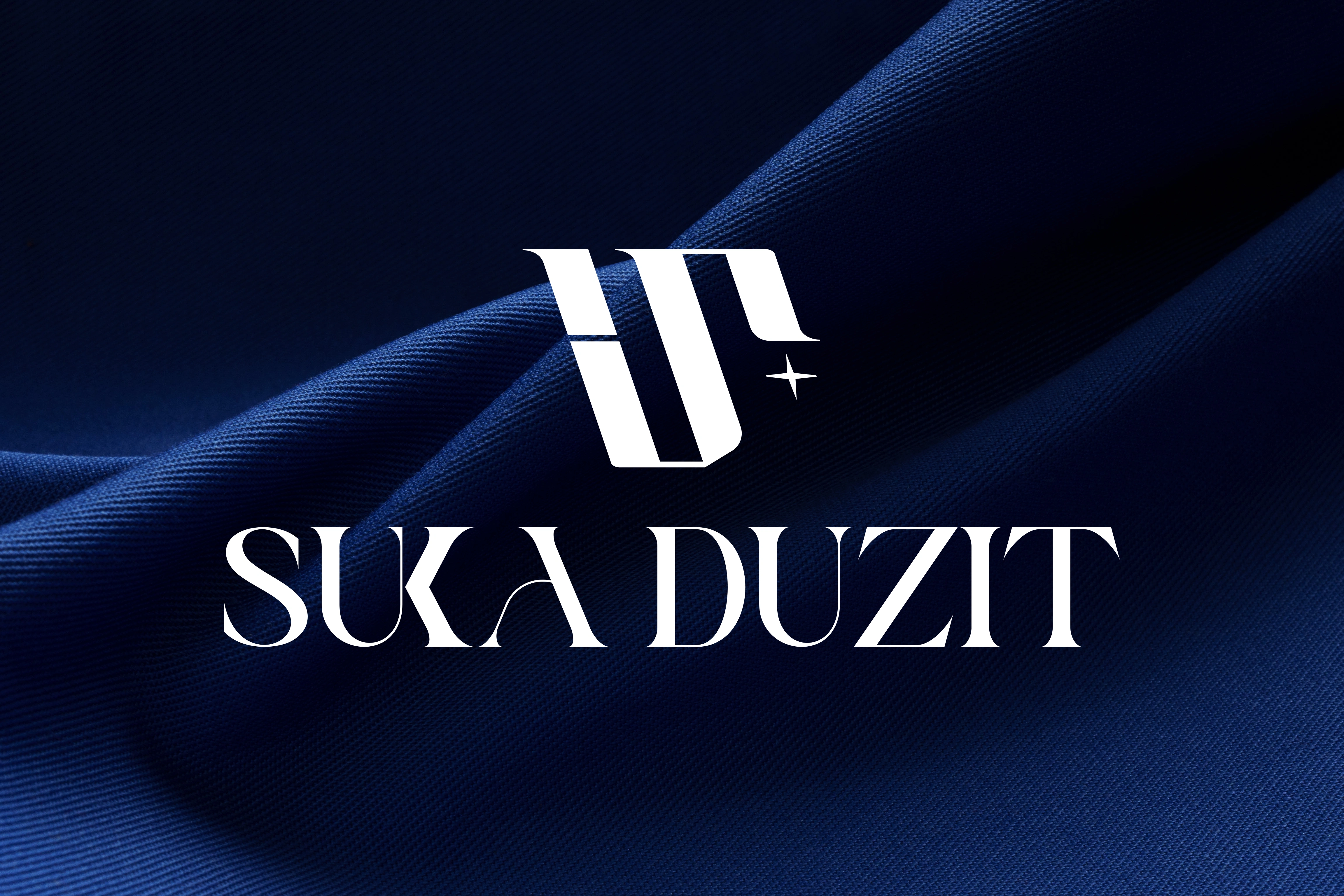
Suka Duzit Logo Refinement & Brand Identity
Studio 11X
REBRANDING: SUKA DUZIT
Suka Duzit
Logo Refinement & Brand Identity
Overview
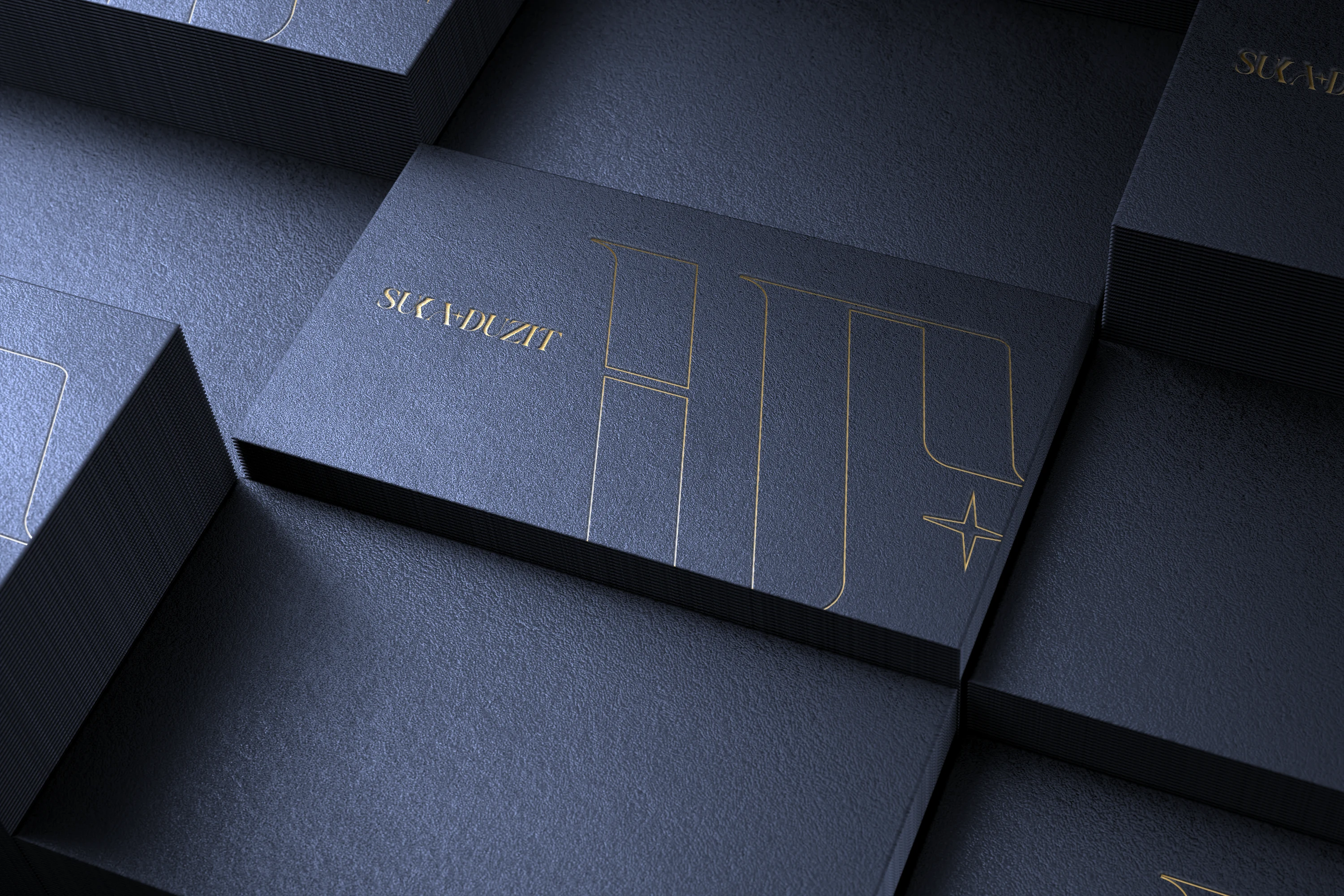
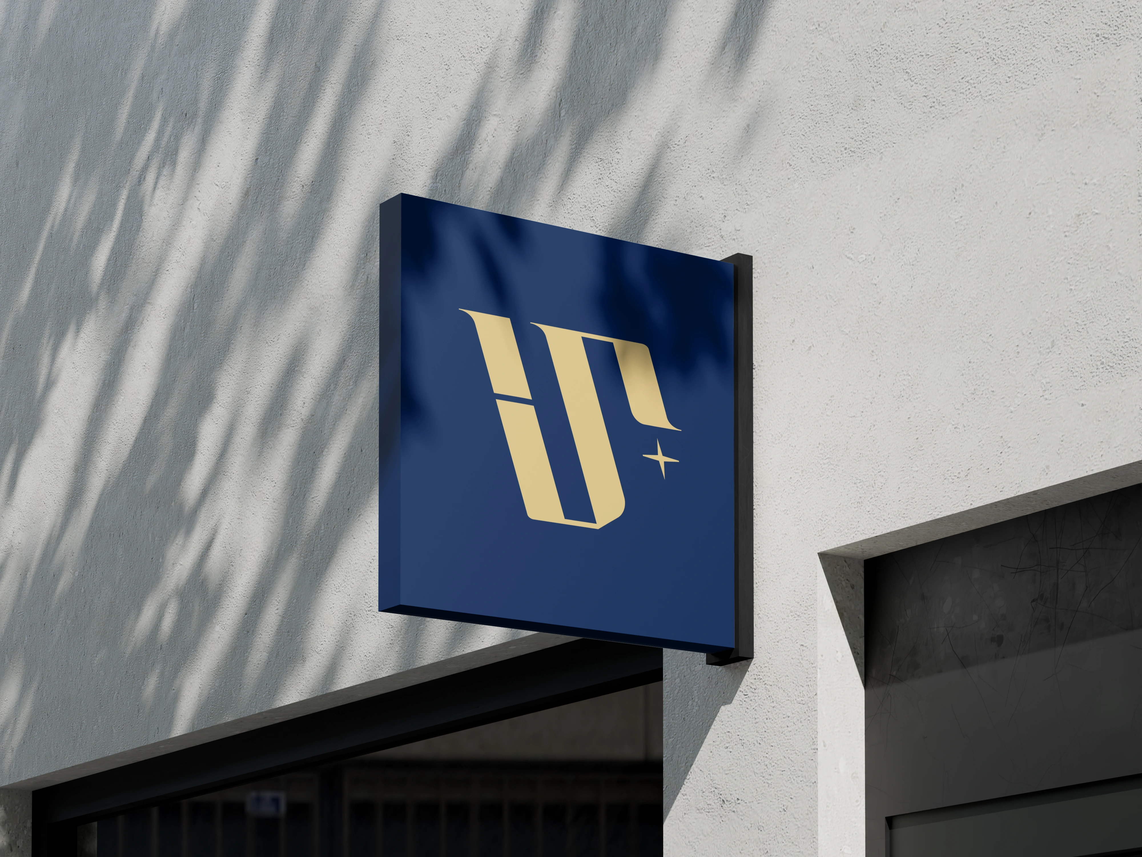
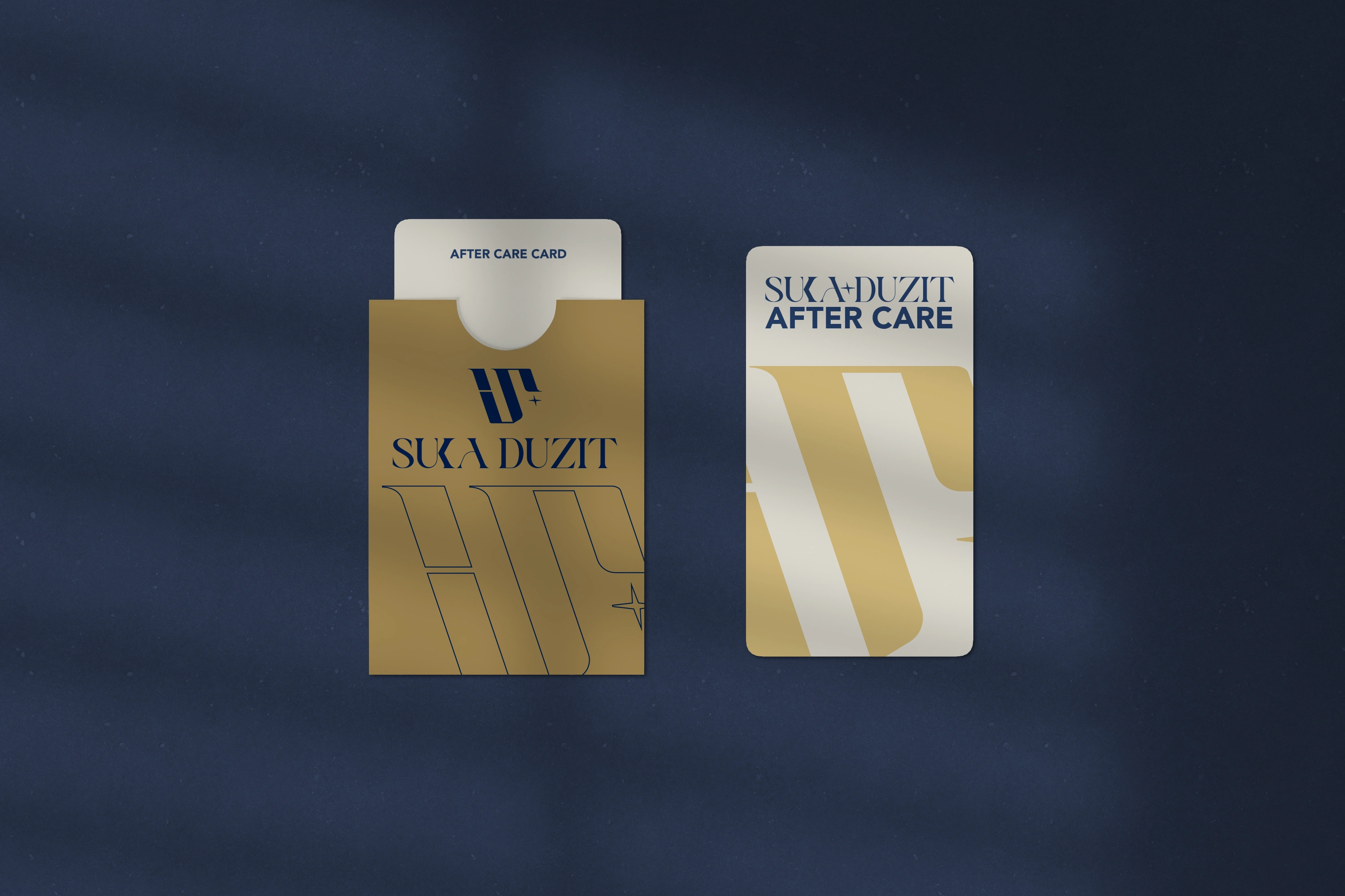
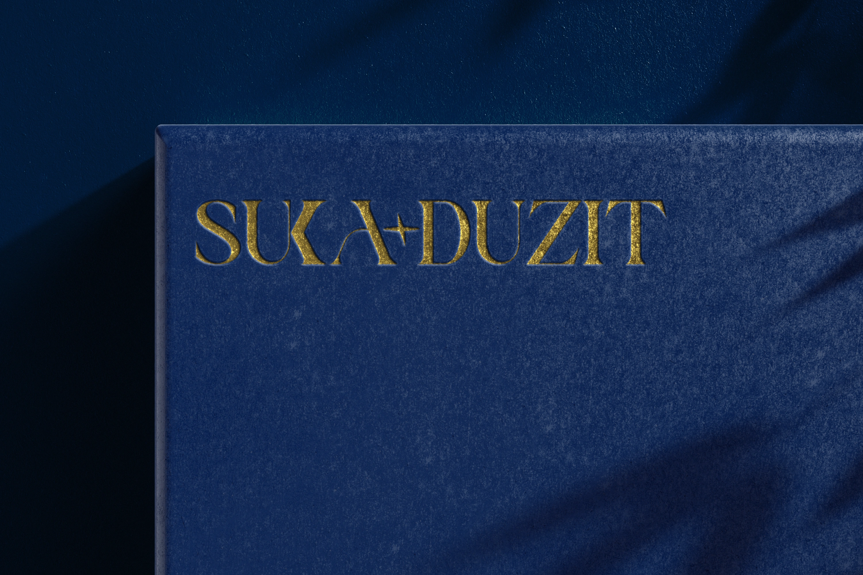
Refined an existing Suka Duzit logo into a cohesive brand identity by strengthening hierarchy, improving versatility, and introducing a meaningful standalone icon.
Challenge
The original logo had strong visual appeal but lacked clarity, recognisability, and flexibility. There was no icon system in place, limiting use across social media, merchandise, and small-scale digital applications.
Solution
Developed a refined logo system anchored by a custom icon built from brand-led symbolism. The identity balances luxury, beauty, and individuality while remaining adaptable across digital and physical touchpoints.
Key Deliverables
Custom brand icon with layered meaning
Type, stacked, and logomark lockups
Flexible colour variations
Scalable logo system for real-world use
Outcome
Suka Duzit now has a recognisable, versatile identity that maintains its retro-modern aesthetic while communicating confidence, luxury, and long-term brand clarity.
Like this project
Posted Dec 27, 2025
Refined Suka Duzit's logo into a cohesive brand identity with a unique icon system.