Northside Arc - Architecture Brand Identity

1960s Studio


Architecture Branding
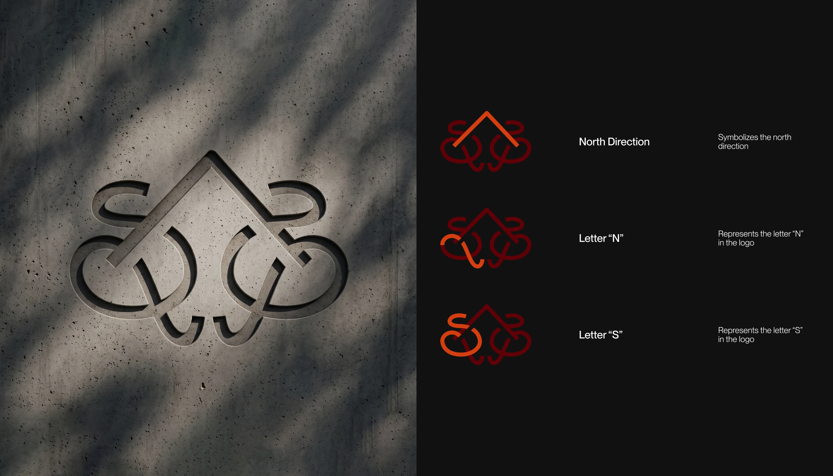
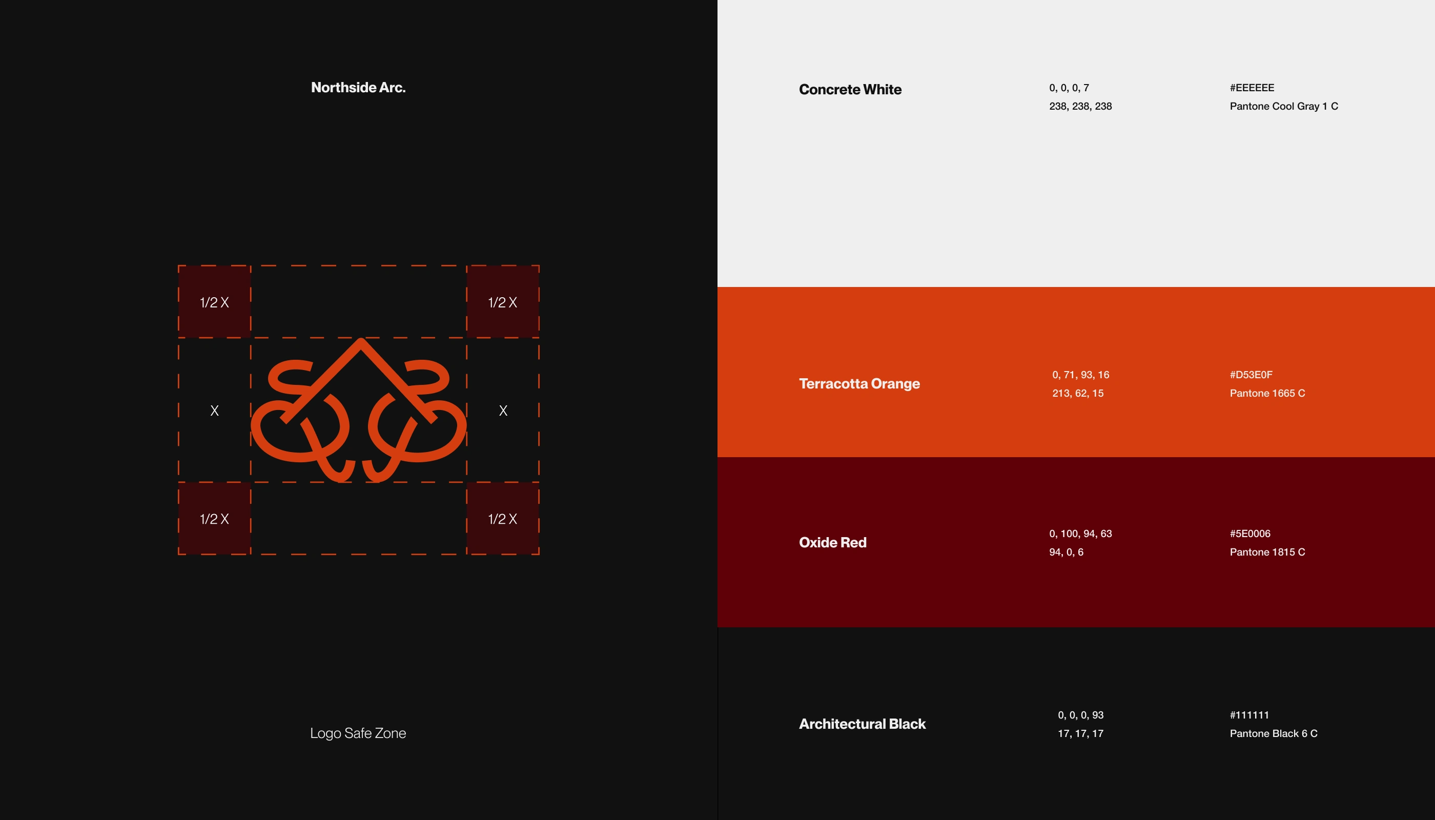
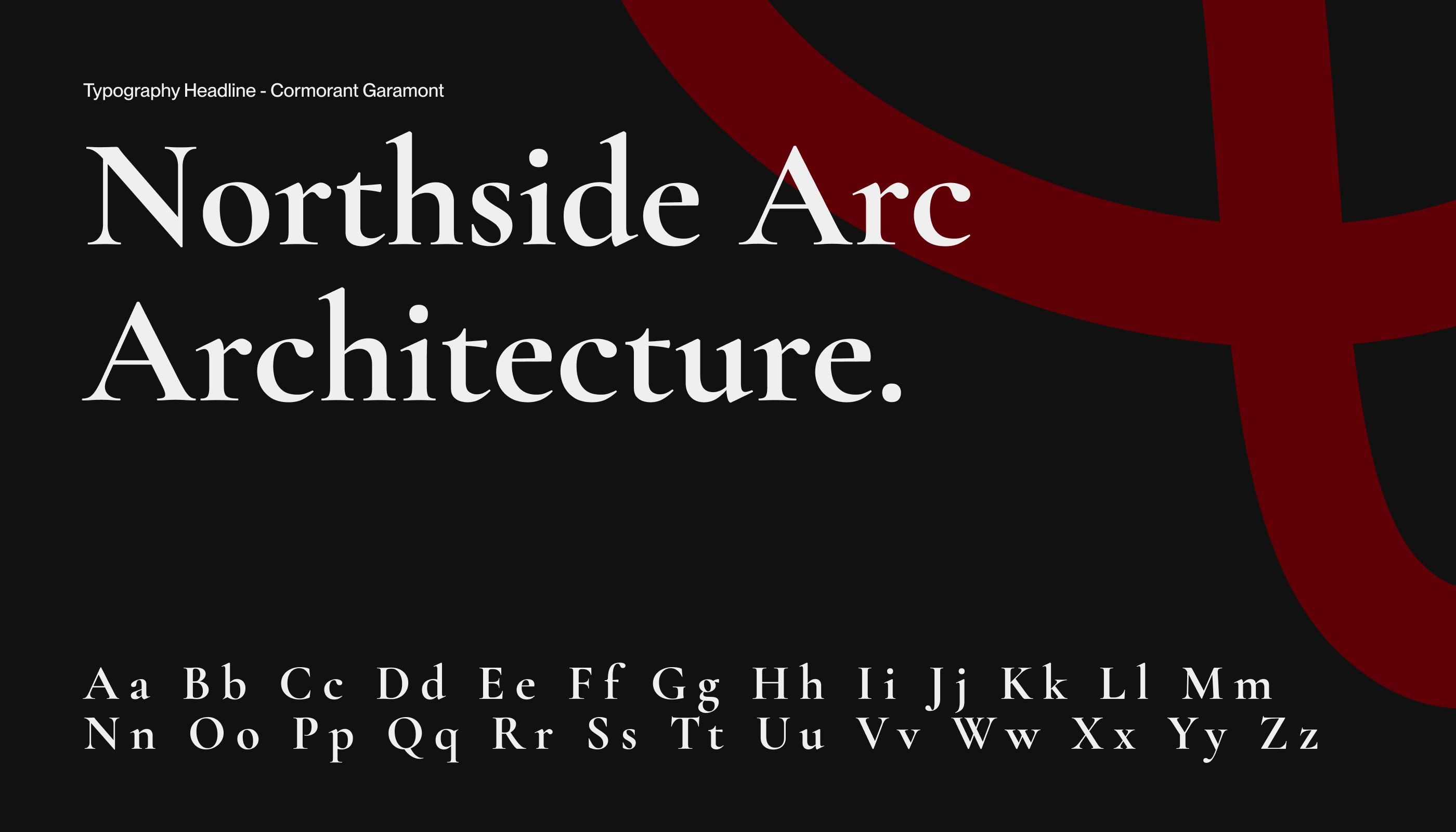
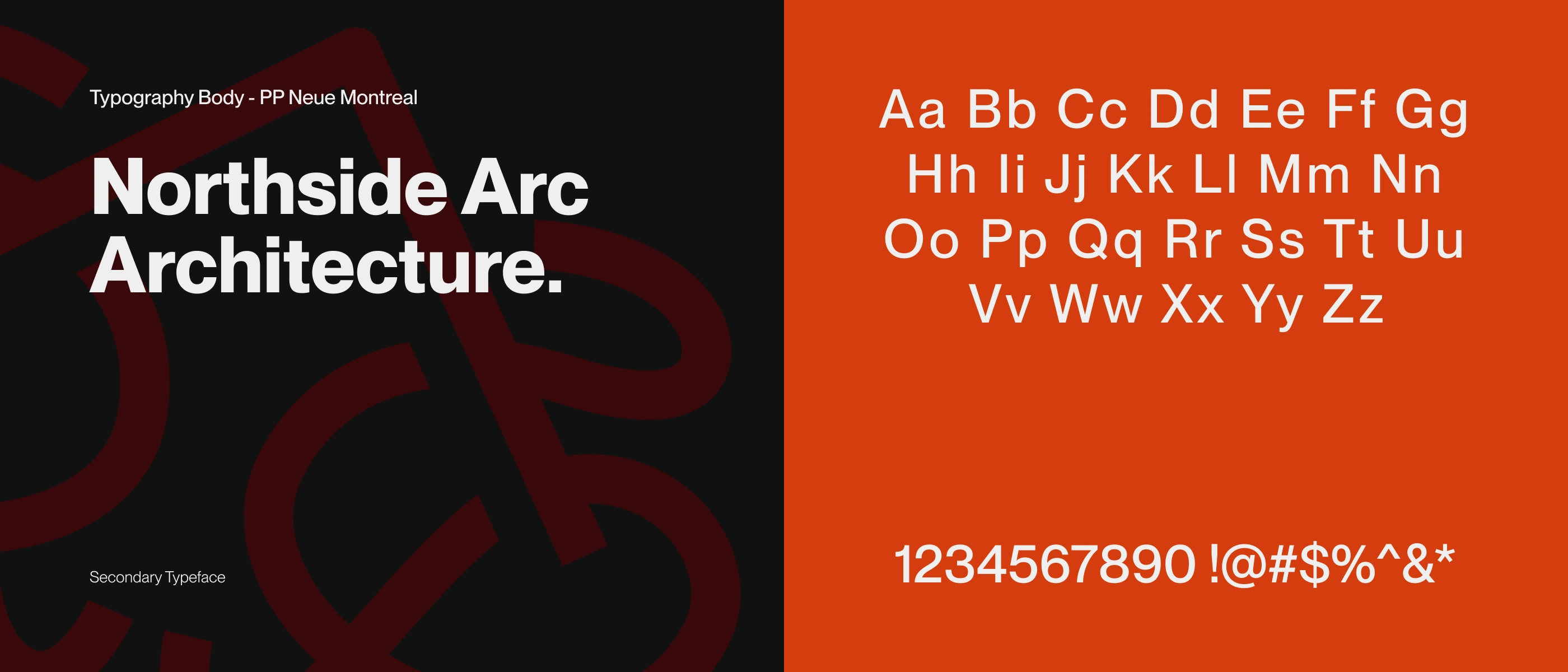
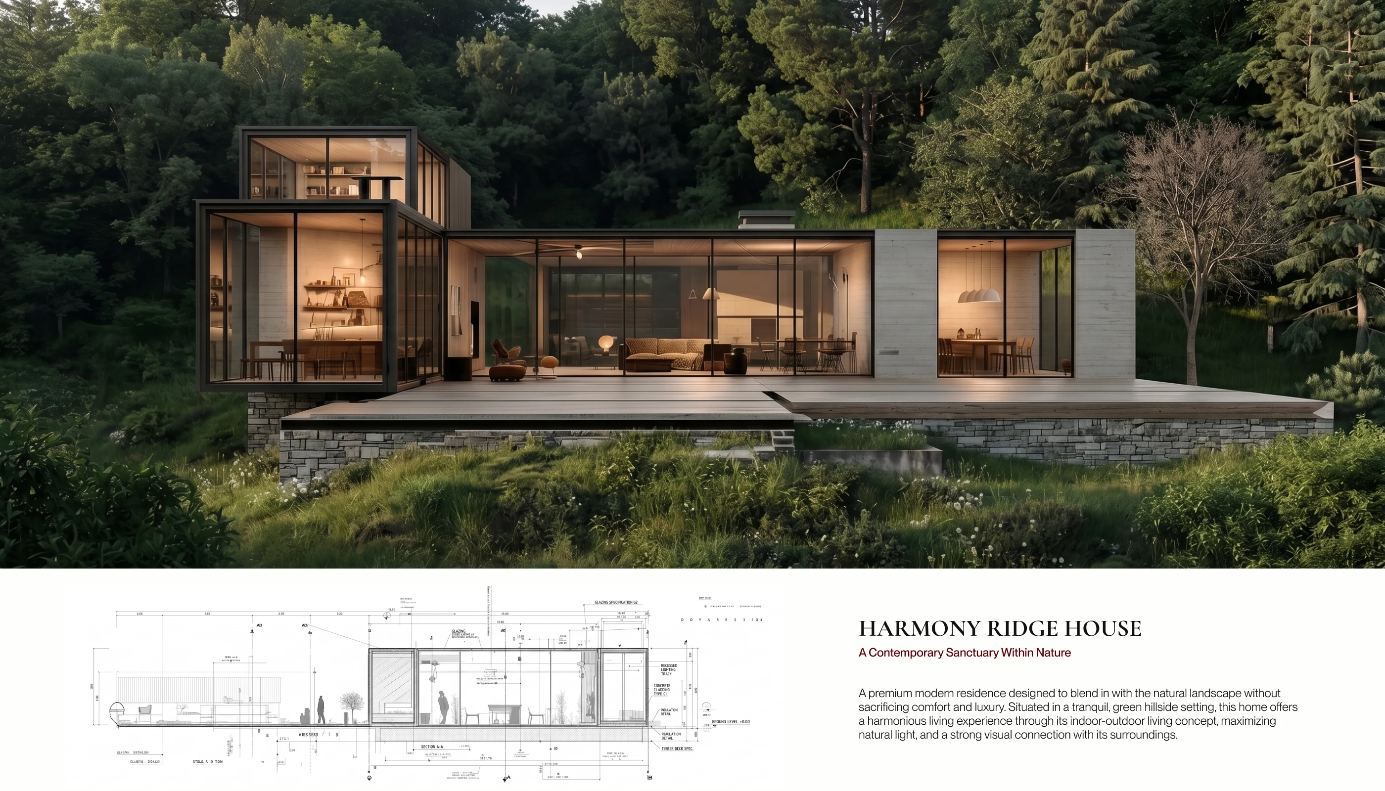
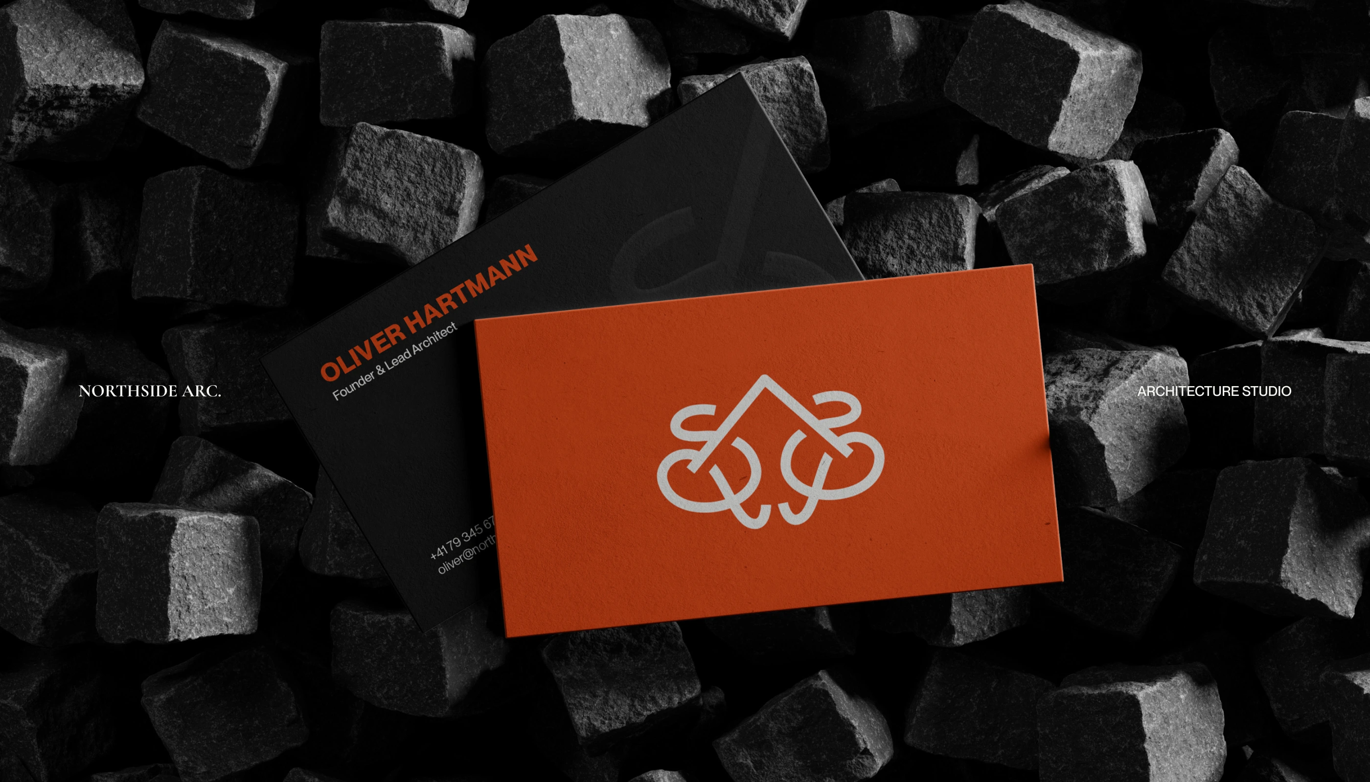
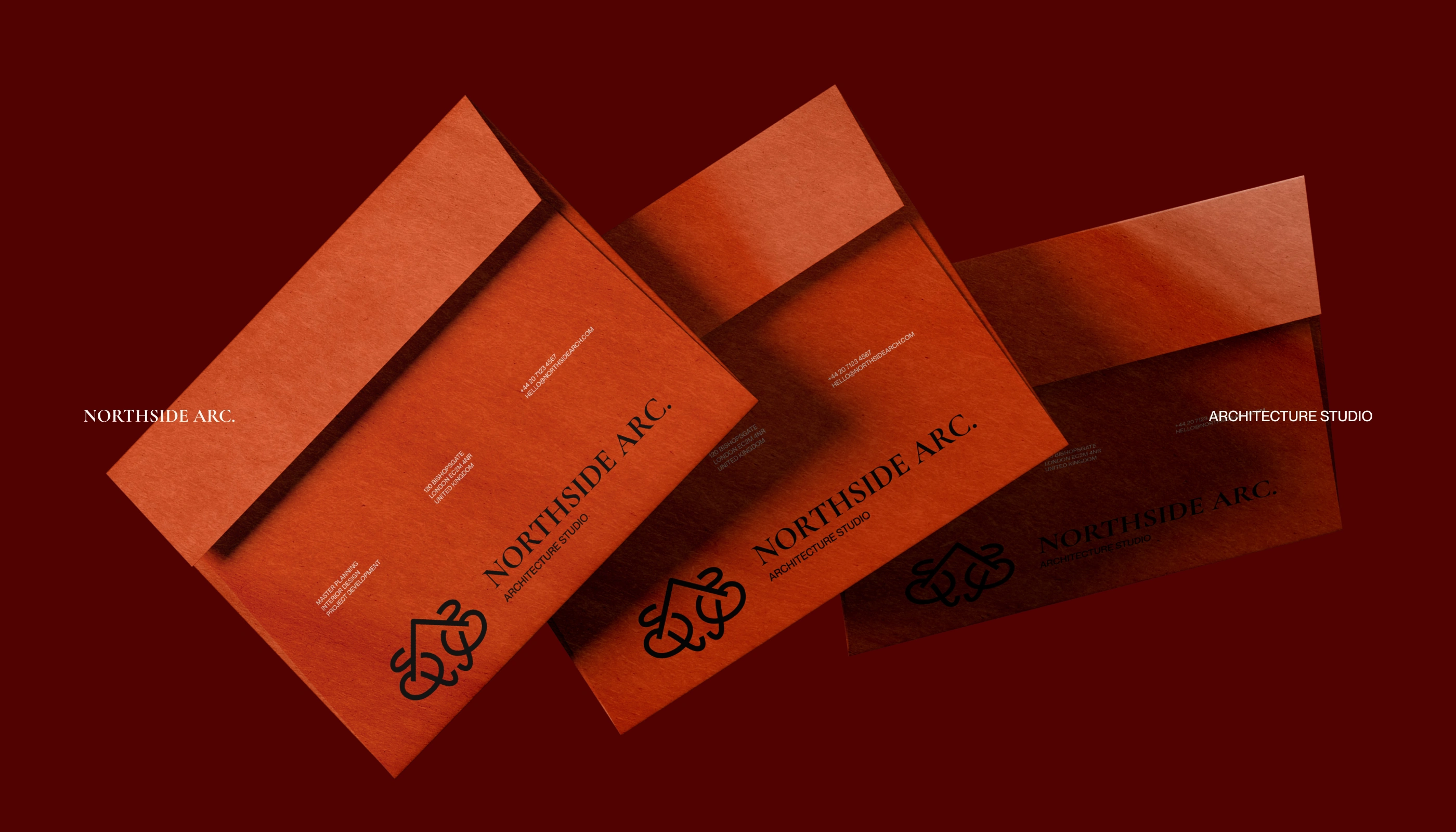
1960s Studio - Northside Arc. is an architecture studio driven by clarity, structure, and forward-thinking design. Rooted in the idea of direction and orientation, the studio approaches each project as a strategic response to its environment - balancing form, function, and context. With a focus on clean geometries and purposeful spatial narratives, Northside Arc delivers architecture that feels grounded yet progressive, shaping spaces that guide human experience with precision and intent.
Word Implementation and Utility
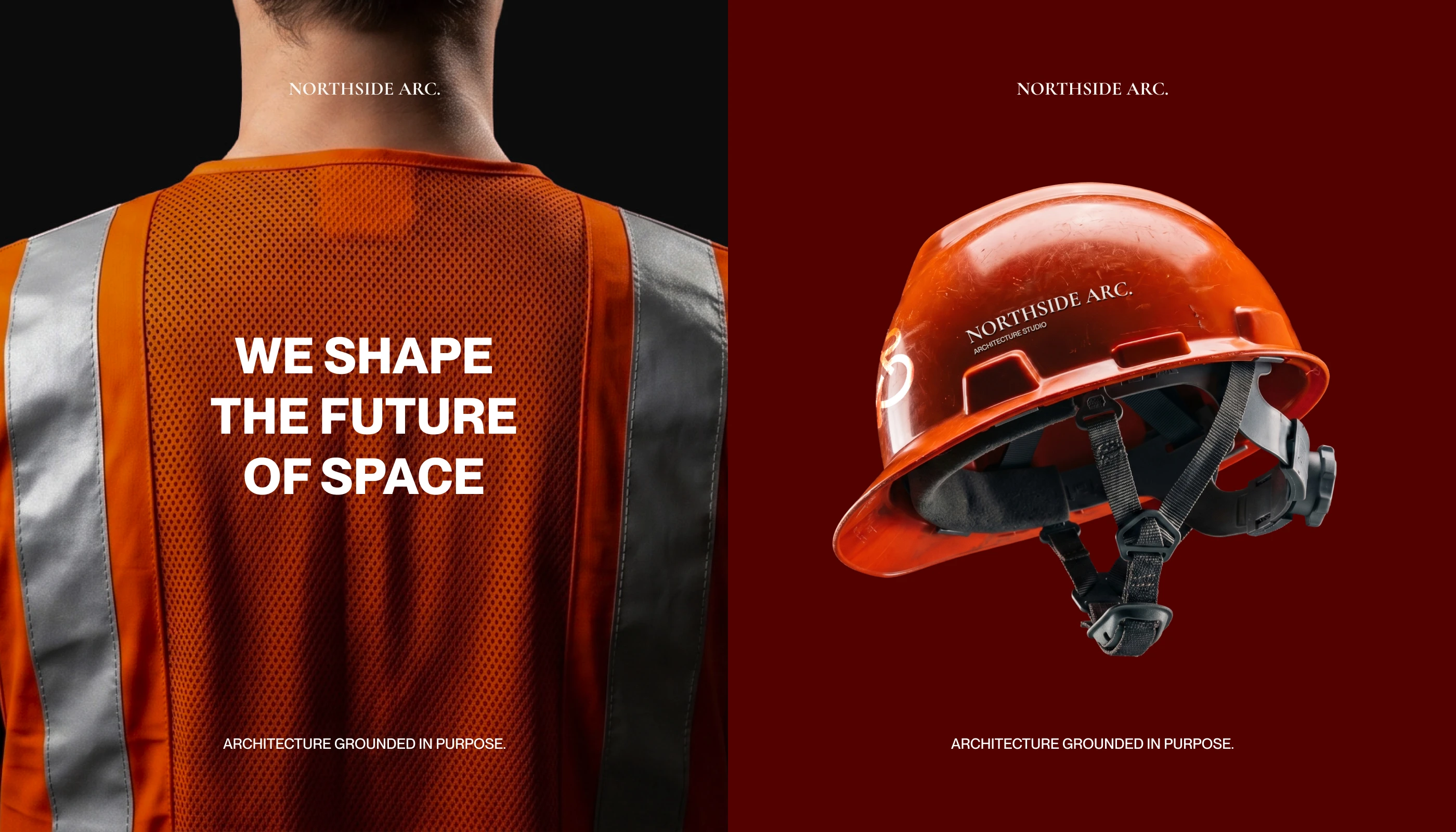
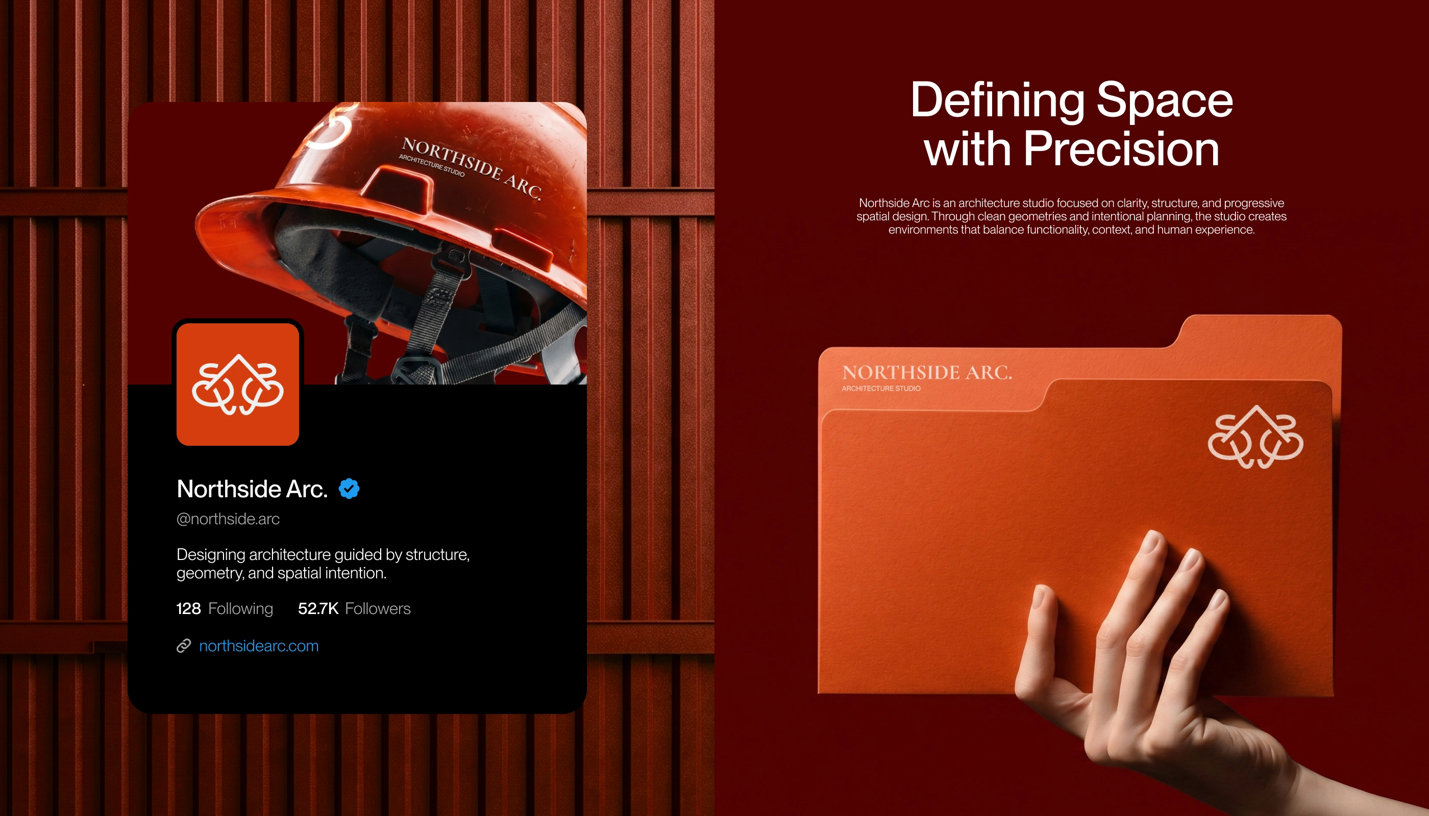
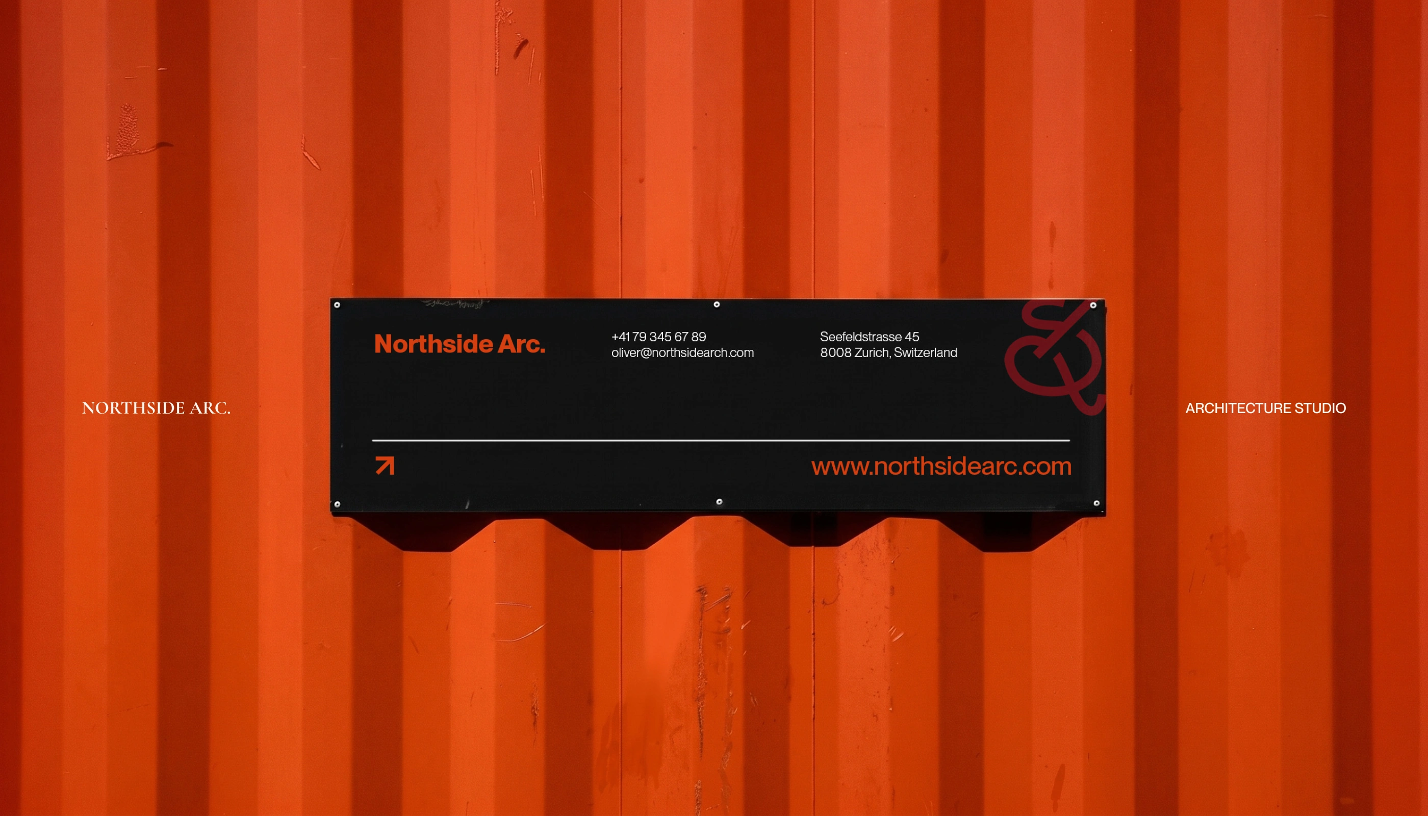
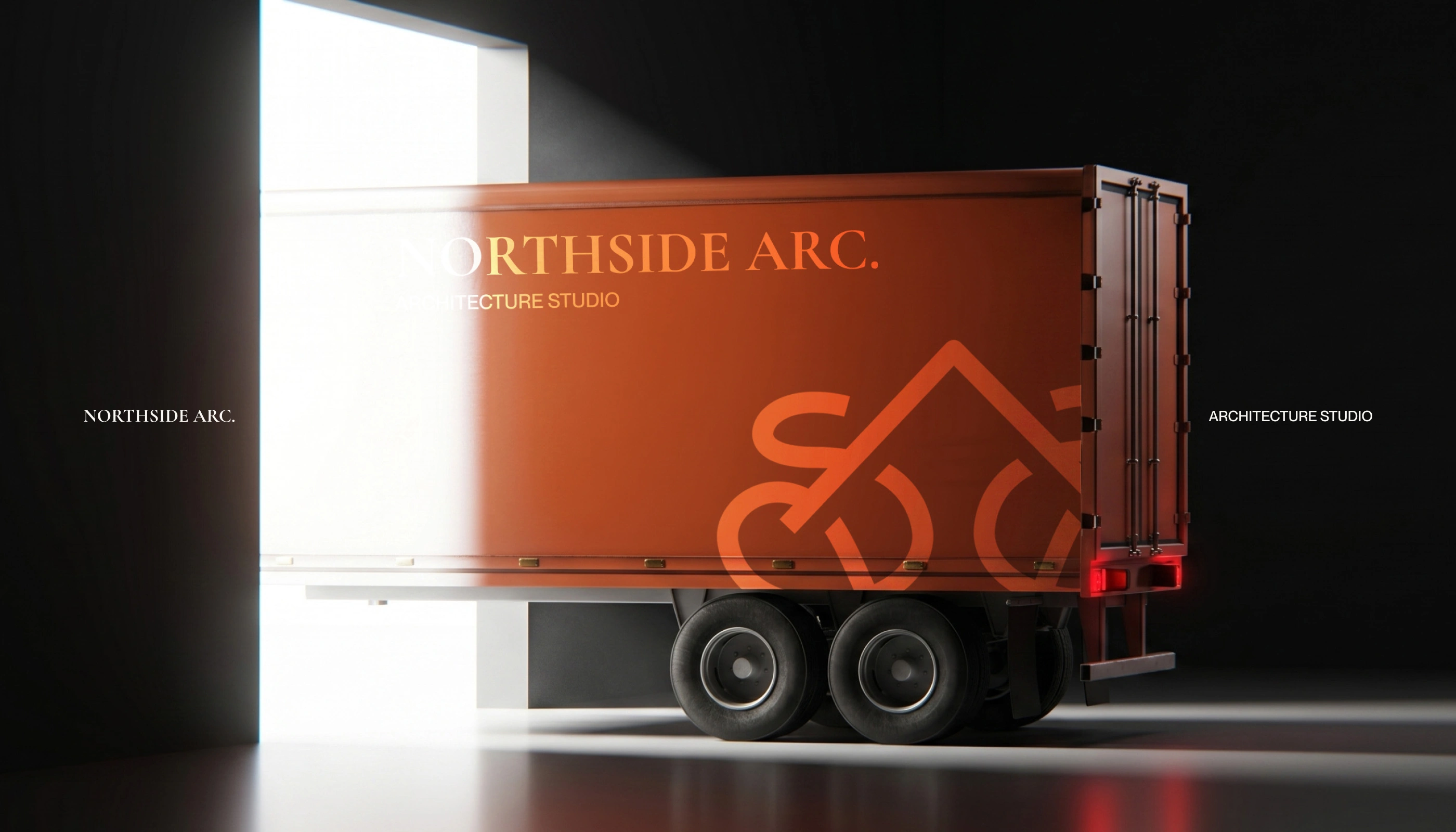
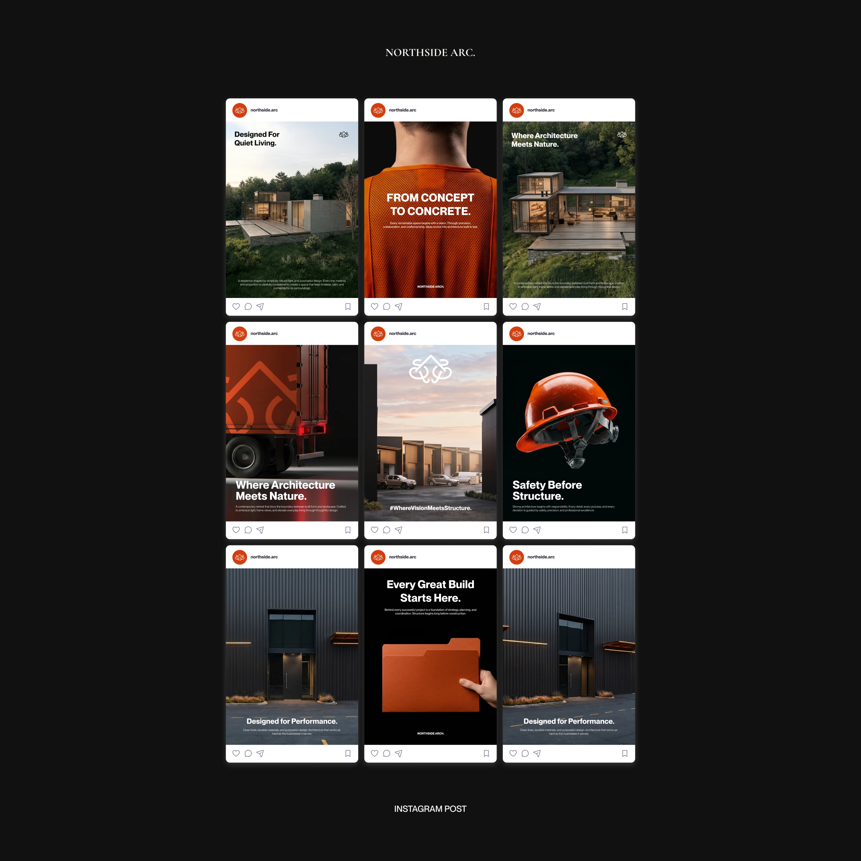
Northside Arc.'s identity extends beyond paper and screen into the real world, where it lives on the field. Branded helmets, vests, and on-site equipment carry the studio's directional mark into active construction environments, reinforcing the connection between design intent and physical execution. This world implementation grounds the brand in utility, proving that Northside Arc.'s visual language holds up not just in presentations, but on-site, in motion, and in the hands of the people building what the studio designs.

Marketing Collateral, Ad or Campaign Creative
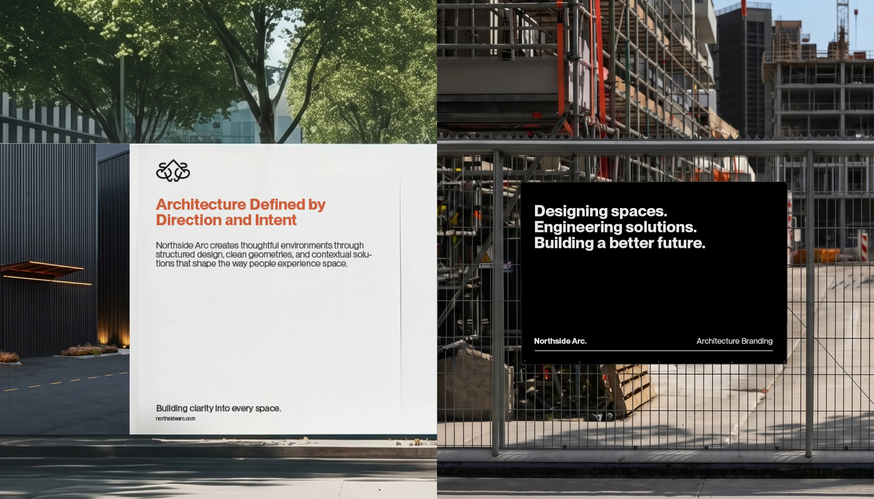
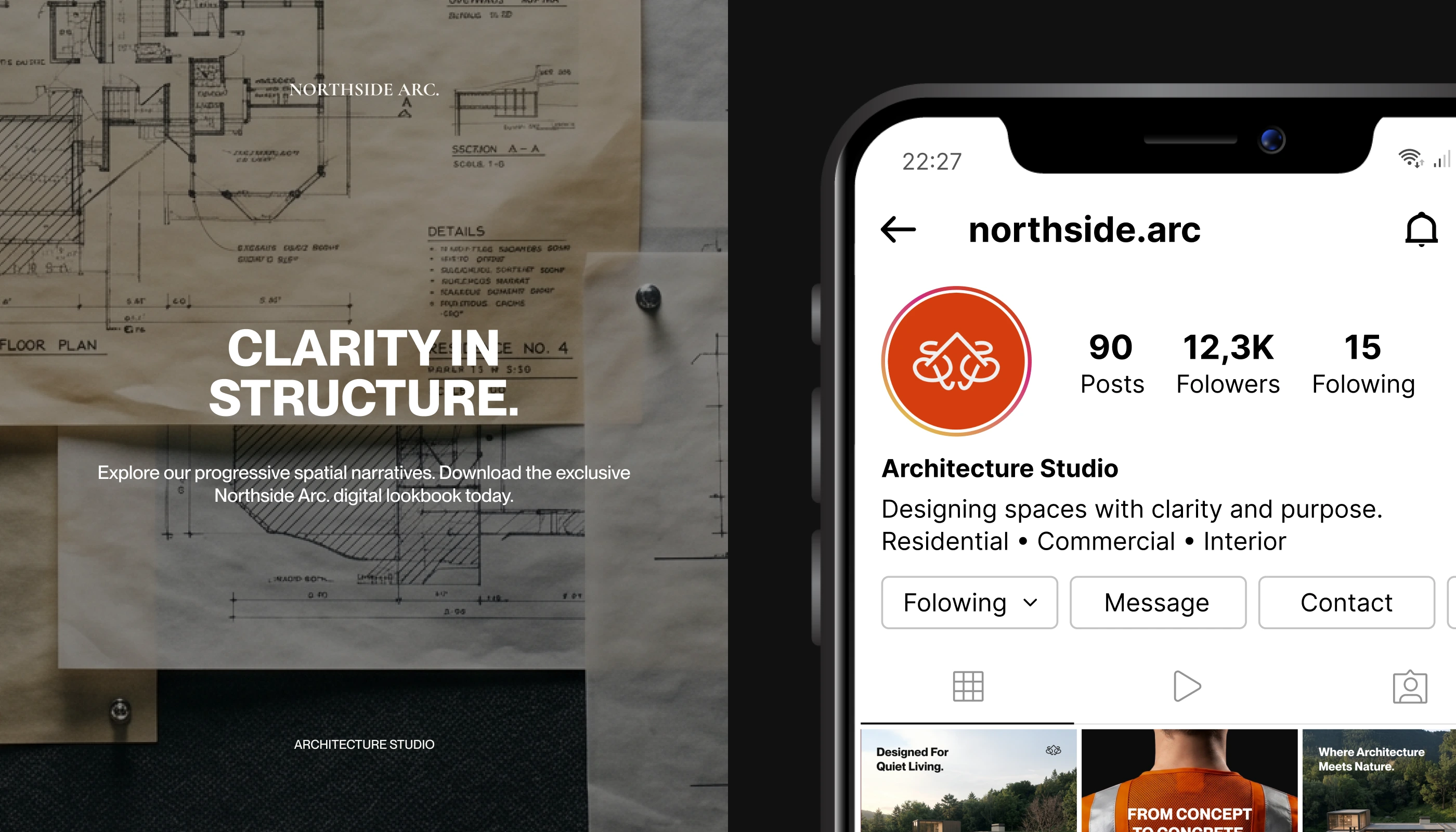
Northside Arc.'s campaign creative comes alive across social media, where the studio's identity is translated into a cohesive content system for Instagram. Each post and story carries a consistent visual rhythm, pairing bold campaign lines like "Architecture with Purpose" "From Concept to Concrete" and "Clarity in Structure" with striking imagery of the studio's work and process. The grounded color palette and structured grid layout extend naturally into the feed itself, creating a profile that feels as deliberate and considered as the architecture it represents.
Like this project
Posted Jul 9, 2026
1960s Studio - Northside Arc. is an architecture studio driven by clarity, structure, and forward-thinking design.