
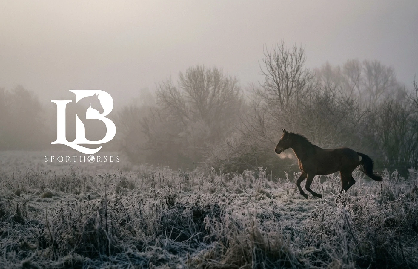
LB Sporthorses works with sport horses for riders who compete. The brief was an identity with the calm of the yard and the sharpness of the ring, at home on a browband, a horse lorry and a letter alike.
Equestrian brands tend to reach for crests, horseshoes and gold script. We wanted a mark that reads as sport rather than costume and still holds up as small as a stall plate.
LB Sporthorses brief
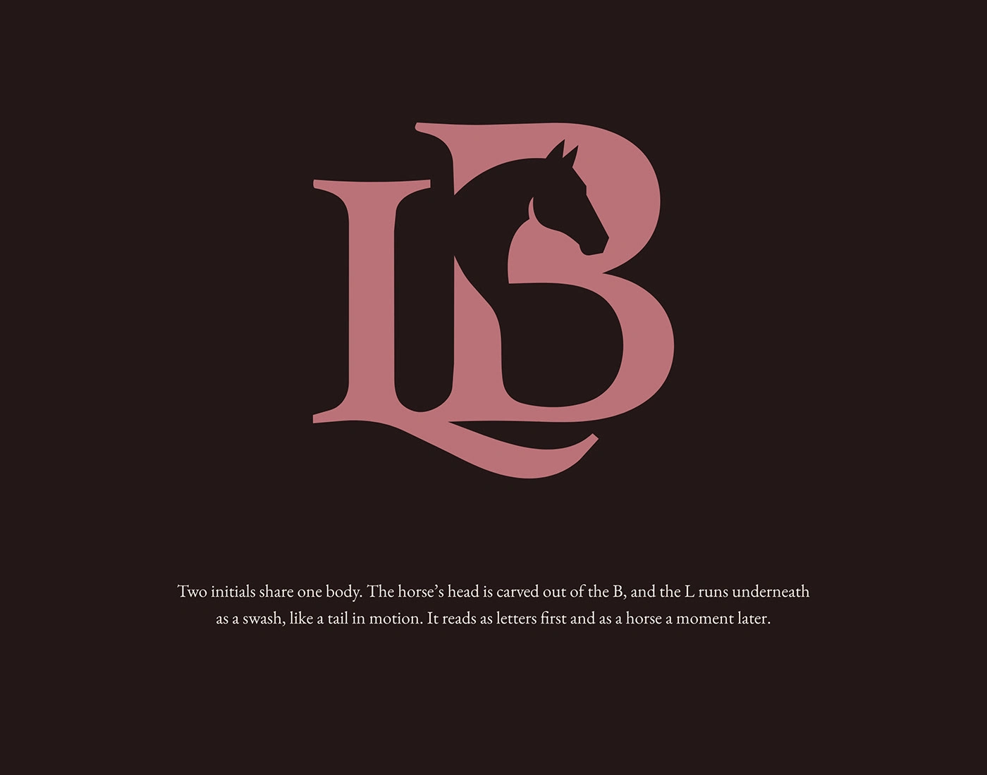
The mark: two initials share one body. The horse's head is carved out of the B and the L runs underneath like a tail in motion. In the wordmark the O becomes a globe.
LB monogram
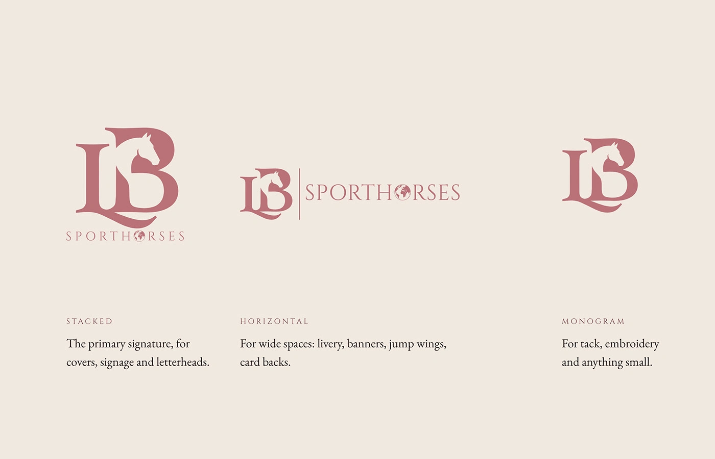
Logo system
The system: Dusty Rose from the logo, grounded in Parchment, Bay Black and Loden. Cinzel for headings, EB Garamond for reading. Real horses in real weather for photography.
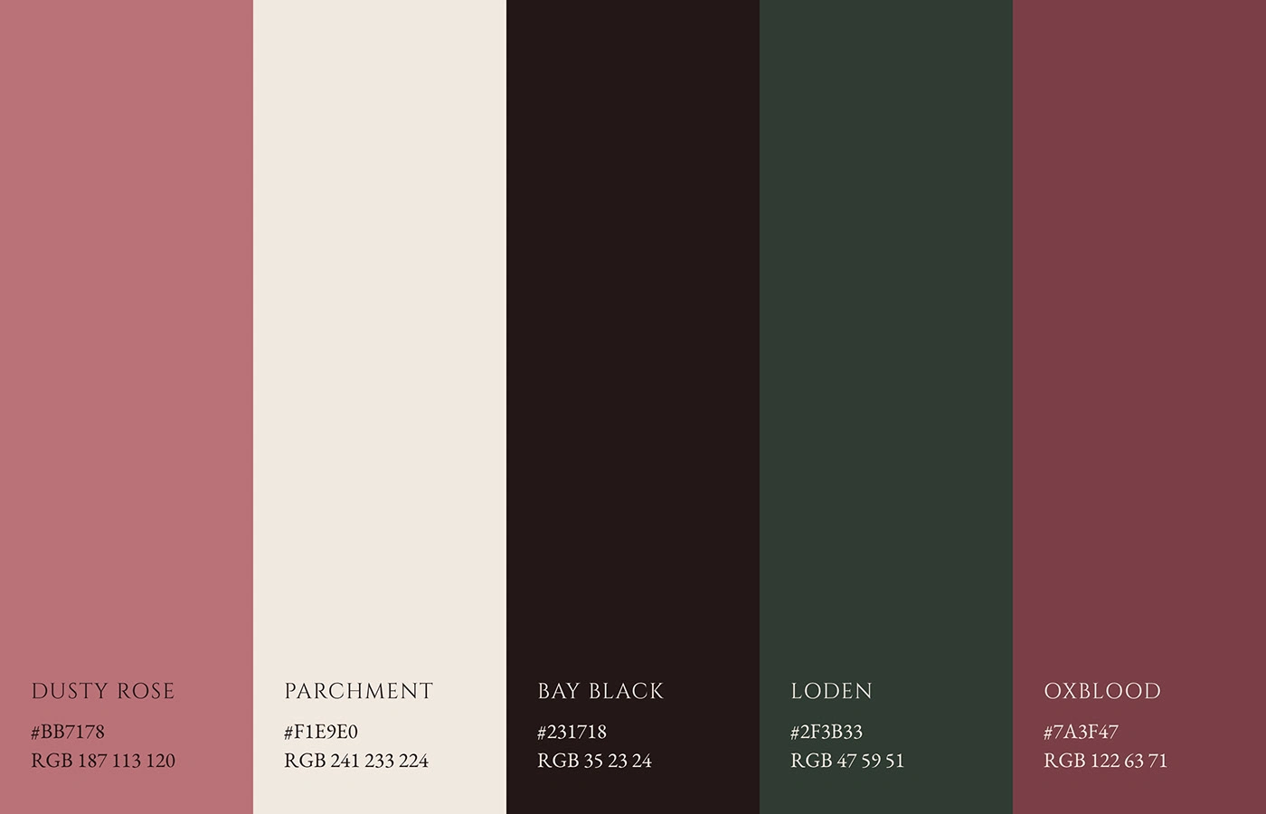
Colour palette
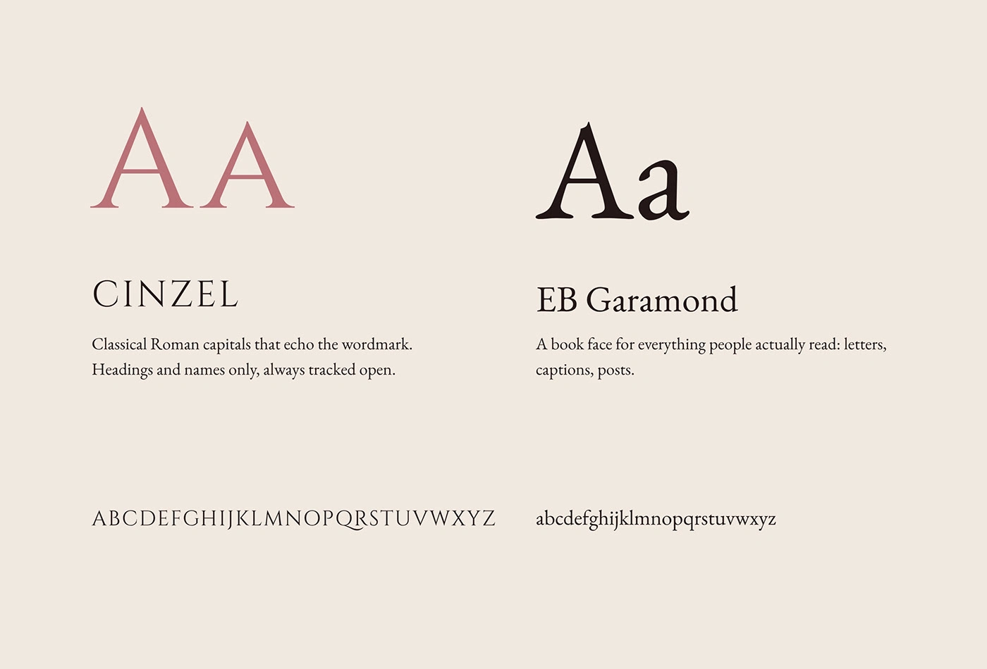
Typography
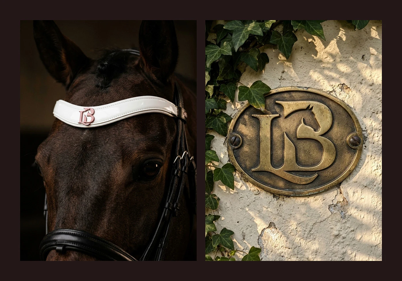
Browband and brass plaque
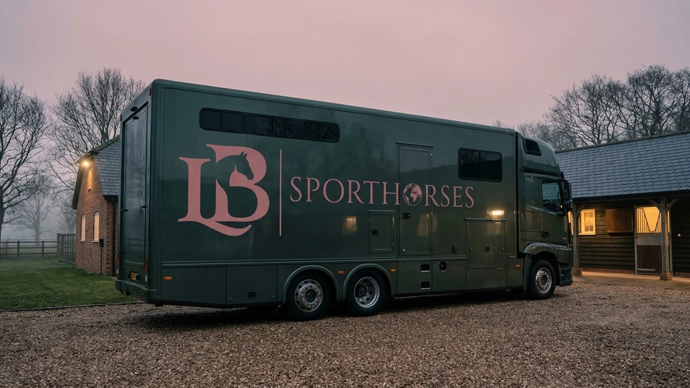
Horse lorry livery
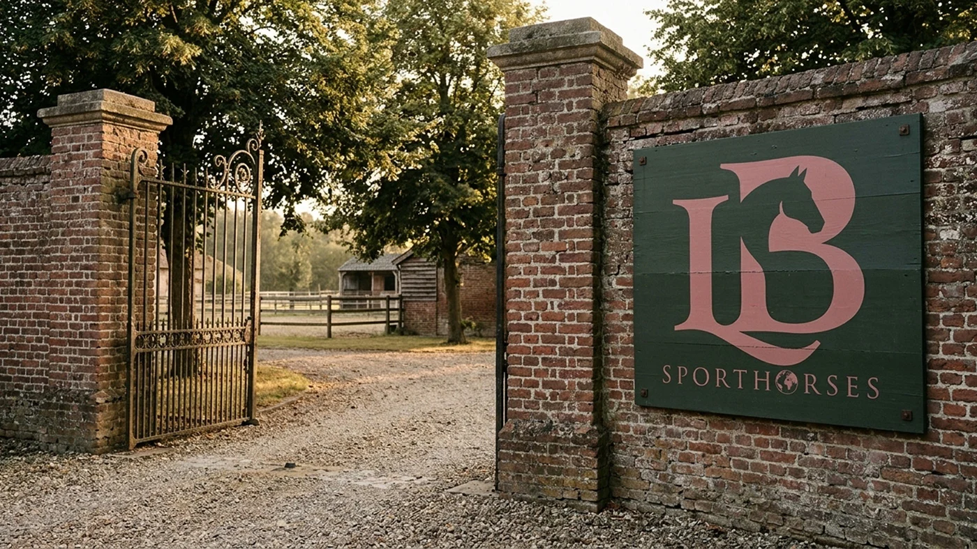
Yard entrance sign
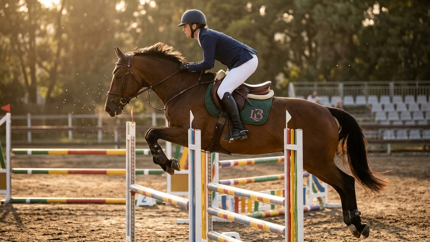
Saddle cloth in the ring
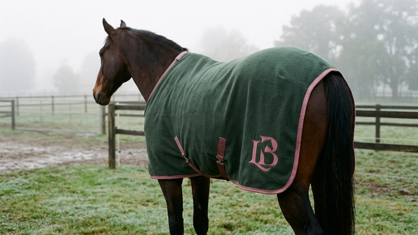
Horse rug
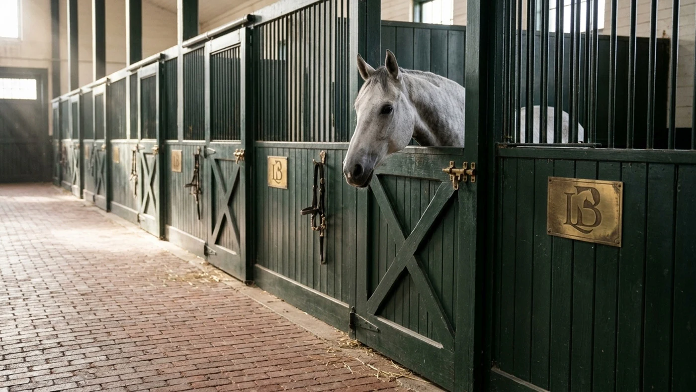
Stall nameplates
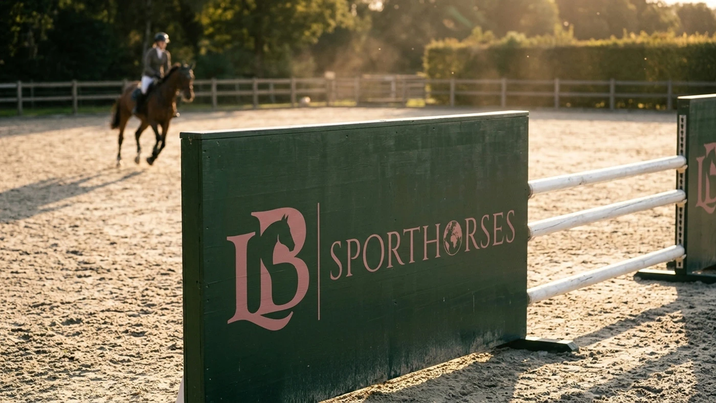
Jump wing
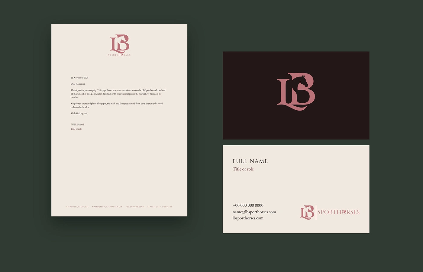
Stationery
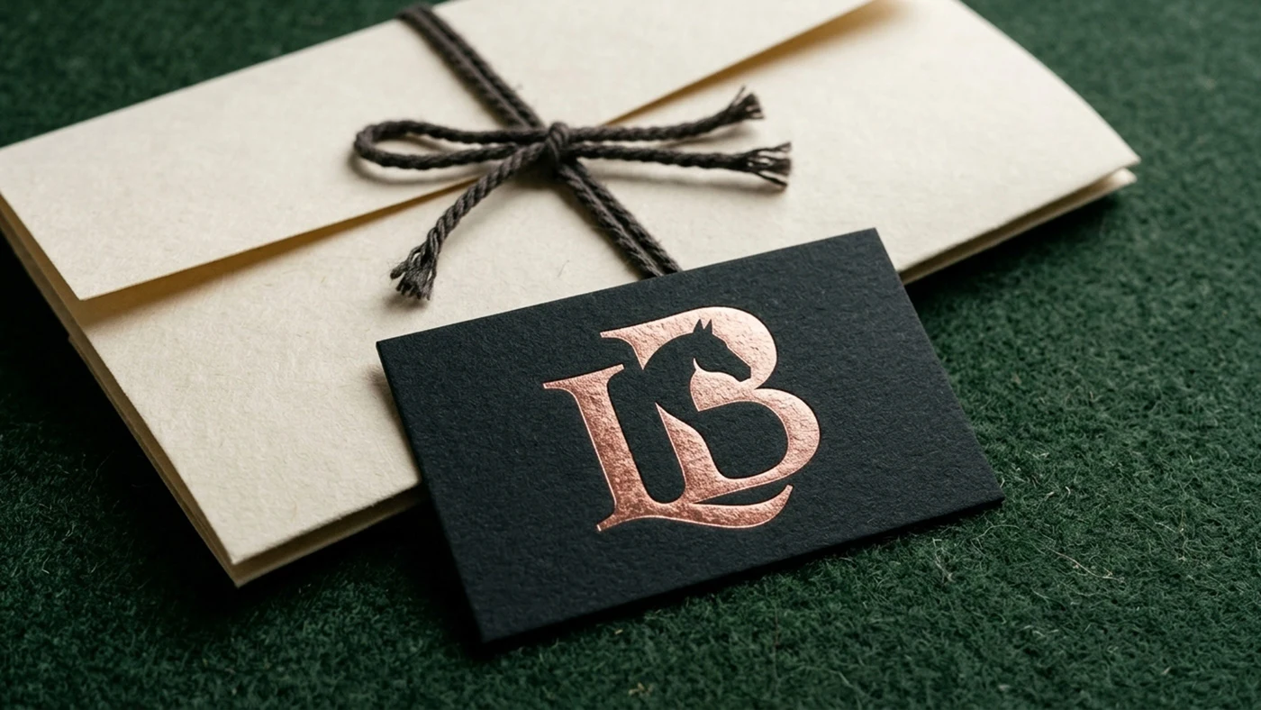
Foil business card
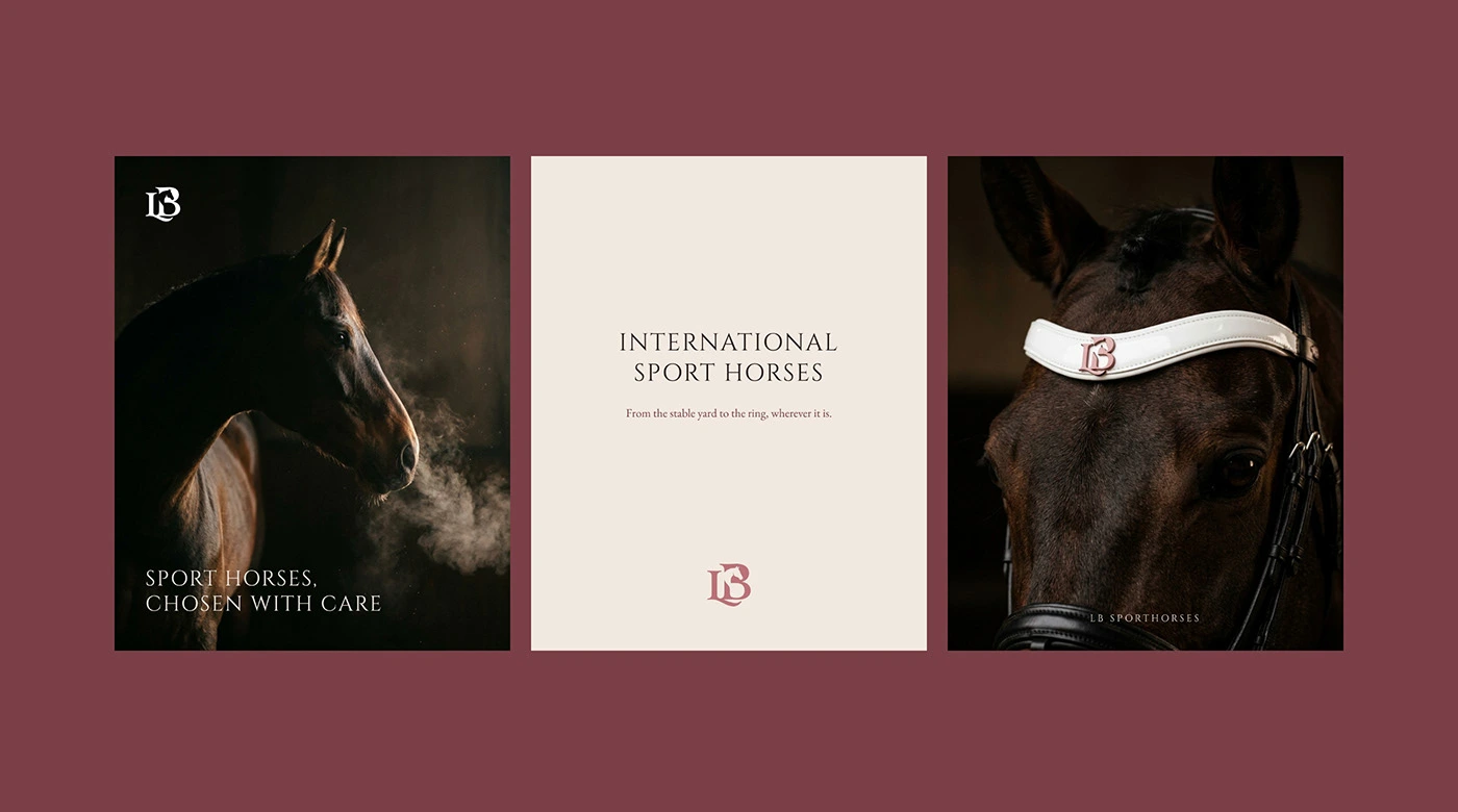
Social media kit
Scope: logo design, visual identity, stationery, social media kit, brand guidelines, applications.
Mockups and photography generated with Google Flow.
Brand identity by Theepa Studio.
0 likes · 0 views · Nov 16, 2026
Monogram, visual identity and brand guidelines for LB Sporthorses, a sport horse business.

