Eterna Clarity Website: Three Offers, One Brand

Eterna Clarity

Eterna Clarity needed one website to do three jobs at once: sell a product, sell a service, and publish, without any of them stepping on the others. Most company sites solve that by picking one job and letting the rest hang off it. We were not willing to do that, because all three are the business.
So the site was treated as a product in its own right, not a brochure. This case study walks through it: the brief, the design system that holds it together, the main pages, and what runs underneath. Everything shown was designed, written and built in-house.
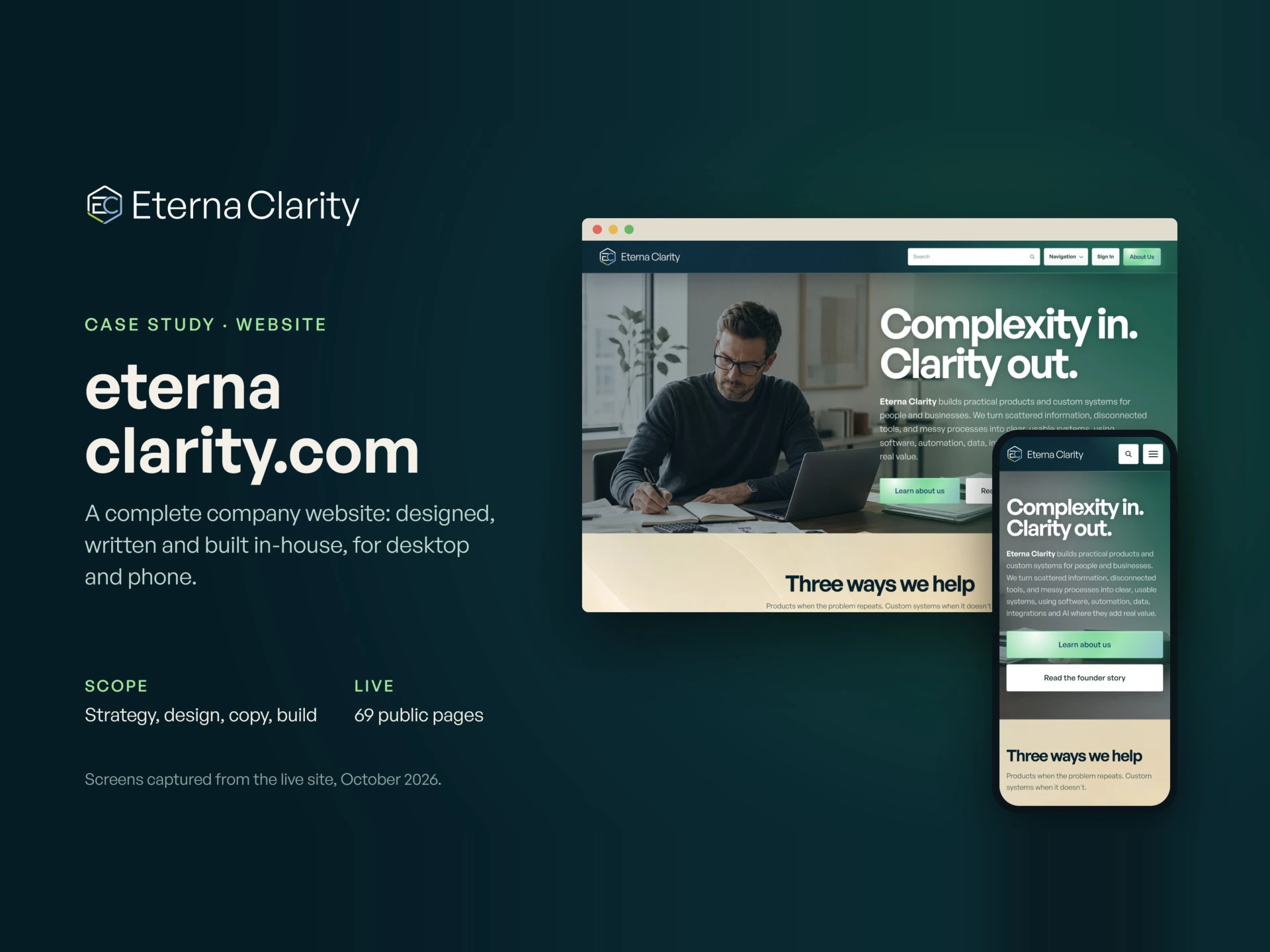
Cover
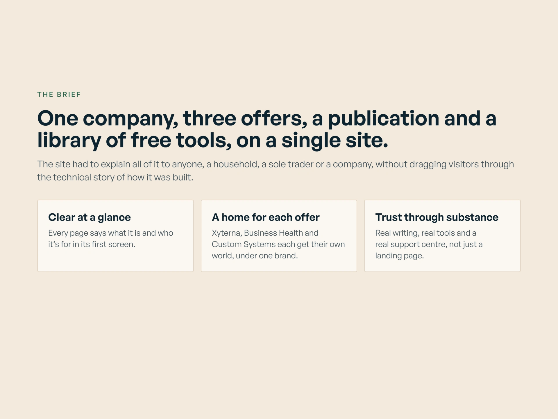
The Brief
The brief we set ourselves was plain. Explain three different offers, a publication and a library of free tools to everyone from households to companies. Use ordinary language throughout. Let the work itself do the persuading, with no technical backstory and no hype carrying the argument.
Every page also had to earn its place. If a page did not help a visitor understand an offer, use a tool, read the company's thinking, or get support, it did not belong on the site.
The Scope
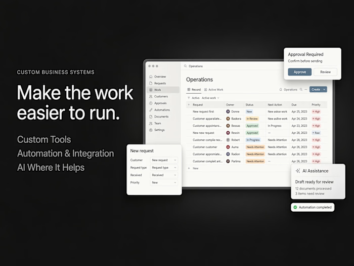
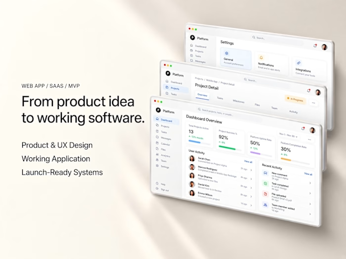
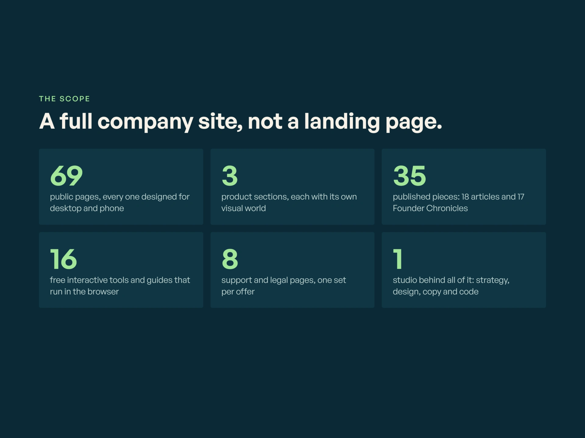
The result is a full company site rather than a landing page: three product sections in their own colour worlds, a publication with two running series, a library of free tools that work right in the browser, and a complete support and legal centre.
The Design System
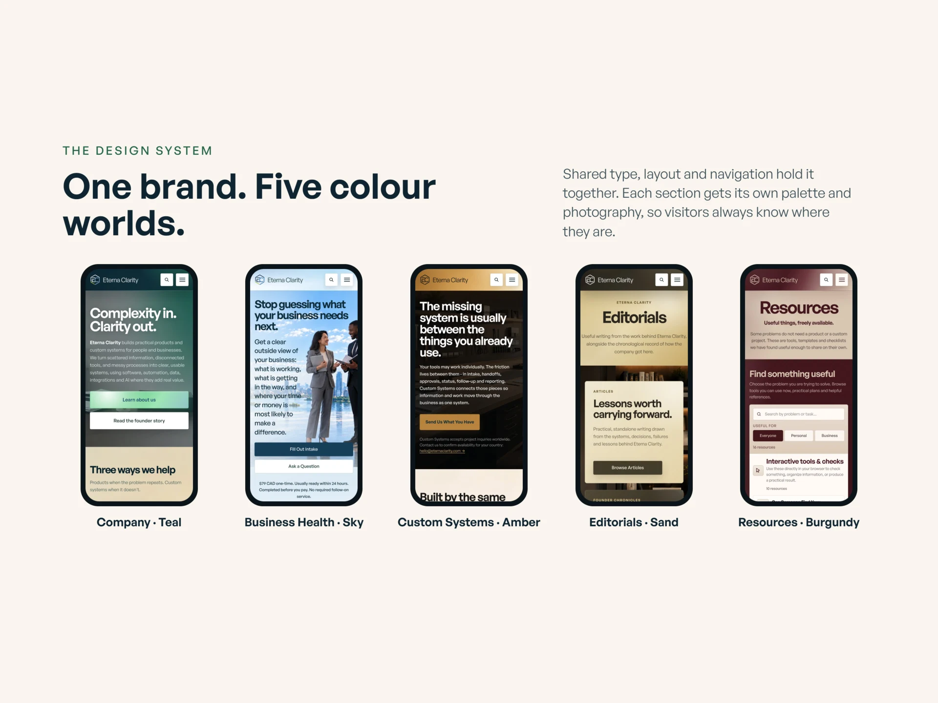
One brand, five colour worlds. Each offer lives in its own colour world with its own feel, inside a single design system, so a visitor always knows where they are and whose site they are on.
The system matters more than any single page. It is what lets a product page, a service page, an editorial and a legal page sit side by side and still read as one company.
Homepage
Product page: Xyterna
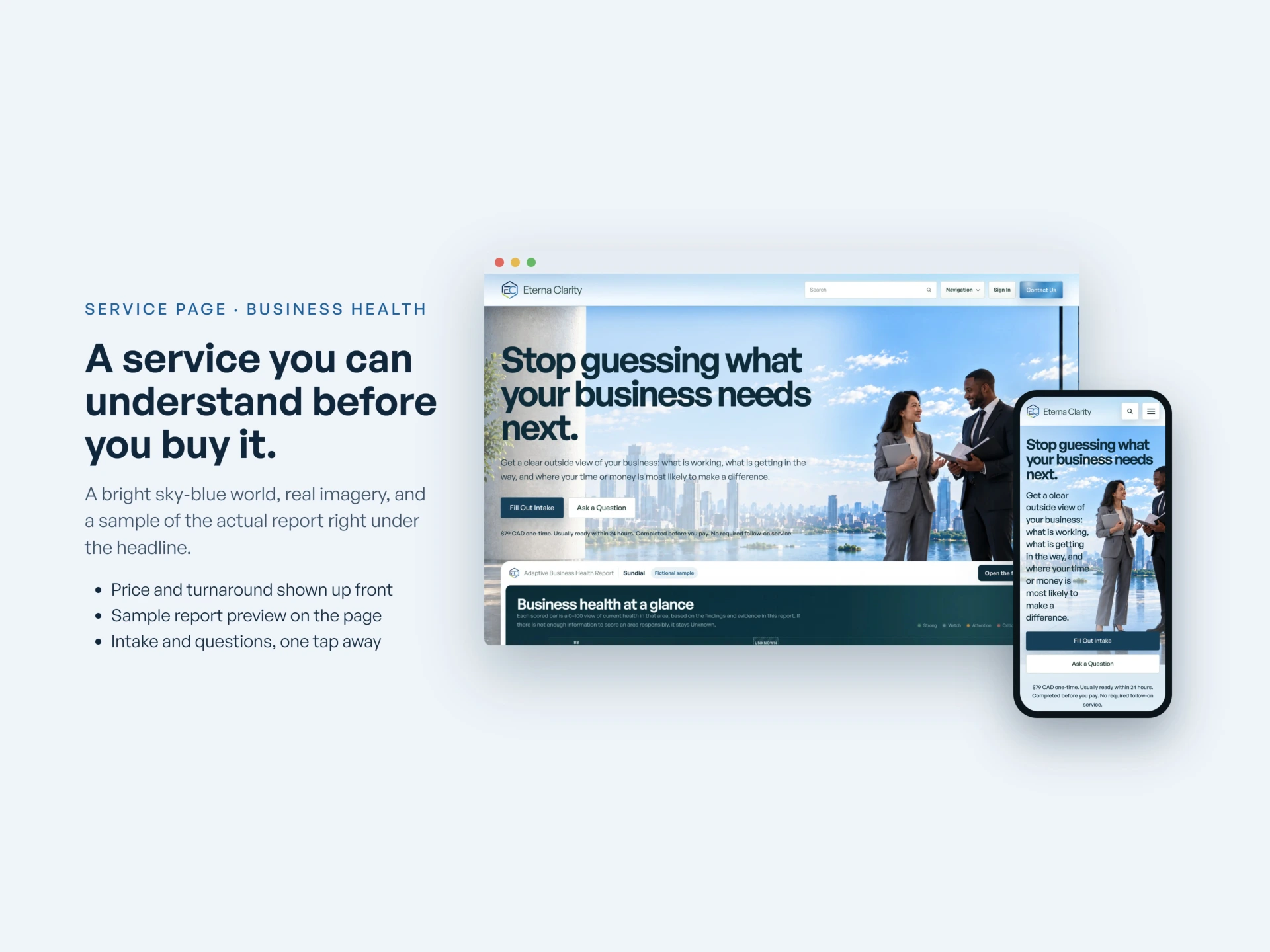
Service page: Business Health
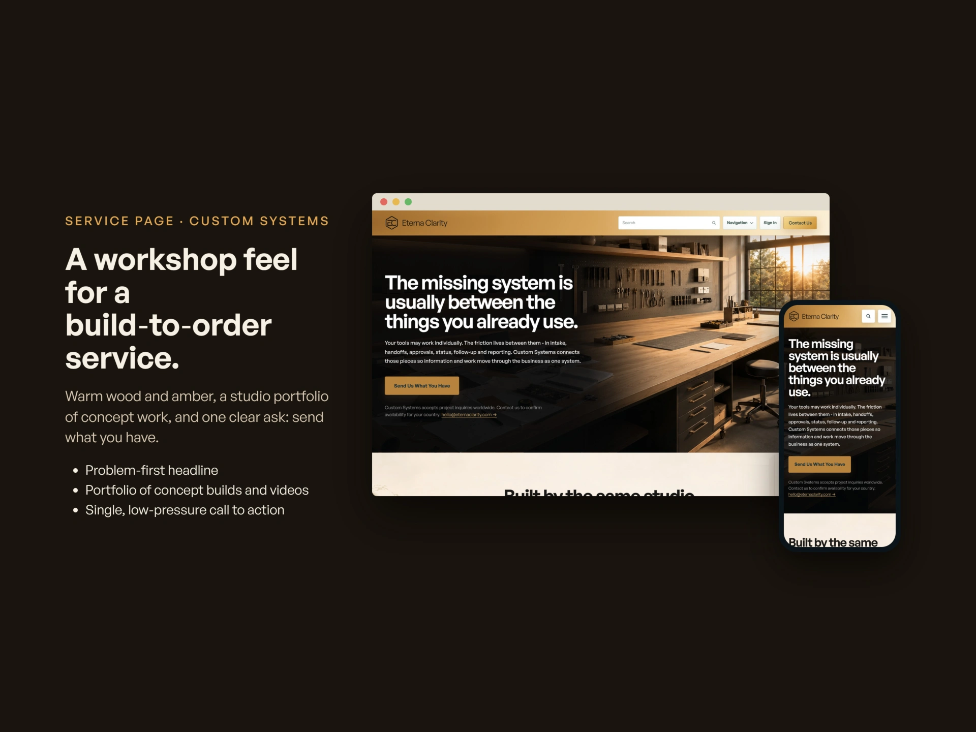
Service page: Custom Systems
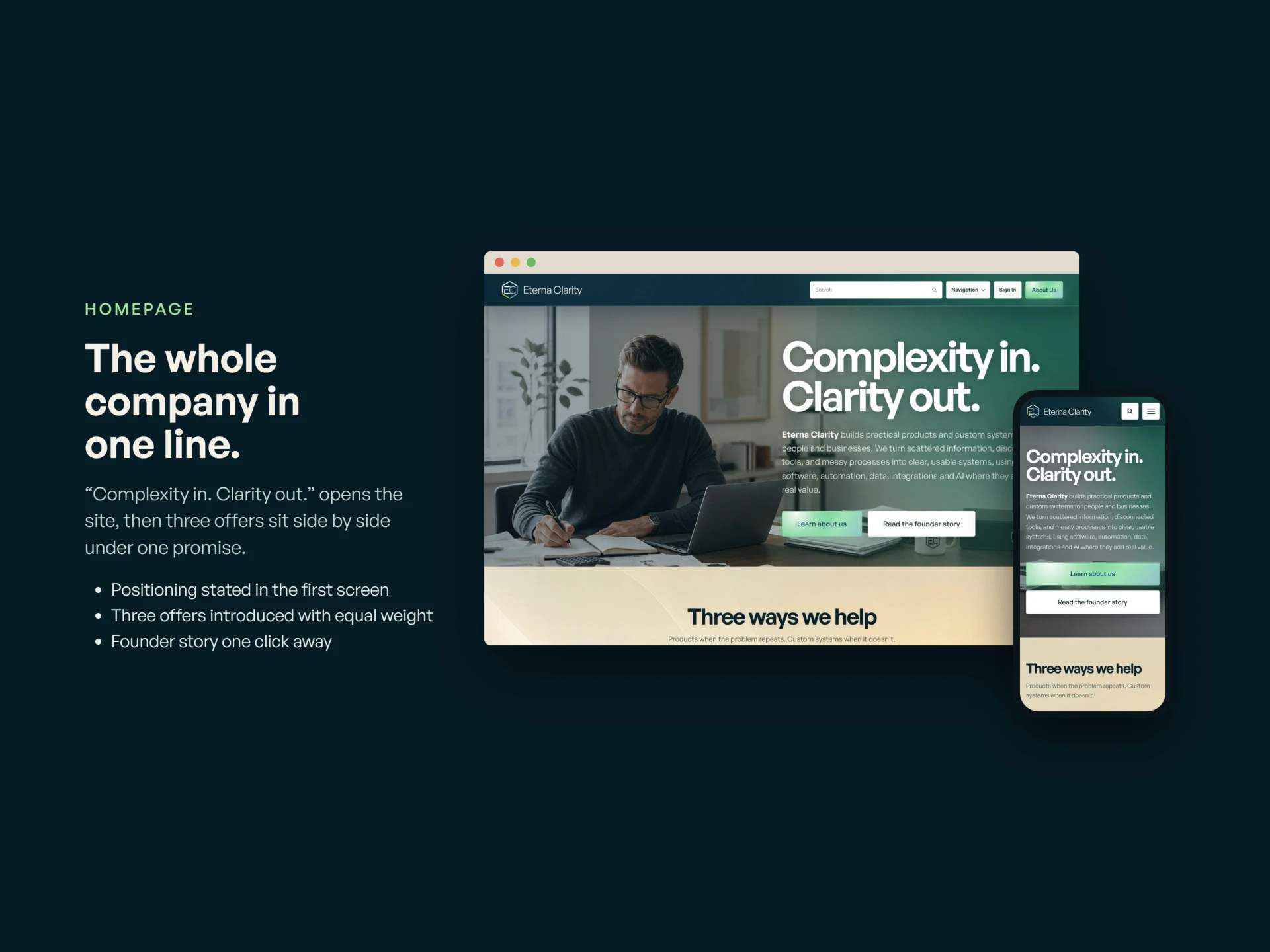
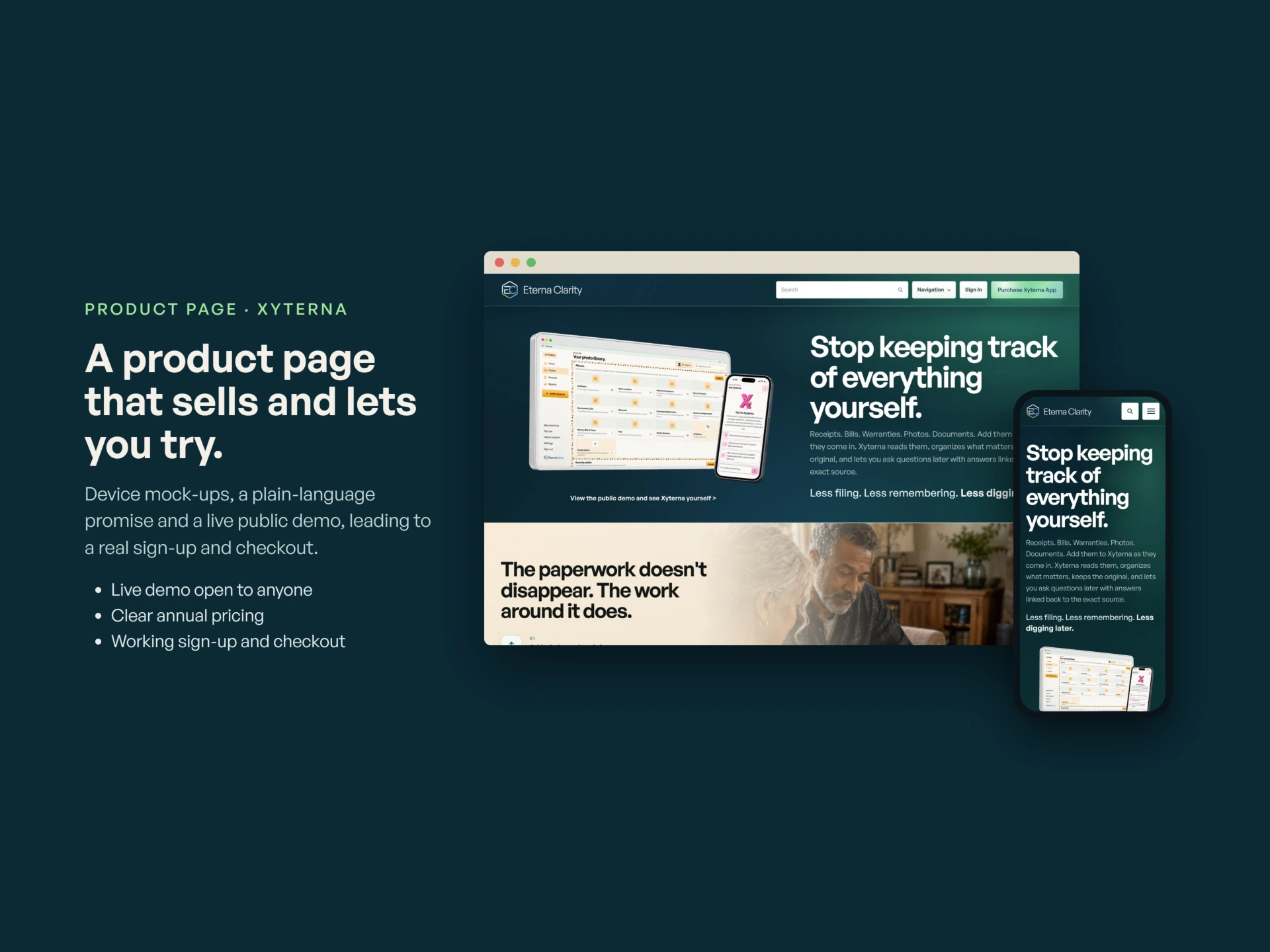
The main pages. Home lays out all three offers and routes each visitor to the right one quickly, because a household with a paperwork problem and a company with a systems problem are not looking for the same thing.
Each offer then gets a full page of its own, written for the person buying, not the person building. Business Health leads with a real sample report, so a visitor can judge the product before any conversation. Custom Systems is presented like the workshop it is: what gets built, how an engagement runs, and how to start one.
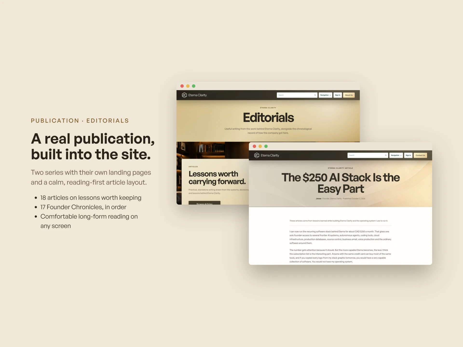
Publication: Editorials
The publication is part of the offer, not decoration around it. The editorials carry the company's thinking in the open, and they reach readers who would never arrive through a services page.
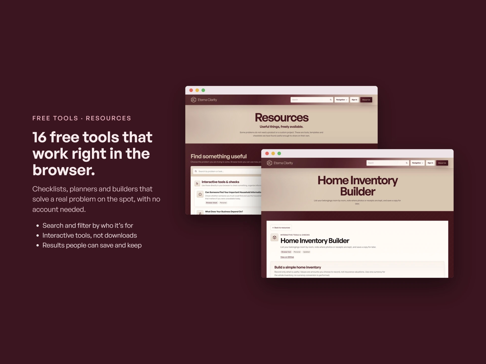
Free Tools: Resources
The free tools in the Resources library are working software, not lead magnets with the useful part removed. They run in the browser, they are free to use, and the same library is mirrored on our public GitHub for anyone who prefers it there.
Support Centre
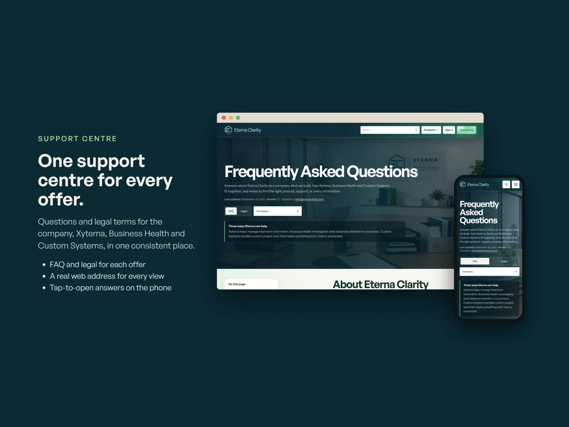
Support and legal received the same care as the sales pages: help, privacy, terms and company information, written to actually be read. A business that cannot explain its own terms clearly has no business selling clarity to anyone else.
Mobile
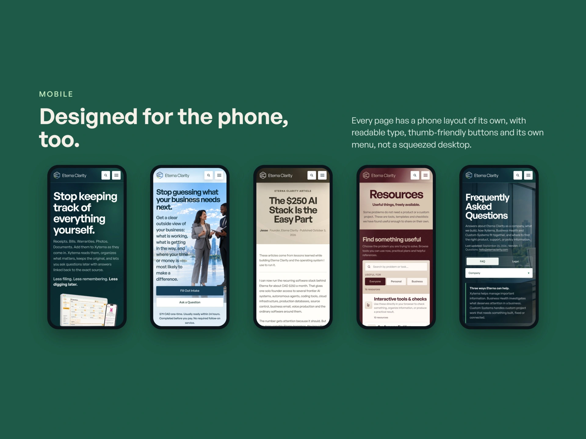
Most first visits happen on a phone, so every page was designed and checked on mobile, not merely shrunk to fit.
Under the Hood
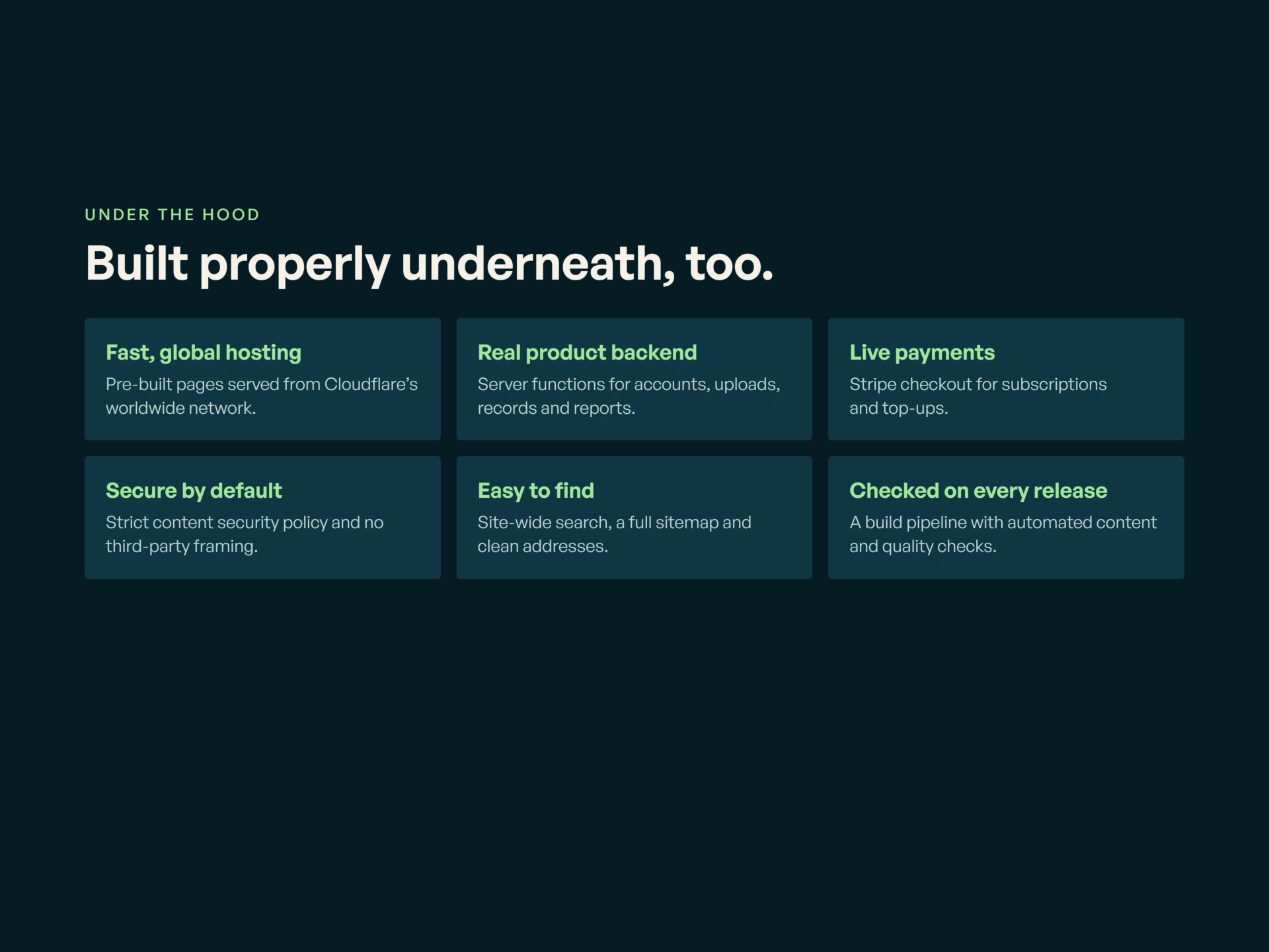
Underneath, the site is a production system. It is hosted on Cloudflare with a strict content security policy. Sign-up and Stripe checkout work end to end. A full public demo of Xyterna runs on it. Every release passes automated checks before it goes live.
That discipline is the real subject of this slide. The site is maintained the way we maintain client systems, because it is one.
Want a site like this?
Designed, written and built in-house by Eterna Clarity. If your business needs a website that carries this much and still reads clearly, that is the work we do.
Like this project
Posted Oct 20, 2026
The Eterna Clarity website: three offers, a publication and a library of free working tools under one brand. Designed, written and built in-house.