OPay Landing Page Redesign
Onifade Ifeoluwa
OPay Landing Page Redesign. Case Study
Overview
OPay is one of the most widely used fintech platforms in Nigeria, offering payments, transfers, and financial services to millions of users.
This project focused on redesigning the OPay landing page to improve clarity, trust, and conversion, especially for first-time visitors.
Prototype Link: Click the expand icon on the left, then press Z on your laptop keyboard for a better experience.
Problem
The existing landing page had a few key issues:
Weak visual hierarchy → users struggled to understand the core value quickly
Overloaded information → too many competing elements
Low conversion clarity → unclear primary action (download, sign up, explore?)
Limited emotional connection → lacked strong trust signals and storytelling
Goal
Redesign the landing page to:
Communicate OPay’s value instantly
Improve conversion (app downloads & sign-ups)
Create a modern, trustworthy fintech aesthetic
Optimize for mobile-first users
My Role
Product Designer (UX + UI)
Research & analysis
Visual design
Prototyping (Figma)
Process
1. Audit & Research
I reviewed the existing experience and benchmarked against top fintech products like:
Paystack
Flutterwave
Grey
Piggyvest
Key insight:
Top-performing fintech landing pages simplify messaging and focus heavily on trust + clarity.
2. Information Architecture
I restructured the page into clear, conversion-driven sections:
Hero (clear value + CTA)
Core features (simple, scannable)
Trust & social proof
Product Screens
Secondary CTA
etc.
3. Visual Direction
Clean, modern fintech aesthetic
Strong use of white space
Bold typography for clarity
Green accents to reinforce brand familiarity
Mobile-first layout decisions
4. UX Decisions
Clear primary CTA: Download App
Reduced cognitive load by grouping related features
Added trust elements (user stats, security cues)
Designed for fast scanning (especially on mobile)
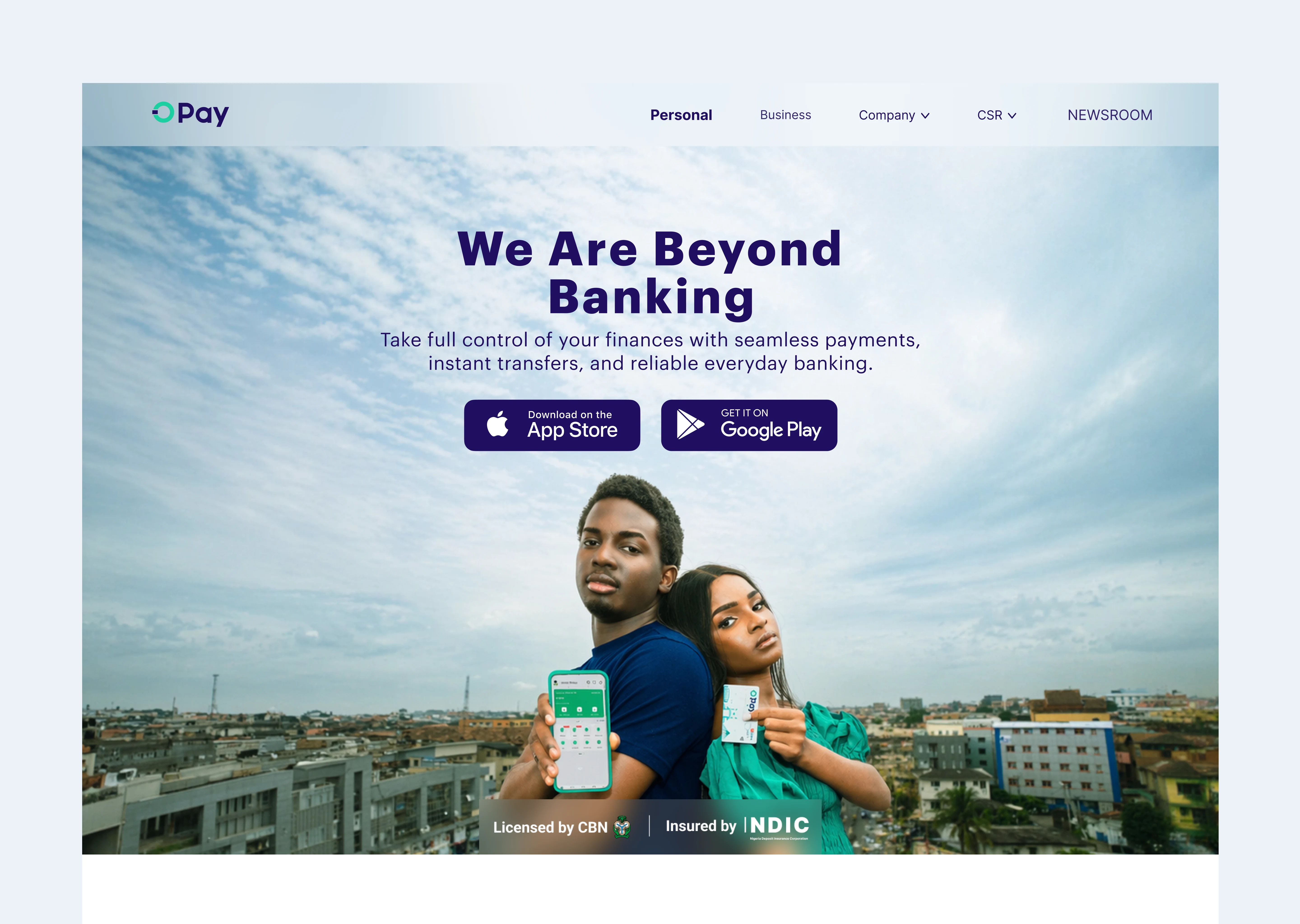
Solution
The redesigned landing page delivers:
A strong first impression with a clear value proposition
Improved visual hierarchy for faster understanding
Focused CTA flow to guide users toward download
A more premium and trustworthy fintech experience
Impact (Expected)
Increased conversion rate (downloads/sign-ups)
Reduced bounce rate
Better user understanding within the first 5 seconds
Stronger brand perception
Tools
Figma
AI image generation (for visual exploration)
Design Choices
I focused on simplifying the experience by reducing noise and emphasizing a single, clear action: downloading the app. The visual direction leans into a clean fintech aesthetic with strong typography and spacing to improve readability and trust. Figma was used for rapid iteration, while AI tools helped explore visual variations quickly.
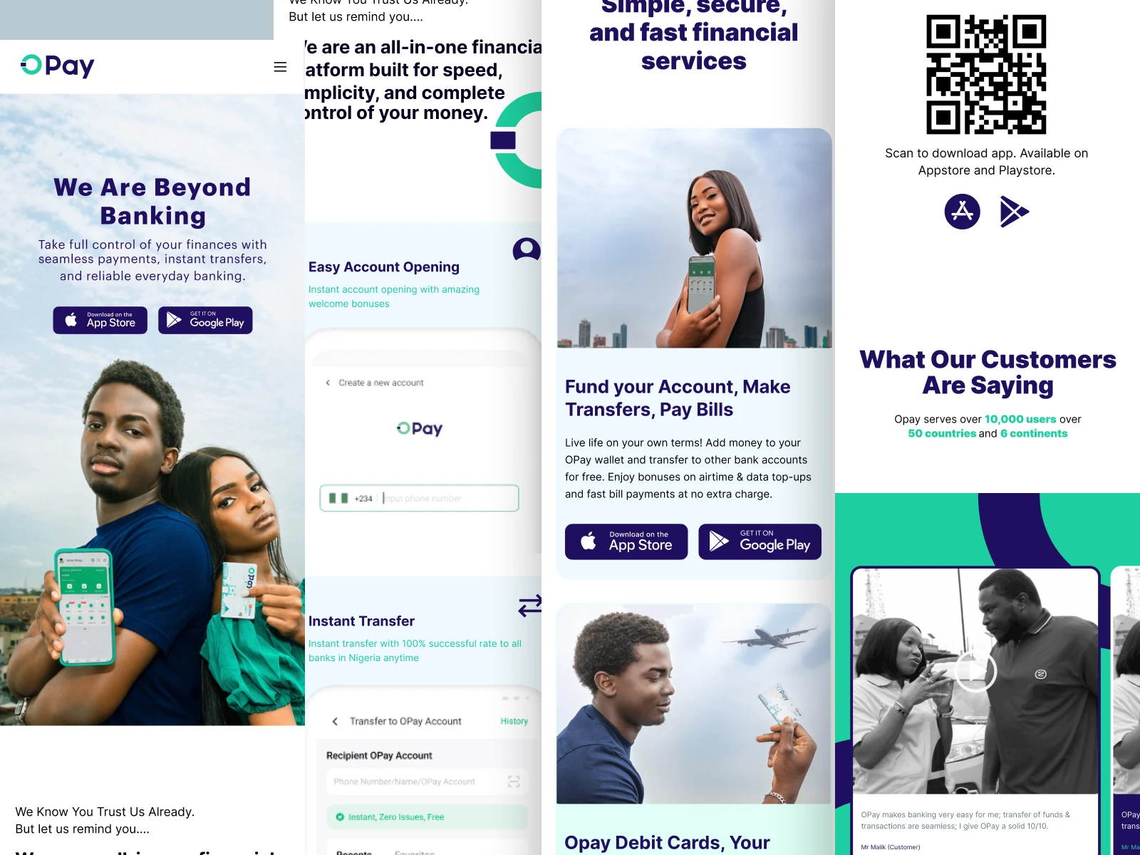
SCREENS SHOTS
HERO SECTION
PRODUCT SCREENS
FEATURES SCREEN
SCAN TO PAY
TESTIMONIALS
SECURITY
CUSTOMER SERVICE
PRE-FOOTER
MOBILE APP DESIGN
What I’d Improve Next
A/B test multiple hero variations
Add localized messaging for different user segments
Introduce more motion/micro-interactions for engagement
Closing
This redesign demonstrates my ability to turn complex fintech products into clear, conversion-focused experiences that drive user action.
THANK YOU
PLEASE DROP A LIKE
Like this project
Posted Apr 17, 2026
Redesigned OPay landing page to improve user clarity, conversion, and trust. This demonstrates my ability to work around complex fintech products and deliver.