Streamlined Navigation and Messaging Boost User Experience
Zachary Anzivino
Situation: A mechanical contracting company with additional plumbing services and a separate safety product brand had a website with unclear navigation. It wasn't easy for customers to understand the full scope of services offered or to find the specific information they needed (e.g., plumbing services, safety products).
Complication: This ambiguity led to a confusing user experience, potentially missed business opportunities, and difficulty for customers to connect with the right service (mechanical contracting, plumbing, or safety products).
Question: How can the website be redesigned to clearly communicate the company's full range of services (mechanical contracting, plumbing, safety products) and improve user experience for customers seeking specific information?
Action: I implemented the following website improvements:
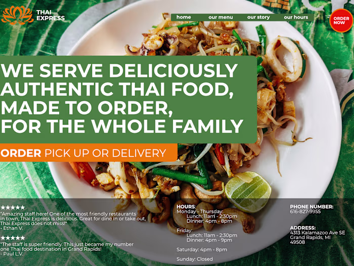
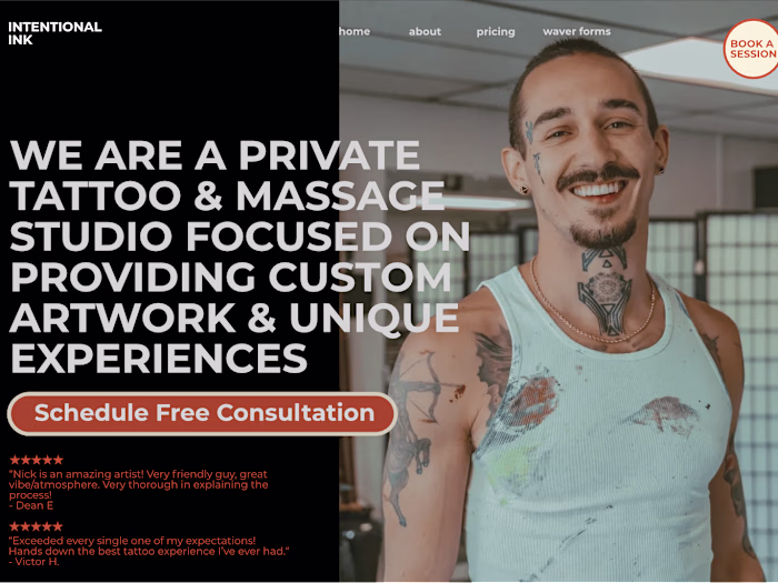
Enhanced Navigation: Revamped the website navigation to make it clear and user-friendly, allowing customers to easily access information on mechanical contracting, plumbing, and safety products.
Hero Statement: Introduced a clear and concise hero statement that highlights their core mechanical contracting service and target audience, building confidence from the start.
Customer Testimonials: Added customer testimonials showcasing positive experiences with the company's mechanical contracting services, further building trust and confidence.
Quick Link to Safety Products: Provided a dedicated and easy-to-find link for their safety product brand, directing interested customers to the appropriate information.
Differentiation Statements: Incorporated three key statements strategically throughout the website to showcase the company's unique selling points within the mechanical contracting industry.
Like this project
Posted Apr 19, 2024
The website redesign improved user experience, clearly communicated the company's range of services, and increased leads and growth for core services.
Likes
0
Views
17