Nodd Branding + Landing Page
About the Project
This is a redesign of a Landing Page. My goal was to improve the overall user experience and create a more engaging and intuitive interface.
Concept & Inspo
Inspired by some brands like Revolut - to establish trustworthy, impactful, clean, yet friendly approach.
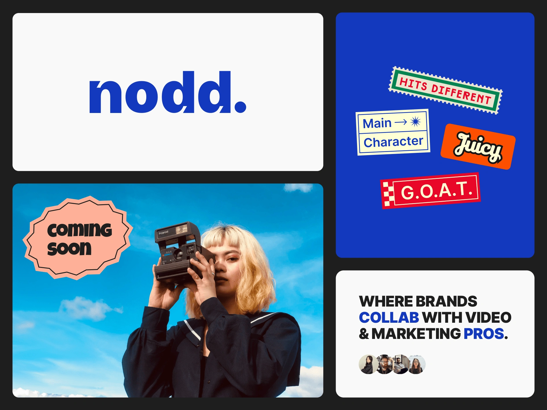
Brand Logotype
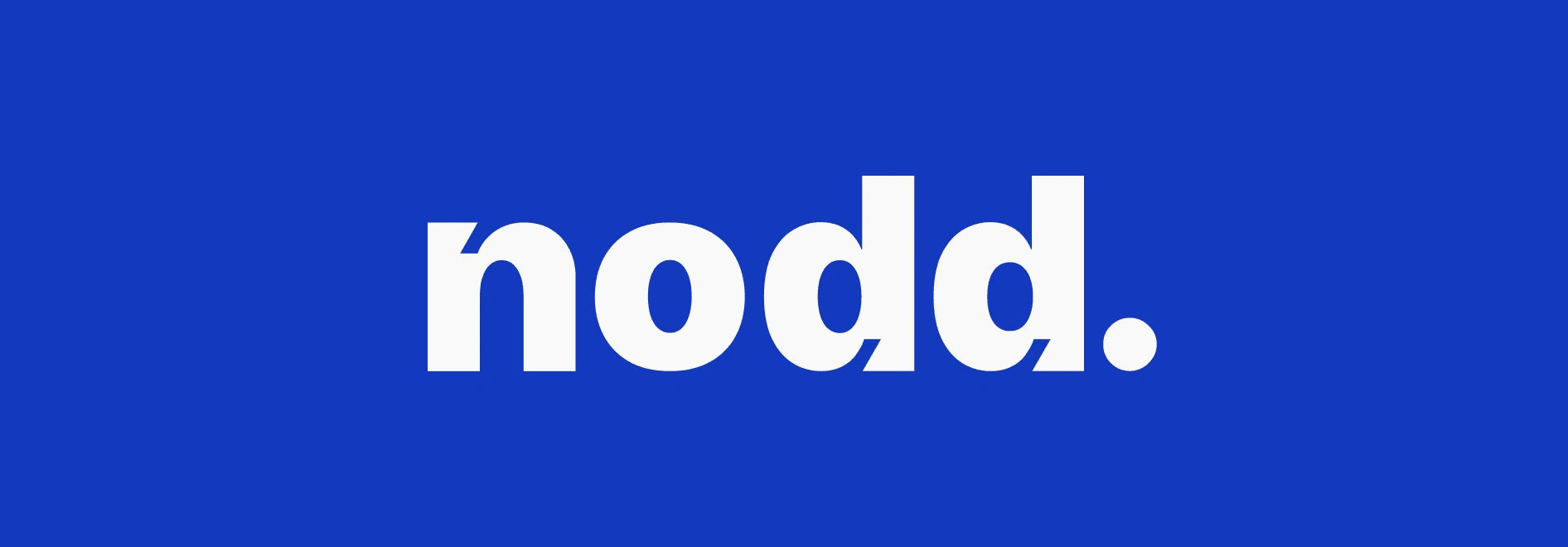
The goal for this logo is to be easy to read while featuring a highly distinctive typeface, maintaining a balance between legibility and uniqueness.
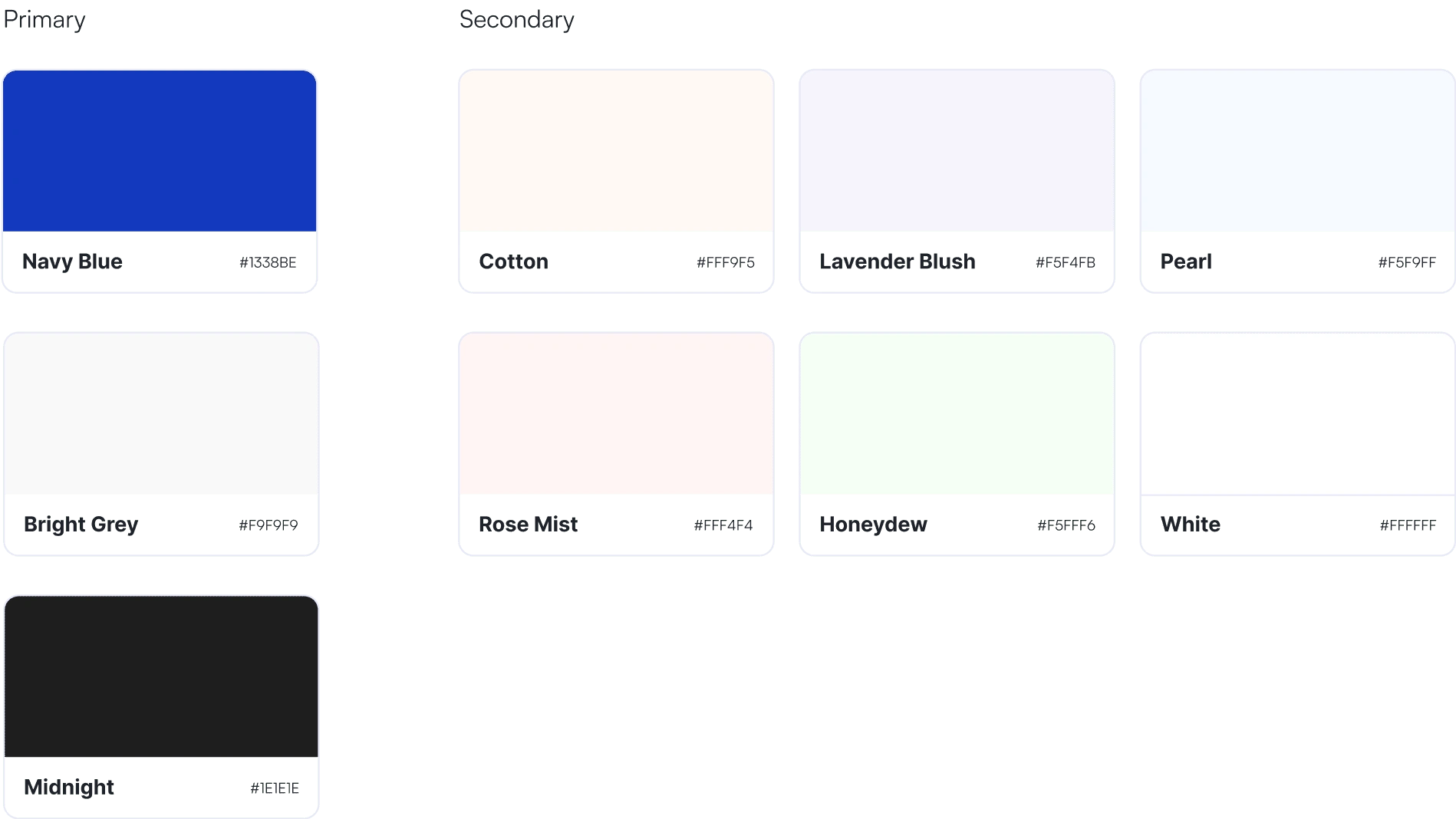
Color Combination
Chose blue as the primary color for trust and professionalism. Added pastel colors for playfulness. Used white for a clean backdrop, symbolizing purity.
Font Selection
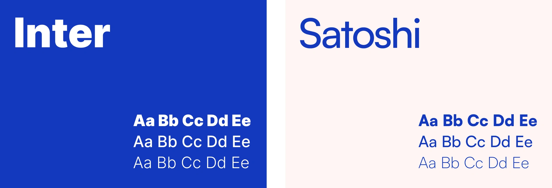
Inter Black Uppercase grabs attention with its confident appearance, reflecting the brand's strength. Font Satoshi adds subtle elegance and refined simplicity.
Landing Page Design
Free Membership Registration

Like this project
Posted Apr 23, 2024
This is a redesign of a Landing Page. My goal was to improve the overall user experience and create a more engaging and intuitive interface.
Likes
0
Views
0


