Built with Jitter
Product Design: Taskpin New Landing, Onboarding, and Explore
Type
Product Design
Challenge
Taskpin experienced slow network effects in its first year, preventing organic growth and resulting in a high marketing customer acquisition cost.
Approach
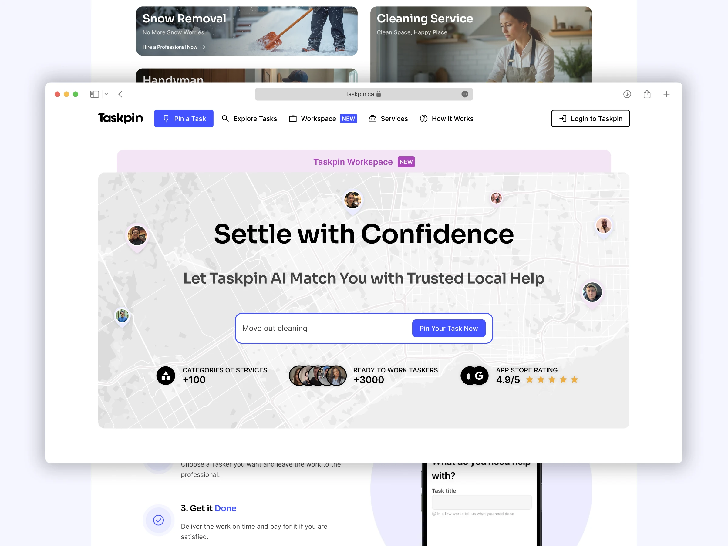
Taskpin Landing v3 was redesigned to introduce new marketplace services and categories while highlighting the launch of Taskpin SaaS, a business management solution for professionals independent of the marketplace. The redesign focused on improving clarity, engagement, and discoverability, making the landing page dynamic and SEO-friendly.
Key Features & Design Decisions
Introduction of Taskpin SaaS: Highlighted SaaS tools for professionals to manage their business beyond the marketplace.
User-Centered Redesign: Updated layouts and sections based on user feedback.
Dynamic Animations: Subtle motion effects for a more engaging browsing experience.
SEO-Optimized Sections: Added “Problems,” “Top Locations,” and “Solutions” sections to improve search visibility.
Category Expansion: Featured new service categories to attract a broader user base.
Impact
Positioned Taskpin as a service marketplace and business enabler.
Taskpin Onboarding v3
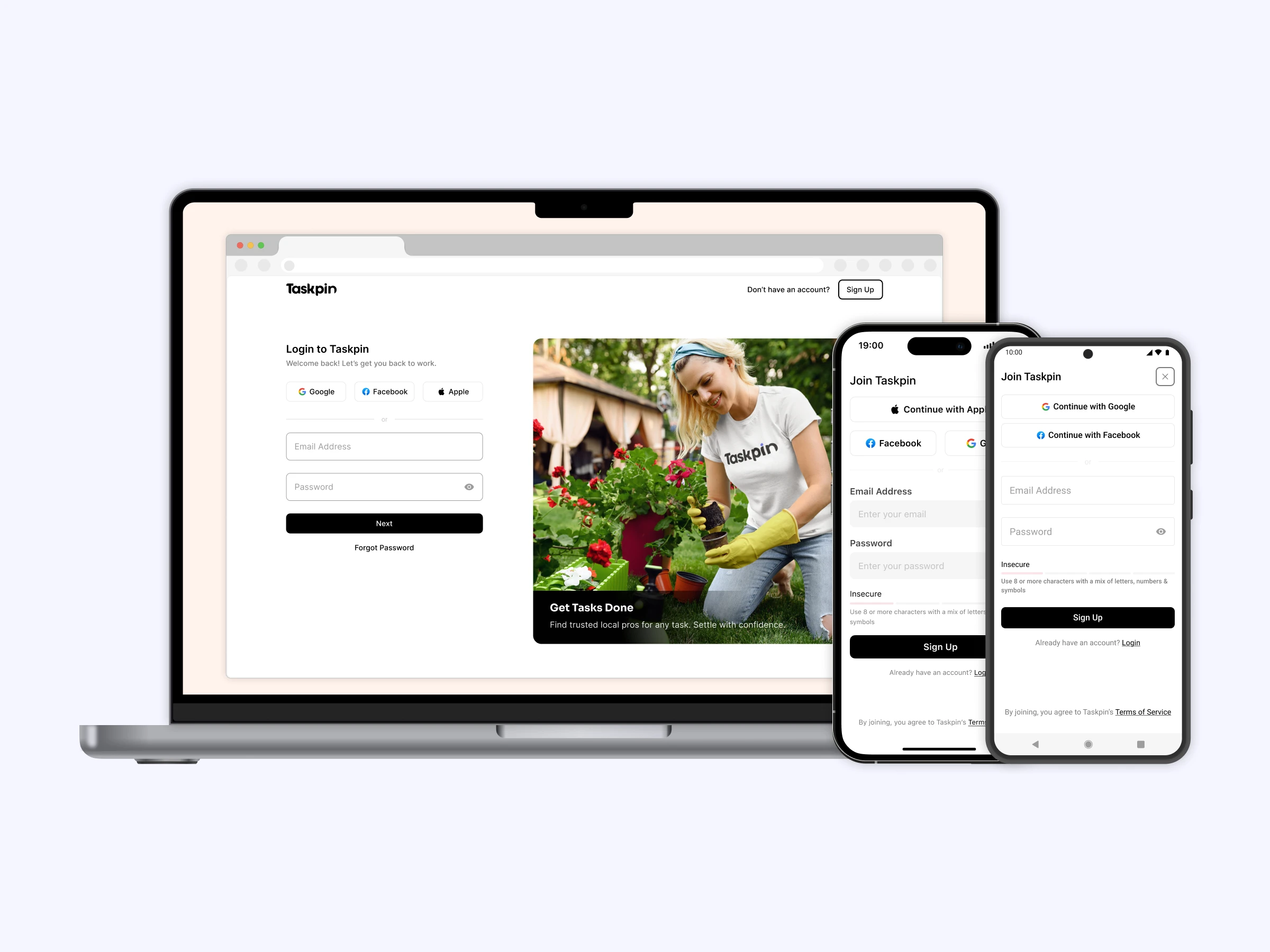
Taskpin Onboarding v3 was designed to boost engagement by making the flow more personalized and aligned with users’ business needs. This version also introduced elements of Taskpin SaaS, enabling solo professionals to manage and grow their businesses beyond the marketplace.
Key Features & Design Decisions
Personalized Onboarding: Captured key information to tailor the user experience.
Business-Focused Setup: Guided professionals in configuring skills, services, and preferences.
SaaS Tool Integration: Introduced Quote Management, Calendar, Notes, and Secure Payments during onboarding.
Consistent Experience: Preserved visual consistency with previous versions while expanding capabilities.
Impact
Combined marketplace entry with SaaS setup in a single flow
Delivered a more engaging, personalized, and business-ready experience
Improved retention by aligning onboarding with long-term user needs
Taskpin Explore v3
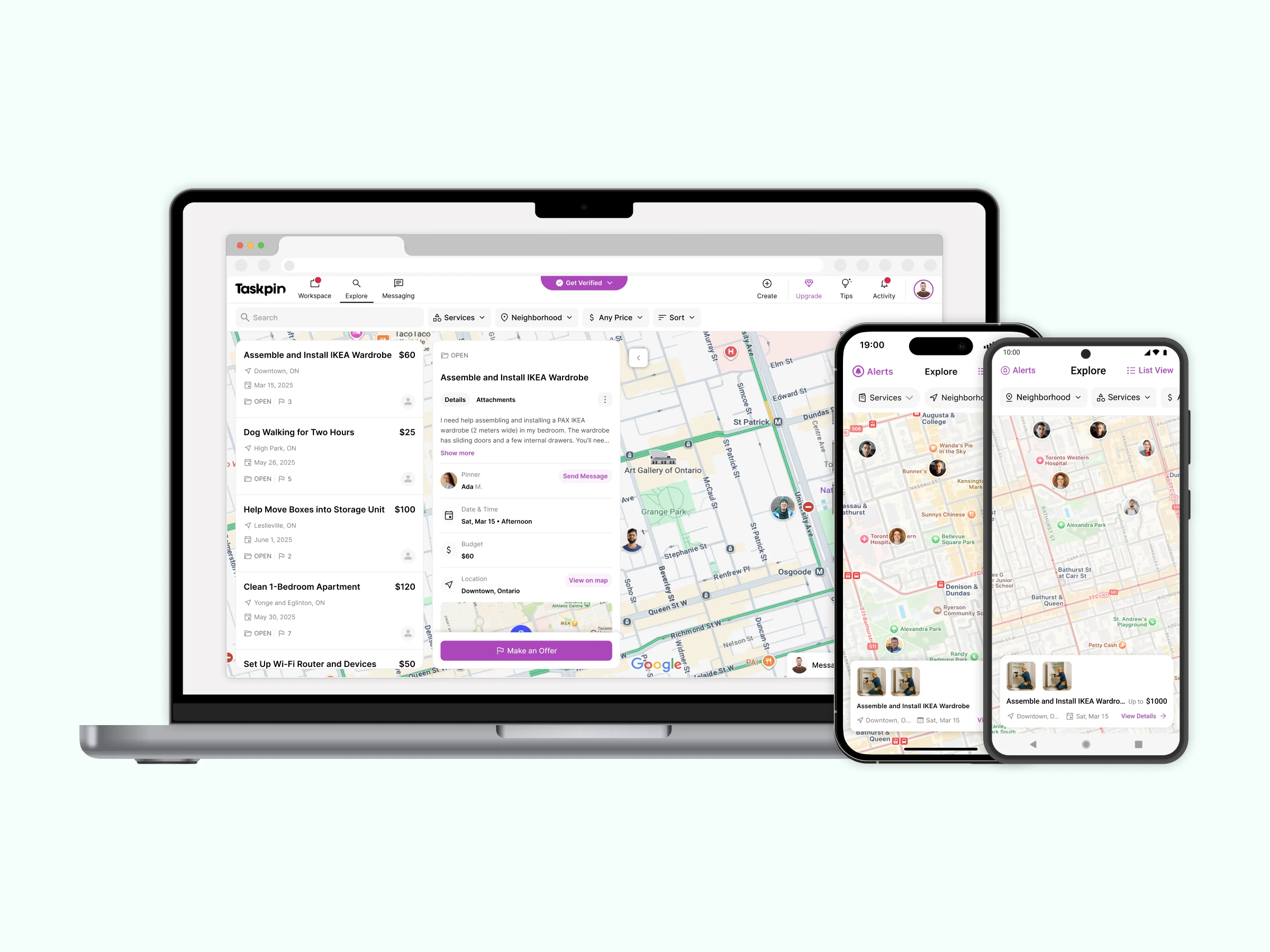
Taskpin Explore v3 refreshed the marketplace experience by reducing visual clutter, improving clarity, and optimizing usability. A major focus was the Task Details view, redesigned to better align with user needs uncovered through research and testing.
Key Features & Design Decisions
Cleaner Interface: Reduced clutter and optimized color usage for clarity.
Task Details Redesign: Reworked details page to support user expectations and workflows.
Mobile Usability Fixes: Removed friction in Map View by redesigning search and tab bars.
Consistent Visual Style: Aligned with the evolving Taskpin Design System for scalability.
Impact
Simplified navigation and reduced friction across devices
Enhanced task discovery and detail exploration
Delivered a more seamless, user-centered marketplace experience
Like this project
Posted Sep 9, 2025
Redesigned Taskpin v3 Landing, Explore & Onboarding to boost engagement, simplify discovery, and drive SaaS adoption for professionals.
Likes
0
Views
8
Timeline
Apr 1, 2025 - Aug 31, 2025
Clients
Taskpin

