Veltrick — Modern Brand Identity & Logo Design
Samuel O
Veltrick Brand Identity
Project Overview
Veltrick is a tech company building AI-powered products. They came in with no existing brand identity and needed a visual system built from scratch, something that could communicate innovation and forward momentum from day one.
The Brief
Create a brand-new identity for an AI tech company that feels bold, modern, and scalable. The brand needed to work across digital platforms, pitch decks, and product interfaces without losing clarity at any size.
The Challenge
Building a brand identity for an AI company means competing visually with hundreds of tech startups that default to the same blue gradients and generic geometric marks. The identity needed to feel distinctly Veltrick, not "another AI logo."
Process
I explored 2 distinct creative directions before arriving at the final concept. Each direction tested a different approach to representing Veltrick's core values of vision, velocity, and growth. The winning direction centered on a sharp V-shaped symbol that could carry meaning without relying on literal AI imagery (no brains, no circuits, no robots).
Design Decisions
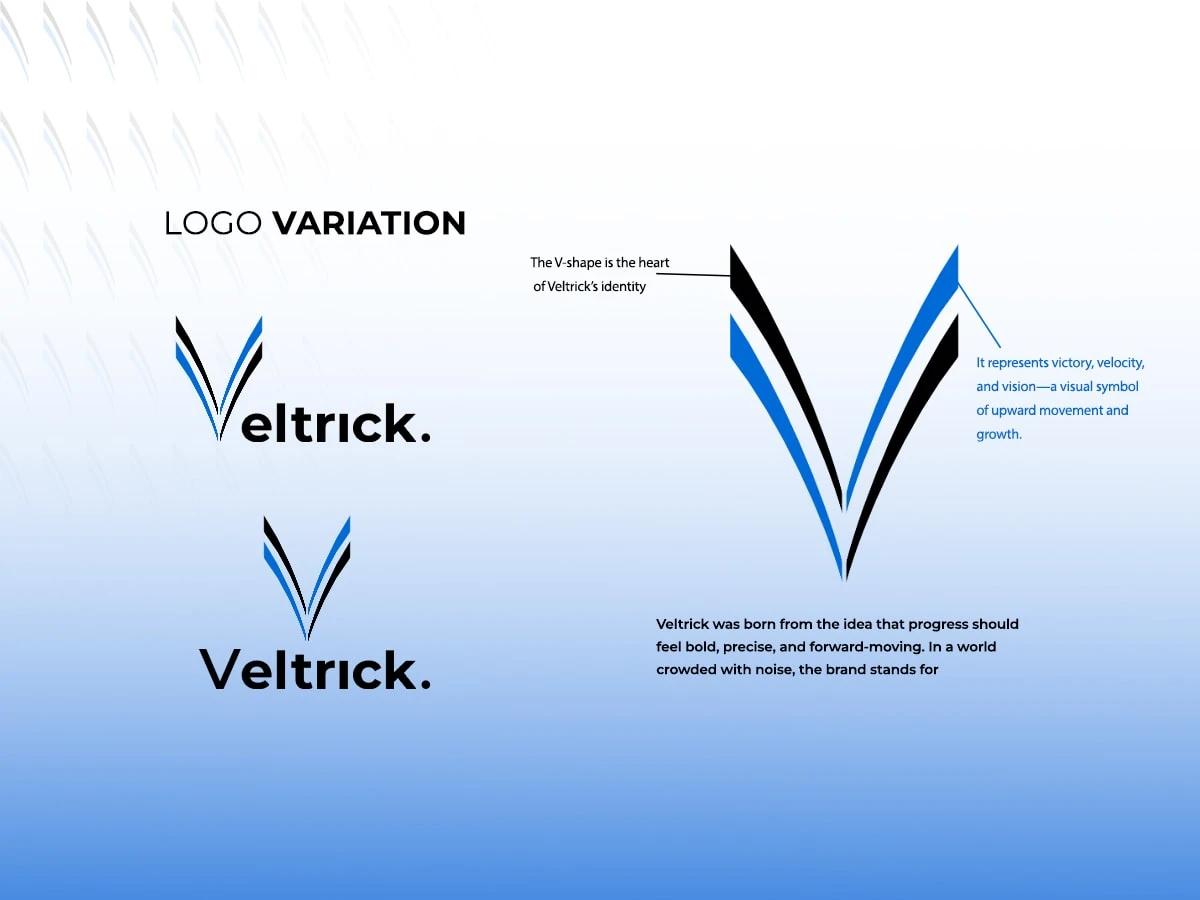
The V-shape was chosen because it works on multiple levels: it's the brand initial, it suggests upward movement, and its angular geometry feels precise and technical without being cold. The blue and black palette was intentional. Blue signals trust and intelligence (critical for an AI company asking users to rely on its products), while black grounds the identity with authority and contrast. Clean, minimal typography keeps the system flexible across applications.
Veltrick Logo System
Outcome
The final delivery is a modern, scalable logo system that gives Veltrick a confident visual foundation as they grow. The identity is built to hold up across product UI, marketing, investor materials, and social presence.
Like this project
Posted Feb 5, 2026
Veltrick brand identity centers on a bold V-shaped logo symbolizing vision, velocity, and growth, creating a modern, scalable visual system built for progress.