Aegle's | Glowing Skin

Joaquín Pinochet


Aegle's is a London-based nutricosmetic skincare brand that develops nutritional supplements and topical products for women with skin conditions. The company develops products of natural origin, as an alternative to harmful chemical treatments, seeking to get to the root of problems and heal women from the inside out.
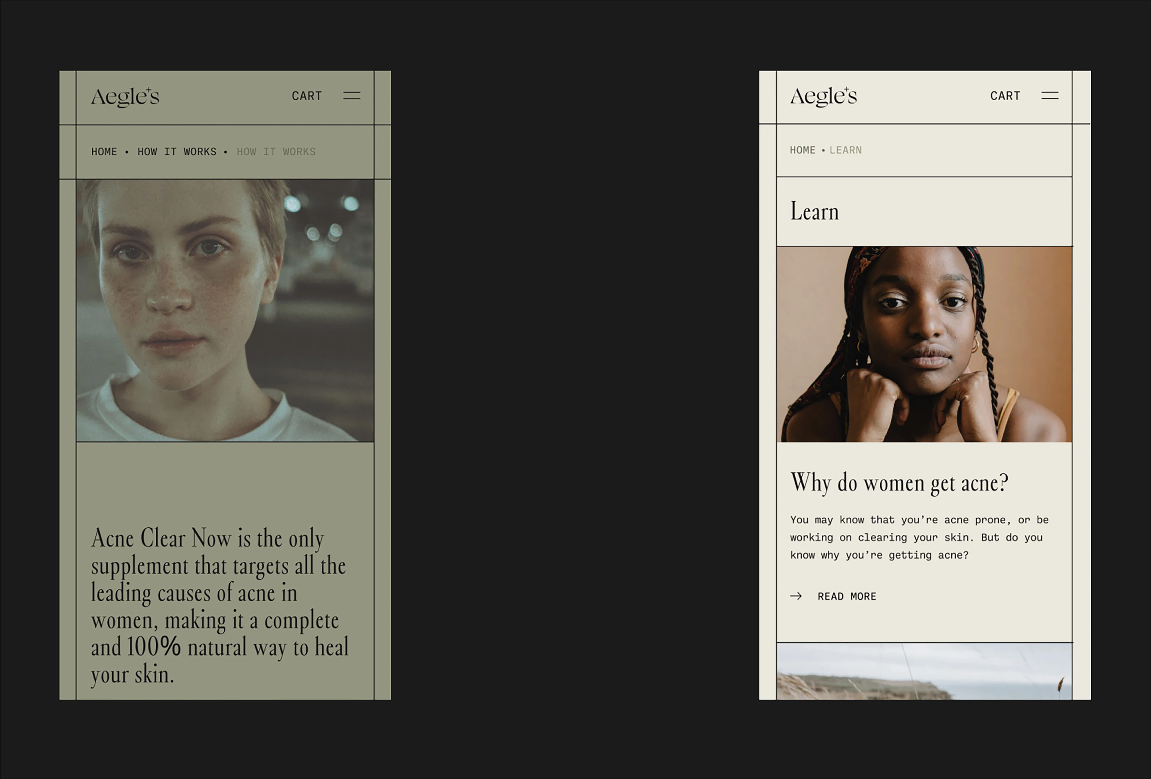
The brand, whose goal to become the luxury leader in preventive and curative skincare, wants to help women heal, making them feel inspired and empowered, while educating them in natural skincare through reliable and truthful information.
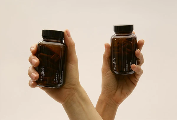
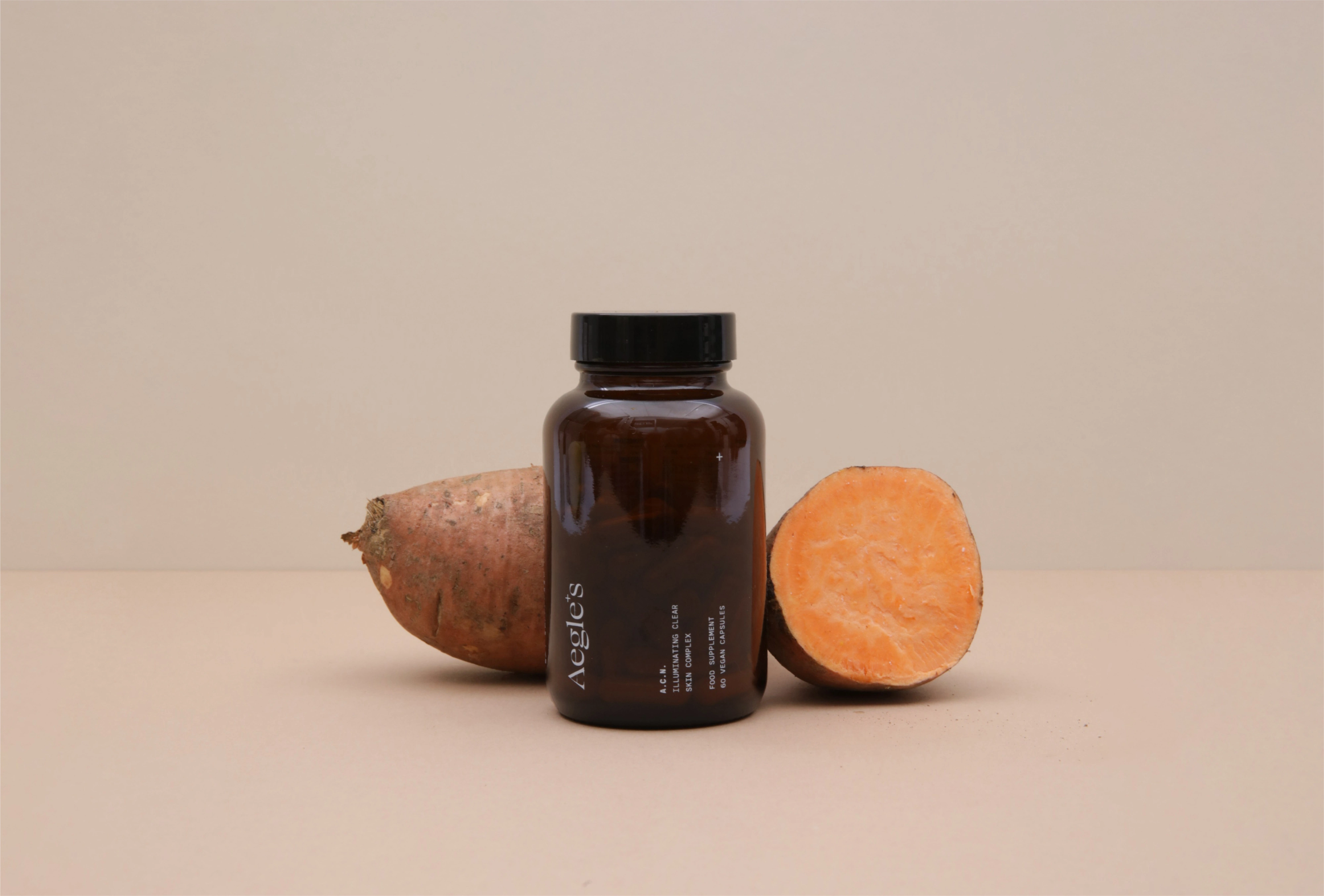
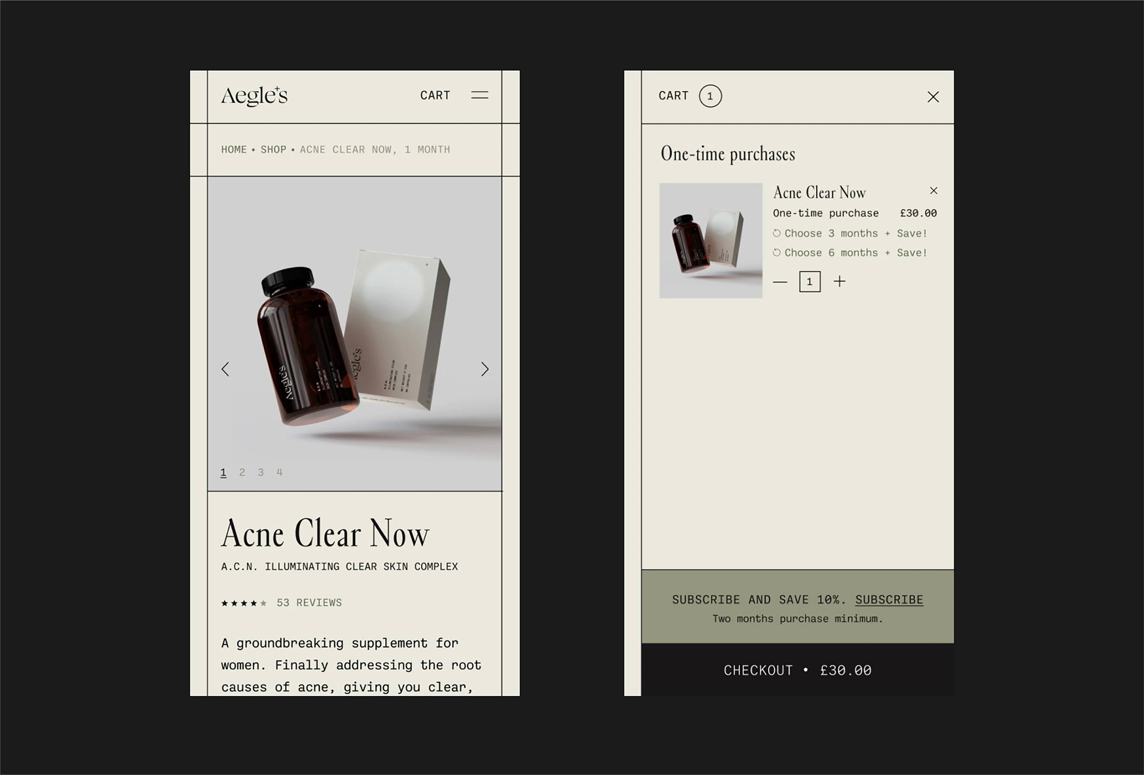
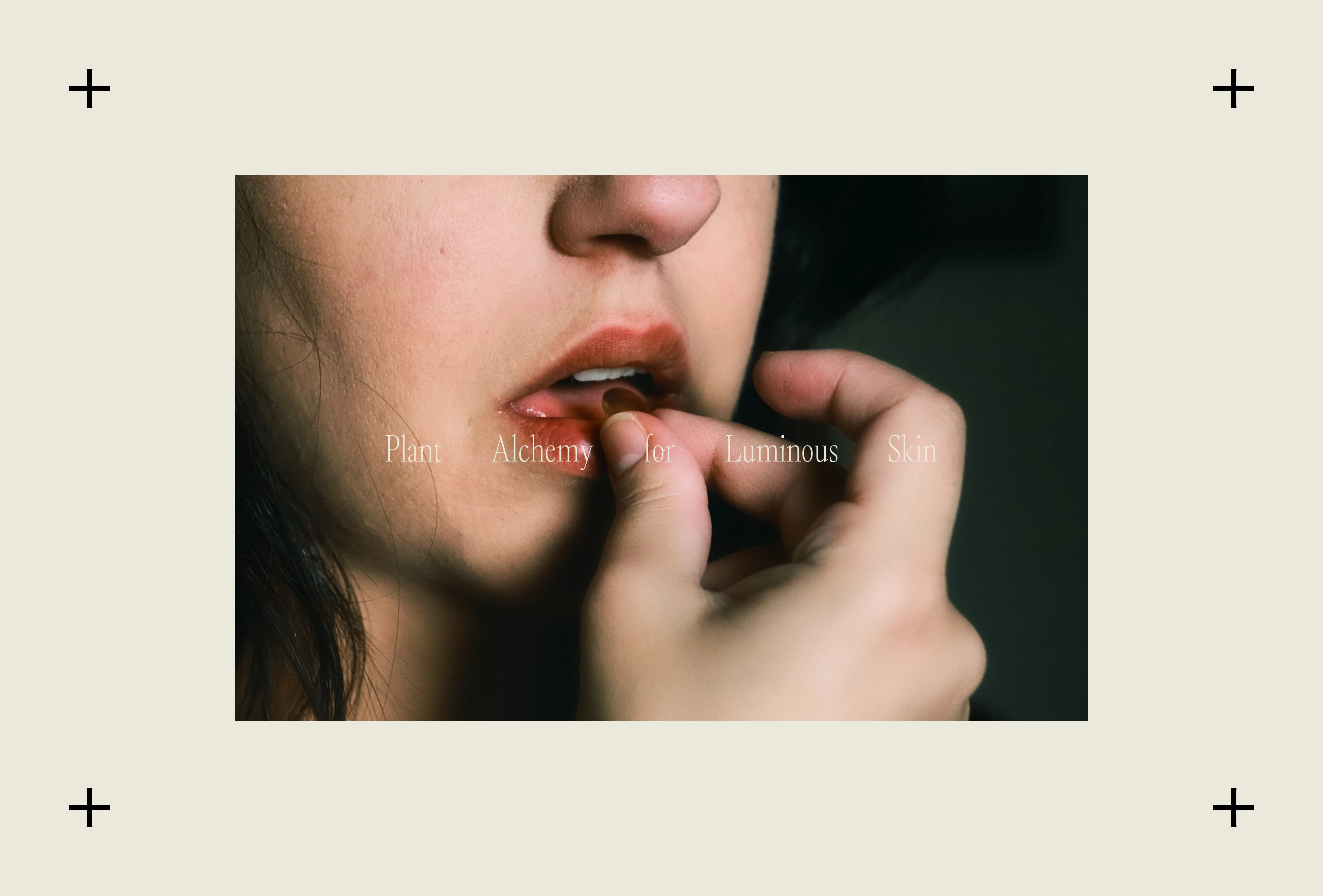
Aegle's Botanicals commissioned us to develop its visual identity and packaging design for its flagship product, a nutritional supplement for the treatment of acne that helps to obtain clear and luminous skin naturally.
Natural Skincare
2022
London | UK
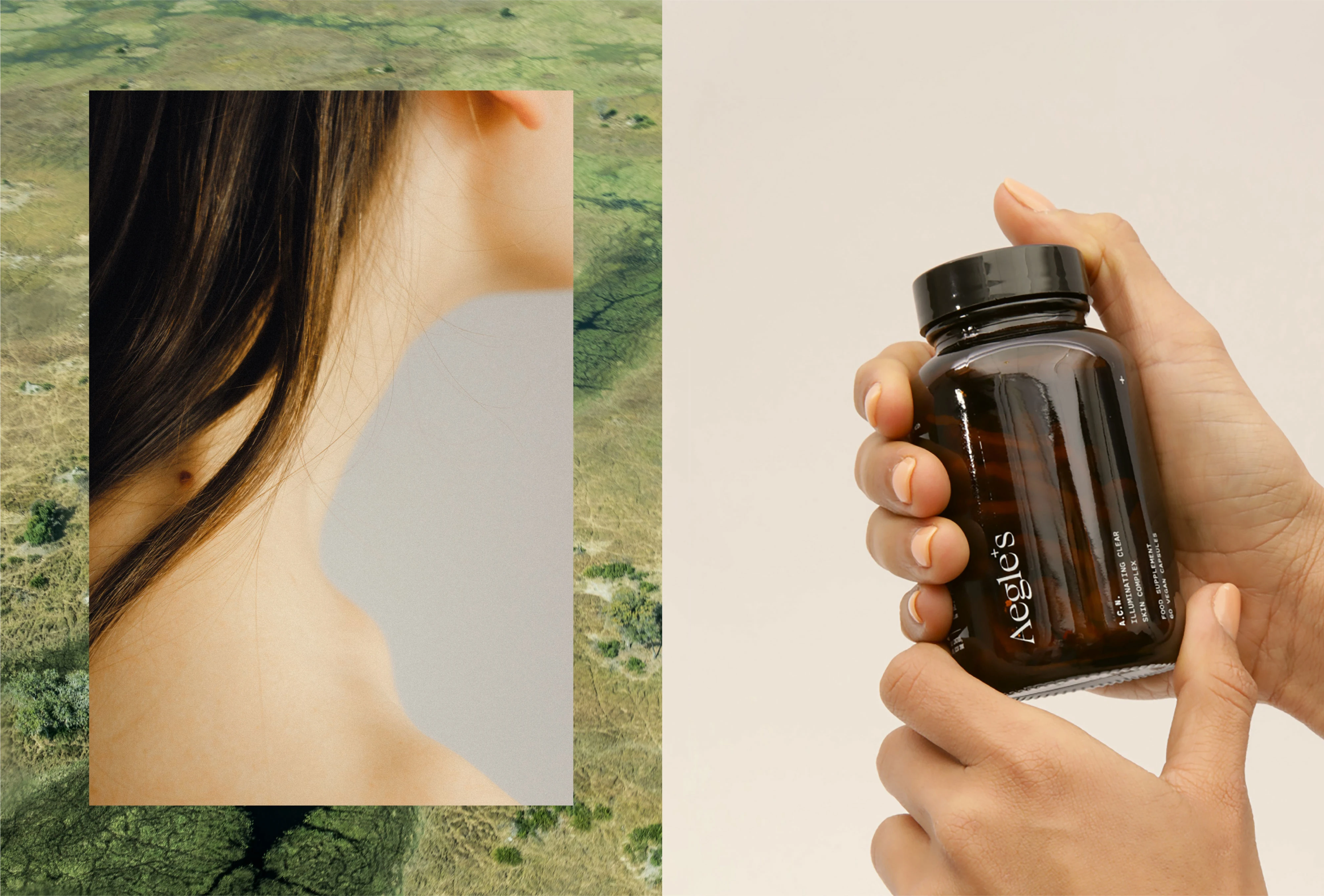
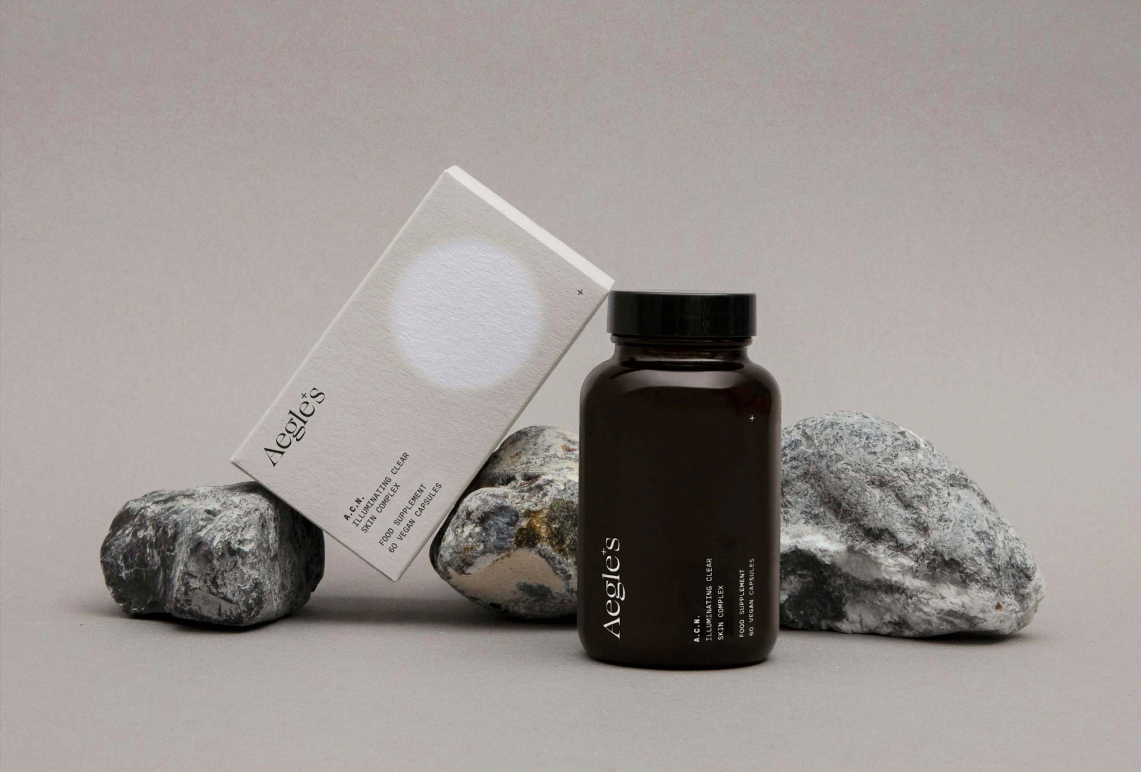
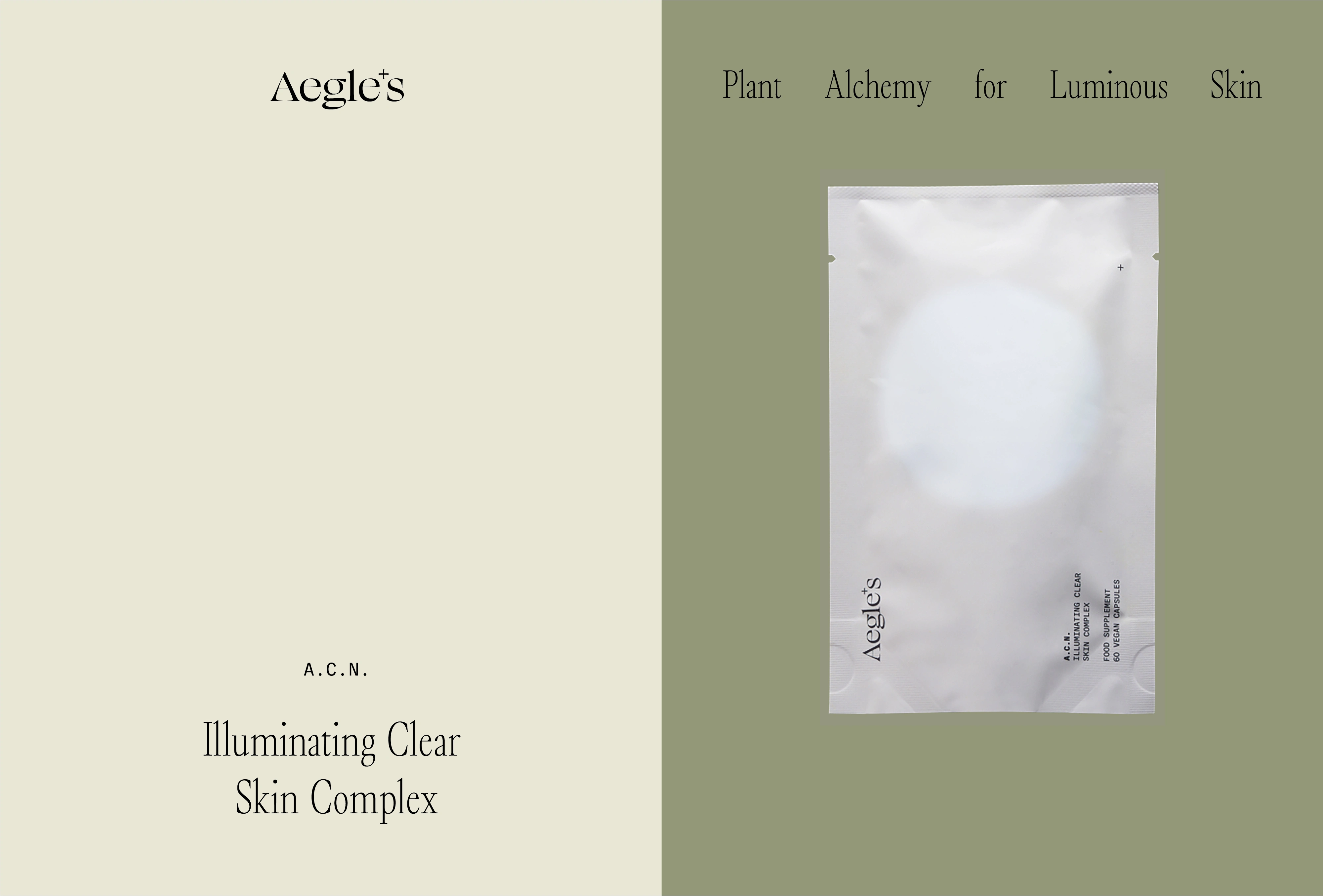
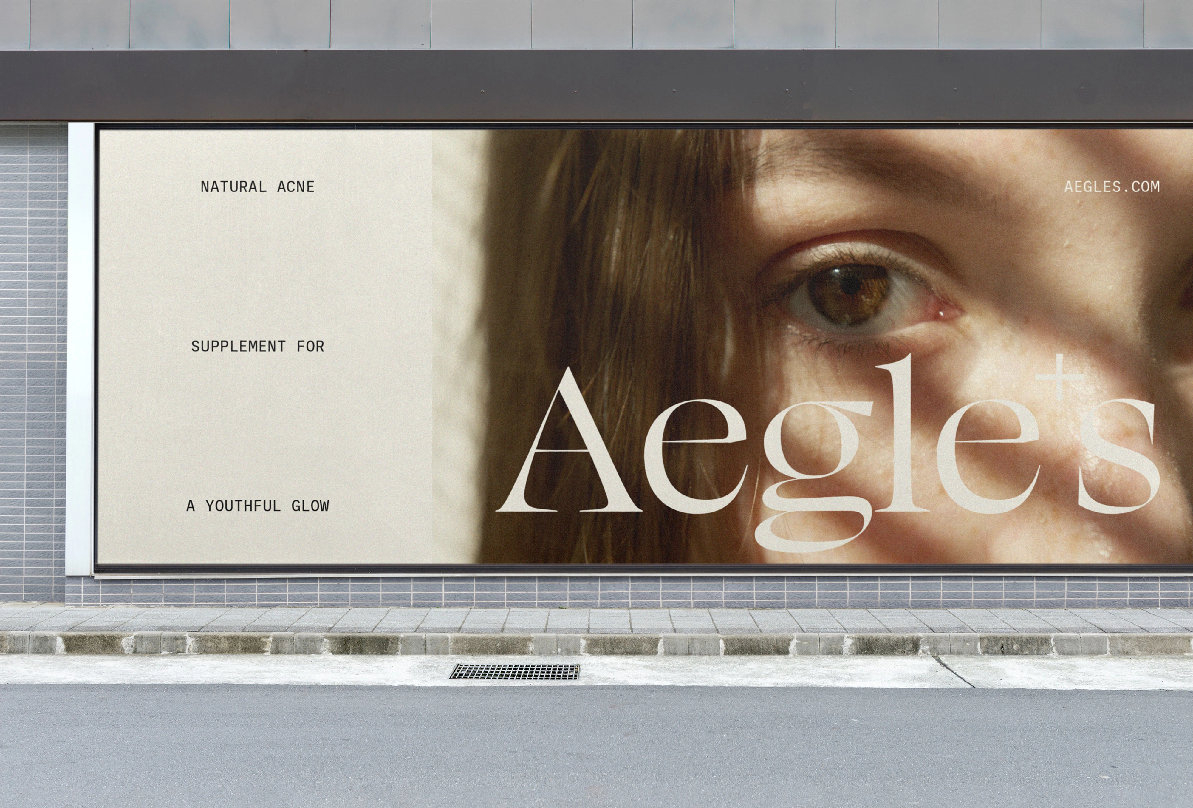
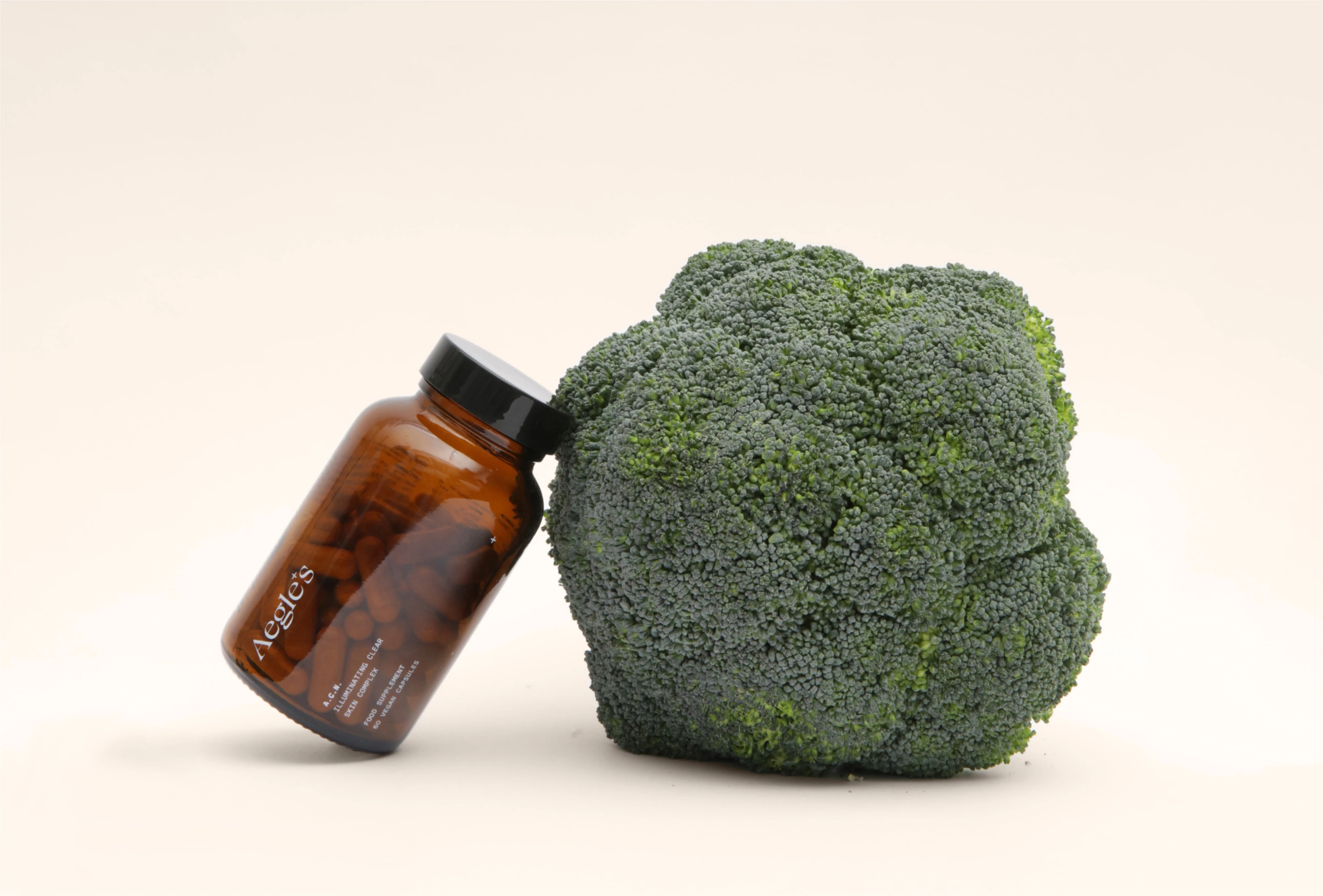
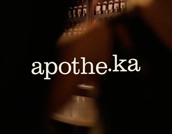
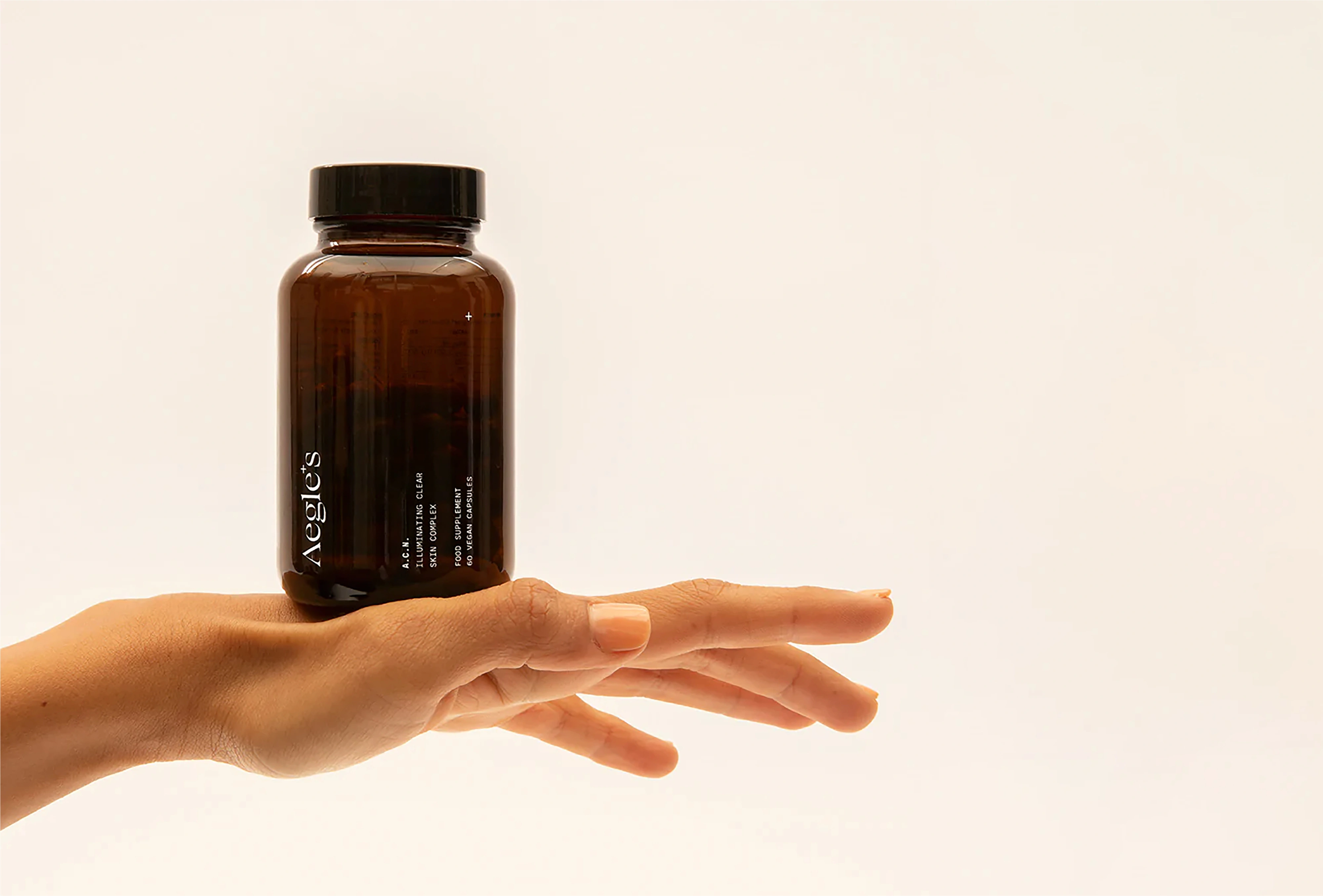
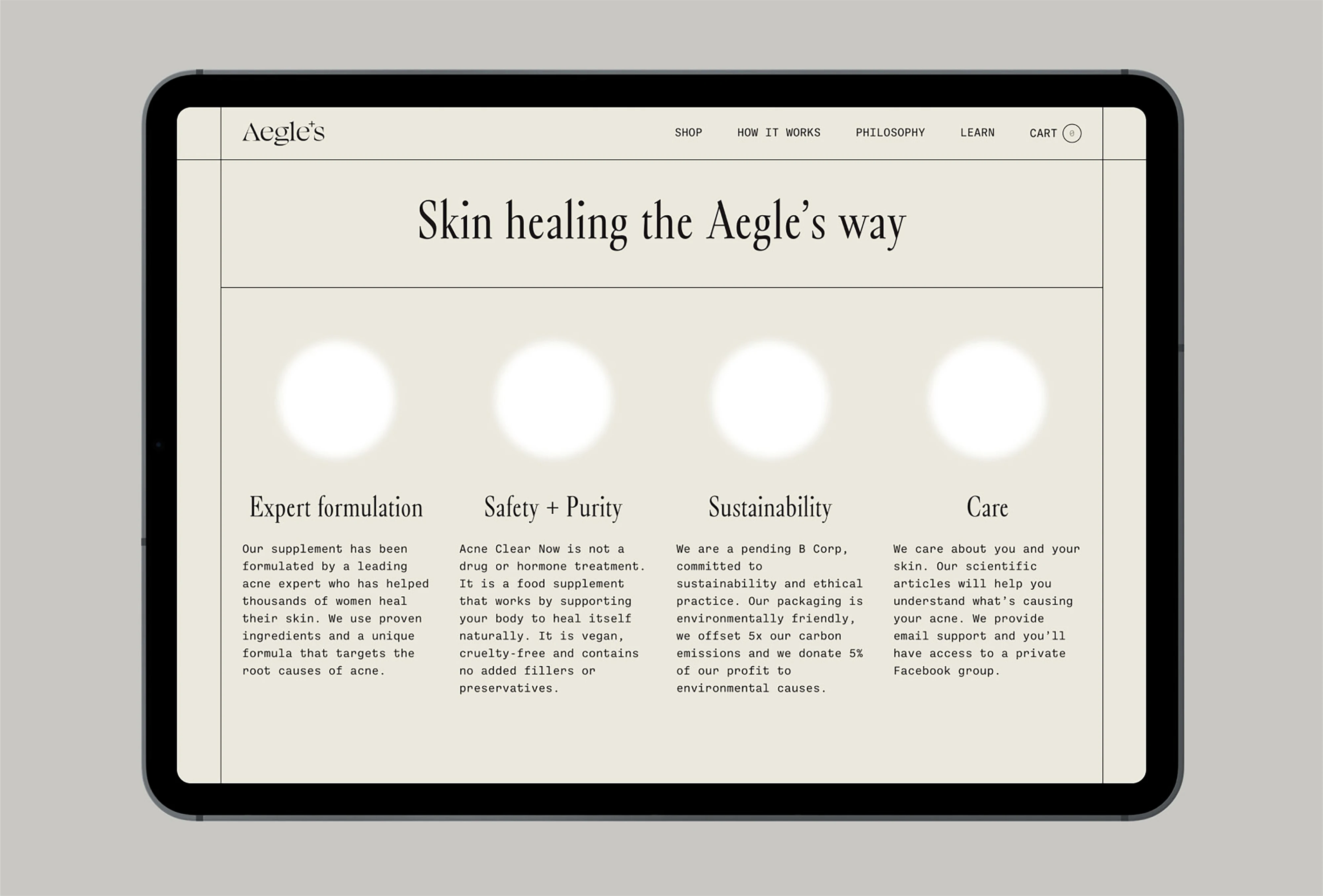
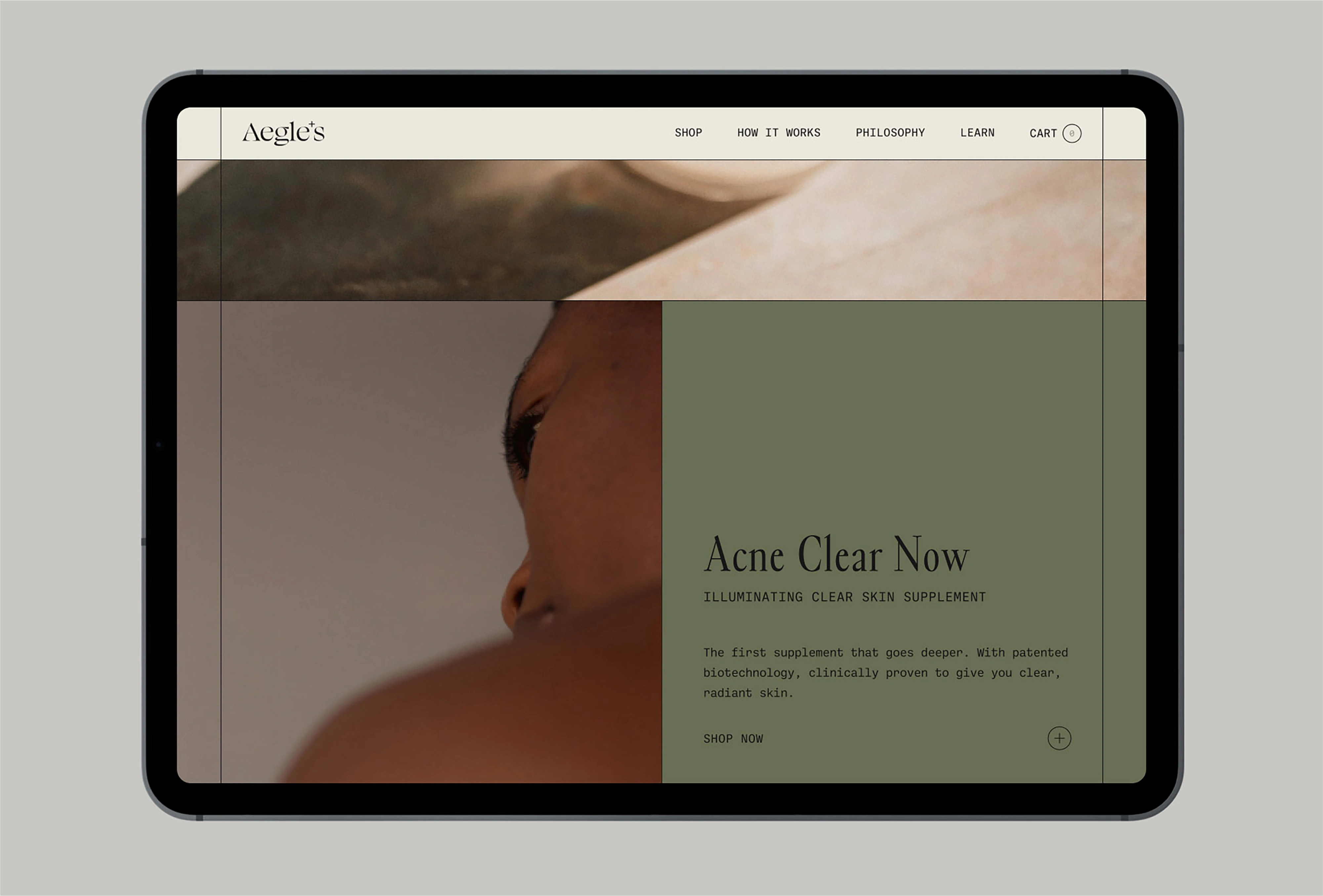
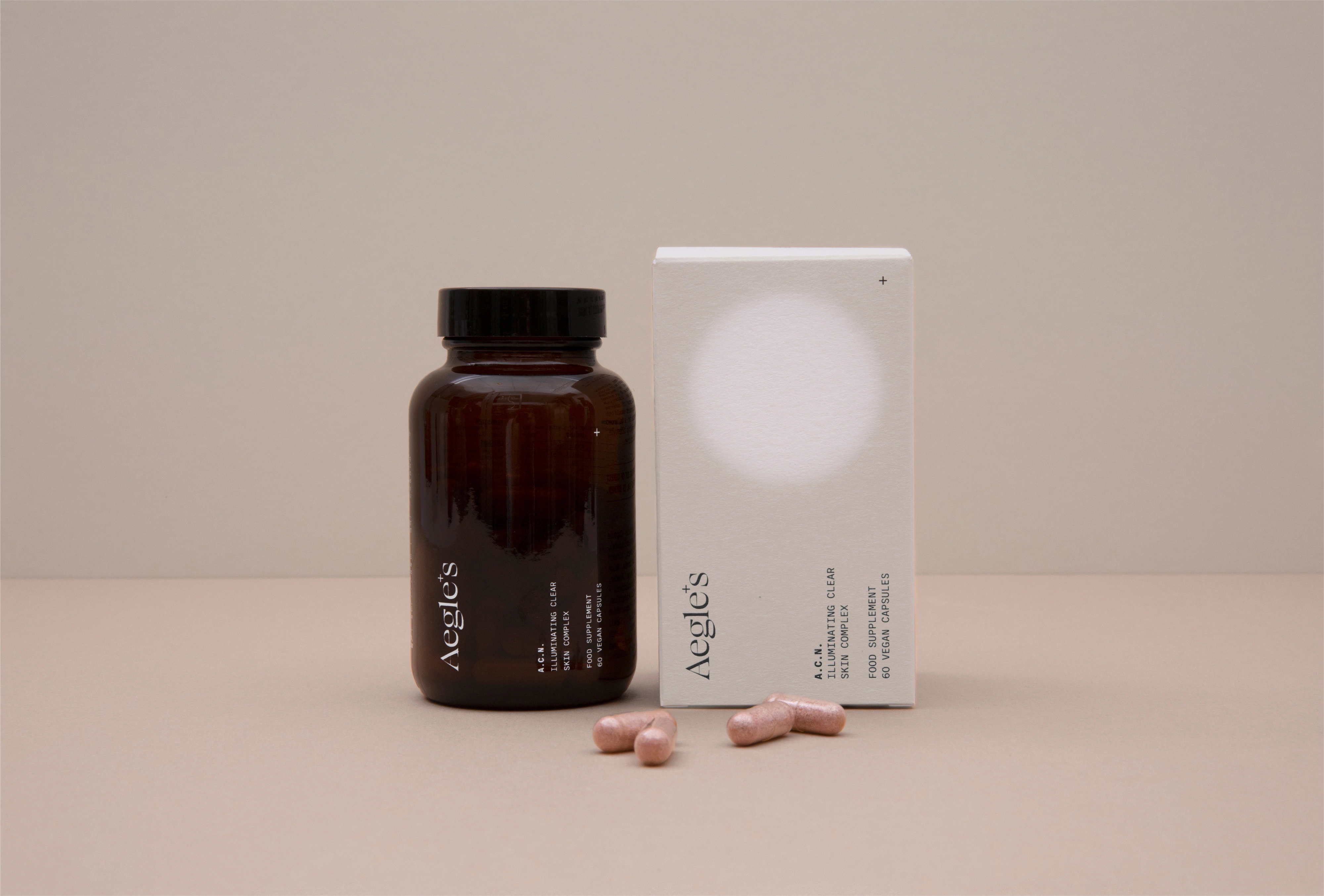
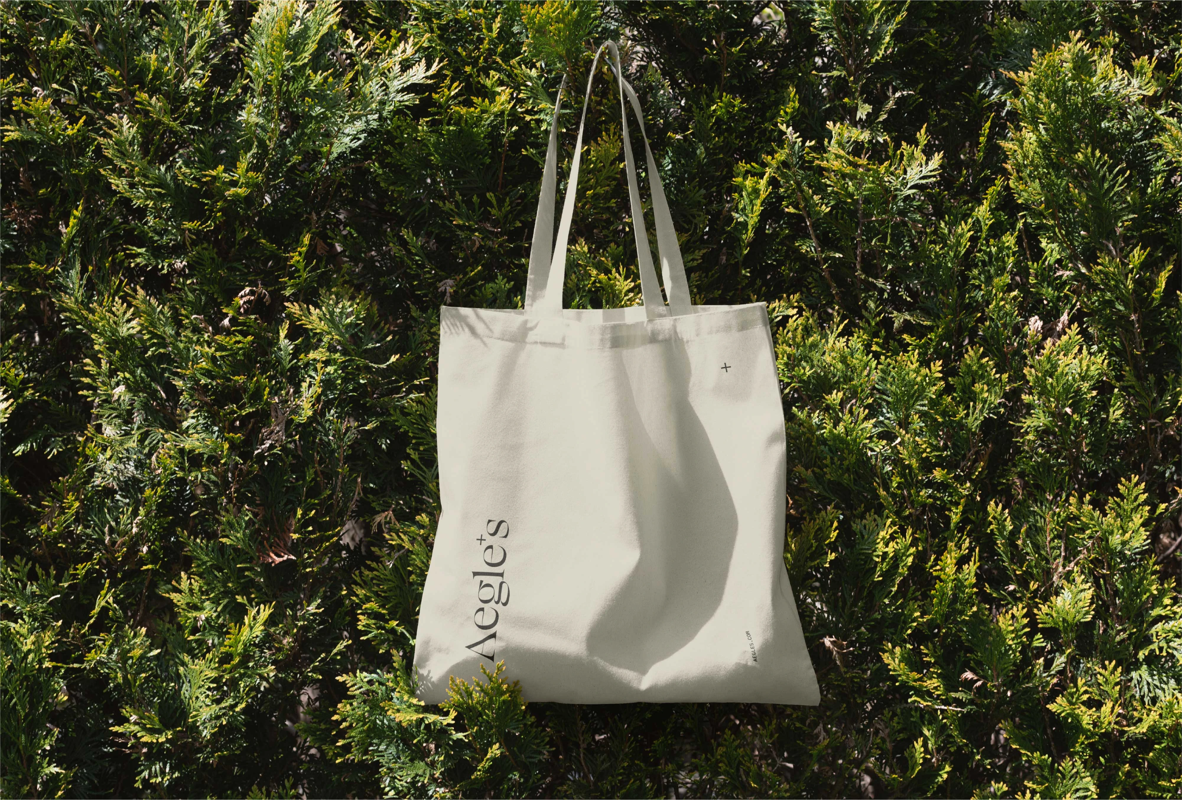
The entire visual identity revolves around the healing concept. The logo, presented in an elegant and delicate typeface, stands out for a cross-shaped apostrophe that represents both health and skin brightness. The packaging features a blurred white circle that, in contrast to the cream tone of the outer boxes, generates a shimmering effect that evokes the skin’s healing process, while conveying a feeling of modern apothecary.
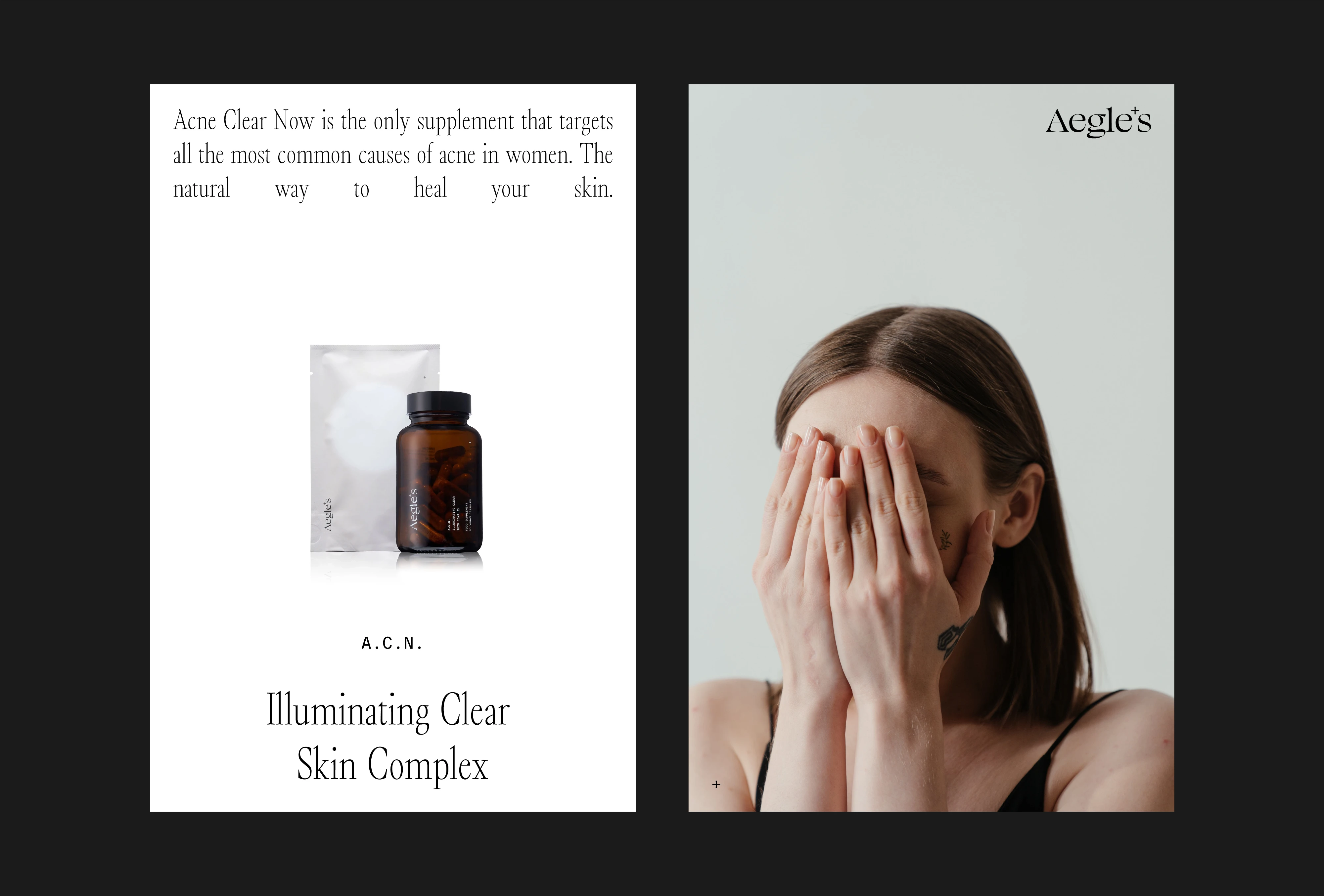
The brand was born from the experience of its founder, who after having suffered from acne and rosacea in adulthood and overcoming these problems with the help of nutritional supplements, decided to create her own company to help other women solve their skin conditions. All of this personal experience, along with years of ingredient study and nutrition training, led to the creation of Aegle's.

Like this project
Posted Sep 14, 2026
Skincare packaging design for award-wining, London-based nutricosmetic brand developing nutritional supplements for women with skin conditions.
Likes
0
Views
2
Clients
Aegle's