Tilde | Style Accentuated

Joaquín Pinochet


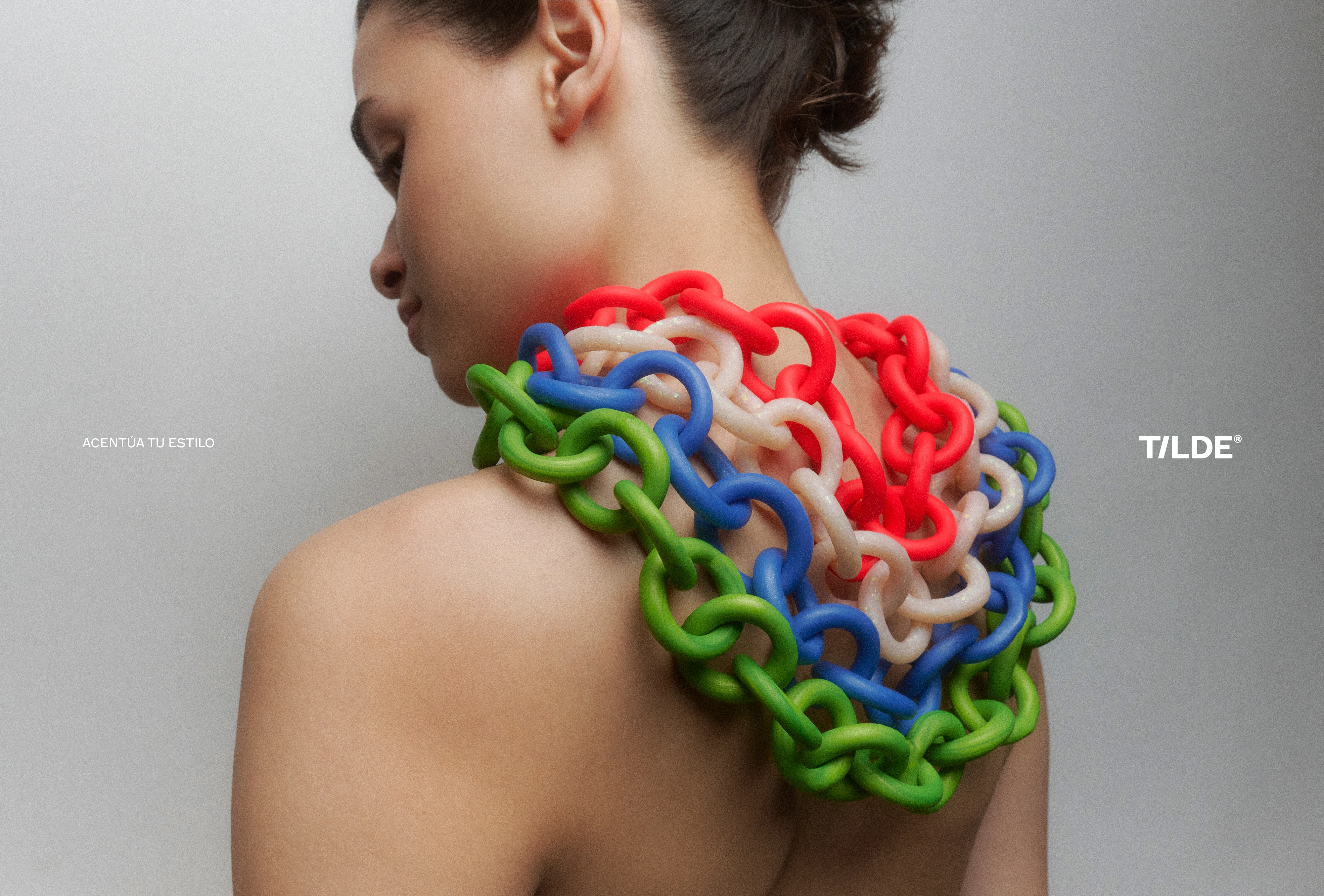
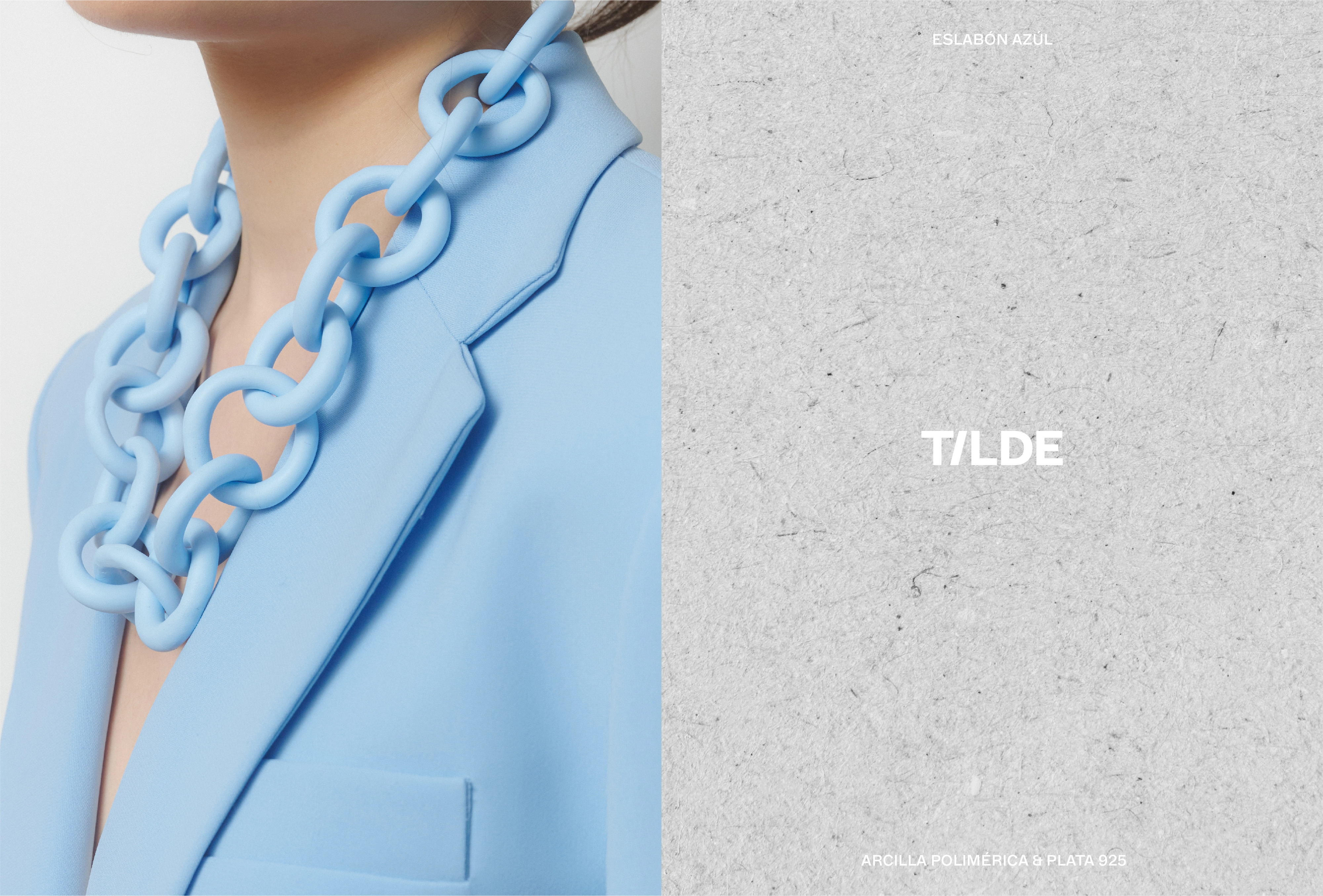
Tilde is a handcrafted fashion accessories brand specializing in polymer clay designs, a lightweight, versatile, and colorful material. The brand’s unique offerings cater to women seeking distinctive, vibrant, and textured accessories that break away from traditional fashion norms.
Fagerström was commissioned to create both the naming and visual identity that would reflect the company’s core values: creativity, exclusivity, and authenticity. The challenge was to develop not only a name that encapsulated Tilde’s mission but also a visual identity that communicated the brand’s dedication to quality and craftsmanship.
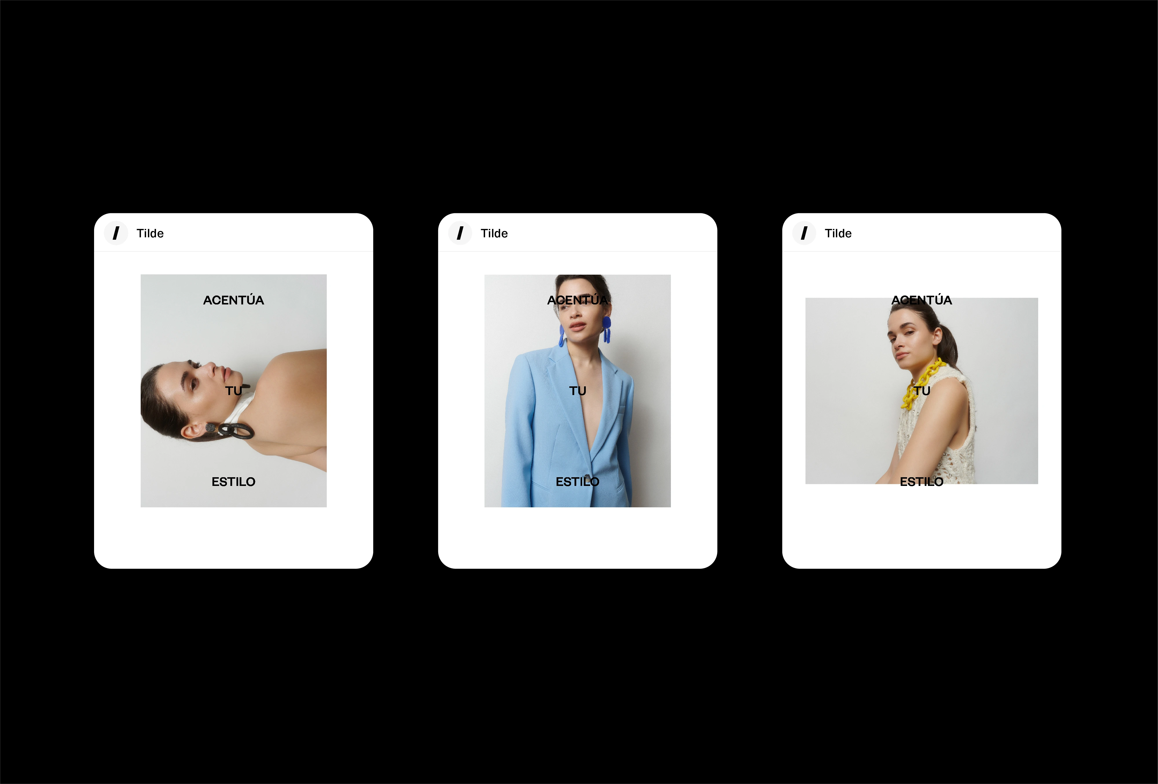
The name "Tilde" comes from the tilde accent in Spanish, a mark that highlights and emphasizes the sound of words. This reflects the brand’s mission: to accentuate individuality through distinctive, handmade accessories. The metaphor extends to Tilde’s products, which, like the tilde accent, highlight and enhance the personal style of the wearer.
Fashion & Accessories
2024
Santiago, Chile
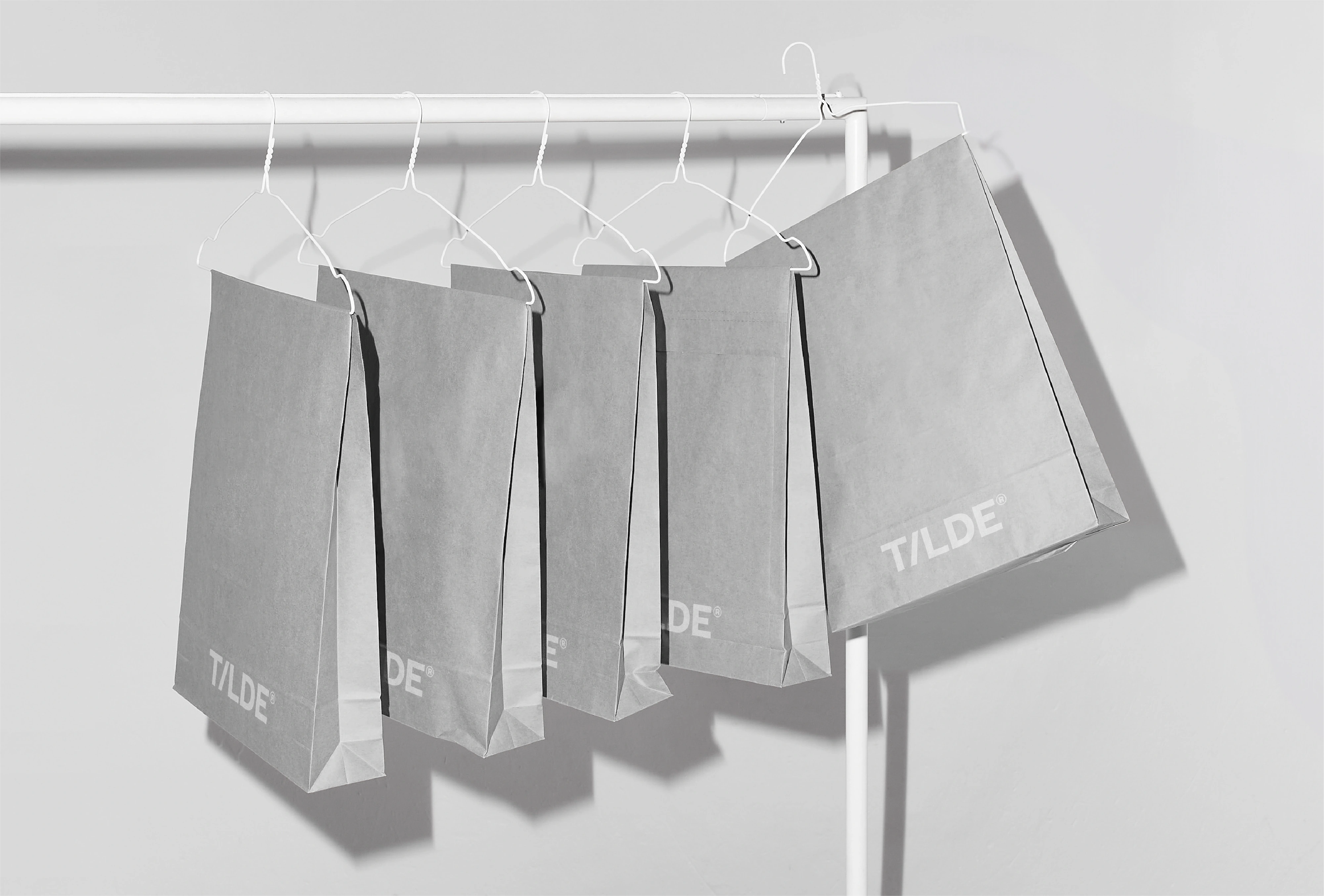
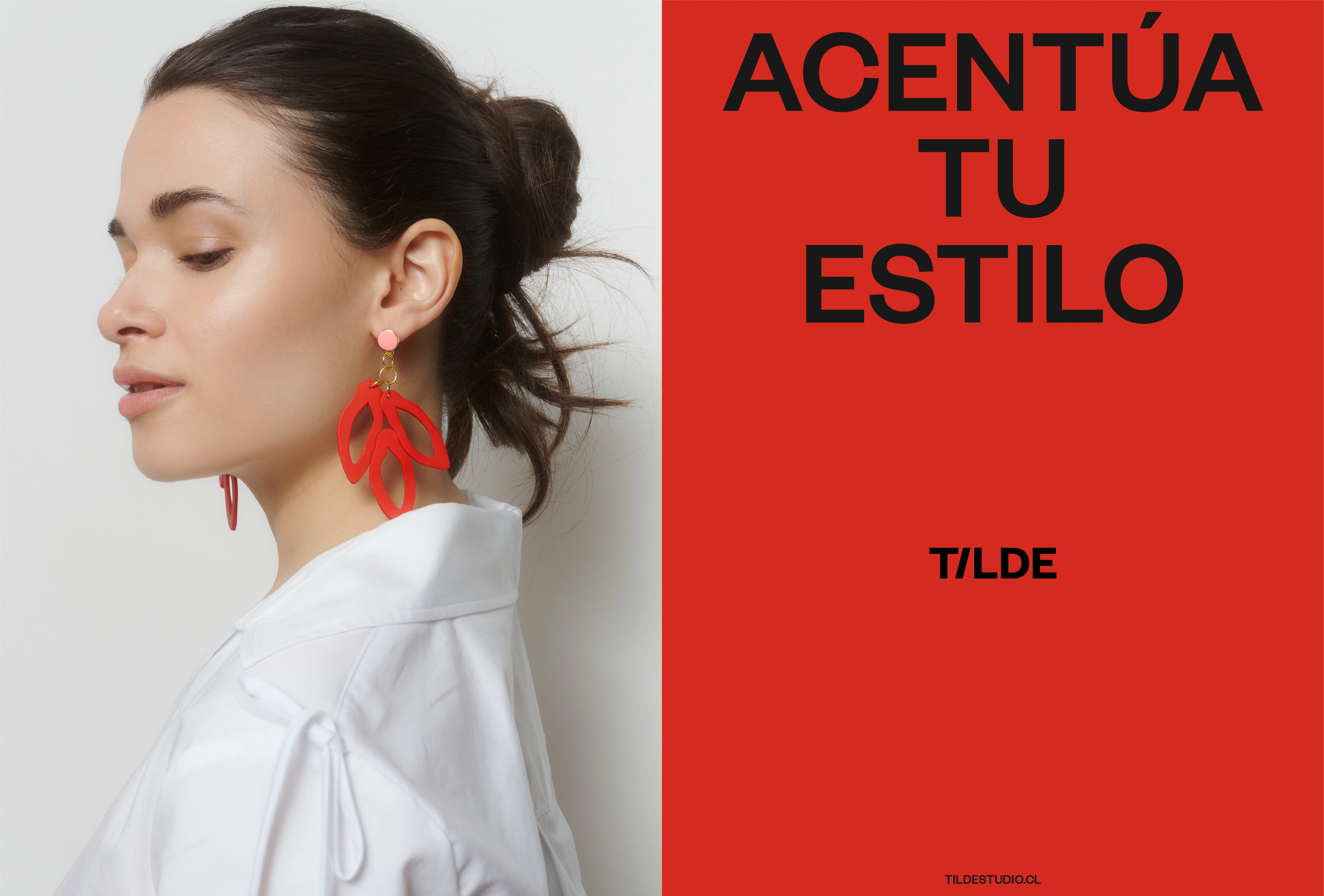
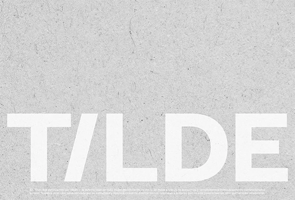
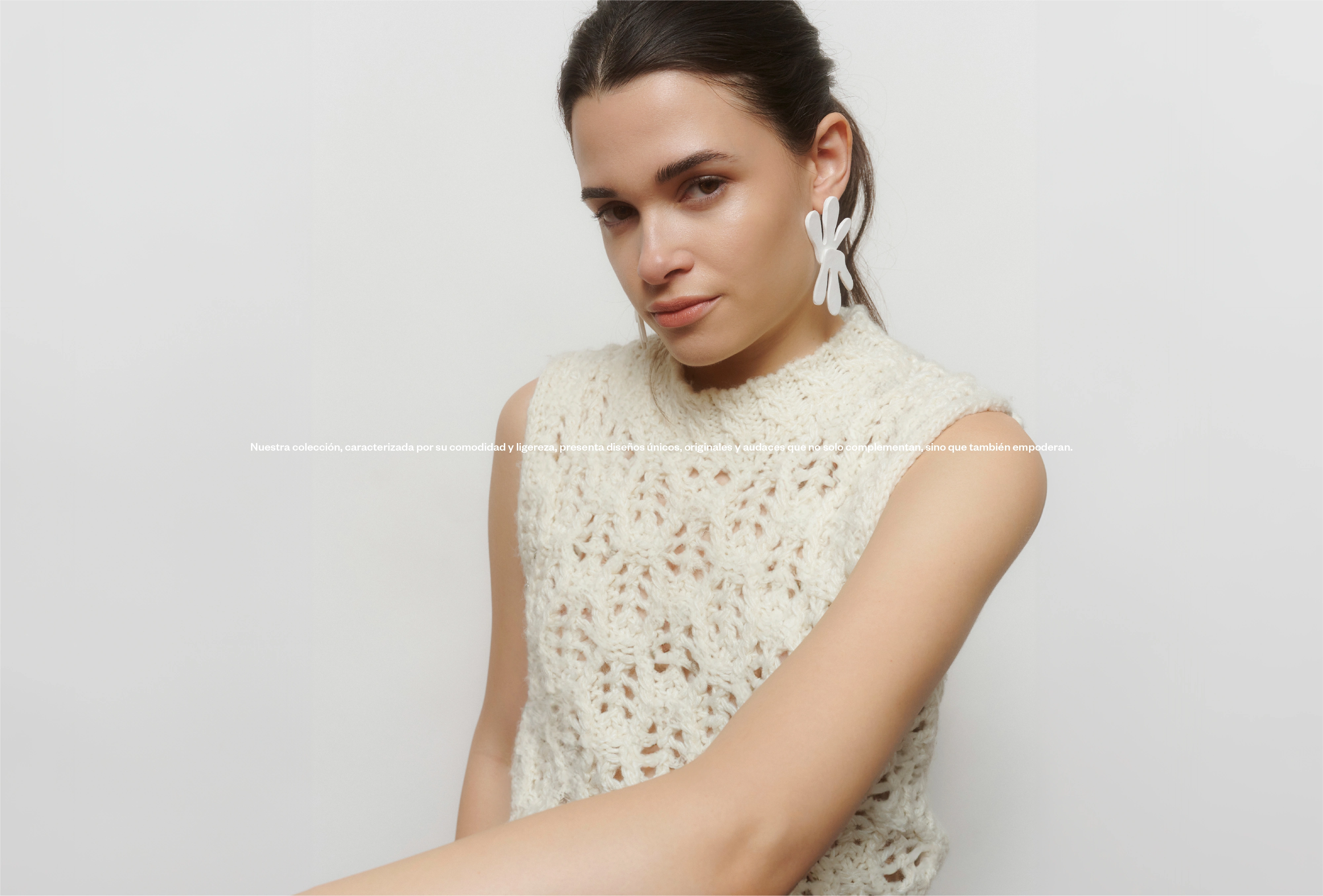
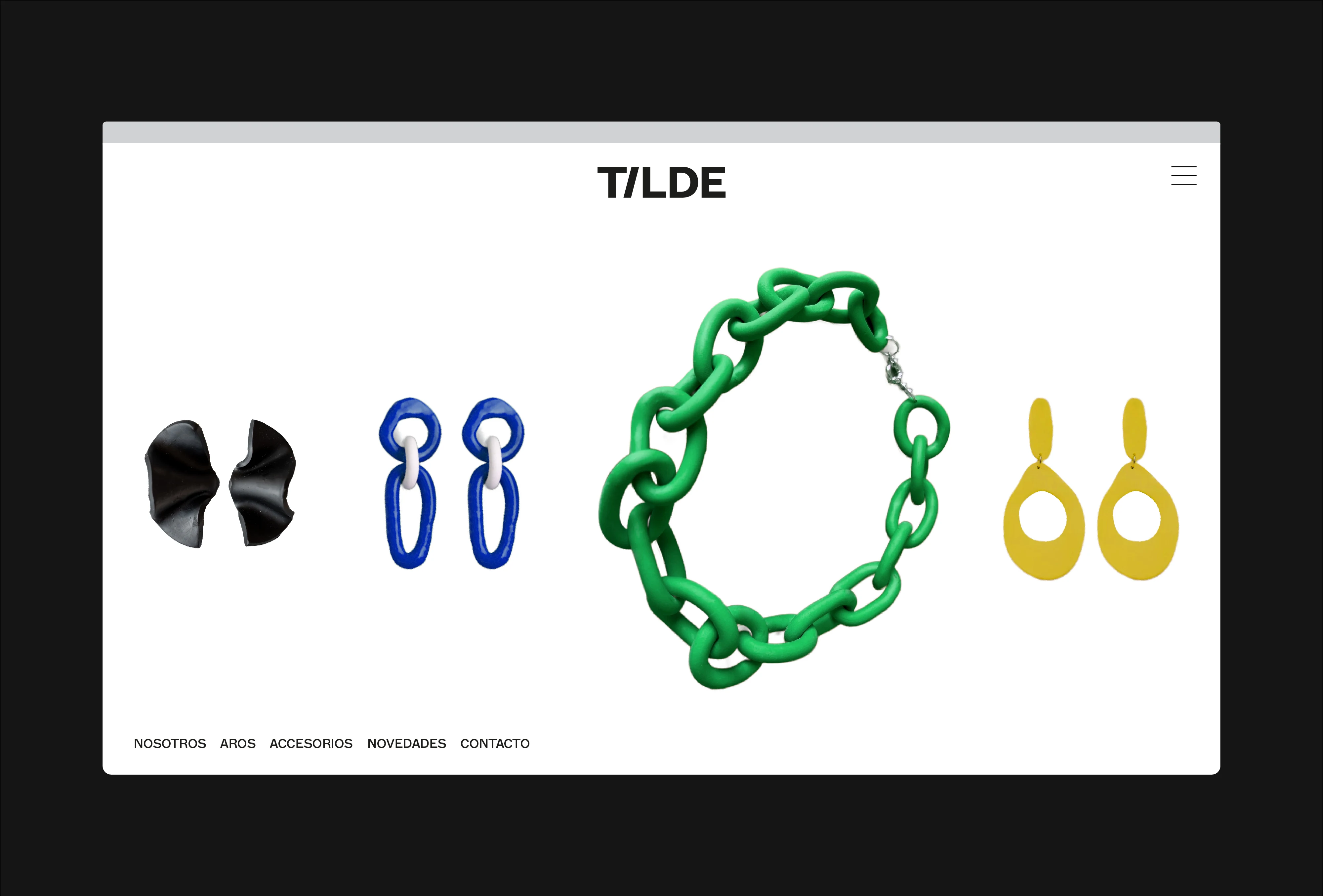
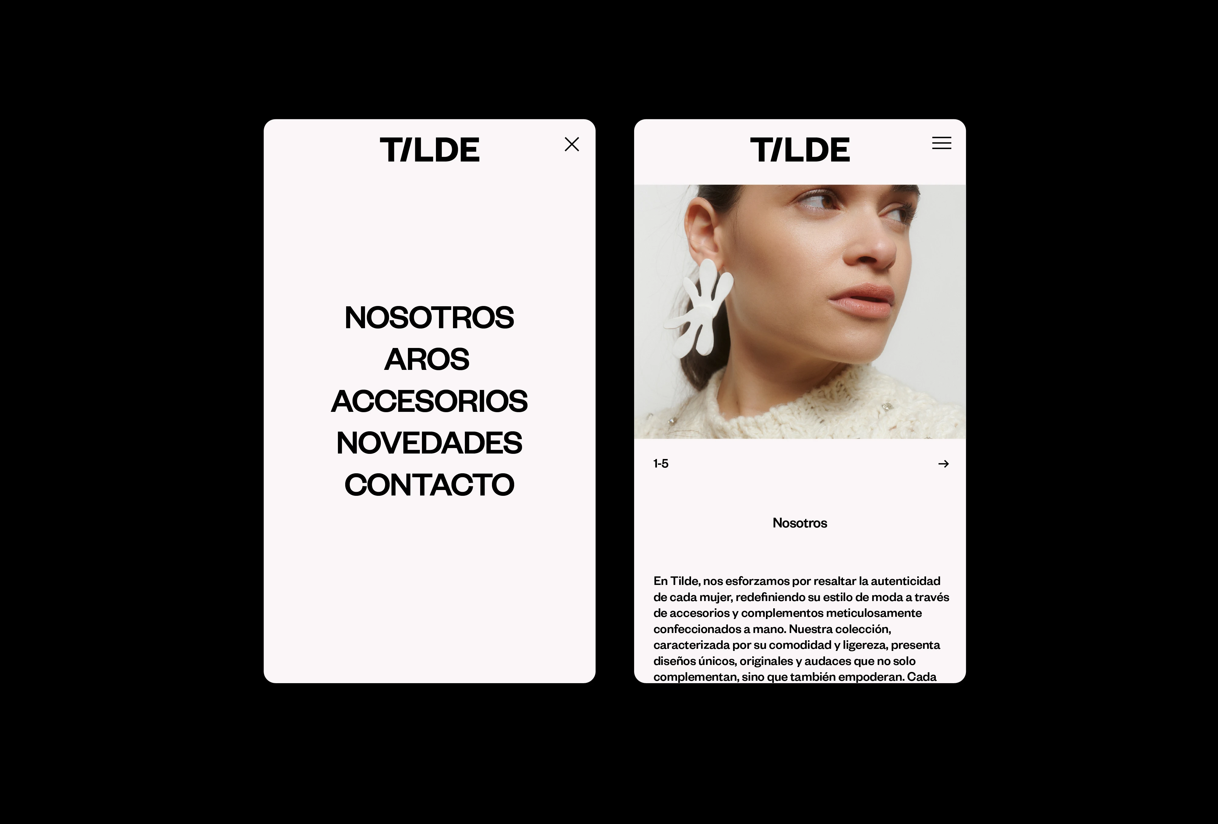
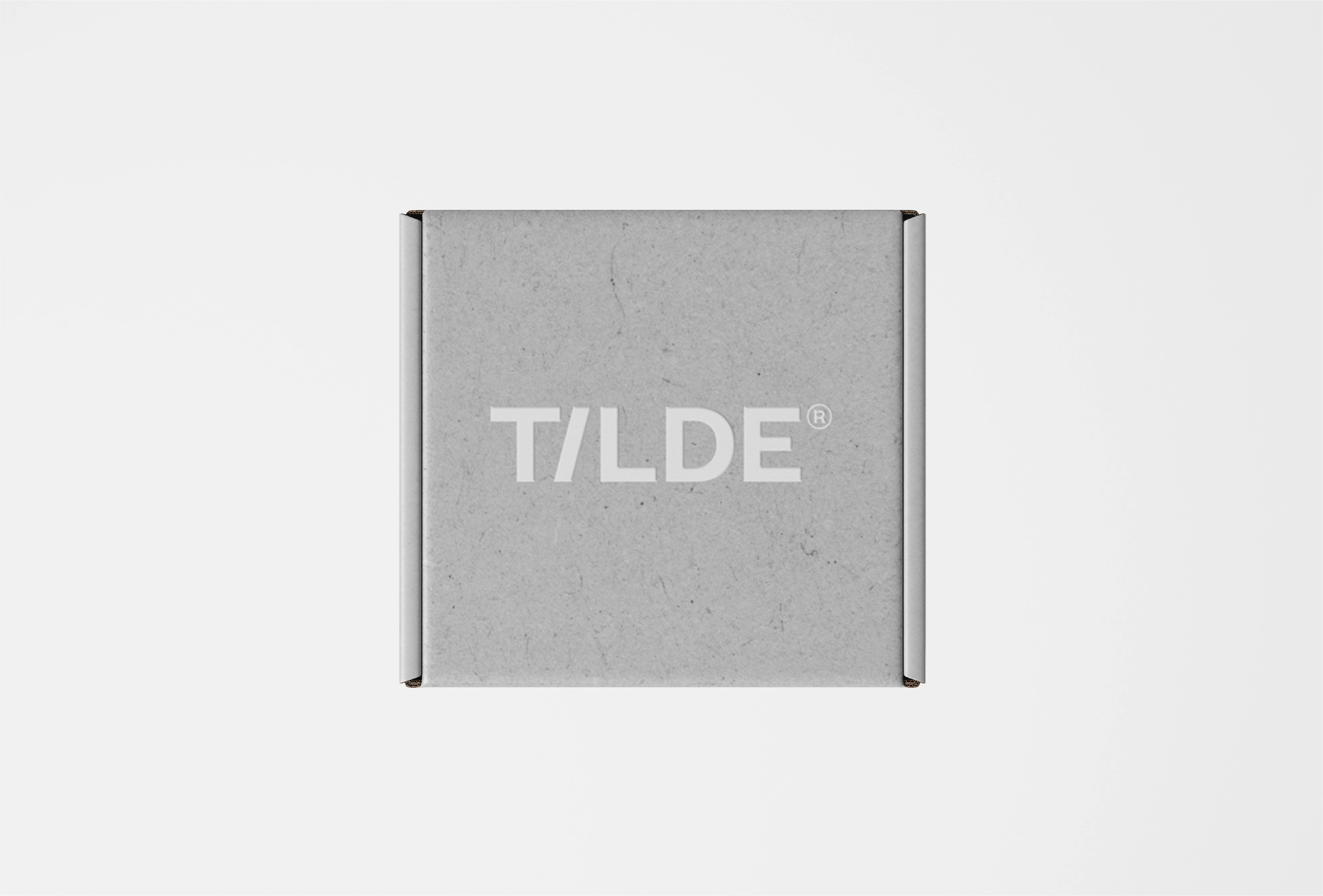
The branding strategy focused on creating a clean, minimalist, and elegant visual identity. The brand, designed with a modern and functional typeface, features a distinctive element—an ‘i’ that is slightly tilted to the right—evoking the idea of a tilde in a word that, paradoxically, doesn’t have a graphic accent.
This subtle detail visually represents the brand’s promise: just as the tilde alters and emphasizes a word, Tilde’s accessories enhance personal style.
_______
For more updates visit:
And follow us on:
Like this project
Posted Sep 14, 2026
Branding for a fashion accessories brand celebrating individuality with handcrafted & colorful designs.