WordPress Theme and Block Editor for an LMS Marketing Site

Olha Stalska


The problem
Nifty Learning sells learning-management software to corporate L&D teams. Its pitch is simple: tedious admin work should be a thing of the past. The website had to say that in one scroll, show the product clearly, and stay easy for the team to edit. I received finished Figma designs and built the whole front end as a custom WordPress theme.
Industry: Corporate training software · Services: Custom WordPress theme, Gutenberg blocks, ACF, animations, page speed · Tools: WordPress, Gutenberg, ACF, JavaScript, CSS, Figma
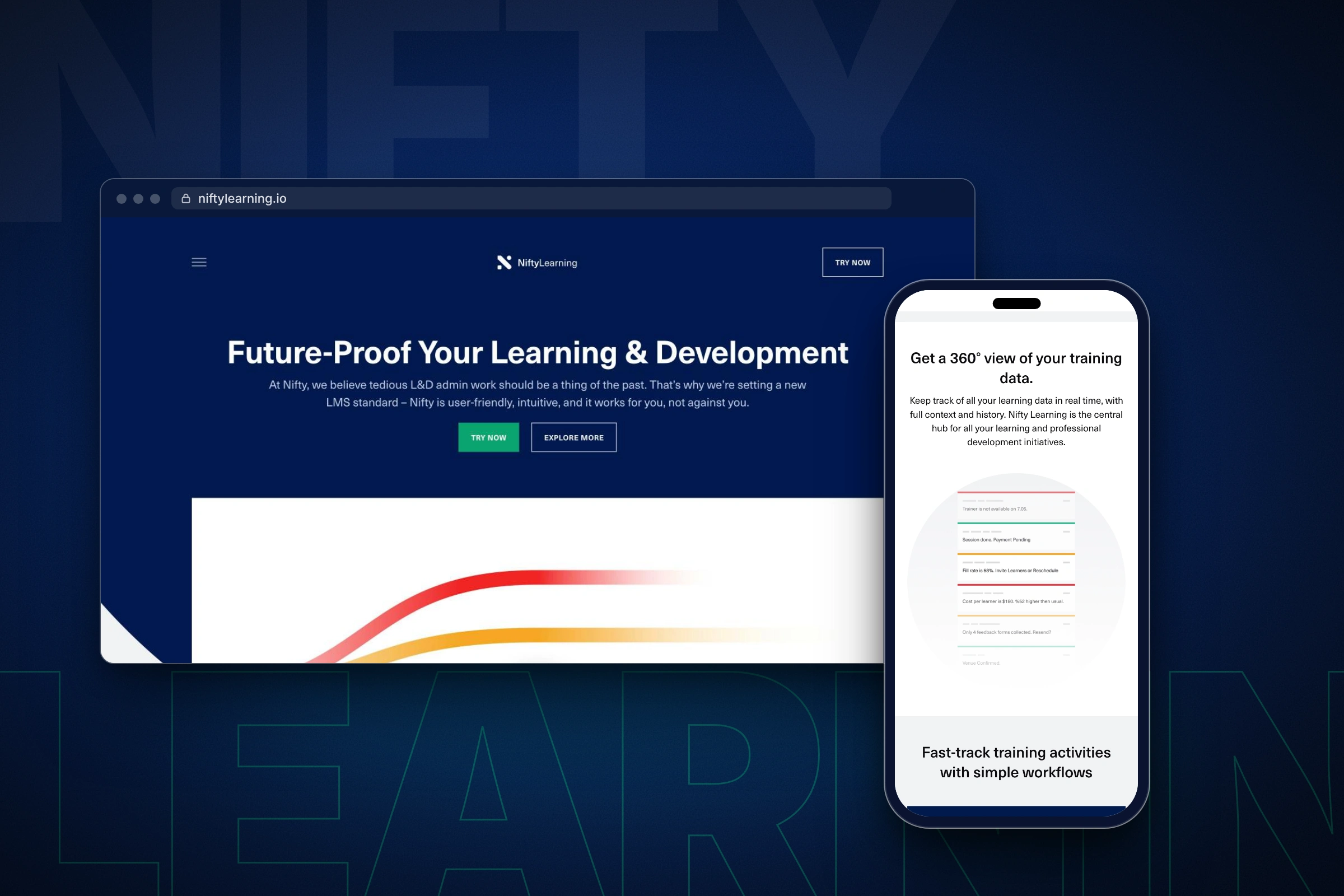
Desktop and mobile views of the finished site.
Write the theme from scratch
I wrote the theme from scratch instead of reaching for a page builder. Templates, styles and scripts carry only what each page needs, so the markup stays clean and the layout follows the Figma file closely, from a 1440 px desktop down to a phone.
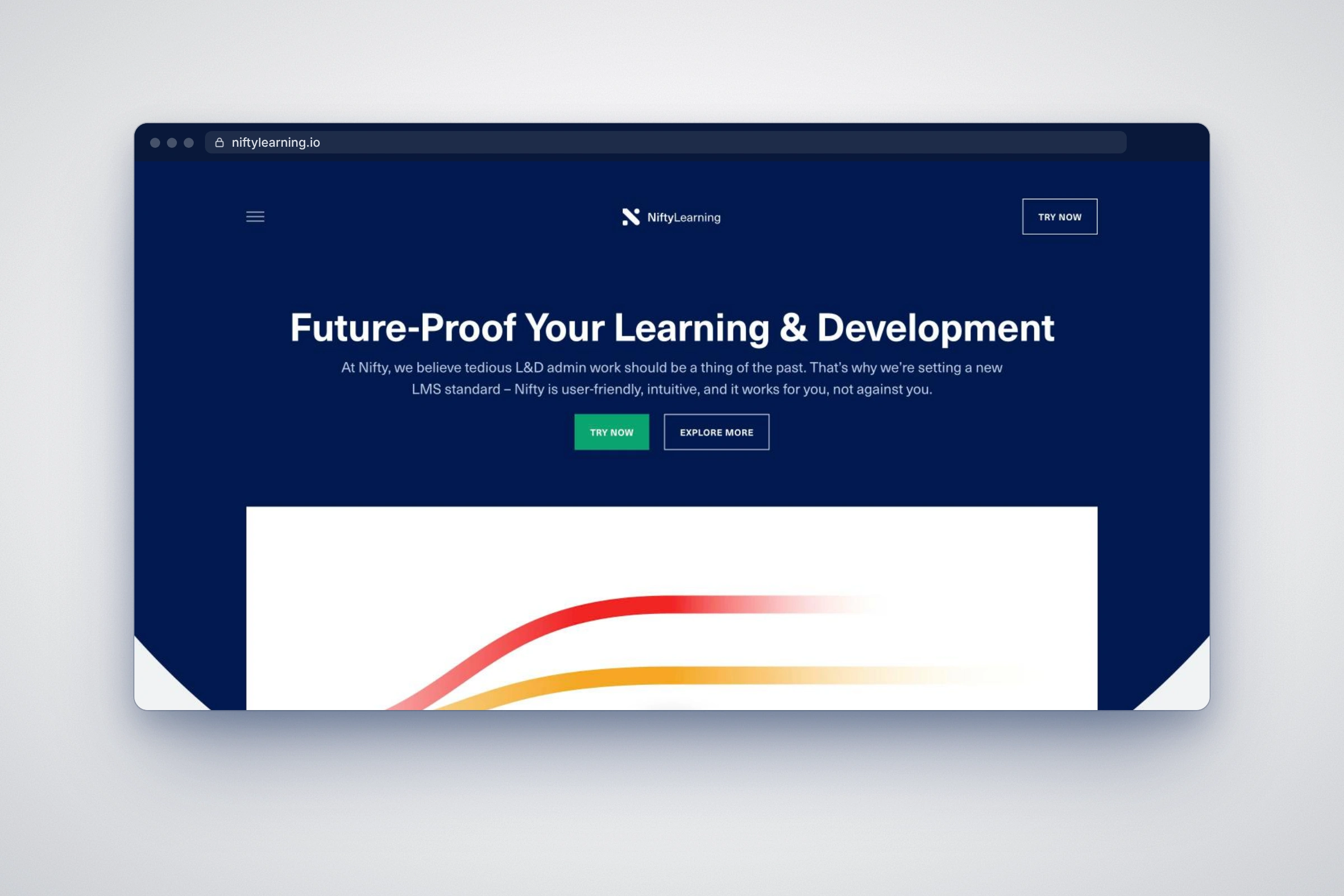
The home page hero, built to the Figma design.
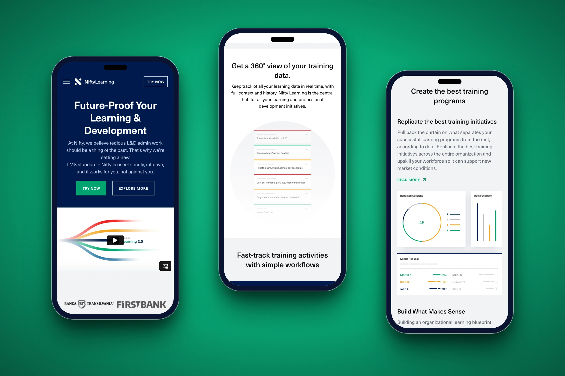
Hero, status cards and analytics.
Make every section a block
Every home page section is a Gutenberg block with ACF fields behind it: the 360-degree view, the workflow showcase, the benefit columns, the analytics cards. The team edits text, links and images in the block editor and can reuse a block on any page.
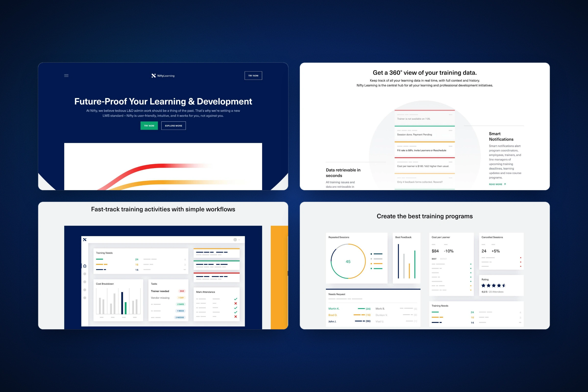
Four sections, each one a block.
Keep the motion light and the pages fast
The motion follows the design: stacked notification cards, product dashboards that slide in, small hover details. I kept scripts light and set up caching so animation never slows the first load.
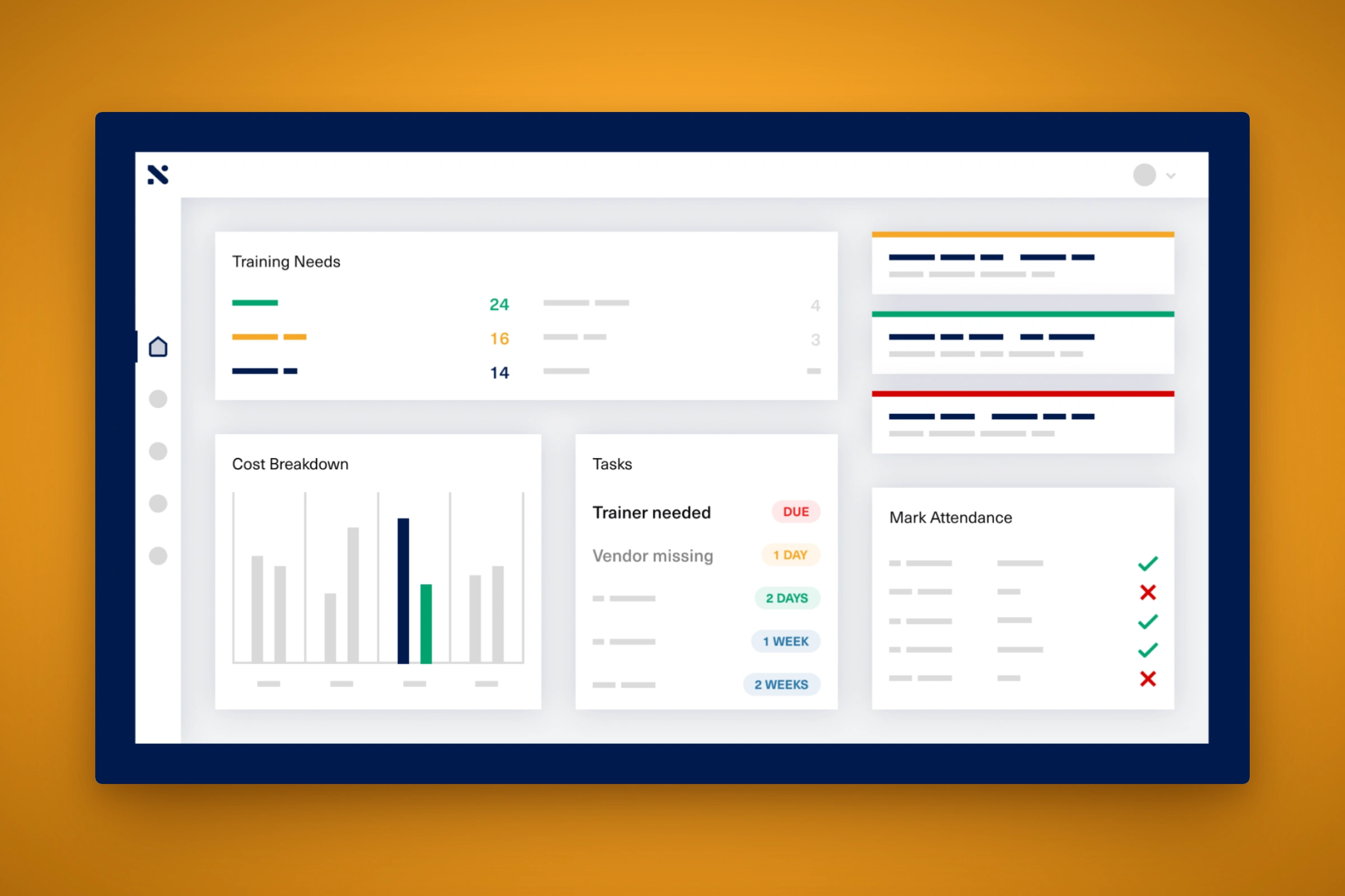
The workflow dashboard up close.
Outcome
Nifty Learning has a marketing site that explains the product in four screens of scroll and is edited through the WordPress block editor, with a reusable block for every section.
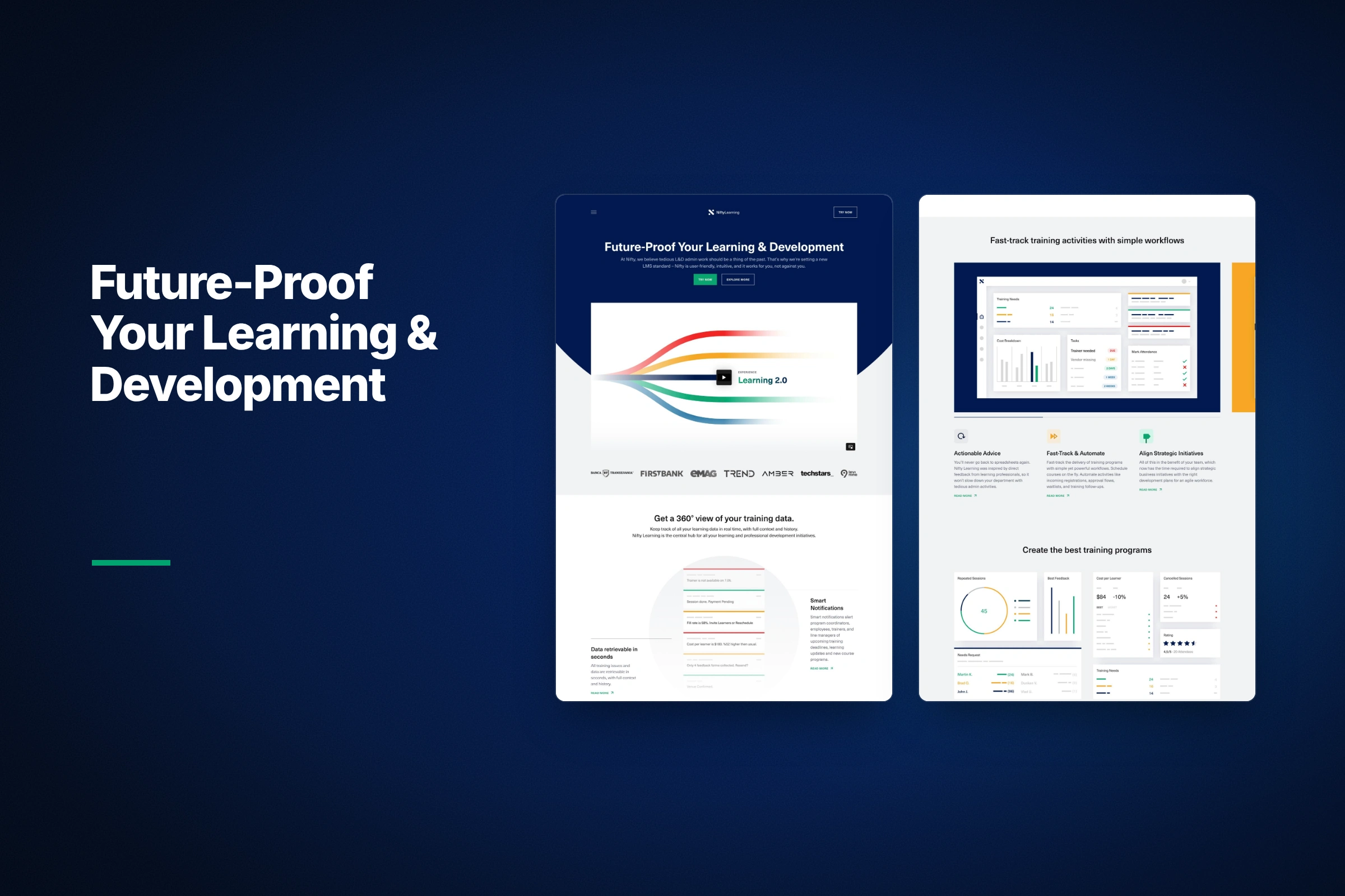
The whole home page, folded into two columns.
Like this project
Posted Oct 27, 2026
A custom WordPress marketing site for Nifty Learning, built from Figma designs with Gutenberg blocks and ACF, no page builder.
Likes
0
Views
2
Clients
Nifty Learning