From the Floor to Your Feet

Patrick Burgess




From the Floor to Your Feet
Project Description
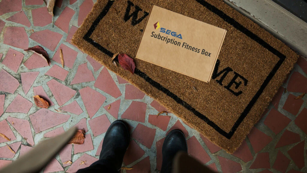
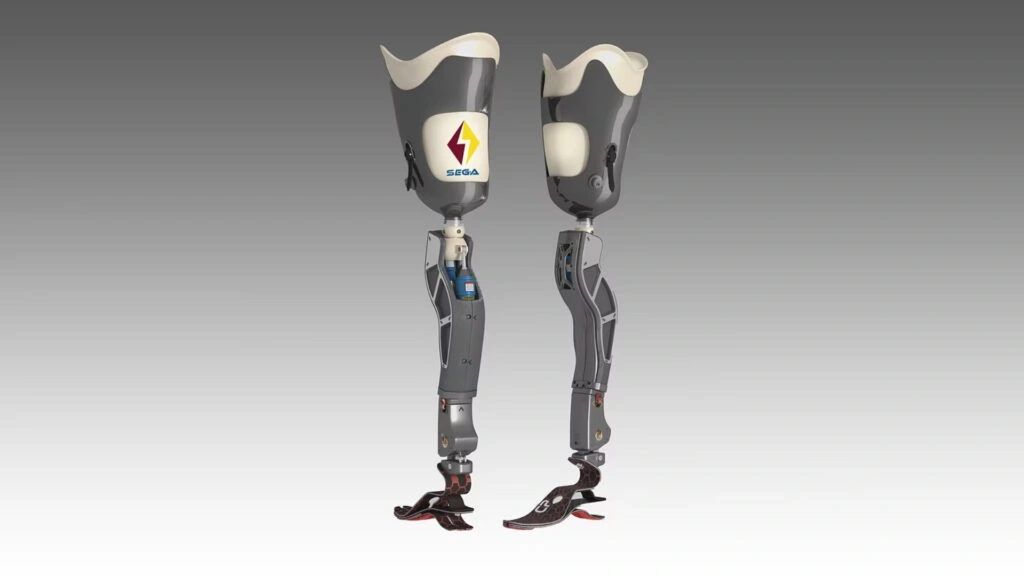
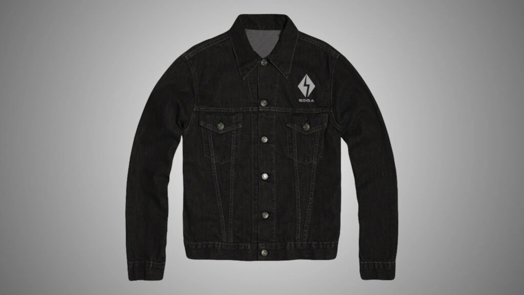
In this project, we were asked to pick a dead or dying company and to rebrand the company for an unrelated industry. My project was focused on the company Sega. After researching the history of the company, the essence of the brand was identified. Then, a new look was created for the brand. The strategy and standards were specified to keep the new identity consistent. Finally, new extensions to the brand were developed and a website was created to hold all this information.
Project Concept & Design Goals
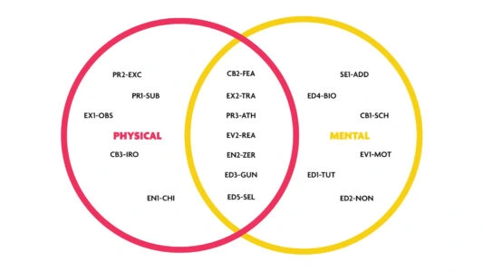
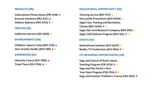
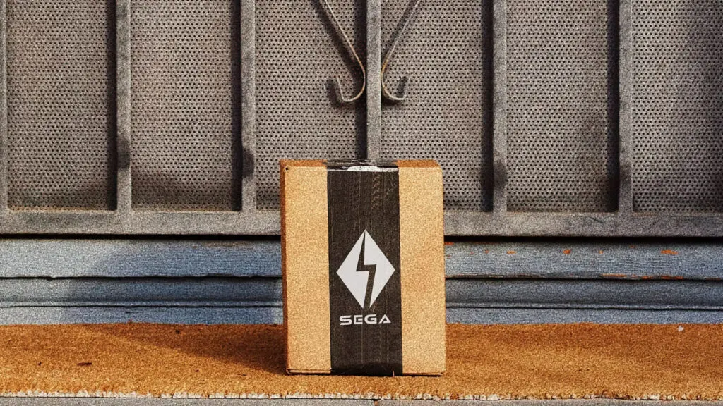
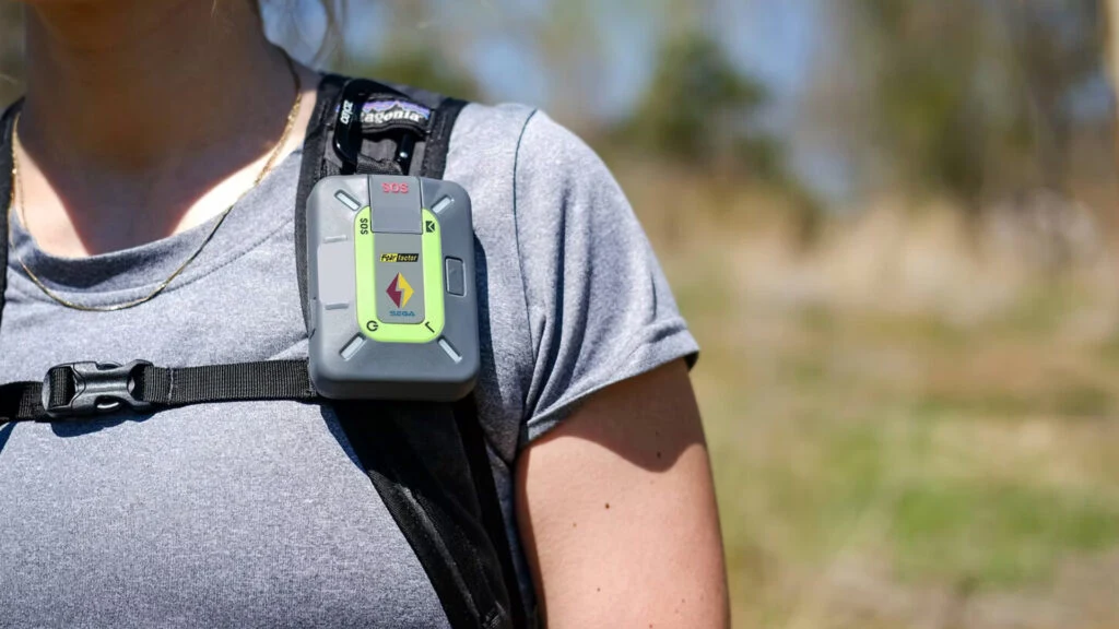
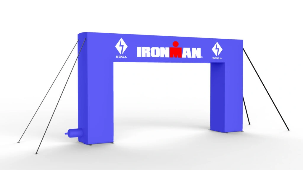
When rebuilding the brand, I wanted to move the brand in the opposite direction, creating a more active approach. Therefore, I built the new strategy on active challenges and goals. My brand extensions focus on physical as well as mental challenges. I used bold colors, including dark red, yellow, and blue. I designed the logo off of the ideas of going past one’s limits and the feelings of excitement and adrenaline.
FROM THE FLOOR TO YOUR FEET A rebranding project 2020
Branding
Product Design
Books/ebooks
Logo Design
Experiential Design
Web Design
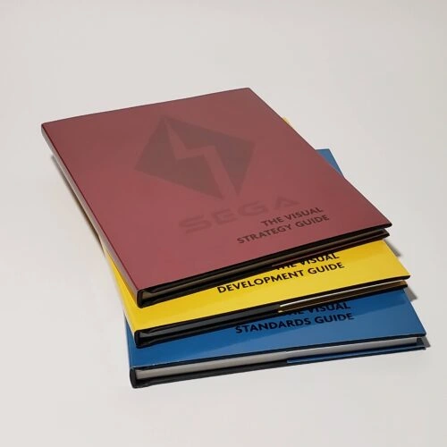
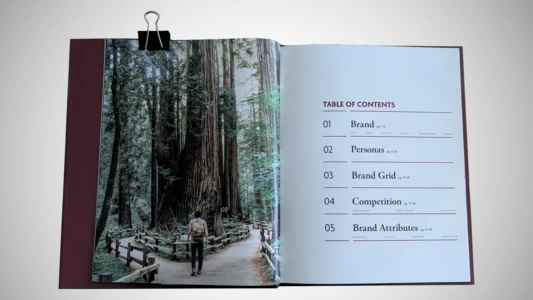
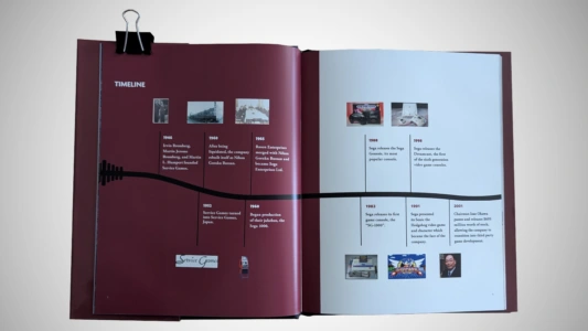
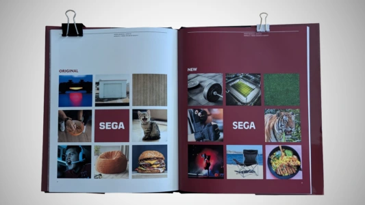
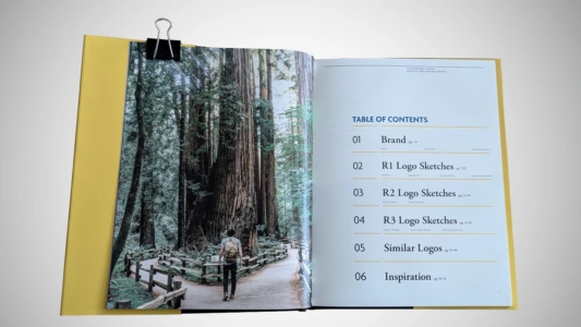
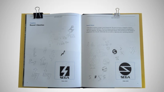
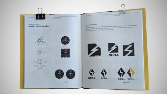
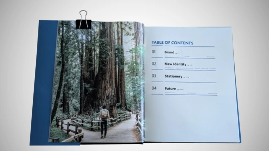
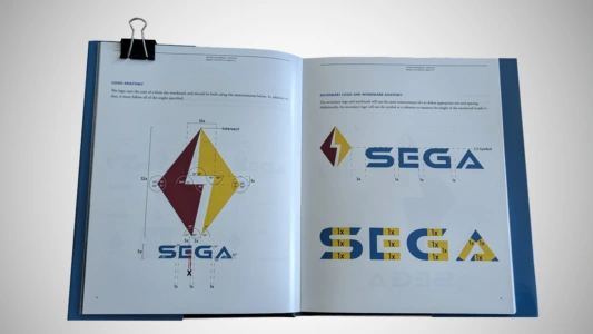
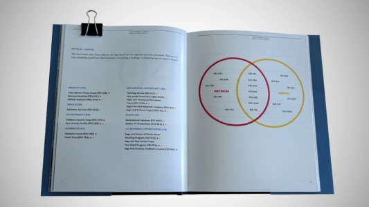
Virtual Flipbooks of the guides are here, but are only viewable on Desktop *
If Flipbooks do not appear, use the below links *









Like this project
Posted Aug 5, 2026
Rebrand concept repurposing Sega into an active-lifestyle brand with strategy, product design, brand extensions, guides, and website mockups.